
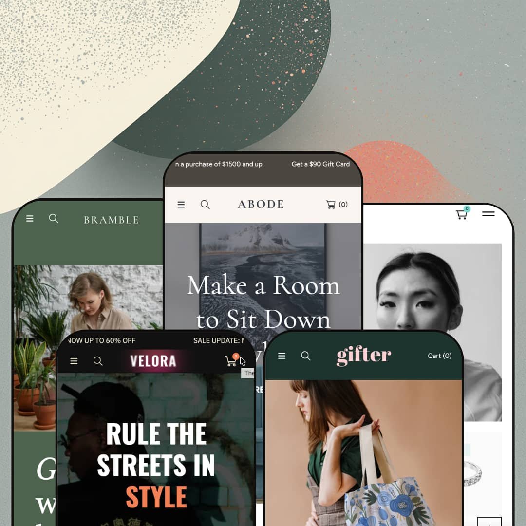
Most Shopify themes hand you one look and leave you to bend it toward your brand. Abode hands you five, and they're different enough that a plant shop, a streetwear label, and a fine-jewellery studio could each launch on it without looking like siblings. Under that range sits a single Online Store 2.0 section library, staged five ways rather than built as five separate toolkits. The useful question isn't whether Abode is versatile; it's what that one shared library does and doesn't stage for you.
Five finished starting points, not five color swaps
Abode ships five presets that differ in structure, not just palette: Velora stages a maximalist merch layout, Javelin a stripped luxury grid, and the three between them land at their own densities. The range is real. Because all five draw on one section library, the preset you pick is a finished aesthetic direction you can later restage toward any of the others, rather than a blank Dawn canvas you build up from nothing, which is a meaningful head start for a solo founder or small team launching a considered-purchase catalog in furniture, plants, jewellery, or art prints.
In-cart merchandising that builds the basket
For merchants who live on average order value, meaning small-catalog streetwear, gifting, and accessories brands where the second item in the cart is the whole margin, the theme puts basket-building where it belongs. Open the slide-out cart and a cross-sell row is already staged inside it, with an order-note field beneath. On the product page, the furniture demo attaches a paid gift-box option as a line-item add-on. None of that needs a separate upsell app.
A product page that carries variants and specs
The product template is built for complexity. It stages a modal image gallery, with the sofa demo running seven angles, color swatches beside a size button-group with per-variant pricing, a sticky add-to-cart bar, breadcrumbs, and a structured detail block for material, dimensions, and assembly. For catalogs with genuine variant depth, such as apparel in size-and-color matrices or furniture in multiple finishes, carrying roughly 50 to 200 SKUs where each item needs several images and a spec sheet, that template does the heavy lifting without an app. The sticky bar also keeps the buy button in reach on long pages.
Filtering wired into the navigation, not just the sidebar
The filtering itself is Shopify's; the staging is the theme's. Collection pages carry Shopify's faceted filtering, but the theme's own move is where it puts those filters: Velora drops a "By Color" set straight into the header mega menu, so a shopper picks Black or Teal from the nav and lands in a filtered grid, and collection pages can also hold an in-grid promo tile and a blog block between the products. That's the theme staging discovery as merchandising rather than leaving it to a bolt-on. For filter-dependent catalogs, meaning apparel and accessories brands carrying 100-plus SKUs that share attributes like color and size, the menu itself becomes the fastest path to the right products.
The editorial story layer is on you
Abode lists lookbooks and image hotspots among its merchandising features. I went looking, and no preset stages either with any conviction. The capability is real. But every demo defaults to grids, carousels, and promo bars, which is fine for volume selling and thin for brands whose sales depend on styled, immersive imagery, so for high-AOV, considered-purchase merchants such as fine-jewellery studios and premium furniture labels where the photography does the persuading, the tools are in the box with no staged blueprint to copy, and that immersive layer gets built from a blank slate.
It assumes you have a catalog to fill
The demos are built for stores with depth: multi-level menus, several featured-collection rows, and product grids many items deep. It's subtraction as much as setup. A brand launching with a small catalog inherits a full complement of merchandising slots and nowhere near enough products to fill them, so for micro-catalog and made-to-order sellers, meaning single-drop brands or studios carrying under roughly 20 SKUs, thinning sections down to a tidy layout is manual work rather than a preset you can pick.
What it takes to launch
Because each preset ships as a fully dressed store under its own demo brand, expect a multi-day pass to swap demo brand names and placeholder copy across hero slides, About and services narratives, and FAQ and blog entries, then to curate or rebuild featured-collection and promo sections to match your real catalog, populate product metafields for specs and badges, and translate any EU-language strings the preset carries. Budget more if you adopt one preset but want to pull sections from another.
-
What works in this preset
This is the preset the theme is named for, and it shows. The Abode demo, staged as a home-and-décor store, runs the deepest navigation on offer: a catalog mega menu that nests furniture, home goods, lighting, and rugs under image-tiled columns, with a gift-card tile tucked into the panel. The depth is real. I clicked through several levels without hitting a dead end, and for a furniture or décor brand with genuine category breadth, the header alone does a lot of merchandising before you reach a single product.
The homepage stacks a merchandising-forward sequence: a three-slide hero, a tabbed collection browser that swaps between Furniture, Rugs, Home Goods, and Lighting, then two fully built featured-product blocks. It reads like a store, not a template. One block stages a Sheesham-wood sofa with color swatches, a size toggle, and per-variant pricing; the other is a gift card with denomination options and a send-to-a-friend message field, so you see a working variant picker and a gift flow on the homepage itself.
Where it stumbles
For an evergreen furniture catalog, the demo leans oddly hard on drop-hype capture: a "next collection is coming soon" block and a repeated newsletter gate frame the store around scarcity. That's a mismatch. Furniture is a considered, restock-driven purchase, not a sneaker drop, and while those capture blocks aren't broken, they're staged against the grain of how people actually shop for a sofa, so a décor brand would likely swap them for something evergreen.
-
What works in this preset
Bramble dresses the same sections as a plant store, and its standout move is a "Special Services" block: three cards for floral design, plant stylization, and garden stylization. Most theme demos are all products. This one carves out room for a service-led business to describe what it does beyond the catalog, which is a genuinely useful starting block for a plant shop, a florist, or any local brand that sells expertise alongside goods. I went looking, and the other presets put those same image blocks to entirely different uses, which tells you how flexible the underlying pieces are.
Typographically it's the most distinctive of the presets. Accent words drop into italics throughout the page, giving the plant vertical a soft editorial voice where the merch layouts stay plain, and a same-day-delivery editorial block plus a press-logo row round it out. None of that is exotic section work. The styling choices are what make one shared library feel like a purpose-built plant brand.
-
What works in this preset
If Velora is the loud preset, Gifter is the quiet one. Staged as a stationery-and-art-print shop, it stages fewer of the heavy merchandising blocks and leans on icon-labeled category tiles for mugs, wallpapers, journals, gift bags, and tees, plus a couple of clean product carousels and a countdown block near the top. For a small artist or gifting brand with a tight catalog and a playful identity, the lighter staging is the point rather than a shortcoming.
One small detail caught my eye. A product in the Trendsetters row shows a per-unit price of about thirty cents per sixteen grams, which means the theme will surface unit pricing wherever it's set, and for anyone selling by weight or volume that's one less thing to bolt on. The rest of the page is deliberately sparse, and it loads that way too.
-
What works in this preset
Velora is where the theme flexes its conversion muscles hardest. Staged as a streetwear label, it's the densest of the five: an announcement bar, a hero, two moving marquees, a discount-code popup, and a product-level countdown all share the page. The featured hoodie carries a full five-color, four-size matrix, twenty variants in all, with a "sale ends in" timer sitting right on the product block. For a drop-driven merch brand that treats urgency as a feature, this preset already speaks the right language.
The move I liked most was in the cart. Open the slide-out drawer and a "You May Also Like" cross-sell row is already sitting there, alongside an order-note field. Velora also wires Shopify's color filter straight into the header, so picking "By Color: Black" or "Teal" from the mega menu drops you into a filtered grid, which puts discovery and basket-building inside the theme with no add-on in sight.
Where it stumbles
The flip side of all that urgency is crowding. Between the announcement bar, the marquees, the popup, and the product countdown, the promo surfaces can outnumber the products on a first scroll. For a brand with a deep catalog it energizes the page; for a lean drop with a handful of SKUs, it's a lot of shouting around very little merchandise, and thinning it back down is manual work, section by section.
-
What works in this preset
Javelin is the opposite of Velora, and that's the most useful thing about it. Staged as a fine-jewellery studio, it strips the header down to four items, opens on a spare product grid, and closes on a near-empty footer. No marquees, no popup crowding the first scroll. It's the proof that the same library which built Velora's noise can also hold its tongue for a luxury brand where restraint is the whole aesthetic.
The merchandising cues suit high-AOV goods. Product cards carry Sale, Best Seller, and New badges, sold-out items show their state, and sale prices strike through cleanly at price points running from two hundred to eight hundred dollars. The cart drawer still offers the same cross-sell row as the busier presets, so the restraint here is visual, not functional: Javelin looks minimal but keeps the conversion tools underneath.
It flexes to price, not just palette
The same library convincingly dresses eight-dollar fridge magnets in the plant preset and eight-hundred-dollar earrings in the jewellery one. Matching staging density and restraint to a brand's price point is a subtler form of range than swapping colors, and it's the thing that lets wildly different merchants share one theme without any of them looking generic.
Discovery and basket-building are native, and stay that way
Across every preset the pattern holds: filtering, cart cross-sell, and gift flows live in the theme, not in a stack of add-ons. Seen in one preset that's a feature; seen staged consistently in all five, it reads as the theme's actual priority, which is reassuring for anyone who would rather not assemble a plugin pile just to launch.
The demos double as documentation
Each preset is built out fully enough that you can learn the theme by editing a working store rather than assembling one from empty sections. For a first-time Shopify merchant, reverse-engineering a finished layout is a gentler on-ramp than starting from a blank theme, and it quietly lowers the real learning curve.
Preset specialization is skin-deep
Every vertical gets the same toolkit dressed in different demo content. The jewellery preset holds no jewellery-specific tooling and the furniture preset none of its own; the specialization is aesthetic, not functional. Buyers hoping the "jewellery" or "furniture" label signals bespoke, vertical-tailored features rather than a vertical-tailored look should reset that expectation before they buy.
An Online Store 2.0 chassis in a Horizon-era market
Abode is a 2023-generation Online Store 2.0 theme, and its section-and-block model tops out where that generation does. Nothing about it feels dated in daily use, but shoppers cross-shopping against 2025-era themes with deep nested blocks or AI-assisted block generation should place Abode's architecture correctly. It's a ceiling on composition, not a flaw in execution.
★ 7.4/10
Rating
-
Cart-drawer cross-sell, product add-ons, native faceted filtering, countdowns, and gift-card-with-message flows all live in the theme; a broad, practical set for a $140 price.
8
-
Standard Online Store 2.0 section editing, but the same richness that makes the demos strong means more sections to curate and dress before launch.
7
-
Slide-out menu, sticky header, and sticky add-to-cart carry to small screens; the promo-dense presets stack a lot vertically, so the lighter presets feel tidier on mobile.
7
-
Lazy-loaded imagery and a restrained load on the lighter presets; the maximalist ones pull in many images and moving sections, so real-world speed tracks how much staging you keep.
7
-
One section library stages five distinct storefront characters, from maximalist merch to minimal luxury; the library is available theme-wide and presets differ in how densely they deploy it.
8
Frequently Asked Questions
-
Abode, staged as a home-and-décor store, is the flagship that matches the theme's name and positioning. The other four are equally complete starting points, not lesser variants.
-
The presets are configurations of one shared library, so you can restage toward another look, but you'll re-dress sections and swap content rather than flip a single switch.
-
Yes. The gift-card product stages a recipient email and name, a message field capped at 200 characters, and a send-on date.
-
Product cards show sold-out states, and collection filters split in-stock from out-of-stock with live counts you can see before you click into a product.
-
Through a structured detail block on the product page; the sofa demo lists material, dimensions, and assembly, which suits spec-driven categories.
-
Yes, and it scales both ways: the home and merch presets run multi-column mega menus with nested collections and image tiles, while the jewellery preset stages a slim four-item nav from the same system.
This review is based on hands-on testing of the publicly available preset demos of the Abode Shopify theme as of July 1 2026. Theme features, preset availability, and performance can change with subsequent updates from the theme developer.