
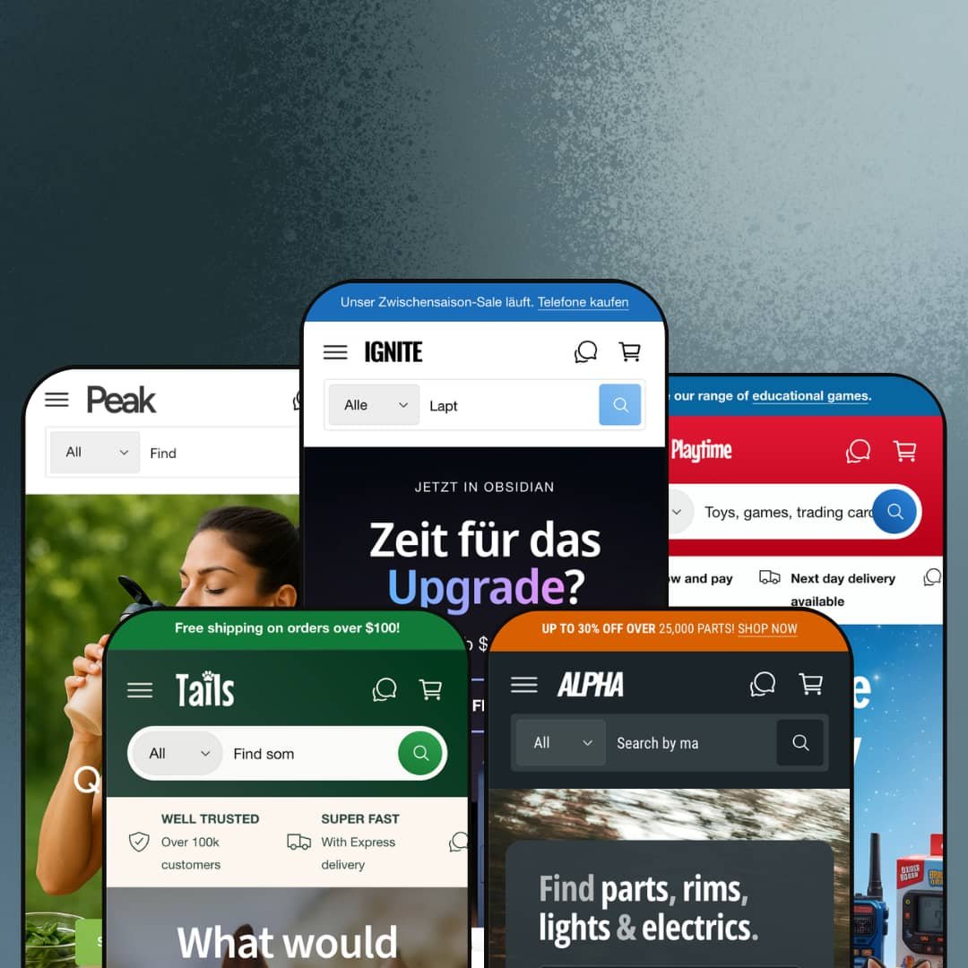
Most premium Shopify themes commit to one vertical and stay there. Ignite ships five and asks you to pick. Built on Online Store 2.0, the theme ships preset families for electronics, design furniture, pets, automotive, and food/health, each with a distinct hero pattern and section deployment. The breadth raises an obvious question: does the underlying section library actually carry across all five, or does each preset hollow out into its own narrow corner?
Five presets, five verticals, one license
Ignite ships five preset families covering electronics, design furniture, pets, automotive, and food/health, each with its own hero pattern, mega menu architecture, and section deployment matched to the vertical. The breadth lets a single theme purchase cover wildly different storefront scenarios. For agencies handling 5+ client storefronts across distinct verticals, or holding-company operators running a multi-brand commerce stack spanning electronics, food, pets, and automotive, the upfront preset cost amortizes faster than buying five separate theme licenses. Worth it.
Compare Products as a first-class theme section
The Compare Products section runs theme-wide. Each preset deploys it for a different category with vertical-appropriate metafield columns. Same template, different attributes per vertical. The mechanic is a theme section, not an app install. For multi-attribute considered-purchase catalogs across electronics, automotive, supplements, and apparel where buyers shop on side-by-side spec evaluation and 20-200 SKUs is the sweet spot, this section anchors the conversion path that buyers actually use. For impulse-buy verticals, less so.
Product cards carry the conversion stack natively
For merchants with cross-shopping behavior and multi-attribute discovery patterns (electronics retailers with 100-500 SKUs, supplement and food brands with dietary segmentation, parts retailers with fitment-tagged catalogs), Ignite's product card is dense with conversion infrastructure. Each card can carry a custom badge slot with multiple badge types available, a sale-claim percentage counter that tracks how much of a discount allocation has been redeemed, color-swatch previews with image-swap on hover, vendor labels, stock counters, and metafield-driven attribute icons that surface category-specific filtering at the grid level. The whole stack runs as theme work rather than a layered set of app overlays. Theme work, not an app stack.
Native service-booking form for hybrid retail-plus-service brands
The native service-booking form section is deployed in three of the five presets with vertical-appropriate field configurations. It handles multi-select service types, two preferred-date slots, contact fields, and free-text notes, posting submissions through Shopify's standard form pipeline rather than a calendar integration. For hybrid retail-plus-service brands where the storefront sells products and books in-person appointments (vet and groomer shops, repair stores, supplement coaches, fitness studios with merch), the form-as-section approach removes the friction of plugging in Calendly or Setmore on every page. Solid native option.
Full B2B affordances require Shopify Plus
Ignite's B2B-ready positioning is partly gated by Shopify Plus tier. Quick order list, Bulk order badges, and quantity-rule UI work on standard Shopify Basic and Advanced tiers, but Quantity pricing (multi-tier wholesale pricing per quantity threshold) only fires on Plus. The Theme Store features list marks Quantity pricing as "Shopify Plus" explicitly. For wholesale-enabled D2C brands on Shopify Basic or Advanced tiers, the B2B feature set is partial: quantity-rule UI without the pricing engine behind it. For Plus merchants, the full B2B stack engages.
Layer 5 apps still required for review-driven and subscription verticals
What looks like native customer reviews on product cards (the "5.0 / 5.0 (2 reviews)" sitting under product titles) appears to render from metafields, not from an integrated reviews engine. No wishlist toggle is present on product cards. No subscription billing UI shows on the product page or in the cart drawer beyond the generic deferred-purchase consent. For supplement and beauty brands where review velocity drives conversion, and for subscription-commerce models like coffee, supplements, or pet food running on Recharge or Appstle, Ignite is the theme half of the stack and the merchant still installs and styles the apps separately.
International defaults skew UK/EU
Benchmark Themes is UK-based. The demo defaults reflect that. The Ignite preset opens in GBP with a UK flag, Peak shows just 7 country options in the currency selector (mostly UK plus EU plus Saudi/UAE plus Canada plus US), and the documented language pack is EU-focused (EN/FR/IT/DE/ES). The Tails and Alpha presets stage 30+ EU country options instead. For US-based merchants serving primarily North American customers, or for APAC-based brands serving Singapore, Australia, or Japan-focused markets, reordering the currency list, swapping the default Market, and adding non-EU language packs through Shopify Translate & Adapt is real configuration time at launch.
What it takes to launch
Expect 2-3 days minimum: replacing anonymized brand names, hero captions, mega menu copy, FAQ entries, About-page narrative, and testimonial slider content; sourcing or shooting vertical-appropriate imagery; populating metafields for comparison tables, fitment data, dietary tags, or whatever maps to your vertical's decision attributes; and reconfiguring currency, language, and Market defaults if you sell outside UK/EU.
-
What works in this preset
The Compare Products section sits mid-page with three phones lined up by display, processor, RAM, camera, and zoom range. Each row pulls a metafield. The buyer scans across the table to settle a decision between three flagships before clicking through to any product page. I sat with this section for a while because a phone retailer would otherwise build comparison rows with a custom Liquid block or a paid comparison app. Here it ships as a theme section with merchant-configurable metafield columns.
Scroll down past the comparison table and the homepage opens out into a fitness-themed editorial section, then a video-hero showcase, then a multi-column blog grid, then a "Who, us?" counter row, then a six-card testimonial slider, then a brand-styled grid of phone variants with color-swap thumbnails. The Ignite preset uses around 18 distinct section types on one homepage. That's a lot, and the page reads dense rather than airy. For a tech retailer with 100+ SKUs across phones, monitors, laptops, accessories, and smart home, that density feels appropriate. For a small accessories shop, it'd be overwhelming.
"Popups can be annoying. But Ignite's popups can show when someone goes to leave your store or copies text to the clipboard." That self-aware copy sits in a homepage block that doubles as a documentation note: the popup engine handles exit-intent, link-click, and clipboard-copy triggers as native theme behaviors. For aggressive merchandising stores running flash sales and abandoned-cart recovery, the three trigger modes cover the high-conversion popup moments without an app install. Minimalist stores turn it off in customizer.
-
What works in this preset
The cart drawer is the standout here. Open it and you find a free-shipping progress bar at top ("£1,000.00 AWAY FROM FREE SHIPPING"), an order notes field, a terms-of-service checkbox, a gift-product slot, a recommended-products carousel, and a discount-code input with apply button. The drawer reads as a checkout-staging area rather than a confirmation panel. For high-AOV design and furniture brands where the buyer consolidates a multi-item room order over a long browse session, that drawer holds up under real use.
Most theme demos stop at category page and product page; Playtime stages a press-and-events horizontal section showing five recent appearances (Milan Design Week 2023, London Design Fair 2023, COLLECTIBLE Fair 2023, "i am u are" NYC, plus catalog downloads), each card with image, headline, body copy, and social tags. The same section is then re-deployed as the "Buy the Look" lifestyle-shop carousel where multiple products from a single editorial image become shoppable cards. I went looking for whether this was a one-off Playtime preset section or theme-wide, and it's the latter — the section sits in the theme's section library and renders consistently across presets, with this preset simply leaning on it harder. Useful for press-led brands.
The mega menu nests four levels deep, with the third level surfacing 30+ named product variants per category (the Decor mega menu pulls in 30+ Tweety, Gutta, Genke, Delaunay, and Gabo vases by name). The fourth level adds visual featured-product tiles with image-headline-body pairs. For a design-furniture catalog with 200+ SKUs and a discovery-led buyer journey, four-level navigation gives the SKU range somewhere to surface in the header. For 30-SKU brands, four levels is way too deep. Collapse to two.
Where it stumbles in this preset
The header is busier than the catalog warrants. The site visibly carries maybe 100-150 unique products across decor, mirrors, lighting, furniture, and limited edition. But the mega menu surfaces 60+ named product links at the third level, most of them duplicates or near-duplicates (multiple "Lake Mirror" entries by number and edition that point to the same handful of SKUs). The header capability is impressive; the staging makes navigation feel more cluttered than the actual range deserves.
-
What works in this preset
The native service-booking form sits below the bestseller grid: a dropdown for "Who's the lucky one?" (Dog, Cat, Horse, Rabbit, Guinea Pig, Hamster, Ferret, Bird, Reptile, Other), a dropdown for "Choose your pet's treat" (Full Grooming, Wash & Groom, Nail Clipping, Ear Cleaning, De-shedding), a free-text "Extra info" field, two preferred dates, plus name and email. It posts through Shopify's standard form pipeline. For a vet, groomer, or pet-supply store offering in-store services alongside retail products, this form replaces the friction of plugging in Calendly or Setmore mid-page. Native form, native theme.
Scroll down past the booking form and the Compare Harnesses section appears. Three dog harnesses side-by-side with metafields for dog-size (For Large dogs / For Small dogs), leash length (140cm / 100cm / 120cm), and material (Leather with adjustable buckles / Waterproof neoprene / Nylon with soft padding), plus a learn-more button on each column. Same theme section as the phone comparison, configured with pet-appropriate attributes. Pattern recognition kicks in. For pet retailers with multi-size or multi-material variants, the comparison mechanic transfers cleanly.
"Wheat Free. Nut Free. Dairy Free." Three small icon overlays sit at the foot of the Wrapped Beef Ribs Dog Treats card, each pulled from a product metafield and rendered as a tooltip-equipped icon. The dietary-badge mechanic recurs across pet-food cards throughout the bestseller grid. For pet brands segmenting on allergen claims and dietary positioning (grain-free, dairy-free, single-protein), the icon overlays surface attribute filters at the grid level without requiring a custom product card template.
-
What works in this preset
The Part Finder 3000™ greets you in the header. Two cascading-dropdown forms (Make → Model → Year → Generation, and Part Type → Make → Model → Generation → Year) anchor the hero region. Each product card carries "Fits:" tags rendered from a fitment metafield ("Fits: 1 Series, 2 Series, 3 Series"). For automotive-parts retailers where buyer intent depends on knowing which vehicle the part fits, this two-pronged finder plus product-level fitment is the differentiator the catalog needs. Catalog without it would be unusable. With it, navigable.
The product card here does more work than in any other preset. Each one carries a vendor label, a fitment list, a stock counter, a "SALE X% claimed" progress indicator, a custom badge ("Bulk order", "Premium materials", "Up to 6% off"), and a row of attribute icons at the bottom (Fast Delivery, Global Delivery, Aftermarket Part, DIY Friendly, OEM Original Part, Expert Installation Recommended). I scrolled the bestseller grid twice to count the layers per card; there are six distinct visual elements per card plus the product image. For high-density catalog stores running aftermarket-parts or B2B-component verticals, that visual density carries weight. Crowded but informational.
The Compare Products section reappears, this time scored by Style (Smoked / Clear), SUITABLE FOR (Mino / BMV), Generation (Clubman / Hatch / Convertible vs 3-Door / 5-Door / Convertible vs X3 / X5 / X6), and Features (LED Lighting / Adjustable angle / Dimmable). The metafield columns shift again per vertical. Pet retailers got size and material. Automotive gets fitment and feature. Same theme mechanic, vertical-appropriate attributes.
Where it stumbles in this preset
The Part Finder's promise depends on metafield discipline. Every product needs Make/Model/Year/Generation populated for the cascading dropdowns to return useful results. For a parts retailer launching with 5,000+ SKUs, that's a multi-week upfront data-modeling pass before the finder works as advertised. The theme ships the mechanic, the merchant supplies the data, and the gap between empty and functional is real.
-
What works in this preset
Dietary-badge metafields run deepest here. Every product card carries 2-4 overlay icons drawn from Vegan, Gluten Free, Dairy Free, Nut Free, Plant Based, and Keto. The icons are tooltip-equipped and metafield-driven. For supplement, protein, and grocery brands where the buyer decision pivots on dietary attribute discovery, the badge overlay puts the filter at the card level rather than only in the collection-page sidebar. Card-level attribute discovery.
Add a bottle of Vina Del Rio Wine to your cart and an age-verifier modal triggers: "Are you 21 or older?" with YES/NO buttons. The gate sits as a theme section that fires on product-page load for tagged products, not as an app overlay. For alcohol, CBD, vape, or adult-only verticals where age verification is regulatory rather than optional, this is a native compliance affordance. Not the most sophisticated age gate on the market. But it works without a paid integration.
Unit pricing is rendered on every product card: "£0.28 / per 10g" on the cereal, "£3.00 / per 100g" on the coffee alternative, "£3.00 / per 500ml" on the coconut water, "£0.10 / per g" on the protein booster. For EU and UK food/grocery merchants where comparative unit pricing on shelf-equivalent labels is regulatory, the theme handles it through standard Shopify unit-pricing without merchant configuration. For supplement merchants pricing on 100g protein doses, same. The grocery-compliance work is genuinely done.
Multi-vertical preset family is the design intent, not an accident
Reading across all five preset demos, the consistent pattern is that Ignite doesn't share a single visual identity per preset. Each preset is configured with vertical-appropriate hero patterns, section deployment, mega menu structure, and design-token tuning. That's not a theme stretching to cover five markets. It's a theme that started with the vertical breadth as the design constraint, then built the section library around it.
B2B affordances aren't bolted on; they're theme-wide
Quick order list, Quantity pricing for Shopify Plus, Bulk order badges, multi-quantity steppers on product cards, vendor labels everywhere: these read as theme-wide capabilities, not preset-specific demos. They surface in Ignite's electronics catalog, in Tails' bulk doggy-bag listings, in Alpha's mounting-bolt SKUs, in Peak's protein-powder size selectors. Same mechanic, every vertical. For wholesale-enabled or hybrid B2B/D2C merchants on Shopify Plus, the consistency across preset deployments matters more than any single feature.
Design tokens span editorial restraint to high-functioning catalog density
Playtime sits visually apart from the other four presets. Where Ignite, Tails, Alpha, and Peak share a high-density catalog aesthetic with packed homepages, sticky sale banners, dense product grids, and multi-row trust bars, Playtime opens with editorial restraint: large white space, sparing typography, lifestyle photography. The shift isn't accidental; the same theme accommodates both reading paths through its design-token system. For brands choosing between editorial-led and conversion-led visual presence, Ignite shows the range within a single license.
No vertical-neutral starting preset
All five presets are heavily verticalized: electronics retail catalog, design furniture editorial, pet supplies, automotive parts, food and health. The theme ships no apparel preset, no beauty preset, no jewelry preset, no home-goods preset, and no single-product DTC starter. For brands operating outside the five demonstrated verticals (apparel, jewelry, beauty, home goods, single-product DTC, B2B services), choosing a preset means picking the closest-fit demo and re-skinning sections, copy, and product cards for an unrelated vertical. Cross-vertical adaptation work.
Preset choice is high-commitment; switching mid-build loses customization
Once a merchant customizes a chosen preset's design tokens, section deployment, and metafield mappings, switching to a different preset later means losing that work and starting over from the new preset's defaults. With 5 distinct presets, the initial preset decision matters more than in single-preset themes where there's only one starting point. For merchants in the early discovery phase who haven't committed to a vertical positioning yet, the preset-first architecture rewards decisiveness and punishes mid-build pivots. Lock in early or rebuild later.
★ 7.8/10
Rating
-
Compare Products section deployed in every preset with vertical-appropriate metafields, native service-booking form, Part Finder cascading dropdowns, dietary/fitment metafield icons, B2B affordances (Quick order list, Quantity pricing for Plus), age verifier, and cart drawer with order notes plus terms checkbox. Feature density is the headline.
9
-
Real configuration surface area: 50+ sections plus 5 distinct preset directions reward decisive merchants and challenge those mixing across preset configurations.
7
-
Back-button stacking mobile menu, sticky add-to-cart on product pages, image lazy-loading throughout; dense homepages stack into long mobile scrolls in 4 of 5 presets.
8
-
DOM is heavy in dense presets (Ignite, Tails, Alpha) where 15-20 section types fire on initial load; Playtime runs leaner. Image lazy-loading is in place.
7
-
Five preset configurations, 50+ shared sections, multi-level mega menu, native form builder, per-preset design-token tuning; editorial path is single-sourced (Playtime), catalog-dense path is well-served.
8
Frequently Asked Questions
-
It's real but partial. Quick order list (a multi-SKU quick-add form for repeat buyers), Bulk order badges and quantity-rule UI on product cards, Quantity pricing (Shopify Plus only), and vendor labels work natively across all presets. For wholesale brands running D2C and B2B from one store, this is solid theme infrastructure. For full B2B with company-level pricing, NET 30 invoicing, and approval workflows, the merchant still needs Shopify Plus plus B2B-specific apps.
-
The bulk of surface conversion features are native: comparison tables, sticky add-to-cart, exit-intent and clipboard-trigger popups, age verifier, service-booking form, dietary/fitment metafield badges, and cart drawer with order notes. The exceptions are customer reviews (no native reviews engine; merchants install Judge.me, Loox, Yotpo, or Stamped), wishlist (app required), and subscription billing (Recharge, Appstle, or Bold).
-
Dawn is Shopify's free baseline OS 2.0 theme with a deliberately minimal section library. Ignite ships 5 preset families and 50+ sections including comparison tables, service-booking forms, the vehicle Part Finder, dietary badge metafields, age verifiers, and rich cart-drawer configurations. For merchants whose conversion path depends on multi-attribute comparison or service-plus-product hybrid models, the section library is the upgrade. For minimal-aesthetic single-product stores, Dawn is sufficient and Ignite's section count is overkill.
-
Yes. The Compare Products section is configured in the customizer by selecting up to three products and mapping product metafields to comparison rows. Setup requires populating the comparison metafields on each product (display, weight, material, allergen, fitment — whatever maps to your vertical's decision attributes) before the section reads anything useful.
-
Playtime, usually. Its editorial design tokens, large-image-led hero pattern, and lower section density are easier to re-skin for a different vertical than the high-density catalog presets (Ignite, Tails, Alpha, Peak). For single-product DTC verticals, none of the five presets fit naturally and most of the homepage section deployment gets rebuilt.
-
It's form-only. The form posts submissions through Shopify's standard contact-form pipeline (received as email to the store owner). It doesn't push to Google Calendar or sync with Calendly. For low-volume appointment booking where staff manually confirms each slot, that's enough. For high-volume booking with availability sync, the merchant still installs a scheduling app and uses Ignite's form section for capture only.
This review is based on hands-on testing of the publicly available preset demos of the Ignite Shopify theme as of May 2026. Theme features, preset availability, and performance can change with subsequent updates from the theme developer.