
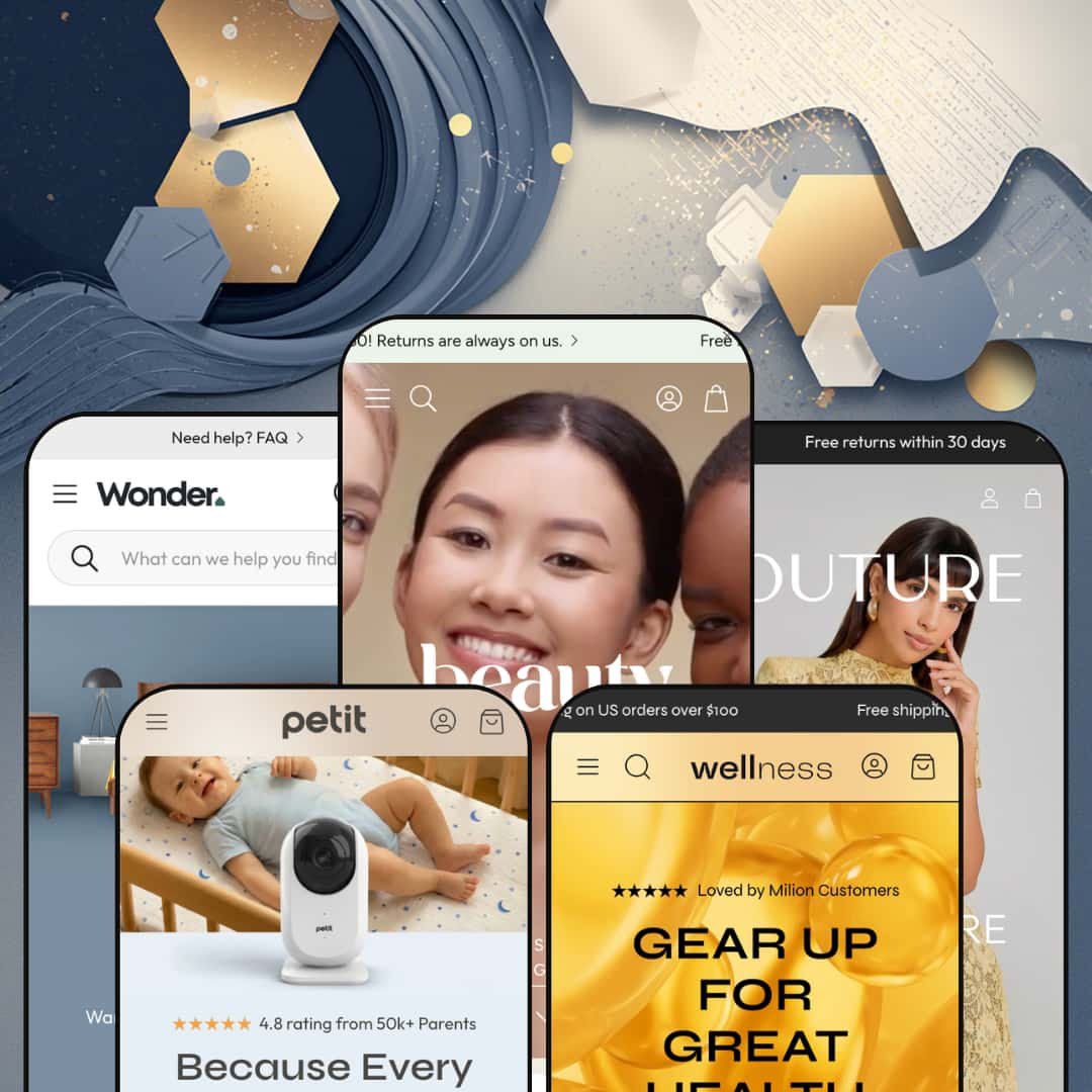
There's a baby monitor sales page hiding inside the Wonder theme. It's called Petit, a one-page CRO layout that sits next to four more conventional presets (beauty, wellness, luxury fashion, home decor) under one $390 NETHYPE license. The architecture is Online Store 2.0, not Theme Blocks. Five wildly different verticals from one purchase, and the buy-or-walk question is whether that mix justifies the price.
Five-vertical preset library, one of which breaks format
Wonder ships five presets covering beauty (Wonder), wellness (Root), luxury fashion (Velour), home and interior (Nook), and single-product CRO (Petit) from one $390 license. The Petit preset is the unusual one, a true one-page conversion layout with multi-tab feature blocks, comparison tables, and a press-logo strip, built around a single hero product (baby monitor in the demo). For multi-brand operators running two or three Shopify stores at the premium tier, that's one license covering work that would otherwise mean three separate theme purchases. Operators with one store but multiple sub-brands get similar mileage.
Visual merchandising kit that replaces three or four paid apps
The visual merchandising stack covers before/after image slider, image hotspots on lifestyle photography, lookbook sections, image rollover on product cards, and full image zoom on the PDP. These work together as a capability-family, what beauty and apparel brands typically install three or four apps to assemble. The Wonder and Velour presets lean into hotspots and lookbooks particularly hard. Image-led brands save real money here. For beauty, skincare, and apparel brands selling under 100 SKUs where photography drives the sell, the native kit means launching without a visual-merchandising app stack on day one.
Out-of-box conversion stack for flash-drop and limited-launch brands
For DTC stores running flash drops, limited-edition launches, or weekly restock cycles, Wonder's conversion-feature stack reads as built for the use case. The bundle: countdown timer, stock counter, sticky cart, sticky buy button (added in v2.3.0), promo popups, trust badges, and subscription widget support (also v2.3.0). What you'd usually assemble through a Klaviyo-Recharge-OptiMonk-style app stack is sitting in the theme editor by default. The relevant audience is DTC operators running scarcity-driven launches at sub-100 SKU catalogs. That's a real time saver.
EU-language pack ships baked in (EN, FR, IT, DE, ES) plus RTL support
The five EU translation files cover English, French, Italian, German, and Spanish in the theme UI strings, with RTL CSS support for Arabic and Hebrew layered on top. None of this is Markets-layer functionality; it's actual theme-side UI translation, ready to deploy without commissioning translation files. For brands selling across EU markets at the mid-luxury price band, especially France, Italy, Germany, Spain, or Netherlands launches, that's a setup-cost gap you don't pay. Useful pairing with Markets when you turn it on.
Online Store 2.0 in a Theme-Blocks era
Wonder runs on Online Store 2.0 architecture, with JSON templates, the section editor, and app-block support, but it doesn't reach into the Theme Blocks framework that Shopify shipped to its theme platform in summer 2025. That means no 8-level nested block customization, no AI block generation, and no compatibility with Horizon-family editor patterns. At $390, you're paying premium-tier pricing for last-generation architecture. For premium-tier brands with deep editorial customization needs, the Theme-Blocks gap will start to show within the first month of editor work. It shows.
Five presets, three actual layout formats
Three of the five presets — Wonder (beauty), Root (wellness), Velour (luxury fashion) — sit in structurally similar editorial-storytelling layouts. Different palettes, same rhythm. Nook breaks as a furniture grid; Petit breaks entirely as one-page CRO. So the "five verticals" promise is closer to three actual layout formats. For multi-brand operators running two or three Shopify storefronts at the premium tier, who budgeted on five visually distinct preset starting points when sizing the license, the reality is three formats stretched across five color stories.
Petit is the smallest tent in the lineup
Petit is genuinely useful as a one-page single-product layout. It doesn't scale. The preset is built around hero product staging, comparison-vs-competitor blocks, and a press-strip narrative; no real path to running a multi-product catalog through Petit's section library. Merchants with catalogs above 50 SKUs and multiple product lines will use four of the five presets, not five. That's still good math at $390, but worth naming up front.
What it takes to launch
Expect copy and imagery replacement across five preset demos, brand-naming decisions for each (every preset ships with a placeholder brand), selective deployment of the five EU translation files depending on launch markets, and a separate copy treatment for Petit's one-page format that runs distinct from the four conventional presets.
-
What works in this preset
I scrolled the homepage and the visual language is clear: clinical-skincare editorial. The Mokosh-branded demo runs a clean white-space hero into testimonials, an image-led product grid, a recipe-style ingredient breakdown, and a four-icon trust strip with eco-conscious messaging (vegan and cruelty-free, doorstep delivery, fine natural ingredients, recyclable packaging). The before/after image slider sits prominently, a useful merchandising tool beauty brands usually install as a paid app. It earns its keep.
The product page does the basics right. Multi-image gallery, size and ingredient tabs, a recommended-products strip below, and a cart drawer that slides out with the discount field exposed by default rather than buried behind a toggle. For skincare brands selling routine-driven $40-80 SKUs at the mid-luxury tier, that's enough conversion infrastructure to launch without a cart-app stack.
-
What works in this preset
Supplement-brand storytelling is the design intent. The Root preset hero opens with "The future of wellness starts here" over plant-based vegan multivitamins and natural collagen as the demo catalog. Below the hero, the preset runs a blog content strip with full editorial articles (the demo includes "Omega-3 fatty acids", "Natural ways to boost your energy", "When it comes to supplements, quality is everything"). Wellness brands typically pair product pages with educational content; Root makes that pairing structural rather than optional. That's the read.
Product pages surface ingredient and nutritional information as a native tab, alongside the standard variant picker and recommended-products carousel. Supplement merchants will recognize the structure — it matches Baymard-guideline patterns for considered-purchase ingestibles. For plant-based supplement brands selling $20-50 SKUs at the wellness mid-market tier, the content-led layout is a setup advantage over starting from a generic product theme. Useful default.
-
What works in this preset
Velour is the editorial luxury-fashion preset. I clicked through the "One shoulder dress with a frill" product page and the layout reads as fashion-vertical first: large hero imagery, dedicated size-chart access, and color-swatch variant pickers staged for visual selection rather than dropdown navigation. The mega menu carries image content directly in the navigation, which is genuinely useful for fashion catalogs running 200+ SKUs across multiple silhouettes and seasons.
Conversion patterns are fashion-specific. Cross-selling and recommended-products sections handle shop-the-look assembly natively, which fashion brands typically install separate apps to achieve when their theme doesn't ship the capability. For womenswear brands at the contemporary-luxury price band ($150-400 dresses, 100-300 SKUs across seasons), Velour reads as preset-and-launch rather than preset-and-customize.
-
What works in this preset
Where does a $390 theme position a furniture preset? Nook's answer is design-consultation forward. The preset surfaces messaging like "Our experienced and certified design team will work with your schedule, style preferences and budget to create a customized space plan and room design" alongside furniture grids, lifestyle photography, and a four-trust-strip ("Items you love at prices that fit your budget," "Two-day delivery on thousands of items," "24/7 friendly team," "All things home & garden in one place").
The structure works for considered-purchase verticals where the sales conversation is longer than a one-click impulse buy. Testimonials read with the credibility weight of pull-quotes ("Quality of materials and craftsmanship make it look and feel like a high-end purchase, minus the price tag"). For furniture and home-decor merchants selling $300-2000 items at the mid-luxury tier, the trust structure is closer to what the vertical actually needs than the generic "free shipping over $50" template. Right tone for the vertical.
Where it stumbles
For a furniture preset at this price tier, the absence of a native room-builder or visualizer feature is felt. Most considered-purchase furniture buyers want to see the piece in their space before buying. Nook doesn't carry that capability natively, and adding it means installing one of several visualization apps. It's a missed opportunity that shouldn't exist at $390.
-
What works in this preset
Open Petit and the structural difference is immediate: it's a one-page preset. The whole page reads as long-scroll: hero with checklist features (Monitor your baby even when you're away / Private secure streaming / Parent-friendly from first use), tabbed feature blocks with nested drawers, comparison table (Petit vs Other with green-check/red-X visual scoring), stat blocks (99.9%, 150° View, 1 Second), press-logo strip (NYT, Goop, Fast Company, Variety, WSJ, Forbes), testimonial wall, FAQ accordion, and trust-icon footer (24h support, free shipping, 30-day return, 2-year warranty). The conversion-stack is fully assembled.
What I found most interesting about this preset is what it doesn't include: there's no traditional product grid, no editorial blog strip, no testimonials-as-card layout. Petit treats the homepage as a long-scroll PDP. For DTC brands launching a single hero product (think baby monitor, single-SKU coffee subscription, kitchen gadget, beauty hero), the one-page CRO format means no theme reconfiguration to get to a clean dedicated launch page. It's a different theme inside the theme.
Conversion infrastructure as a default expectation across every preset
Every preset, from Wonder through Petit, ships with trust strips, testimonials, conversion features, and prominent CTAs baked in. It's not a Petit-only treatment. The mobile-first design ethos shows in section rhythms: shorter hero text, larger tap targets, and conversion cues placed above the fold in every layout. This pattern isn't visible from any single Pro; it's what you see when you read all five presets back to back.
Four-of-five Awwwards recognition is a positioning signal
Four of the five presets (Wonder, Root, Velour, Petit) carry Awwwards nominations or recognition. That's a positioning signal more than a quality claim, and it tells you NETHYPE markets to a design-led buyer segment that values industry-jury recognition. The pattern is clearer cross-preset than from any single demo. That's the meta-read.
No preset escapes the Online Store 2.0 ceiling
The architecture choice constrains all five presets equally, from Petit through Nook. Even the most modern-feeling preset (Petit's one-page CRO layout) can't reach for AI block generation or 8-level block nesting because the underlying platform doesn't support it. This is a theme-wide pattern, not a preset-specific limitation, and only visible when you read all five demos against current Theme-Blocks newcomers in the same price band.
The vertical-mix story is harder to tell than the count suggests
Counted by surface verticals, Wonder is five. Counted by structural layout formats, Wonder is three (editorial-storytelling, considered-purchase grid, single-product). For a buyer evaluating Wonder against two competing themes that each ship two presets, the relevant question isn't "does Wonder have more presets," it's "does Wonder have more layout formats." The honest answer: three to their two.
★ 8.2/10
Rating
-
The native feature inventory is broad: before/after slider, image hotspots, lookbooks, countdown timer, stock counter, sticky cart, sticky buy button, subscription widget support, EU translations, RTL. Theme-Blocks support would push this to 9.
8
-
Standard Online Store 2.0 editor patterns, documentation hosted at support.wonder-theme.com, and an active support team mentioned consistently in merchant reviews. Five presets means more sections to learn before launch.
8
-
The mobile-first design ethos shows up in section choices: Petit is mobile-led by design, Velour optimizes touch behavior on fashion grids, and tap targets stay generous across the lineup.
9
-
Image lazy-loading, restrained section count per preset, lean default video loading. The CRO-feature stack does add weight you'd avoid on a Dawn-baseline setup.
8
-
Many section variants per preset, deep mega-menu options, footer columns flex from 2 to 5. Within a preset, the editorial format is firm; easier to evolve than to override.
8
Frequently Asked Questions
-
Not really. Petit's section library is built for hero-product launches with comparison tables and press strips, not collection grids and filtered browsing. Merchants with 50+ SKUs should treat Petit as one of five available presets and lean on Wonder, Root, Velour, or Nook for the catalog work.
-
The Theme Store feature list mentions only "Account menu" without specifying new vs classic customer account support. Buyers planning to use subscription products or rich account-page customization should verify this directly with NETHYPE support before purchase.
-
Functionally similar for the standard use case (skincare results, room transformations, fitness progress). The native version sits inside the theme editor without ongoing app fees, but it lacks the deeper analytics and conditional-display logic that dedicated comparison-slider apps offer.
-
Editable. They cover theme UI strings (button labels, navigation text, form labels, error messages) and can be customized per language through Shopify's standard translation editor. Product content itself still needs translation through Markets or a translation app.
-
For the next 12-18 months, no. OS 2.0 themes continue receiving Shopify platform updates. Longer-term, NETHYPE will need to migrate or build a Theme-Blocks successor if Wonder is to stay current. Buyers planning multi-year storefront strategies at this price point should ask NETHYPE about their roadmap before committing.
-
Yes, with copy and imagery replacement. The Wonder preset's editorial structure (image-led hero, ingredient tab, four-icon trust strip, before/after slider) translates cleanly to men's grooming, hair care, and personal-care verticals as long as the visual language stays editorial and photo-driven.
-
Reliance on apps. The Theme Store feature list doesn't include native reviews, so merchants will install Judge.me, Loox, Yotpo, or similar to surface star ratings under product titles. Wonder does provide integration hooks for review apps in the PDP area.
This review is based on hands-on testing of the publicly available preset demos of the Wonder Shopify theme as of May 25, 2026. Theme features, preset availability, and performance can change with subsequent updates from the theme developer.