
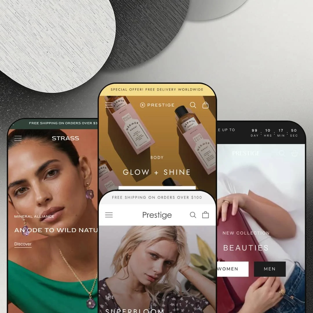
Eight years in the Theme Store, and Maestrooo just shipped a brand new preset for Prestige. Strass arrived in March 2026, a fourth design tier built specifically for fine jewelry and watches, on a theme that launched in June 2018. That kind of sustained investment matters when you're committing $400 to a license you'll run for years. Prestige runs on Online Store 2.0, and across four presets it covers leather goods, women's fashion, beauty, and now luxury jewelry.
Four-vertical preset coverage from one purchase
Prestige's $400 license covers four presets: Allure (Léo et Violette leather goods), Couture (Auguste the Label womenswear), Vogue (Artifact Skin Co. beauty), and Strass (luxury jewelry), each with its own dedicated demo store and its own commercial staging. Four verticals, one purchase. The presets aren't recolored variants of the same homepage; they're distinct merchandising contexts with different navigation patterns, demo content, and section emphases. For agencies and design studios shipping DTC builds across categories, or for multi-brand operators running two or three boutique Shopify stores in different verticals, one license covers what would otherwise be three or four separate theme buys.
Editorial-grade mega menu with promotional cards
For fashion and accessory brands with 100+ SKUs split across multiple genders or categories, Allure's mega menu carries three structured columns (text-link sub-categories, popular product names, popular color filters) plus two promotional cards with featured products and CTAs. Couture extends the same architecture for capsule-based merchandising: Francesca, Pacific Girl, Magnolia, and Festival all sit as named capsule links inside the dropdown. For jewelry, accessory, and apparel brands with deep catalogs that need merchandising inside navigation rather than just routing, the three-column-plus-card structure is what makes the mega menu work as a discovery tool, not a directory.
Editorial sections that earn the luxury framing
The section library includes Timeline (Allure uses it for 2013-2021 brand history; Couture uses it for in-store boutique locations with addresses, phone numbers, and opening hours), Images-with-text-scroll for cinematic founder-story panels, Before/After image slider (Allure stages it for color comparison between Almond Green and Blue Denim Liégé; Vogue stages it for skincare transformation), Multiple-media-with-text for video paired with narrative copy, and Press coverage logo strips (GQ, Farfetch, and Forbes in Allure; Grazia, Marie Claire, and Cosmo in Couture). That's an editorial toolkit, not a section list. For luxury and considered-purchase merchants with founder narratives, founding-year timelines, press credentials, or process documentation to surface, the section library covers magazine-style content patterns you'd otherwise build from custom Liquid.
Strass-specific refinements for the minimalist tier
Strass shipped in March 2026, and Maestrooo used the release to add preset-specific UX choices: transparent header on product pages (image blends into the header zone for a more immersive PDP), Underline and Swatch (Underline) variant selector styles that strip pickers down to typographic markers, XX-Small content width for editorial-style collection banners and image-with-text overlays, padding settings inside media grid blocks, and the option to hide the collection title in Featured Collections for cleaner layouts. Small choices individually. Together they read as a deliberate luxury-tier polish pass, the kind of refinement that signals "this preset was built for jewelry," not adapted from another vertical. For fine jewelry, watch, and accessory brands targeting top-of-market positioning, where every typographic decision signals price tier, the Strass-specific options matter more than another section would.
Online Store 2.0 architecture at a $400 price ceiling
Prestige runs on Online Store 2.0 (sections, blocks, JSON templates), not the Theme Blocks architecture Shopify introduced with the Horizon family in summer 2025. No AI-block generation. No 8-level nested block hierarchies. For DTC merchants running large catalogs (300+ SKUs across multiple product families) where AI-block generation and Theme-Blocks nesting are the deciding factors over Prestige's section breadth and polish, $400 buys you the previous-generation answer.
Strass is too new to be field-tested
The Strass preset shipped in March 2026. That's roughly two months of in-the-wild use across paying merchants before this review. Preset-specific features (transparent product-page header, Underline variant selectors, XX-Small editorial layouts) look well-staged in the demo, but the behavioral edge cases that only surface across hundreds of merchant catalogs haven't had time to be reported back to Maestrooo. For risk-averse luxury jewelry and watch brands launching in the next six months on a tight implementation timeline, going with Allure, Couture, or Vogue (all field-tested for years) is the lower-risk path than betting on Strass-specific features in their first deployment cycle.
Four presets, one design voice
Across Allure, Couture, Vogue, and Strass, the typography rhythm, layout cadence, and section staging carry the same Maestrooo signature. Different palettes. Different photography. Same handwriting. If you've worked on a few Maestrooo builds, you'll recognize a Prestige store the moment it loads. For challenger DTC brands in oversaturated verticals (skincare, jewelry, women's apparel) deliberately seeking visual differentiation from other Shopify storefronts in their category, the recognizable design voice is a real cost to price in on top of the $400 license.
What it takes to launch
Expect a multi-day copy and imagery pass before launch across the preset's hero slideshow, featured collections, mega menu cards, Timeline section, About page narrative, Press coverage logos, and country selector defaults. Add a few extra days if you're staging Strass for a vertical other than jewelry, since the preset's demo content assumes luxury-tier merchandising and will need vertical-appropriate replacement throughout the section stack.
-
What works in this preset
I clicked into Allure first because it's the flagship demo, staged for Léo et Violette, a Paris-based leather goods brand. The hero isn't a single video; it's two videos stacked inside the slideshow component, giving the homepage a film-reel cadence on first paint. Below that, the featured collection runs Women and Men as tabs inside one section, and the mega menu carries three structured columns plus two promotional cards with featured products and price callouts.
What sets Allure apart is the editorial density mid-page. There's a Timeline section walking through Léo et Violette's brand history from 2013 to 2021 across six milestones, an Image-with-text-scroll cinematic founder-story panel, and a Press coverage row with quotes from GQ, Farfetch, and Forbes. The Before/After slider stages Le Dalia in Almond Green Liégé against Blue Denim Liégé as a color comparison tool, not a transformation gimmick.
The product page runs Le Continental wallet at $200 with five gallery images and a single-axis color selector. Beneath it, a multi-column "From A to Z" section breaks down design, materials, and know-how with three image-text columns. The footer carries social handles, a multi-column information block, and a 30+ country selector.
Where it stumbles
The two-video hero is striking but heavy on first paint. For a $400 theme where Performance is supposed to be a selling point ("Optimized for performance" is one of three pillars on the Theme Store page), the demo itself loads with real weight before the page settles. That's a tension Allure stages directly into your face.
-
What works in this preset
Couture stages the same section library for Australian women's fashion (Auguste the Label), and the rhythm changes meaningfully. The slideshow drops to three slides; the hero leads with a flat lifestyle image rather than video; star ratings appear on every product card (5.0 across the board, app-driven via a third-party review integration, not a theme-native feature). The mega menu structures Capsules ("Francesca," "Pacific Girl," "Magnolia," "Festival") as named sub-links rather than category routes, which is a smart merchandising pattern for collection-driven brands.
The most interesting reuse is the Timeline section. Where Allure uses it for brand-history milestones, Couture uses it for in-store boutique locations: Brisbane and Byron Bay each get their own card with address, phone number, opening hours by day. That's the same Liquid section staged for an entirely different merchandising job.
Press coverage lands with Grazia, Marie Claire, and Cosmo logos as a media-strip section. The countdown timer is wired into a Sonnet Collection launch announcement, and the Shop the Look hotspot section runs three distinct lookbook images with multi-product attribution.
-
What works in this preset
What changes in Vogue is restraint. The slideshow stays at four slides, but the section count below it drops noticeably compared to Allure's editorial pile-up. The demo is staged for Artifact Skin Co., a beauty brand running roughly 20-25 hero SKUs across Masques ($52 each) and Lips ($12-21). Featured Collection runs Masques and Lips as tabs; Promo tiles route to four categories (Skincare, Body, Hair, Kits) as a four-column grid.
The Before/After slider gets reused here as a literal skin-transformation tool, which is one of the more honest uses of that section type across the four presets. The Hair section runs a Shop the Look hotspot with three Mèr-Mèr Monoï product placements over a single lifestyle image, and the featured Konjac Sponge product runs five gallery images including hand-held lifestyle shots.
Vogue's country selector is wider than Allure's, scrolling through roughly 200 markets with currency mapping. That's the same theme infrastructure, configured for a brand with broader geographic reach.
-
What works in this preset
Two months in the wild and Strass is the freshest answer Maestrooo has shipped for the luxury jewelry vertical. The v11.0.0 release notes (March 6, 2026) introduced preset-specific options: transparent header on product pages so the product image blends into the header zone, Underline and Swatch (Underline) variant selector styles that strip pickers down to typographic markers, XX-Small content width for editorial-style collection banners, padding settings inside media grid blocks, and the option to hide the collection title in Featured Collections for cleaner layouts.
These aren't section-library additions; they're refinement-tier UX choices aimed at jewelry's specific merchandising needs. A jewelry buyer wants to see the product breathe, not negotiate with a chunky variant picker. The Underline swatch selector is a typographic choice, not a UI element, and that's the point.
The release also added a Shopify managed account component for the login button in the header, which threads into Shopify's newer customer-account architecture rather than leaving Strass on the legacy account modal.
Where it stumbles
Strass shipped in March 2026, so the homepage's section count in the demo is leaner than Allure or Couture by design. That restraint matches the luxury positioning, but for merchants choosing Strass for the design polish and expecting the same section-pile depth as the older presets, the starting demo is thinner than you'd expect from a Maestrooo preset.
Sustained investment beats novelty
Maestrooo has avoided the ship-and-coast pattern that catches many premium themes from 2018. The April 2026 v11.1.0 release added a Dynamic grid section and split-image slideshow blocks. The March 2026 v11.0.0 release introduced an entire fourth preset. Eight years in, the developer is still adding meaningful capability, not just bug fixes, which is the strongest signal for merchants buying a theme they expect to run for years.
Editorial toolkit as the through-line
The same section types (Timeline, Image-with-text scroll, Before/After, Multiple media with text, Press coverage) appear in all four preset demos, each used to tell a different brand story. Timeline becomes brand-history in Allure, boutique-locations in Couture. Before/After becomes product-color in Allure, skincare-transformation in Vogue. That reusability is the signal: these sections are real merchandising tools, not preset-specific theater.
One architecture generation behind the frontier
Prestige sits in the Online Store 2.0 generation it has lived in since OS 2.0 launched. Theme Blocks (the Horizon-era architecture from summer 2025) is now where Shopify's investment is going, and Prestige hasn't been ported. For buyers evaluating the theme against where Shopify itself is steering merchants over the next three years, that gap is the most consequential decision-driver.
Same homepage arc, four different costumes
The four presets stage the same narrative arc on the homepage: announcement bar, slideshow, featured collection with tabs, editorial story section, Before/After or media-with-text, Press or testimonials, featured product, multi-column finish, newsletter. Different content fills each slot in each preset, but the structural rhythm is identical. For buyers expecting four genuinely different homepage philosophies, what you get is one philosophy expressed in four palettes.
★ 8.6/10
Rating
-
The section library covers the editorial toolkit you'd need to build magazine-style storytelling, plus four vertical-specific presets. One point off because Theme Blocks architecture isn't supported.
9
-
The OS 2.0 editor with sections and blocks works as expected. Maestrooo's documentation is comprehensive, but the section library depth means a learning curve on how Multi-media-with-text, Images-with-text scroll, and Timeline differ in use cases.
8
-
Slide-out cart, sticky add-to-cart, and sticky header all configured cleanly. Country selectors expand into the mobile menu without crowding it. Product galleries render variant-image swap on mobile correctly.
9
-
Homepages run heavy on imagery and video. Allure's hero stacks two videos, which is striking but loads with real weight. Image lazy-loading is in place. Vogue's restraint loads visibly leaner than Allure.
7
-
Four presets give meaningful starting points, and the section library handles editorial content patterns the typical premium-tier theme leaves to custom Liquid. One point off because the design DNA is recognizable; a full visual break-out requires CSS and Liquid customization.
9
Frequently Asked Questions
-
At $400, Prestige sits at the ceiling of the premium tier. If you're using one preset and that preset's specific staging matches your vertical, you can find single-vertical premium themes at $290-$380 that ship comparable section libraries. The case for Prestige at $400 is the four-preset license, the eight-year track record, and Maestrooo's sustained investment (Strass added March 2026, Dynamic grid section added April 2026). If those don't matter to your build, look elsewhere.
-
The preset is on the Theme Store and feature-complete in v11.0.0 onwards. The risk isn't bugs (Maestrooo's QA is well-established after eight years), it's that some Strass-specific features (transparent product-page header, Underline selectors) haven't been deployed across hundreds of merchant catalogs yet. For high-stakes launches, the older presets carry more deployment data behind them.
-
The section library and Allure's demo are built around a catalog (Léo et Violette's full bag range). For under-30-SKU stores, Vogue and Strass stage better. Vogue's Artifact Skin Co. demo runs roughly 20-25 hero SKUs, and Strass leans editorial enough that small catalogs feel intentional rather than thin.
-
The mega menu is theme-built (no app required), with three-column dropdown support, promotional cards with featured products, image columns, and capsule sub-category named links. The implementation matches what dedicated mega menu apps charge for monthly, but it lacks the deep nested-column flexibility of app builders if you need 5+ column dropdowns or featured-product carousels inside the dropdown.
-
No. The 5.0 ratings on every Couture product card are app-driven (Judge.me, Loox, Yotpo, or similar review-app integration). Prestige exposes the integration hooks; the actual review collection, display, and moderation lives in the app, not the theme. Budget accordingly if you want them on your storefront.
-
Yes. Prestige is built for both standard and Plus plans. The Theme Store feature list flags Quantity pricing and Combined listing as Plus-specific (those are platform features, not theme features), but the rest of the theme renders identically across plans.
This review is based on hands-on testing of the publicly available preset demos of the Prestige Shopify theme as of May 2026. Theme features, preset availability, and performance can change with subsequent updates from the theme developer.