
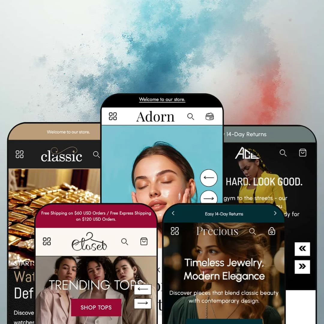
Adorn is a conversion-focused Shopify theme built for fashion, beauty, and lifestyle storefronts that want image-led storytelling and strong merchandising density. Across five presets (Default, Choice, Closet, Precious, and Ace), the demos lean into full-bleed hero imagery, clear headline hierarchy, and subtle motion effects that make the pages feel active without turning every scroll into a spectacle.
While each preset starts with its own aesthetic direction, the underlying theme structure is consistent. The demos repeatedly pair editorial sections with commerce-forward product grids, so the storefront can feel like a lookbook and a shop at the same time.
Pros.
〰️
Pros. 〰️
✚ Flexible presets, consistent core
flexible preset options that maintain core functionality while offering distinct aesthetic approaches. That consistency means you can start from a preset that matches your brand mood while still relying on the same core shopping patterns across the theme. In practice, the presets feel like different wardrobe choices for the same underlying storefront engine.
✚ Robust navigation and on-site discovery
Adorn’s demos lean on sticky navigation paired with multi-column mega menus to keep category browsing within easy reach. Predictive-style search overlays are also staged as a fast way to jump into products and categories without detouring through multiple pages. For shoppers, this combination reduces “where do I go next” moments and keeps browsing flowing.
✚ Cart and quick-buy momentum
Across the demos, quick actions are positioned close to product thumbnails, and adding an item typically keeps the shopper in the same browsing context rather than forcing a full-page interruption. The slide-out cart drawer presentation is used to show item details alongside helpful cart tools like quantity controls and cross-sell suggestions. When staged well, this structure supports larger carts because shoppers can keep shopping while still seeing progress.
✚ Product pages built for detailed storytelling
The product-page templates shown in the demos are structured to carry substantial detail through galleries, swatches, and accordion-style information blocks. Some products also demonstrate quantity-based pricing tables, which supports bulk-buy messaging without changing the page layout. For higher-consideration categories, these patterns help reduce uncertainty by keeping key details accessible and organized.
✚ Merchandising sections that create campaign rhythm
Adorn’s presets repeatedly use marketing sections such as countdown timers, lookbooks, testimonials, blog teasers, and homepage FAQs to create a narrative around promotions and brand story. The Default demo also spotlights a before-and-after section, reinforcing product-proof storytelling in a highly visible way. For merchants who run campaigns often, these sections provide ready-made beats for urgency, credibility, and editorial depth.
✚ Content templates beyond the product grid
The demos include thorough supporting pages that carry brand narrative and customer reassurance, including story-style layouts, brand-value callouts, and community-oriented social blocks. Several presets also stage rich contact experiences with multiple inquiry paths and embedded location content, which can make the storefront feel more established. For brands that invest in content, the theme’s page structure supports more than just transactional shopping.
Cons.
〰️
Cons. 〰️
🚫 Performance can wobble on media-heavy pages
During testing, several demos occasionally crashed with “Aw, Snap!” errors when pages were scrolled rapidly, suggesting heavy media and animation loads. Even when the experience is visually impressive, these moments can disrupt browsing and reduce trust. Merchants who adopt the most media-rich staging should plan to optimize imagery and keep an eye on section density.
🚫 Preset demos vary in how they stage quick-buy interactions
Some demos put quick-preview modals front and center, while others stage the collection experience around bag-icon quick add actions. This does not mean the theme lacks capabilities, but it does mean the default browsing feel can change noticeably from preset to preset. Merchants who want a consistent browse-to-buy rhythm should plan their preferred interaction model early and stage it deliberately.
🚫 Accessibility and contrast need an audit
The demos show a few accessibility pressure points, including low-contrast text in darker palettes and occasional imagery presented without descriptive text. Interactive storytelling elements like the before-and-after slider also lacked clear keyboard-friendly cues in testing. Stores with accessibility requirements should expect to spend time auditing contrast, alt text, and interactive controls during setup.
🚫 Variant selection can create momentary friction
In testing, some add-to-cart flows appeared to require manual variant selection before producing feedback, which can make the button feel like it did nothing in the moment. A similar pattern showed up in quick-preview behavior where shoppers had to make a selection before progressing. Merchants should review variant defaults and ensure the demo’s interaction patterns are adjusted to match their catalog complexity.
🚫 Embedded maps may add weight on support pages
Some presets stage contact pages with embedded maps, and those embeds were slow to load in testing. For local businesses, that may be worth the trade-off, but for online-only brands it can feel like unnecessary page weight. Merchants should decide whether the “location-forward” staging supports their customer journey or whether a lighter support layout is better.
-
The Default preset is staged for skincare and beauty brands, using a light palette, generous whitespace, and delicate typography to create an upscale, spa-like first impression. The homepage pacing is calm and polished, with plenty of breathing room around the core campaign messaging.
What works in this preset
The opening hero area is built around an expansive slider with arrow navigation and text placed directly on the imagery. Calls to action sit inside each slide, so campaigns are introduced as part of the visual story rather than as separate blocks below. In this demo staging, that design makes it easy to scan the brand promise first and then commit to a collection click without hunting for links.
A before-and-after slider appears early on the homepage and is presented as a hands-on proof point. The draggable handle encourages interaction, and the side-by-side framing fits the product-efficacy narrative that skincare shoppers expect. In this preset demo, it functions as a credibility beat, not just a decorative widget, because it is positioned as a primary storytelling section.
The “Our Signature Collection” area breaks the usual grid rhythm with a circular product carousel that uses round images and overlay text. The shape language feels intentional, and it gives the collection presentation a more curated, boutique tone. Clicking through from these circular tiles also keeps the browsing flow simple, because the carousel reads like a single, guided row rather than a dense merchandising wall.
Product discovery sections like “Shop Best Sellers” and “Shop New Arrivals” are staged with rich cards that surface swatches, sale flags, and a second image on hover. The quick-preview affordance is also made obvious in this demo, with an eye icon revealed as part of the hover treatment. That combination keeps the grid feeling premium and informative, which helps when shoppers are comparing textures, shades, or bundles.
Supporting pages in this preset demo continue the spa-like tone through split layouts that balance photography and copy. Value callouts such as “cruelty-free” and “dermatologist approved” appear as icon-led statements, and newsletter capture is repeated across the experience. The sign-up shown here asks for both name and email, which makes these moments feel more like a brand relationship touchpoint than a quick footer-only opt-in.
Where it stumbles
The aesthetic is intentionally light and delicate, and that can be a limiting starting point for brands that want a moodier, more industrial presentation without significant restyling. If your product photography is already dark or high-contrast, this demo’s soft, airy framing may underplay that edge.
-
Choice (also labeled Classic in the demo) is presented with a dark, masculine palette and gold accents that push the storefront toward a luxury positioning. The photography is staged to feel cinematic, and the section spacing keeps the mood consistent from the first hero moment through the deeper product storytelling.
What works in this preset
Navigation in this demo is presented as a multi-column “Shop All” drop-down that groups categories into clear clusters like “Our Favorites,” “Best Sellers,” and “New Arrivals.” Thumbnail imagery is used as part of the menu staging, which makes the navigation feel like an extension of the brand, not a utility bar. For luxury accessories, that matters because even the act of choosing a category can reinforce the premium tone.
The homepage merchandising rhythm leans on tabbed product sliders, such as the “On-Trend Apparels” block. The tabs are staged as a quick way to rotate between trending, latest, and most-popular sets without changing pages. In this preset demo, that interaction supports browsing momentum by keeping the shopper anchored in one area while still seeing variety.
Lookbook-style sections are used as primary storytelling anchors, pairing lifestyle imagery with short copy and direct calls to action. The message is framed as aspiration-first, with shopping links woven into the editorial presentation. For brands selling watches, leather goods, or similar accessories, this demo’s lookbook pacing can make the site feel more like a campaign landing page than a product catalog.
Video is also treated as a core mood-builder in this demo, including blocks that embed auto-play clips for product promotion. The presence of motion content amplifies the cinematic intent of the preset, especially when paired with dark backgrounds and metallic accents. When used carefully, this staging can communicate craftsmanship and materials faster than long paragraphs of copy.
On product pages, the demo leans into detailed storytelling with large imagery and deeper editorial sections that highlight craftsmanship and styling tips. Rather than stopping at a short description, the page continues with narrative blocks that feel closer to a magazine spread. In this preset demo, that depth supports higher-consideration browsing, where shoppers want reassurance before committing to a premium item.
Product cards also stage quick interactions as part of the shopping experience, using a bag-icon-driven quick preview flow in the grid. The interaction design makes the collection feel commerce-forward, with the “shop now” impulse prioritized over passive browsing. For returning customers who already know what they want, that staging can reduce friction by pushing actions closer to the product thumbnails.
Where it stumbles
Because the palette is so dark, small text can read low-contrast in areas like the footer and newsletter sections. The effect is subtle, but it can add strain for shoppers who skim quickly or browse in low-light environments. In this demo staging, merchants who keep the dark look may want to audit type sizes and contrast carefully.
The tabbed sections can also show minor instability when switched rapidly, with occasional overlap and layout shift. It is not constant, but it is noticeable when you test the interaction quickly. For a luxury presentation, even small visual glitches can feel out of place, because the brand promise is precision.
Some imagery in the demo content lacks descriptive captions or alt text, which creates an accessibility gap. While merchants can address this through content and media hygiene, the demo staging does not model strong accessibility defaults for imagery. Stores that prioritize inclusive browsing should plan on a thorough audit during setup.
-
Closet is staged as a modern women’s boutique with soft beige tones, pops of color, and editorial photography featuring models in styled outfits. The overall layout feels magazine-like, and the homepage is designed to move shoppers through categories, looks, and time-boxed offers in a single scroll.
What works in this preset
The hero area is fashion-centric and built around multiple models, which immediately signals “outfit shopping” rather than single-item merchandising. A “Trending Tops” call to action is staged as the first high-visibility click, and the announcement bar is used to promote a free-shipping threshold. In this demo, those two elements work together to set both style context and purchase incentive before the shopper reaches the first product slider.
Merchandising blocks on the homepage rely on multi-row product sliders like “Latest Arrivals” and “Our Favorites.” Product cards in this demo keep quick-buy actions close at hand through bag icons, and clicking the bag triggers a vertical choice overlay before the cart interaction completes. The result is a grid experience that feels action-oriented, which can be useful for boutiques that run frequent drops and want fast add-to-cart behavior.
A “Shop by Category” grid divides the assortment into clear groups such as dresses, tops, bottoms, and outerwear, using large imagery for each tile. The category framing is straightforward and easy to scan, which helps reduce decision fatigue on fashion sites with many similar SKUs. In this preset demo, the category grid also breaks up the slider-heavy rhythm, giving the page a cleaner mid-scroll reset.
Lookbook and lifestyle sections are used as editorial anchors, pairing full-bleed imagery with overlay text and decorative stamp elements. These stamps function as visual punctuation, reinforcing the boutique identity and giving the page a styled, curated cadence. For shoppers, the effect is less “warehouse of products” and more “guided style story.”
Closet also uses a “Deal of the Day” block that spotlights a single product with urgency cues like a countdown and stock indicator, paired with direct purchase buttons. That staging creates a promotion-first moment inside the browse flow, which can encourage impulse decisions when the offer is genuinely time-bound. For boutiques, this is a natural fit for limited runs, seasonal markdowns, or featured bundles.
The home page includes an image-supported FAQ accordion, which keeps reassurance content close to the shopping path. Product pages continue the editorial approach, with large imagery and narrative sections that extend beyond a short description. In this preset demo, the storefront feels designed to sell a “look and lifestyle,” not just individual items.
Where it stumbles
In this preset demo, collection browsing is staged around bag-icon quick add rather than an in-grid preview experience. That means deeper details and variant exploration are naturally pushed toward the product page, which can slow down comparison shopping for visitors who like to assess multiple items quickly. Merchants who want more pre-purchase information surfaced at the grid level may need to rethink how this demo’s default rhythm guides behavior.
On at least one product page, the description text briefly overlapped with imagery during initial load. It did not appear everywhere, but it was visible in testing and can feel distracting when it happens. For an editorial fashion presentation, those small layout moments matter because they interrupt the “magazine” illusion.
Some decorative elements, such as stamp-style icons, are purely stylistic and can compete with product focus if overused. They contribute to the boutique vibe, but they can also distract when the shopper is trying to compare silhouettes or colors. This demo staging works best when decorative accents are balanced with clear product hierarchy.
-
Precious is positioned for fine jewelry and luxury accessories, using soft pastels with gold accents and elegant typography that feels airy and refined. The demo leans into spacious line spacing and gentle section pacing, giving product photography room to feel premium.
What works in this preset
The homepage uses category grids such as “Shop by Collections” to present necklaces, rings, earrings, and bracelets with overlay text and a clear view-all action. A separate vertical slider is staged to promote occasions like Engagement, Weddings, and Birthdays, which is a natural mental model for jewelry shopping. In this preset demo, the browsing flow is guided by intent and occasion as much as by product type.
Product carousels like “Our Most Loved Pieces” are staged with clean cards that prioritize the jewelry image and price, with a plus icon used as the primary interaction cue. Unlike more icon-dense grids, this demo does not lean on extra hover-revealed controls, so the cards stay visually quiet. For luxury accessories, that restraint helps the merchandising feel elegant rather than gadget-heavy.
The quick-preview entry point in this demo is presented as an intentional, minimal gesture through that plus icon. Instead of inviting shoppers to hunt for multiple controls, the interaction is simplified to a single clear affordance. In a high-consideration category like jewelry, that clarity can help hesitant shoppers explore a piece without feeling overwhelmed by UI.
On product pages, long-form details are staged as accordion sections for areas like description, care instructions, materials, and size. The result is a page that can carry substantial information without becoming a wall of text. In this preset demo, the structure supports a “read, then decide” buying posture that suits higher-ticket items.
Precious also uses icon-led editorial sections to highlight sustainability and craftsmanship themes such as ethically sourced materials and handcrafted design. These blocks read as trust builders, especially when paired with generous whitespace and consistent typography. For brands that sell on provenance and quality, the demo staging makes those messages feel like a core part of the shopping experience.
Navigation and browsing in this demo also include curated educational moments, such as an “Explore Diamonds by Shape” section that lists cuts like Asscher and Radiant. That kind of guided browsing can reduce intimidation for newer jewelry buyers by turning browsing into learning. The supporting pages continue the thorough tone, with a comprehensive contact layout and story-style content pages that mirror the same premium pacing.
Where it stumbles
Some calls to action on the homepage are staged smaller relative to the surrounding imagery. The buttons are still visible, but they can feel secondary when placed inside large, image-led sections. For merchants who want a more assertive “shop now” posture, this demo’s CTA scale may require adjustment.
The contact page staging includes an embedded map, and in testing it loaded slowly. That may not matter for every store, but it can feel unnecessary for merchants who operate primarily online or who prefer lighter contact pages. Stores that want maximum speed on informational pages may want to simplify this demo’s contact layout.
-
Ace is staged for activewear and fitness brands, combining muted greens and greys with pops of coral for energy. The demo relies on high-motion photography, motivational copy, and ticker-style animations to create a sense of pace and performance.
What works in this preset
Category navigation in this demo is presented inside the mega menu with large photos for groups like sports bras, leggings, tops, and outerwear. The use of imagery in navigation keeps the experience consistent with the athletic lifestyle tone. For shoppers, it makes category selection feel like browsing a training collection, not clicking through a plain list.
Collection merchandising leans on product cards that surface discount badges and bag icons, with quick add staged as the primary action cue. In this demo, that creates a fast “add and keep moving” rhythm that fits repeat-purchase categories like basics, sets, and seasonal colors. The cart interaction that follows is presented as a slide-out experience that reinforces progress toward incentives and cross-sell suggestions, which can keep momentum high.
Product pages in this demo emphasize performance attributes through structured bullet-style highlights and variant options where applicable. Details like materials, care instructions, and size-chart information are grouped into accordion blocks so shoppers can drill into specifics without losing the page’s athletic, high-scan feel. For activewear, that structure supports confident buying by surfacing fit and fabric details without forcing a full read-through.
The editorial sections lean into motivational messaging, using full-width imagery with overlay text such as “Stay Warm, Stay Ready” and similar performance cues. The layout feels designed to keep the shopper in a training mindset, which can increase engagement for brands built around identity and routine. In this preset demo, the storytelling blocks are not subtle, and that is part of the appeal.
Cross-selling and return-browsing are also staged prominently through sections like “You may also like” and “Recently Viewed Products.” These placements create a sense of continuity across product exploration, especially when combined with quick actions on the cards. For a fitness storefront where shoppers often build outfits or sets, that staged repetition can encourage multi-item carts.
The supporting content pages extend the same high-energy tone with brand-story sections, logo blocks, ticker animations, newsletter capture, and community-style social content. The blog layout shown in the demo also supports active-living editorial content with dates, excerpts, and clear links into articles. Together, these elements make the preset feel like a fitness brand hub rather than just a product shelf.
Where it stumbles
In this preset demo, the collection-grid shopping posture is very quick-add-forward. Shoppers are encouraged to act from the card level, while deeper context and variant exploration are naturally deferred to the product page. For some brands, that is ideal, but for stores with complex variants or fit education needs, it can create a “click in, click back” browsing pattern.
On the about page, some sections briefly rendered text on white backgrounds in a way that reduced readability until the page was fully in view. It is a small presentation issue, but it can feel jarring when the page is meant to carry brand trust and mission copy. In a performance brand context, clarity and legibility are part of the credibility story.
Niche Suitability
Not Ideal For
Final Recommendation
-
Fashion, beauty, jewelry, and activewear brands that want an image-led storefront with campaign sections and strong merchandising density. It fits merchants who are comfortable building around rich media and who want to blend editorial storytelling with commerce-forward browsing.
-
Stores that need ultra-lightweight pages or a strictly minimalist presentation may find the demo staging too media-heavy. Merchants with strict accessibility requirements should also plan on additional setup work to tune contrast and content presentation.
-
Medium — The presets are pre-styled, but getting the best results requires deliberate media optimization, contrast checks, and content cleanup for accessibility. Merchants should also plan time to tune variant defaults and decide how prominently quick preview versus quick add should be staged.
★ 7.4/10
Rating
-
The demos show a wide mix of merchandising and storytelling sections paired with commerce-forward product-card interactions and cart tools. Variant-selection behavior can introduce friction, and preset defaults can stage quick-preview versus quick-add differently.
8
-
The theme appears section-rich and flexible in how it can be staged, but the number of moving pieces means setup choices matter. Merchants may need extra time to tune variants, media weight, and content presentation to match their standards.
7
-
Key sections in the demos, such as hero carousels and product sliders, are staged to remain usable on smaller screens. Some presets still show contrast and CTA-sizing considerations that merchants should review for readability and tapping comfort.
7
-
Heavy imagery, video, and animation staging occasionally led to page crashes during rapid scrolling in testing. Stores that keep the richest media layouts should budget time for optimization and careful section use.
6
-
Five distinct presets provide different aesthetic starting points while sharing a consistent underlying structure. Merchants can lean more editorial or more commerce-forward by choosing how the demos’ lookbooks, FAQs, and campaign sections are staged.
9
FAQ
〰️
FAQ 〰️
-
👑Yes. The Default demo is staged with serene visuals and a before-and-after storytelling section that fits skincare or wellness positioning. The product-page structure shown in the demos also supports ingredient and benefit narratives.
-
📱In testing, the demos adapted cleanly to smaller screens and kept core interactions like sliders and drawers usable. Heavier media can still weigh down browsing on slower connections, so merchants should prioritize image and video optimization.
-
🎨 The demos suggest a flexible theme structure, with presets providing distinct starting aesthetics and many section types used across pages. Merchants can restyle typography, color, and how densely the homepage is merchandised to fit their brand tone.
-
⚡ Pages can feel quick when media is optimized, but several demos showed instability when scrolled rapidly, likely due to heavy videos, animations, and large imagery. Merchants should compress assets and remove unused media-heavy sections to keep browsing smooth.
-
👕 The demos show variant swatches and clear option presentation on product pages and in quick-preview flows. However, some interactions required a manual selection before add-to-cart feedback appeared, so merchants should test their catalog’s variant defaults carefully.
-
🔎 There are no theme-specific SEO dashboards shown in the demos beyond what Shopify typically provides. The demo blog templates and structured page layouts can still support content-driven SEO when paired with strong copy and metadata.
-
💱 Yes. The demos surface language and currency selectors in the header or footer, and the available options are governed by Shopify Markets and your store settings rather than by a single preset’s styling.
-
⚙️ Yes. Adorn follows Shopify’s modern theme architecture, so most apps designed for that framework should integrate. If you rely on upsells or cross-sells from apps, it is still worth testing them alongside the theme’s built-in merchandising patterns.
-
🛒 Yes. The preset demos used for this review are publicly accessible, and they provide a practical way to experience the staging and interactions before you commit. This review’s observations come directly from exploring those live demo sites.
This review is based on hands-on testing of the publicly available preset demos of the Adorn Shopify theme as of 3 January 2026. Theme features, preset availability, and performance can change with updates from the developer.