
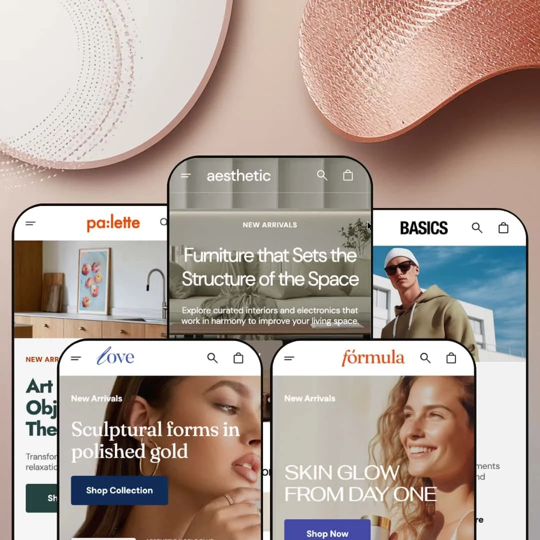
Most premium Shopify themes pick a vertical and commit. Aesthetic, from the Yerevan studio Noord, takes the opposite bet — one license unfolds into five fully dressed demos that run from furniture and fashion to skincare, fine jewelry, and wall art. The build question is whether a single Online Store 2.0 theme can wear that many costumes without the seams showing. Across the five presets, the answer is mostly yes, with a couple of telling exceptions.
A hero product can sell straight from the homepage
Aesthetic's featured-product section drops a complete variant picker above the fold. In the skincare demo, a body cream offers three sizes crossed with three scents, with every combination carrying its own price and stock state, plus a quantity stepper and an add-to-cart button sitting right there on the home page. The hero sells itself. A single-product brand or a small skincare or food catalog under roughly thirty SKUs can shorten the journey from landing to cart to almost nothing, which is where impulse and hero-product stores lose people.
Three product-gallery layouts to match the photography
The product page ships in three gallery builds: a slider with thumbnail previews, a stacked vertical gallery, and a slider with bullet navigation. The choice matters because products photograph differently. A flat-lay apparel range and a framed-art catalog and a multi-angle furniture piece each want a different way of showing images, and a mid-to-large catalog in any of those product types can set the layout per template rather than living with one compromise.
Grid-level merchandising that works before the product page
For browse-heavy, impulse-leaning catalogs, the product grid does real work before anyone reaches a detail page. Cards carry quick view and quick-add, swap to a second image on hover, and flag status with new, sale, and sold-out badges. Across the furniture and jewelry grids, hovering reveals an alternate shot and color options preview inline without a click. Shoppers triage fast. An apparel or accessories store with a large catalog and a lot of casual browsers gets a grid that closes the gap between scrolling and adding to cart.
European interface strings and right-to-left, built in
For a brand selling across European markets or running a bilingual DACH storefront, some groundwork is already done. The theme ships its own interface copy pre-translated into five European languages (English, French, Italian, German, Spanish) and includes right-to-left layout support, and the demos surface different language subsets in the switcher, English with German and French in some, English with Italian and Spanish in others, drawn from that same set. This is theme chrome (button labels, form text, navigation), and it sits apart from the currency conversion and per-market catalog logic that Shopify Markets handles. The payoff is concrete: less translation work on the theme's own UI, and an Arabic or Hebrew storefront that doesn't need a layout rebuild to read correctly.
No path for spec-heavy or comparison-driven catalogs
The theme's entire vocabulary is visual: lifestyle imagery, editorial bands, curated rows. There is no staged comparison table, spec sheet, or attribute matrix for products that sell on numbers instead of mood. I went looking for a comparison view and the theme simply doesn't speak that language. The demo says electronics; the design says lifestyle catalog. A merchant selling actual electronics, appliances, or technical hardware, whose buyers cross-compare specs before they commit, would be building that comparison layer from scratch or reaching for an app, and at that point a different theme may be the cleaner start.
Bundles, subscriptions, and comparison engines stay in app territory
At $320 the merchandising kit is well-made but finite. It covers quick view, badges, three galleries, a size guide, and a homepage featured product, and it stops before native bundles, native subscriptions, or a true product-comparison engine. Those remain app installs: Recharge or Appstle for subscriptions, a dedicated bundle app for kits. A subscription-box brand or a bundle-led seller at this price point should price in those apps and the integration time alongside the theme, rather than expecting the conversion stack to arrive complete.
What it takes to launch
Plan for a multi-day build. The demos lean on extensive lifestyle photography you will replace, metafield-backed size guides and product options to populate, a featured-product block to wire to a real SKU, the theme's five-language interface strings to review, and cross-vertical copy plus placeholder contact and image-credit details to align before launch.
-
What works in this preset
I clicked the menu open and the furniture logic landed fast. Two grouping rails sit side by side, one sorted by object type (Tables, Lighting, Sofas, Seating) and the other by room (Living Room, Bedroom, Kitchen, Kids Room, Bathroom), and a pair of image tiles rides along the edge pushing seasonal arrivals, so a shopper who thinks in "sofas" and one who thinks in "the living room" each find a way in. A merchant gains two browse paths over the same catalog for free. That dual entry suits furniture, where intent splits between people replacing one piece and people styling a whole space.
The homepage reads like a lookbook that happens to sell. A three-slide editorial hero gives way to a six-tile category grid, then a dedicated lighting row, two full-bleed media bands, and a featured-collection slider that frames rooms rather than products. It is browse-led by design. For a home-and-decor catalog where discovery beats search and customers arrive to be inspired before they arrive to buy, the rhythm fits the shopping mindset well.
-
What works in this preset
The apparel build swaps the room rail for a season rail. Spring, Summer, Autumn, and Winter sit beside the category groups, and individual products nest directly under each collection in the navigation, so a merchandiser can push a hero SKU into the menu itself. Fashion buys on a calendar. Giving the nav a seasonal axis and letting standout pieces surface a level up matches how clothing shoppers actually move through a range that turns over four times a year.
A four-panel values strip anchors the middle of the page. Built on the tabbed image-and-content section, it runs Recycled Materials, Carbon Dioxide, Donation, and Eco Initiatives as equal blocks with their own imagery and copy. It earns its place for a certain kind of label. A sustainability-led or founder-driven apparel brand that sells on ethics as much as on cut gets a ready-made place to make that case without bolting on a separate page.
-
What works in this preset
The beauty menu reorganizes around concern, not just category. A "Shop by Skin Type" rail (Normal, Dry, Sensitive, Anti-Aging) runs alongside Body Care, Cleansers, Face Care, and Hair Care, which mirrors how skincare customers self-diagnose before they shop. It is a small change with a real payoff. A shopper who knows their skin is dry but not which product they need can start from the problem and let the menu route them toward the fix.
Scrolling the skincare homepage, I kept landing on routine-building prompts. A split-screen new-arrivals banner, a Beauty Bestsellers row, and a trust strip stack into a path that nudges a visitor from a single product toward a regimen. The flow rewards repeat-purchase categories. For a skincare or supplement brand whose customers buy a cleanser now and come back for the serum and the moisturizer, that build-the-routine staging does quiet merchandising work.
-
What works in this preset
I clicked into the Classic Love Link Necklace expecting a token size chart. Instead a full modal opened: UK, European, and US ring conversions, necklace lengths labeled from choker to opera, bracelet wrist measurements, and carat-to-millimeter tables for both round-brilliant and princess-cut stones. This is real fit infrastructure, not decoration. For fine jewelry, where a returned ring is an expensive mistake, that depth of sizing guidance is the difference between a confident purchase and an abandoned cart.
The menu trades the season rail for metals. Gold, Silver, Rose Gold, and Mixed Metal sit beside the category groups, and the price tiers on the demo products climb from the high hundreds to nearly fourteen hundred dollars. The presentation reads luxury. A jeweler running considered, high-ticket pieces that buyers cross-shop on material gets a navigation and a price treatment that match the way that audience browses.
-
What works in this preset
The art preset leans into curation. A "Shop by Style" rail (Contemporary Classics, Minimalist Marvels, Architectural Wonders, Fashion Forward) frames the catalog like a gallery wall, the product grid stays clean and single-image, and the FAQ is written to the category rather than reused from a template. Those questions are genuinely art-shaped. Framing services, safe shipping of fragile work, and certificates of authenticity are exactly what a print buyer asks before spending, and answering them on the homepage removes friction a generic FAQ would leave in place.
A featured-collection slider and two media bands carry the rest of the page. Collections are presented like exhibitions, with full-bleed imagery and minimal sales pressure. The mood suits the goods. A print studio or gallery seller that wants curation and atmosphere to do the selling, rather than urgency banners and dense grids, will find the tone already set.
Where it stumbles
Art is also where the theme's product model shows its edges. Prints usually sell in multiple sizes and frame options, but the Palette demo stages single-variant pieces and routes its merchandising through the collection slider rather than the variant-rich featured product the skincare preset uses. The capability is there theme-wide. A merchant selling framed prints in three sizes and two frame finishes will simply need to build those product options out and stage that featured-product block themselves, since the art demo doesn't model it for them.
Five storefronts under one license
Furniture, fashion, skincare, fine jewelry, and wall art each arrive as a finished demo rather than a recolored copy. The menu axes change with the vertical, moving from rooms to seasons to skin types to metals to styles; the FAQs are rewritten to each category; and the price tiers travel from forty-five-dollar tees to necklaces near fourteen hundred. For an agency building client stores or a multi-brand operator launching across categories, that is five credible starting points from a single purchase.
One mega-menu pattern, dressed five ways
Across every preset the navigation follows the same strong build: two grouping rails plus promotional image tiles, with product links nestable underneath. It is the connective tissue that makes five different demos feel like one considered system instead of five unrelated templates. That consistency is also what keeps the setup learning curve flat once you have configured the menu on your first store.
Five skins, one skeleton
Read all five presets back to back and the underlying homepage template barely moves: hero slider, category or product rows, a media band or two, testimonials or FAQ, journal, newsletter. The variety lives in imagery, color, and menu labels, not in layout. A merchant who wants a genuinely different page architecture per vertical will find the same bones under each demo and will be reordering sections rather than discovering new ones.
Long, image-led homepages
Every demo runs tall and asset-heavy, stacked with full-bleed sliders and large media bands. It is a deliberate immersion play and it photographs beautifully, but it trades quick scanning and lean page weight for that editorial feel. A brand that wants a short, fast, funnel-tight homepage will spend its first hours removing sections rather than adding them.
Rating
★ 7.8/10
-
A deep section library, a homepage featured-product block with full variant logic, three gallery layouts, and a genuine size guide cover most storefront needs; bundles, subscriptions, and product comparison stay with apps.
8
-
Online Store 2.0 sections plus a demo Features menu that previews section and gallery options make the structure legible; the five-vertical setup with its imagery and metafields is what adds the hours.
8
-
A slide-out menu, a sticky header, and responsive product rows hold up well on a phone; the long homepages simply ask for more scrolling than a tighter layout would.
8
-
Image lazy-loading and a restrained build help, but every preset's homepage stacks several full-bleed sliders and large media bands that ask a lot of the page.
7
-
Five presets, three galleries, varied menu axes, and a broad section set give real styling range, even with one shared layout skeleton sitting underneath them.
8
Frequently Asked Questions
-
All five presets draw on the same section set, so pick the one closest to your main category and reshape the rest. The grouping rails are editable, so a home-and-gift store could start from the furniture preset and rename one rail from "Rooms" to "Occasions."
-
No. Shopify theme demos never ship with their imagery, and the credited studios behind the furniture and jewelry shots are not licensing those photos to you. Budget for your own photography or pull from a free source like Shopify Burst.
-
Yes. The size chart is a theme-wide feature rather than a jewelry-only one, so an apparel or footwear store can populate the same modal with its own measurements per product type.
-
Both can work. Collection navigation, filtering and sorting, and infinite scroll handle volume on the catalog pages, while the homepages are styled to feel curated rather than exhaustive.
-
The testimonial sections are static content blocks you fill in by hand. Live, verified star ratings on products still come from a reviews app such as Judge.me or Loox.
-
Noord advertises replies within about fifteen minutes on business days, extended to trial users, and the store's documentation lives on the Noord help center.
This review is based on hands-on testing of the publicly available preset demos of the Aesthetic Shopify theme as of June 13, 2026. Theme features, preset availability, and performance can change with subsequent updates from the theme developer.