
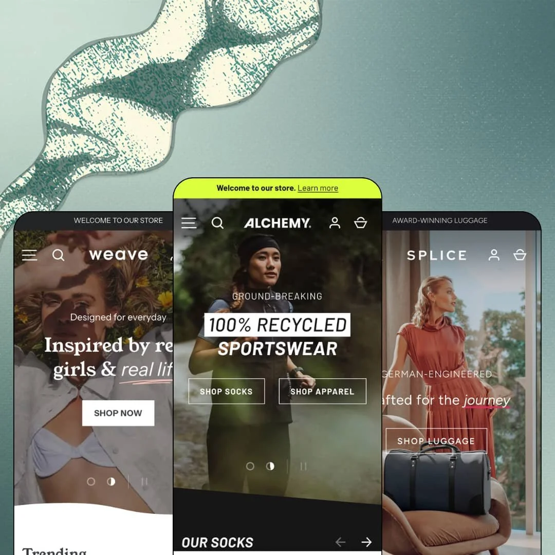
Three real brands lent their products, photography, and copy to this theme's demos, and it shows in every grid. Clean Canvas staged Alchemy with Rockay sportswear, Splice with Vocier luggage, and Weave with Cools Club womenswear, so what you're judging is a storefront running actual catalogs rather than stock imagery with placeholder prices. At $420, that staging sets a high bar the theme then has to meet on its own merits. Alchemy runs on Online Store 2.0, with JSON templates, a section library that repeats across all three presets, and version 7.0.1 shipped in March 2026 with the new Shopify customer-account component in the header.
Homepage buy module with live variant selection
Why send a shopper to a product page when the homepage can take the order? All three demos drop a Featured Product section into the homepage flow: Weave stages the Badge Crop Sweat with three colors, six sizes, and a 17-image gallery, while Alchemy runs the Women's Windbreaker with a video in the gallery and a live "In stock" line. Variant buttons, quantity stepper, Add to Cart, and Buy It Now all work in place. For single-hero-product brands and drop-driven apparel labels with a fresh release each month, this turns the homepage into a landing page without duplicating templates.
Mega menu built from product-level links and image tiles
The header menu accepts individual products, not just collections, as menu entries. Splice lists F38 Carry-On Luggage, F35 Garment Bag, and C38 Pure Carry-On directly under its Luggage column, with Wallets and AirTag-ready Wallets as a separate column, and the theme pairs those text columns with image tiles that carry their own call-to-action buttons. Short menus stay short. Deep catalogs get a routing layer that puts hero SKUs one click from any page, which suits multi-category brands with 50 to 200 SKUs and a handful of products that drive most of the revenue.
Native stock, pre-order, and pickup states
Inventory messaging is handled in the theme rather than by an app. Product pages render unit-level stock counts ("24 in stock, ready to ship" on the Norrebro Run Crew, "5 in stock" on the Fitted Shift Dress), card badges switch to Pre-order when a variant is backordered, and the pickup block under the add-to-cart button names the fulfillment location and a "Usually ready in 24 hours" promise. That's three conversion signals from one inventory setup. Restock-driven brands and retailers with physical stores get the urgency and the fulfillment choice without stacking two app subscriptions on top of the theme.
Card-level merchandising vocabulary
Product tiles carry a lot of information before anyone clicks. Badge labels run from stock states (Sold out, Pre-order, New arrival) through editorial picks (Staff Pick, Editors Choice, Trending) to discount math ("Up to 36% off"), and each card shows either named swatches or a colorway count ("6 colors") beneath the price. The labels are configurable text, so a brand can retire "Staff Pick" for something on-voice. For cross-shop-heavy apparel and accessory catalogs in the mid-market price band, this is the difference between a grid shoppers scan and a grid they actually use.
The review layer is rented
Every star rating across all three demos comes from Judge.me, mounted as an app block under the product title. The theme renders the stars and the review counts, but there's no review collection, moderation, or display engine in the package itself. The stars are on loan. Merchants launching a considered-purchase catalog (luggage, performance tights, dresses above €100) where proof drives the sale will need to budget for a review app and its setup before the demo's social-proof density is reproducible, and the testimonial sections that carry the quotes are hand-typed blocks with no link to actual orders.
Online Store 2.0 architecture at a $420 price
Alchemy runs JSON templates and a flat section library, the same generation Dawn shipped for free in 2021, and does not adopt the nested theme-block architecture that Shopify introduced with Horizon. Blocks nest two levels deep, sections are fixed in composition, and the AI-assisted block generation Shopify now ships stays out of reach. Dawn gives you the same generation at $0 with a fraction of the section variety, so the $420 buys Clean Canvas's section depth and polish, not a newer foundation. Agencies building multi-store rollouts and merchants planning a three-year theme horizon should weigh how long a flat-section theme holds up against the editor tooling Shopify is building around nested blocks.
Lookbooks without shoppable hotspots
The Lookbooks feature on the Theme Store listing resolves to pages assembled from image banners, multi-column tiles, and text links, as Weave's "My Island Home" lookbook shows. There are no image hotspots that open a product from the photo itself. I went looking for a shop-the-look mechanic on the lookbook images and found only caption links beneath them. For editorial-led fashion brands and furniture stores that shoot styled room or outfit scenes with multiple purchasable pieces per image, this means either an app install or accepting that the lookbook stays a gallery with buttons below it.
What it takes to launch
Expect a multi-day pass across demo-store notices embedded in product descriptions, third-party brand credits in footers and copy, press quotes and testimonial blocks, countdown end dates, pickup-location names, and the mega menu's product-level links before any preset is launch-ready.
-
What works in this preset
The mega menu behaves like a catalog in miniature. Under Men, I found three columns: Apparel with T-Shirts, Jackets & Vests and Tights & Pants; Socks listing three named products (Norrebro Run Crew, Razer, 20four7) as direct links; and Accessories with Water Bottle, Run Belt, and Wash Bag. Two image tiles sit alongside those columns, one for Apparel and one for Socks, each with its own Shop All call to action. A sock shopper can reach a product page in one click without ever touching a collection grid.
Below the fold, the homepage reads like a brand manifesto rather than a sale flyer. A scrolling marquee repeats "Uniting people to our movement" between a collection list and a two-slide story section, followed by a four-tile values row (Cleaner Oceans, Rocksolid Guarantee, Materials & Technology) and a featured blog pulling four running articles. I scrolled through it twice. The sequence is long, but each section answers a question a performance-wear buyer would ask before trusting a €112.95 pair of tights.
The Norrebro Run Crew product page stacks three uppercase trust lines directly under the title: "Made from recycled materials", "Lifetime guarantee", "Designed in Denmark. Made in Portugal." Those lines sit above the description and ahead of the color and size pickers, so the value argument lands before the buyer reaches the €14.95 price decision. Two accordion tabs (Key Features, Materials) carry the long-form detail without pushing the add-to-cart button down the page.
Where it stumbles
The homepage "Our Socks" grid leads with the deepest discounts and includes a sold-out Razer in position five. For a demo that pitches sustainable performance wear at full price, opening the first product grid with "Up to 47% off" and "Up to 60% off" badges undercuts the premium positioning the story sections work so hard to build.
-
What works in this preset
Luggage buyers want proof before they spend €694.95 on a carry-on, and Splice leans into that. An "As seen in" press-logo strip sits above a countdown section for the CP38 Interlink collection, and a three-quote testimonial slider credits Wall Street Journal, Vogue, and GQ. The press-logo list is a dedicated section type, not a hacked image row. It gives a considered-purchase brand a place to stack authority without writing a single paragraph.
Colorways live on the card. Every product tile in the Flash Sale row shows its leather options as named swatches (Brown Leather, Black Leather, Blue Leather) beneath a Sale badge, and the F26 Double Briefcase carries three of them straight into the product page's color picker. I noticed the swatches render as text labels rather than color chips here, which suits a leather-goods catalog where "Anthracite" says more than a grey square would.
The F26 product page is the most complete buy-box in the family. Under the three-color picker, a stock line reads "20 in stock, ready to ship", a pickup block names Chicago Flagship with a "Check availability at other stores" link, and three accordions split Features & Details, Specifications, and Warranty & Return Policy. A four-item trust strip (free shipping and returns, 100-day trial, lifetime warranty, duties paid) closes the page. That's a lot of reassurance in a short scroll.
Where it stumbles
The homepage's lead product grid stages a sold-out P55 Carry-On and a sold-out F25 Business Briefcase among its first eight tiles, alongside a Pre-order Tote Bag. For a luggage brand selling sets and matching pieces, dead inventory that high on the page works against the "Designed to impress" hero copy directly above it.
-
What works in this preset
A size guide link sits directly beside the Size label on the Fitted Shift Dress page, ahead of the six numbered size buttons and the four-color picker. That placement matters for a dress catalog with Australian sizing (6 through 16) selling to international shoppers. The collection filter drawer on Dresses exposes Availability, Color, Product type, Size, and Brand facets with nine sort orders, so a shopper can narrow 15 dresses to a size 10 in stock before opening a single product.
This is the preset where the card badge vocabulary gets playful. "Trending" and "Editors Choice" labels appear across the homepage grid, the 90s Mini Dress shows three pattern swatches (Plaid, Sand Checker, Pink Checker), and the Cut Mini Dress carries its Neon Leopard print as a named swatch. I sat up at how much merchandising signal fits on one tile without the layout feeling crowded.
The lookbook page is built from the theme's own section library. A hero leads into an image banner, a multi-column row of five capsule tiles (Casual knitwear, Retro sweats, Feature fleeces, Luxe linen), a marquee, an image gallery, and a video, with "Shop the Club Sweatshirt" and "Shop the 90s Mini Dress and Sun Hat" links threaded through. Nothing here requires a page-builder app.
Where it stumbles
The testimonial slider credits GQ, Vogue, and Cosmopolitan with quotes like "Great shop! We absolutely love the clothes!" Those read as customer reviews wearing magazine mastheads. A boutique-scale womenswear brand copying this staging would invite exactly the credibility questions the section is meant to settle.
Real catalogs prove the section library under load
Because each preset runs a genuine brand's inventory, the theme's sections get tested against real SKU counts, real variant depth, and real copy lengths rather than lorem ipsum. That makes the demos unusually honest about how the theme behaves with 75 best-sellers in a collection or a luggage set with three leather finishes. A buyer can map their own catalog onto a preset with some confidence.
One homepage grammar, three very different tones
Sportswear manifesto, luxury luggage authority, coastal boutique playfulness: the three demos share the same slideshow, featured collection, story, testimonial, featured product, and blog sequence, yet they read as three distinct brands. That's a sign the color, typography, and section-style tokens do heavy lifting. Merchants who don't match any preset's vertical can still expect the skeleton to bend to their voice.
Fulfillment and inventory states are theme-native across the family
Pickup blocks with multi-location checks, stock counts, pre-order badges, and cart notes appear in every preset's product page, wired to Shopify's own inventory and locations. Nothing here depends on a preset-specific configuration. That consistency means a merchant switching presets mid-build keeps the operational layer intact.
Promotion is the default voice
Countdown timers run on Splice and Weave, flash-sale rows appear on all three homepages, and percentage-off badges lead the first product grid in Alchemy. Read together, the demos treat urgency as the baseline register rather than an option. Brands whose positioning depends on never discounting will need to strip that layer out of every preset before the theme reflects them.
Listed industries the presets never visit
The Theme Store listing names Jewelry and Accessories and Food and Drink as target industries, but the three presets stage sportswear, luggage, and womenswear. A jeweler or a specialty-food merchant gets no reference demo showing how the theme handles small-item photography, gift packaging, or ingredient-led product pages. That gap leaves them building from an apparel skeleton.
Social proof is presentation, not data
Testimonial sliders, press-logo strips, and trust-icon rows are all hand-entered blocks that exist independently of orders, reviews, or any structured source. The theme gives merchants many places to display proof and no mechanism to generate it. The result is a storefront that looks established on day one and has to earn that look separately.
★ 7.6/10
Rating
-
Product-level mega menus, native stock and pickup states, homepage buy modules, and a press-logo section cover most of what an apparel or accessories brand needs; the lookbook and review layers still lean on apps.
8
-
The section library is broad and the March 2026 update hides irrelevant editor settings, but the mega menu's image tiles and product links, plus the trust and testimonial blocks, all need manual population.
7
-
The mobile menu uses a back-button stacking pattern, sticky header is on by default, and product galleries collapse to a swipe carousel with numbered image counts.
8
-
Homepages run long (15 to 19 sections with videos, marquees, and countdowns), though images lazy-load and individual sections stay lightweight.
7
-
Three presets demonstrate how far the same section sequence stretches across sportswear, luxury luggage, and coastal boutique tones without custom code.
8
Frequently Asked Questions
-
No. The countdown section on Splice's CP38 promo and the "As seen in" logo row are theme sections; both are part of the Marketing and conversion feature set on the listing.
-
Colorways can run as variants with named swatches (Blue, Black, Brown Leather on the F26 Double Briefcase) or as separate products with linked swatches on the card, as several Weave dresses do. Both patterns show the options on the collection tile.
-
Yes. The Featured Product section renders the full variant picker, quantity stepper, and both Add to Cart and Buy It Now buttons inline; Weave stages it with three colors and six sizes.
-
Yes. Splice's product pages show a Chicago Flagship pickup block with a "Check availability at other stores" link, reading from Shopify's location inventory.
-
The March 2026 update added the Shopify customer-accounts component to the header, indented nested cart line items for bundles, hid irrelevant editor settings, and fixed an iOS 26 section-boundary display bug.
-
They cover the theme's own interface strings (buttons, labels, form text) in English, French, Italian, German, and Spanish. Product titles, descriptions, and collection copy still go through Shopify Markets or a translation app.
-
Weave. It stages a "Sale now on" countdown, a Flash Sale collection with 35 products, and Trending and Editors Choice badges, so a drop calendar maps onto it with the least re-staging.
This review is based on hands-on testing of the publicly available preset demos of the Alchemy Shopify theme as of August 2026. Theme features, preset availability, and performance can change with subsequent updates from the theme developer.