
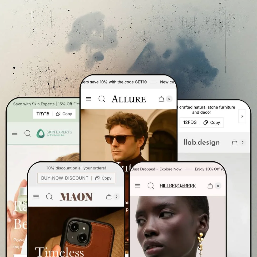
Most budget themes pick one look and stop there. Allure ships five, and they don't even agree on what a store is: a tailor, a leather workshop, a marble furniture studio, a skincare spa and a jewellery chain all run on the same code. It's an Online Store 2.0 theme from UTD BV, a studio in Antwerp, and its feature list is long for a $100 purchase. The open question is how much of that list sells product and how much of it is staging.
A physical-retail layer that ships with the theme
The store locator section gives each location its own card with photo, address, phone number and opening hours, and the demos run it with three and with six shops; on product pages, a pickup line under the button reads "usually ready in 2-4 days" for the named location. That's a lot of bricks-and-mortar plumbing. For multi-location jewellery or beauty retailers who run click-and-collect alongside shipping, it means the storefront can show where stock sits without a locator app and without a custom page build.
Against Dawn, the $100 buys a merchandising kit
Put it next to Dawn, Shopify's free baseline, and the gap is easy to list. Image hotspots with quick view, a before/after slider, countdown timers, promo popups, an age verifier, back-in-stock alerts, a pre-order product template and a quiz section all arrive as one coordinated merchandising kit. None needs an app. For single-brand fashion and accessories merchants with 50 to 100 SKUs and a seasonal campaign rhythm, that covers the bulk of launch-week promotion work from inside the theme editor.
A cart drawer with a job beyond the total
The drawer takes a discount code directly, so a shopper can see the saving before leaving for checkout, and it adds an order note, an optional compare-at price per line, gift wrapping and a custom empty-state message with a link back to collections. It's a working surface. For gift-heavy accessories stores with impulse-priced add-ons and a mid-market basket, those small controls reduce the number of reasons to abandon between cart and checkout.
Is a fourteen-month-old theme still moving?
Yes. Eight releases have landed since launch, and they read like a to-do list being worked: right-to-left styles and the in-cart discount field in August 2025, high-variant support in October, a desktop carousel gallery and logo positioning in December, the Quiz section and a gift-product block in January 2026, a mobile grid setting in March, a mega-menu header block in July and the new Shopify account component in September. For non-technical, single-brand merchants planning to stay on one theme for several years, that cadence is the practical insurance against platform changes.
No social proof layer anywhere
Across five demos I couldn't find one testimonial block, star row or review section, and the Theme Store feature list offers Press coverage but nothing for customer reviews; a merchant review from July 2026 says the same, noting that review and testimonial integration isn't built in. Five storefronts, zero customers speaking. That's a gap, not a style choice. For considered purchases at luxury price points (the demos stage €1,195 suits and five-figure stone cabinets), merchants should budget for a review app and the section work to place it before they launch.
Appointment pitches end in a form
Pristine's "Book an Appointment" button leads to a Spa Menu page, and Bijou's bespoke-service button goes to the contact page. Nothing books. The demos stage no calendar, deposit step or service-product flow, and the feature list names a customizable contact form but no scheduling tool, so appointment-driven businesses such as spas and bespoke jewellers running a hybrid retail-and-service model will need a booking app and a way to fit it into these layouts.
Design controls sit at theme level, and the editor has a learning curve
A July 2026 merchant review lists what it found isn't native: section-specific font and image controls, more than one call-to-action per section, and product blurbs. Another review from the same month calls the theme very hard for beginners, and the developer's reply points to documentation and email support instead of a simpler path. That's honest, at least. For single-brand founders launching a first store with under 30 SKUs and no developer on call, expect to work within global typography settings or pay for small code edits.
What it takes to launch
Expect a two-to-three-day pass covering product-page pop-out content (size guides, care, ingredients and shipping pages per product type), recommendation and cross-sell configuration, market and currency setup, homepage copy and imagery for a dozen-plus sections, and brand naming across informational pages before the store reads as yours.
-
What works in this preset
Open the Man menu and you're already looking at product names. The mega menu lays out six collection columns, each with six or seven linked products underneath, and closes with three image tiles that point at Jackets, Suits and the full men's range. For a tailoring catalog where shoppers arrive knowing they want a double-breasted suit, that depth removes a click from every visit. It's a menu that doubles as a catalog.
Three option rows sit above the price on the Coloured Safari Back Suit: Garment, Color and Size. The size row alone runs nine buttons from 44 to 60, the colour row uses fabric-style image swatches, and two pop-out links, Size Guide and Shipping, sit under the add-to-cart button. I clicked the Size Guide link and got a measurement table in a panel instead of a trip to another page. The same suit also appears as a full buy module on the homepage, options and all.
A "New Look" hotspot image pins three products onto one campaign photo, each with its own quick-view trigger. Below it, an eight-tab collection strip (Coats, Jackets, Shoes, New, Best, Sale, Suits, Women) swaps a tall image per tab, and a tabbed Features, Benefits and Sustainability block with icon rows handles the fabric story. It reads like a lookbook that can take orders.
Where it stumbles
Two-piece tailoring gets one size row. The demo sells its suits as "Suit" or "Suit + Extra Pair of Trousers", yet the picker offers a single 44 to 60 axis, so a shopper who wears a 50 jacket with 48 trousers has nowhere to say so. For a preset dressed as a tailor, that's the first question a customer asks. Merchants selling sets will want a second size option or a line-item field before launch.
-
What works in this preset
Leather goods live or die on colour and compatibility, and Stitch is staged around both. The F360 iPhone case page puts 21 model buttons, from 12 Mini to 16 Plus, into one picker without the layout buckling, while wallet cards show leather swatches with a "+5" overflow counter when a style runs to nine colours. Twenty-one options, one tidy picker. It holds up.
The announcement bar carries a copyable code. One tap on BUY-NOW-DISCOUNT copies it, which beats asking shoppers to memorise a string before checkout. Further down, a countdown banner with a "Grab the deal" button points at the On Sale collection, and a homepage buy module for the Gizz Shoulder Bag packs four colour swatches, a stock count and a two-group FAQ accordion into a single block.
I scrolled past it twice before noticing how much the three-panel story section does. Each panel (Essential Carry, Everyday Elegance, Timeless Craft) pairs a short pitch with a live product card, so editorial copy and a buy path share the same row. A four-point Specifications block and an icon strip close out the page. It's a tidy template for a craft brand with a small hero range.
Where it stumbles
The For Apple menu lists 16 phone-case entries built from three designs, because every colour is staged as its own product. Wallets on the same store use swatches inside one listing, so the split is a catalog choice in this demo. It's worth knowing, though, that the Theme Store ties Combined Listings to Shopify Plus. Non-Plus merchants with colour-led ranges should plan on variants instead of sibling products.
-
What works in this preset
The colour swatches here aren't colours. They're photographs of stone: Calacata Verde, Bianco di Carrara and Travertine each get a cropped image of the actual slab, on product cards and in the buy box, next to Size and Material rows. For material-led furniture that's the right call, since a flat colour chip can't carry veining.
A video slide leads the hero, followed by four still campaign frames with a thumbnail strip. Seven small collection tiles sit directly under it, then a plain text manifesto, then an unlabelled six-image product mosaic that links straight to product pages. No countdown. It's the quietest of the five demos, and the restraint suits merchandise that needs room around it.
On the VIYALO coffee table page, I noticed the hotspot block before I noticed the description. A room photo pins four related pieces, three of them with direct add-to-cart buttons, which turns a single product page into a small collection pitch. An "Our Marbles" image marquee does similar work for materials on the homepage.
Where it stumbles
Dimensions arrive as a sentence. Small, Medium and Large are spelled out in the description as diameters, heights and weights up to 170 kg, and the demo stages no spec rows, lead-time block or freight note anywhere near the button. Furniture buyers comparing sizes want that data in a table, so plan custom content or metafield work for this vertical.
-
What works in this preset
Skincare shoppers want to be told what goes first. Pristine tells them: the "Your Routine, Step by Step" section lines up three panels (Polish & Prep, Glow On, Firm & Nourish), each tied to a product card with quick view, so the routine reads left to right and sells as it goes. It's a simple device, and it does the job of a regimen page without sending anyone off the homepage.
Six shade swatches and four size pills share the Sheer Tinted SPF 46 buy box. Sizes are labelled in both fl oz and ml, a row of icons flags Vegan-Friendly, Cruelty-Free and Sulfate-Free, and three pop-out links (Directions, Key Ingredients, Features & Benefits) keep the long copy out of the main column. I tested each link. They open as panels over the page, which keeps the shopper next to the button.
A "Skin Experts in Press" section turns the blog into a press wall, with one lead article and six smaller cards. A Wellness dropdown, a Treatment menu of nine direct product links and a supplements feature row round out the navigation. Useful staging for a brand whose credibility comes from coverage.
Where it stumbles
The bundles are flat products. Glow, Hydrate, Exfoliate, Repair and Heal Acne each sell as one item at one price, nothing on the card lists or links what's inside, and no pick-your-own mechanic is staged. Cleansers and vitamins are also one-off purchases in the demo, so replenishment selling will come from a subscription app, not from the theme.
-
What works in this preset
Ring sizing is the first thing I went looking for. It's there: the Opal Ring Set carries eight size buttons from 5 to 12, a Gold and Silver colour row, and a Size guide link with a small ruler icon that opens a printable ring sizer in a panel. Metal colours also drive the card imagery, so a Silver swatch shows the silver piece in the grid.
Four messages rotate through the announcement bar: a new collection, the WELCOME10 code, gift wrapping, and free shipping over $100. The Shop menu runs six columns with six product links each plus three image tiles, and a separate On Sale menu lists 14 pieces by short name. It's dense, but jewellery shoppers browse by type, and the columns map to that.
Scroll a product page and a slim bar with thumbnail, title and price follows you down. Under the buy box sit four benefit icons and three pop-out links for care, shipping and plating, then a full-width "Add a Jewelry Box" banner that links to a linen case. On the homepage, a "Complete the Look" hotspot pins four charm-bracelet parts to one wrist shot.
Where it stumbles
The charm system sells part by part. Bases, holders and charms are separate listings, and the demo stages no builder that assembles a bracelet into one cart action or previews the result. There's also no engraving or personalisation field on the pieces I opened, which matters for a gifting-led jeweller.
One buy box, five very different catalogs
The same product-page grammar hosts 21 phone models, photographed stone swatches, six skin shades with four sizes, and ring sizes 5 to 12. Nothing about the layout changes between them. That range is the clearest sign the variant handling was built for awkward catalogs, not only for the fashion brands the listing names first.
Navigation treated as merchandising
Every demo's menu goes down to product-level links and ends in image tiles, and every search panel opens pre-filled with trending terms and recently viewed products before a single character is typed. Read across all five, it's a consistent decision: the header is expected to sell. Smaller catalogs benefit most, because a shopper can reach a named product from anywhere in one hover.
Demos dressed with real brands' catalogs
Each preset carries a recognisable brand's range, from Australian tailoring to Canadian demi-fine jewellery, with genuine photography and full variant data. That makes the demos unusually useful as evidence, because the sections are shown coping with mixed image ratios, long titles and deep option lists instead of tidy placeholder products.
A discount-first default voice
Discount codes sit in all five announcement bars, a newsletter popup is staged on every demo and two add a second promo popup, sale badges print the percentage, and all of it runs under a tagline that promises sophistication meeting simplicity. The tools can all be switched off. Read together, though, the defaults push every vertical toward the same promotional register, and quiet luxury brands will spend their first day turning things down.
Prose where data should be
Size guides, ingredient lists, care notes and dimensions all live in pages, pop-out panels or description text across the five demos. None of them is shown drawing from structured product fields, and there's no spec-table or comparison section in the feature list. Catalogs where buyers compare numbers will feel that first.
★ 7.0/10
Rating
-
Hotspots, store locator, pickup line, countdowns, quiz, pre-order and back-in-stock arrive in the theme; customer reviews and booking don't.
8
-
Global-level design controls and merchant reports of a steep start for beginners, offset by documentation and responsive email support.
6
-
Separate mobile slide images, a mobile grid setting for collections, an optional transparent mobile header and a stacked drawer menu with phone and hours at the foot.
7
-
Images are served in responsive sizes, but Bijou's homepage stacks well over a dozen sections and Carrara opens on a full-HD video slide.
7
-
Five genuinely different presets and a broad section library; per-section typography and multi-button sections are outside what the editor offers.
7
Frequently Asked Questions
-
Yes. A dedicated mega-menu block was added to the header in July 2026, and all five demos show multi-column menus with product-level links and image tiles.
-
High-variant product support arrived in October 2025, and the Stitch demo shows it with 21 phone-model buttons in one picker. A later update also marks unavailable options as "Sold out" in dropdown pickers.
-
Both are on the feature list, and both are flagged as Shopify Plus features. Merchants on other plans won't see them.
-
A Quiz section was added in January 2026. None of the five demos stages it, so plan to test it in the editor during your trial.
-
Don't count on it. A merchant review from August 2026 reports that a preset's page content and images didn't arrive with the install and had to be rebuilt section by section.
-
Right-to-left styles were added in August 2025, and the theme ships interface strings in English, French, Italian, German and Spanish.
-
UTD BV, based in Antwerp, handles support by email and maintains an online manual; its replies to Theme Store reviews in summer 2026 typically landed within a few days.
This review is based on hands-on testing of the publicly available preset demos of the Allure Shopify theme as of September 17 2026. Theme features, preset availability, and performance can change with subsequent updates from the theme developer.