
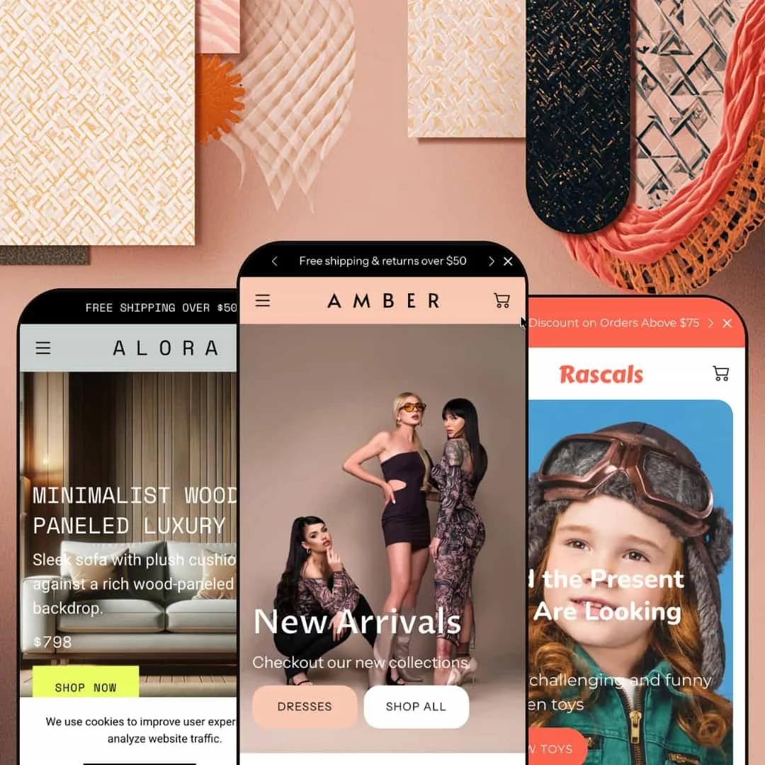
Most Shopify themes pick one vertical and build everything around it. Amber ships three of them from a single $220 license: women's fashion, high-end furniture, and children's toys. The three demos share almost nothing in their merchandising except the engine underneath, and that engine is Online Store 2.0 — JSON templates, a section-based product page, and a color-scheme system the developer rebuilt in early 2026. The question this review works through is whether one theme stretched across three retail logics holds up, or whether the range costs it depth.
Three storefronts, one license
Shopify's free Dawn theme gives you one well-built starting point and a single design logic to extend. Amber gives you three, and they are not reskins of one another: the fashion, furniture, and toy presets run different navigation depths, different price architectures, and different content rhythms, so moving between them feels like changing themes rather than swapping a palette. For an agency standing up several client stores, or a multi-brand operator running a fashion line and a homeware line under one roof, that range is the whole argument at this price. One purchase, three directions.
A merchandising library that does real work
Across the demos I clicked through image hotspots layered over lifestyle photography, a shoppable video section that tags products inside the clip, lookbook panels, age and attribute segmentation bands, and bestseller carousels with color swatches and quick view built in. Each ships as a native theme section under one styling system, so a merchant tunes and restyles them in a single place rather than reconciling a stack of separate apps. For a visual-merchandising-heavy catalog in apparel or furniture, where the product is sold on how it looks in context rather than on a spec sheet, that consolidation is the practical win. It adds up fast.
A product page tuned for considered, fit-sensitive buying
On the fashion preset's product page, the size selector sits beside a measurement calculator that takes your chest and waist and returns a recommended size, backed by an international conversion table covering US, UK, EU, and Japan sizing. The same page surfaces in-store pickup availability pulled from Shopify locations, a quantity stepper, product tabs, and a complete-the-look cross-sell. For an apparel merchant fighting fit-driven returns, or an omnichannel brand that wants online shoppers to reserve and collect in person, those are the details that move the number that matters. Returns are expensive.
Filtering deep enough for high-consideration catalogs
The furniture catalog runs a deep filter rail: alongside availability and price, shoppers narrow by material, cushion shape, armrest size, leg height, number of modules, pattern, and a 22-option color list. Those filters are built on product metafields, which means the capability lives in the theme and the depth is a function of how thoroughly a merchant tags the catalog. For a furniture or home brand with a structured catalog in the low hundreds of SKUs, where buyers cross-shop on attributes long before they look at price, that filtering turns a long scroll into a guided one. It earns its place.
One aesthetic, dressed three ways
The three presets diverge in content but converge in look. Stack them side by side and the same dense, section-heavy styling shows through: the same card treatment, the same heavy use of full-bleed imagery, the same promo furniture of popups and benefit-icon rows. Three storefronts, one accent. A jewelry house, a minimalist fashion label, or a single-product brand that wants air and restraint will spend real time stripping Amber back toward quiet, because quiet is not where this theme starts.
Built on Online Store 2.0, not the newest block architecture
Amber is a mature OS 2.0 theme: JSON templates, section-based pages, and a recently rebuilt color-scheme system. It is a 2023 theme at heart. What it is not is a Horizon-era theme built on the newest nested theme-block model, with its deeper block nesting and AI-assisted section generation. For an in-house team at a content-led brand that restructures its storefront often and is betting on the newest Shopify editing model for the next few years, Amber's generation is its ceiling, and that is a deliberate architectural line rather than a defect.
The best tooling rewards catalogs that can feed it
Amber's strongest features are the ones that need the most merchant input to come alive. The furniture filters need a fully tagged metafield catalog. The size calculator needs real garment measurements. The shoppable videos need video you have produced and edited. A solo merchant with thirty SKUs, no metafield discipline, and no video budget will light up only a fraction of what they have paid for, and at this price that gap matters. You are buying capacity you have to grow into.
What it takes to launch
Plan a multi-day pass before publishing: a full copy rewrite across heroes, section headers, testimonials, FAQ entries, and footer details; metafield population if you want the deep filtering the furniture demo shows; product measurements to drive the size tools; and a consistency sweep so shipping-threshold messaging and brand naming read the same on every page. Budget extra time if you adopt more than one preset, since each carries its own content set to localize.
-
What works in this preset
The first screen alone stacks a slideshow, a scrolling promo bar, and a countdown before you reach a product. It moves. The Amber preset is built for a fashion brand that wants momentum and commits to that idea hard: bestseller carousels with swatches and quick view, a lookbook with clickable hotspots over editorial photography, a shoppable video block, and a customer-testimonial run all land on the homepage before the footer. If your brand sells on energy and newness, this is a strong starting canvas.
I scrolled into an embedded product block partway down the page and found a working size selector and a low-stock note sitting right there, no click-through required. Pulling a live product onto the homepage like that is a nice touch for a brand that wants to push a hero item without making shoppers go hunting for it.
The mega menu carries three columns of links plus promotional image tiles for collections, which gives a deep apparel catalog room to breathe in the navigation rather than collapsing everything into a flat list.
Where it stumbles
Density is the cost of the energy. The default Amber homepage runs long and asks a shopper to absorb a lot of competing calls to action before reaching the catalog, and a fashion label chasing a calmer, more curated feel will be removing sections rather than adding them. That is a positioning choice the preset makes for you, and unmaking it is real layout work.
-
What works in this preset
Price is the first thing Alora changes. Where the fashion preset deals in two-figure dresses, this one opens on a $798 sofa and climbs past $2,800, and the whole layout adjusts to suit: product-linked hero slides that each carry a price and a shop button, lifestyle hotspot scenes you can click into, and testimonials attributed to interior designers and architects instead of generic shoppers. It reads like a different company.
The collection filtering is where Alora made me sit up. The catalog narrows by material, cushion shape, armrest size, leg height, number of modules, pattern, and a long color list, which is the difference between browsing furniture and actually shopping it. I worked through several combinations and the rail held up.
Sold-out badges and from-pricing on variant products are handled cleanly on the cards, so a catalog with wide price ranges inside a single item still reads clearly at a glance.
Where it stumbles
The premium signals fight the discount signals. A $2,899 sofa sits under the same 15%-off popup and the same "free shipping and returns over $50" marquee that would suit a budget-friendly store, and for a true luxury furniture positioning that urgency layer undercuts the calm the rest of the preset is trying to project. Resolving that tension is a tone decision the merchant has to make deliberately rather than inherit.
-
What works in this preset
Where the other two presets pile on sections, Rascals pulls back. The toy demo runs a simpler homepage with a single hero, a few product carousels, and a clean run of categories, which suits a children's brand that wants warmth over hard selling. Less noise, more play.
The age-band navigation is the smart idea here. Rascals stages a row that sorts toys by developmental stage (baby, toddler, preschool, elementary, pre-teen), which is exactly how a parent shops for a gift. It turns a catalog into a guide.
The embedded product block, a Montessori camera with a low-stock note, works the same way it does on the fashion preset, so the merchandising muscle carries over even though the styling is calmer and the palette softer.
Where it stumbles
Simpler can read as unfinished. Because Rascals is staged so much more lightly than its siblings, a toy brand that wants the richer treatment (the multi-slide heroes, the shoppable video, the deeper content sections the other presets show off) will be building those up from the shared library rather than inheriting them here. The capability is in the theme; this preset just chooses not to lead with it, so picking Rascals means more assembly to reach the same ceiling.
One engine, three honest verticals
The point is not that you get three designs; it is that the section system underneath is general enough to express fashion, furniture, and toys without any of them feeling like a recolor of another. It is a kit, not a template. That is a builder's accomplishment, and it is what makes Amber worth more than the sum of its presets to a merchant willing to treat it as raw material rather than a fixed layout.
The good tooling does not thin out by category
Whichever preset you start from, the conversion surfaces are the same depth: the hotspots, the shoppable video, the segmentation, the cross-sell, and the metafield filtering are theme-wide, so your category never locks you out of the best parts. That parity is easy to miss until you have looked at all three. It is the quiet strength here.
A theme that is still being built
It is not coasting. The early-2026 update added a working shoppable-video section and moved the whole theme onto a color-scheme system, and you can see that new section already live in the fashion demo rather than merely promised in a changelog. For a multi-year purchase, that maintenance signal counts for a lot.
It assumes a particular kind of store
Every preset is built around a long, scrolling, conversion-led homepage with an urgency layer switched on by default. A merchant whose model is a tight single-product page, a stripped catalog-first utility store, or a slow content-led brand is adapting against those assumptions on every preset, not just one. Amber holds a strong opinion about what a store should be, and its opinion does not bend easily.
Broad, not deep
The same generalism that lets Amber cover three verticals keeps it from going specialist in any of them. There is no true room planner or AR preview for the furniture brand, no fit prediction beyond a static size calculator for apparel, no age-gated logic wired behind the toy segmentation. For many merchants that breadth is the right trade. A brand that needs category-specialist depth will eventually reach for something narrower and deeper.
★ 7.8/10
Rating
-
A full conversion and merchandising suite — hotspots, shoppable video, countdowns, segmentation, deep metafield filtering, and a fit-focused product page — all available theme-wide rather than reserved for one preset.
9
-
The editor follows familiar Online Store 2.0 patterns, but the density of sections and the reliance on metafields and measurements to unlock the best features add real setup load.
7
-
The mobile menu uses a stacked, back-button drilldown through the mega-menu levels, and product cards, swatches, and quick view all translate cleanly to small screens.
8
-
Homepages run long and image-heavy by design, though the demos lean on lazy-loaded imagery and a restrained script footprint to keep that weight in check.
7
-
Three distinct preset starting points, a broad section library, and a new color-scheme system give plenty of range, tempered by a recognizable house style that takes effort to fully escape.
8
Frequently Asked Questions
-
Treat the presets as starting points, not categories. The section library is shared across all three, so pick the one whose merchandising rhythm is closest to yours, whether that is dense and promotional, premium and filter-led, or simple and warm, and restyle from there.
-
It is a measurement-to-size tool aimed at apparel, taking body measurements and returning a recommended size. For a non-apparel catalog you would hide it and lean on the product tabs for spec tables instead.
-
The filtering engine is built in, but the specific filters (material, cushion shape, modules, and so on) are driven by product metafields you populate. Expect tagging work before your catalog filters as cleanly as the demo does.
-
No. It arrived in the early-2026 update as a theme section, so it is available to every preset; the fashion demo is simply the one staging it. You can add it to any storefront you build.
-
Yes. The latest update migrates the theme to a color-scheme system and resets existing color settings, so plan to reconfigure your palette right after updating.
-
The product page surfaces in-store pickup availability pulled from your Shopify locations, so once locations are set up, online shoppers can see and choose collection. It is wired through Shopify, not a separate app.
This review is based on hands-on testing of the publicly available preset demos of the Amber Shopify theme as of June 2026. Theme features, preset availability, and performance can change with subsequent updates from the theme developer.