
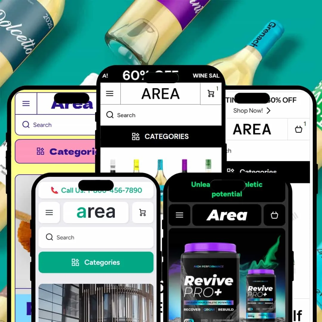
Area is a dynamic and visually sharp Shopify theme that packages five distinct presets: Area, Winery, Flavor, Technical, and Medicines. It's built for brands that rely on strong photography and want to present their products with a clean, modern, and confident aesthetic. Our hands-on review confirms it’s more than just a pretty face, integrating a suite of conversion-focused tools that feel native, not tacked on.
Pros.
〰️
Pros. 〰️
✚ Seamless "Quick Shop" Experience: The theme's universal hover-activated "Quick Shop" button opens a pop-up modal on collection pages. This allows customers to select variants and add products to the cart without leaving the page, which streamlines navigation and can directly lower bounce rates.
✚ Excellent Built-in Information Modules: Across presets, the theme uses accordions, icon-based lists, and info tables to present complex information (ingredients, tech specs) in a clean, digestible format. This builds customer trust and can increase conversion rates by answering key questions upfront.
✚ Polished User Experience & Core Functionality: Core interactive elements like the full-screen search overlay, the slide-out cart drawer with a free shipping progress bar, and the header announcement bar are fast, modern, and well-designed across all presets. This creates a cohesive, premium feel that enhances brand perception and can support a higher average order value (AOV).
✚ Integrated Conversion Aids: Features like a stock counter ("Just X left"), countdown timers, and promotional banners are seamlessly integrated into the design. They feel like native parts of the theme, not clunky add-ons, making them powerful tools for driving urgency and sales.
Cons.
〰️
Cons. 〰️
− The Minimalist Trap (Strategic Weakness): The theme's greatest strength—its clean, image-forward design—is also its biggest strategic risk. It absolutely requires merchants to have professional-grade photography and a strong visual identity. Without high-quality assets, the minimalist layouts will look empty and unfinished, damaging customer trust and failing to deliver the intended premium experience.
− No Variant Swatches on Collection Pages: Customers cannot see available colors or sizes directly on the main collection page grid. They must hover and open the "Quick Shop" modal to view options. This extra click creates user friction that could negatively impact mobile conversion rates for apparel or beauty stores.
− Inconsistent Blog & Content Page Design: Across the presets, the standard blog and article page templates lack the high-design polish of the e-commerce pages. For brands where content marketing is a core strategy, this design drop-off could be jarring for users and detract from the site's professional appearance.
-
The Area preset is a masterclass in modern streetwear and lifestyle branding, offering a vibrant, high-energy canvas for apparel and accessories.
⊕ Pros
✚ Clear Variant Swatches: The product page uses clean, circular color swatches and straightforward button-style size selectors. This visual clarity is crucial for apparel, where variant selection is a key part of the buying process.
✚ Impactful "Wild Series" Section: The demo highlights a specific product line with a full-width image and bold text, an excellent staging technique for promoting new arrivals or hero collections.
✚ Engaging Grid Layouts: The homepage effectively breaks up the page with multiple collection grids like "Amazing Collection" and "Discover Your Style Essence," encouraging exploration without feeling cluttered.
✚ Prominent Email Capture: A full-width, high-contrast newsletter signup section is placed strategically mid-homepage, making it an effective tool for lead generation.
⊖ Cons
− Homepage Can Feel Busy: While energetic, the sheer number of different product grids and collections showcased on the demo homepage could feel slightly overwhelming for brands with smaller catalogs.
− "Sold Out" Button Styling: The "Sold out" button on collection grids has a very low contrast, which could be easily missed by shoppers scanning the page.
-
The Winery preset is designed with an air of sophistication, perfect for merchants selling artisanal goods, beverages, or luxury items where storytelling is key.
⊕ Pros
✚ Unique Product Detail Sliders: The product page features interactive sliders for wine characteristics like "Body," "Sweetness," and "Tannin." This is a brilliant way to communicate nuanced product details visually and is a standout feature for this niche.
✚ Age-Verification-Ready CTA: The product page includes an "I agree with the Terms and Conditions" checkbox directly above the "Buy it now" button. This is a thoughtful inclusion for merchants selling age-restricted goods like wine or spirits.
✚ Focus on Large-Scale Imagery: The preset is built around huge, impactful images. This allows the quality of the product and the branding to shine, creating a luxurious feel throughout the site.
✚ Elegant Product Categorization: The homepage neatly separates wines into "Red," "White," and "Rose" with large, appealing image sections, making for an intuitive Browse experience.
⊖ Cons
− Static Layout Feel: The design, while elegant, is very static. Brands looking for more dynamic animations or interactive elements might find it too restrained.
− Limited Iconography: The preset relies almost entirely on photography and text, lacking the icon-based feature highlights seen in other Area presets, which could help break up text-heavy descriptions.
-
The Flavor preset is a burst of fun and color, perfectly staged for food and beverage brands that want to convey a sense of playfulness and delight.
⊕ Pros
✚ Effective "From €X" Pricing: The product grids clearly display starting prices (e.g., "from €4,95 EUR"), which is an effective psychological nudge to get customers to click and explore options.
✚ Well-Organized Flavor Options: The product page neatly organizes product variations (like flavors or package sizes) into clean, clickable text buttons, handling complex inventories with ease.
✚ Strong Visual Hierarchy: The homepage uses different background colors and headline sizes to effectively separate product categories like Ice Cream, Sherbet, and Gelato, guiding the customer through the catalog.
✚ Clear In-Stock Status: A prominent "In stock!" message on the product page provides immediate reassurance to the buyer, reducing uncertainty before they add to cart.
⊖ Cons
− Small Price Font: The price on some product grids is smaller and less prominent than in other presets, which could be a minor drawback for scannability.
− Overly Playful for Some Brands: The bright, bubbly aesthetic is highly specific and might not be suitable for brands aiming for a more neutral or sophisticated feel.
-
The Technical preset is engineered for clarity and precision, designed for brands selling electronics, mobility devices, or any product where specs and features are a primary selling point.
⊕ Pros
✚ Icon-Based Feature Highlights: Key product specs (e.g., max speed, battery range) are displayed using clear icons directly under the price on the product page. This makes technical data easy to scan and digest, improving the user experience for detail-oriented buyers.
✚ Excellent Informational Tables: The product page uses a clean, two-column table for "Item specifics," which is a perfect way to present dense technical data without overwhelming the user.
✚ Prominent Trust Messaging: The footer includes clear, icon-based messaging for "Free Shipping," "Guaranteed Return," and "Recycled Materials," which helps build customer confidence.
✚ Clean Information Architecture: The entire preset is designed to present information logically, from the categorized navigation to the structured product descriptions, making it easy for customers to find what they need.
⊖ Cons
− Relies on Professional Product Angles: The design heavily favors clean, studio-shot products from multiple angles. It would be less effective for single-image products or services.
− Slightly Hidden Cross-Sells: The "Complementary products" section is placed quite far down the product page, below all the technical details, potentially reducing its visibility and effectiveness.
-
The Medicines preset uses a bold, dark, and high-contrast design to create a sense of power and performance, tailored for supplements, fitness products, and modern wellness brands.
⊕ Pros
✚ Landing Page-Style Homepage: The homepage is structured like a long-form sales page, with sections dedicated to "Recover," "Grow," and "Rebuild." This is perfect for single-product stores or for telling a deep story about a hero product.
✚ Clear Benefit-Driven Headlines: The design uses powerful, benefit-oriented headlines like "Ignite Fat Burning. Preserve Lean Muscle" to quickly communicate value to the customer.
✚ High-Contrast, Readable Design: Despite the dark theme, the use of bright accent colors and strong typography makes all text highly readable and calls-to-action impossible to miss.
✚ Persuasive Multi-Step Benefits: The "Elevate your training intensity" section breaks down product benefits into four numbered steps, guiding the user through the value proposition in a logical, easy-to-follow manner.
⊖ Cons
− Very Niche-Specific Aesthetic: The intense, dark design is highly tailored and would be difficult to adapt to a brand outside of the fitness, gaming, or supplement space.
− Single Product Focus: The design is heavily optimized for a single hero product. Brands with large, diverse catalogs might find the homepage structure too restrictive.
Niche Suitability
Not Ideal For
Final Recommendation
-
This theme is ideal for design-conscious merchants in the fashion, high-end electronics, luxury goods, and modern wellness spaces who have strong visual assets and want a premium, fast, and feature-rich site without needing dozens of apps.
-
Merchants on a tight budget for photography, drop-shippers with inconsistent product images, or businesses that require highly complex, data-heavy filtering might find the theme's visual demands challenging and should look for a more content-flexible option.
-
Medium. While easy to set up, achieving the polished look of the demos requires a significant investment in high-quality photography and a clear brand strategy.
★ 8.6/10
Rating
-
Includes a robust set of built-in features like a stock counter, quick view, and promo timers. The theme presents Shopify's standard features, including filtering, in a clean, usable way.
9
-
The theme editor options are logical, but merchants will need to put in the effort to source high-quality visuals to make the designs work as intended.
8
-
The mobile experience is excellent. Responsive layouts are clean, touch targets are large, and key features like the slide-out cart and filters work flawlessly.
9
-
Based on hands-on testing, interactive elements are snappy, pages load quickly, and animations are smooth without noticeable lag, providing a fluid user experience.
9
-
While each preset is highly polished for its niche, adapting them to a completely different industry would require significant stylistic changes. The core structure is flexible, however.
8
FAQ
〰️
FAQ 〰️
-
👑 Yes, the "Medicines" preset, in particular, is perfectly designed for a single-product store, with a homepage that functions like a long-form sales page.
-
📱Absolutely. Our testing found the mobile experience to be excellent across all presets, with responsive layouts, large touch targets, and smooth-functioning mobile menus and filters.
-
🎨 The theme is very customizable for branding, with full control over colors, typography, and logos. However, its minimalist foundation means branding is most successful when paired with strong photography.
-
⚡Performance is a major strength. In our hands-on testing, pages loaded quickly, and interactive elements like the search overlay and cart drawer were highly responsive and lag-free.
-
👕Yes, it supports variants very well on the product page with clean swatches and buttons. The "Quick Shop" modal also allows for variant selection from collection pages.
-
🔎 The theme supports all of Shopify's standard SEO features for editing meta titles, descriptions, and image alt text. No special, theme-specific SEO tools were observed.
-
💱Yes, a functional language and currency switcher was present in the footer of the demos, indicating it fully supports Shopify Markets for international selling.
-
⚙️ Yes, as a modern Shopify theme, it's built to be compatible with apps from the Shopify App Store. The demos feature app-friendly sections for reviews and trust badges.
-
🛒 Yes, you can try the theme with your own products for free on the Shopify Theme Store. The live demos for all five presets are also available for hands-on exploration.
Disclaimer: This review is based on hands-on testing of the publicly available "Area," "Winery," "Flavor," "Technical," and "Medicines" preset demos of the Area Shopify theme as of June 28, 2025. Theme features, preset availability, and performance can change with subsequent updates from the theme developer.