
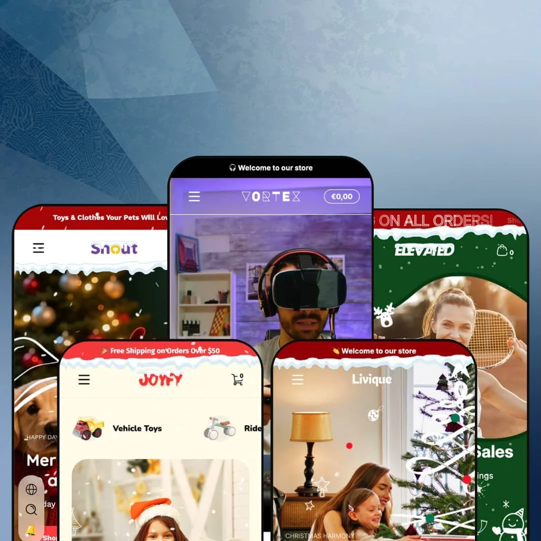
Two clicks separate Ascent's gaming-electronics preset from its porcelain-and-pottery preset, and that's the most honest summary of the theme. The five presets (Vortex for esports, Elevated for tennis, Joyfy for kids' toys, Livique for ceramic art, Snout for pet supplies) span verticals with no overlap in audience or aesthetic. That breadth is a serious bet from Webvista Studio, and the rest of this review is about whether the Online Store 2.0 foundation can carry five distinct merchandising stories without thinning out.
A real product-comparison engine, not an app dependency
The Vortex preset's Find Your Fit section surfaces a 5-column comparison table for keyboards across Connection type, Weight, Rating, Keyboard format, and Keyboard layout. It's wired into metafields, not an app integration. For electronics merchants with multi-attribute variants and considered-purchase buyer behavior at the 50-200 SKU range, this means side-by-side spec comparison ships in the theme rather than as a separate install plus integration work. Real fit for gaming, audio gear, and tech-accessory catalogs where buyers cross-shop on numerical attributes before clicking through to PDPs.
Five verticals from one $320 license
For multi-brand operators running two or three Shopify storefronts at the Premium tier, Ascent's preset list (Vortex for gaming electronics, Elevated for tennis gear, Joyfy for kids' toys, Livique for ceramic art, Snout for pet supplies) replaces what would otherwise be three separate theme purchases. That's the math when one license covers verticals an agency or holding-company would normally license separately. Worth checking before paying theme-per-store.
Image-hotspot product feature breakdown built in
A second draw is the Highlight Features image-hotspot section. Numbered touchpoints overlay a single product image to break down spec stories that buyers usually have to scroll through a paragraph wall to find. The setup is image-based, not text-list. For merchants selling products where the spec sheet sells the unit (VR headsets, mechanical keyboards, drinkware, kitchen tools, electronics with non-obvious feature stories), this kind of inline breakdown beats stacking a description tab.
A merchandising kit that sits on top of the theme, not behind apps
What gets covered before you start installing apps? Ascent's conversion stack (pre-order, back-in-stock alerts, stock counter, gift labels, cross-sell links, image rollovers, sticky cart, lookbook hotspots) sits inside the theme rather than as a stack of paid apps you'd otherwise need to wire up. For merchants launching with a lean app budget and considered-purchase product categories like furniture, electronics, or apparel, the merchandising baseline is unusually wide.
Online Store 2.0 architecture at the Premium ceiling
Ascent is built on Online Store 2.0, not the newer Theme Blocks architecture that Shopify's Horizon family introduced last year with deeper nesting and AI-block compatibility. At the $320 premium tier, merchants increasingly have Theme-Blocks options to compare against. For merchants prioritizing future-proof architecture and merchants planning heavy section customization (5+ levels of nesting, AI-block generation, mobile-first layout primitives), this is the architecture gap to weigh. The section flexibility is solid for what it is. The architecture clock is ticking.
Footer doesn't keep up with the rest of the theme
Across all five presets, the footer locks to a similar 4-column structure (Shop/Customer Care/About/Newsletter) with no section-group integration visible — no draggable Featured Collection block in the footer area, no built-in trust-badge row (Vortex's 5-icon row is a custom add, not a default footer pattern), and a minimal block library compared to what the headers and product pages ship with. For premium DTC brands at the $290-400 tier who treat the footer as a secondary conversion zone (newsletter + featured product + brand story tile), this is the weakest area of an otherwise feature-rich theme. Plan on footer-section app work or custom Liquid.
No vertical-specific tooling beyond the section library
Each of Ascent's five presets ships the same generic section library, but no preset includes vertical-specific tools dedicated to its niche. Tennis merchants don't get a string-tension or racket-weight comparison schema. Ceramic-art brands don't get a kiln-temperature or glaze-type metafield template. Pet-supply merchants don't get a species-and-life-stage filter. The Compare Products and Highlight Features sections work as generic configurable blocks merchants populate themselves; they aren't vertical-aware out of the box. For merchants with 200+ SKUs in a single vertical who want category-specialized merchandising UX from day one, a dedicated single-vertical theme will require less configuration work than Ascent's generic section model.
What it takes to launch
Across all five presets expect a multi-day copy pass (hero captions, FAQ entries, About-page narrative, brand-naming alignment), full metafield population for the Compare Products and Highlight Features sections to reflect actual SKUs, currency and localization reset for any preset starting in non-USD demo data, and i18n cleanup before launch. Multi-brand operators running more than one preset should budget agency engagement for cross-preset brand consistency.
-
What works in this preset
The standout is Find Your Fit. Five gaming keyboards line up across six attributes (Color, Connection type, Weight, Rating, Keyboard format, Keyboard layout) surfaced from product metafields rather than from a paid comparison app. For gaming electronics where a buyer typically opens four browser tabs to compare DPI ranges, switch types, and weights before deciding, I'd guess this section eliminates a comparison-shopping step that most theme PDPs leave to merchants.
Then the Highlight Features hotspot section. A VR headset gets numbered hotspots over a single image, breaking down Adjustable Head Strap, Lens Adjustment Knob, Audio Port, and High-Resolution Display as inline tooltips you'd otherwise stuff into a product description. The architecture is Online Store 2.0, and Webvista's section library makes good use of that ceiling. Image-anchored breakdown sections are the merchandising real estate that gets eaten by a wall of paragraph text on plainer themes.
Navigation depth is the third strength. The mega menu carries five image-tile categories (Mouse, Headset, Keyboard, VR Sets, Accessories) with category-specific subcategories nested beneath, and a "Theme Features" panel that doubles as the merchant's exposure to all the merchandising sections Webvista wired in (Sibling Products, Complementary Products, Related Products, Variant Images Group, Pre-order, Gifts, In Box Products).
Where it stumbles
The "Theme Features" mega menu panel is itself the stumble. It exposes the theme's merchandising wiring as live navigation rather than as setup documentation. Pet brands, athleisure brands, and any merchant launching Vortex without removing this nav block will end up with header labels reading "Sibling Products" and "In Box Products" that mean nothing to their shoppers. It's a removable block, but it shouldn't have shipped default-on in the demo.
-
What works in this preset
It's not subtle. The structural answer to a $149-tier sports-equipment catalog is volume merchandising, and Elevated commits to it. The hero rotates three full-bleed slides (Christmas Sales, Brand Story, Tennis Apparel) and the section flow stacks Featured Collection, Limited-Time Offers, Tennis Racquets grid, Tennis Apparel grid, New Arrivals with no editorial breaks in between. For tennis retailers running flash drops with sale codes and seasonal pushes (back-to-school, year-end), the section pace matches the buying behavior.
The mega menu earns a second mention. Within Best Sellers it carries a 3-item sub-nav (Top Tennis Racquets, Popular Tennis Apparel, Best-Selling Accessories), and within Collections it goes three levels deep across Tennis Racquets (5 subcategories), Tennis Apparel (5 subcategories), and Tennis Accessories (3 subcategories).
Where it stumbles
The aggression cuts against the premium positioning. A tennis brand pitching $149 racquets and $78 polos doesn't usually open with three countdown clocks ticking simultaneously, a stat counter claiming 250B hours played, and red sale badges on a third of the product grid. The framing works for fast-fashion or fitness drops, but it fights the "premium" framing the hero copy is selling. Tennis brands wanting Wilson-tier or Babolat-tier brand restraint will likely strip half the urgency mechanics before launch.
-
What works in this preset
I'd peg Joyfy as the most conversion-focused toy-shop preset of the five, with a bright yellow palette, image-tile mega menu blocks, and a section flow that prioritizes browsing-by-age over browsing-by-category. Shop by Age is the section worth borrowing. Five age bands (0-12 Months, 1-2 Years, 3-4 Years, 5-7 Years, 8+ Years) get tile cards that route into age-filtered collection pages. Kids-toy buyers don't shop by "toys". They shop by "what does my 3-year-old want," and the preset commits to that mental model where most toy-store themes still lead with category trees.
The Shop by Feed Instagram-style video grid is the second standout. Six video tiles arrange in a feed-pattern layout with shoppable product cards below each, mimicking the social-media browsing pattern kids-toy parents already use on TikTok and Reels. For toy brands with active video UGC pipelines (unboxing videos, demo clips, parent reviews), the section drops in directly. Without that pipeline, it sits empty.
-
What works in this preset
"Sculpture for Living Moments" is a navigation label in Livique, not marketing copy. The cream palette, the editorial section headers (Ornamentum, Quiet Living, Edibles), and the marquee text strips (DESIGN FOR LIVING repeated across the page) commit Livique to a magazine-style aesthetic the other four presets don't attempt. For ceramic artisans and home-decor brands at the $20-100 price point who sell as much through mood as product, this is the on-brand option in the family. The character is unmistakable.
The Featured Product widget is the second draw. A single product surfaces with full PDP-style elements (review count, stock urgency "Hurry up! Only 5 left", multi-step gallery, share buttons, color variant selector) embedded on the homepage. For artisan brands launching with a hero product strategy (one statement vase, one wishing candle, one signature mug), this widget replaces a separate landing-page build.
-
What works in this preset
I went into Snout expecting another pet-supply slideshow and got the soft-pastel category-tile chassis instead, with the cleanest image-led mega menu of the five (Shop for Dogs / Shop for Cats as full-tile blocks). Easy to scan. The Joyful Collections grid surfaces 9 products with image rollovers, sale badges, and color-swatch variants. Clean rhythm for a category where buyers cross-shop the same SKU across multiple sizes (toy/treat/bed/harness for one pet).
The Pet mega menu is interesting in design because it mixes blog navigation with collection navigation in the same panel. Care & Wellness routes to articles (Daily Care, Grooming Tips, Health). Travel & Outdoor routes to collections (Carriers, Harnesses, Outdoor Gear). For pet brands running content marketing alongside catalog (which is most of them, given Shopify's Pet category lean toward education-driven SEO), this dual-purpose menu pattern is a legitimate design choice.
Visual-first homepage rhetoric is a theme rule, not a preset preference
Across all five presets, the homepage commits hard to visual-first rhetoric: full-bleed video or large-image hero blocks, image-rich mega menus, lookbook/hotspot sections, marquee strips. The text-led "wall of features" pattern that Dawn and budget-tier themes default to doesn't appear in any preset. It's a theme-wide rule. For merchants prioritizing aesthetic-led commerce (fashion, decor, lifestyle, hobby) the theme's visual bias is consistent regardless of which preset you start from.
Mega menu depth across the family
The mega menu architecture is the most consistently strong section across the preset library. Vortex carries five image-tile category panels with subcategory nesting. Joyfy ships image+text hybrid blocks (Vehicle Toys, Bath Toys, Other Toys as image tiles inside a text-link panel). Elevated handles three-level Collection nesting across Racquets/Apparel/Accessories with 13+ subcategories total. Snout blends blog and collection routing in one panel. For category-heavy catalogs (50-300 SKU brands needing 15-30 nav entries to keep navigation usable), the mega menu does work that's usually reserved for top-tier custom-Liquid builds at agency price points.
Generic section library, vertical-tuned demo content
Reading all five presets in sequence reveals the staging strategy: a shared section library deployed with vertical-specific copy and imagery rather than vertical-specialized section variants. The theme's architecture treats vertical-fit as a content layer, not a section-library layer. Merchants whose vertical maps cleanly onto a generic section pattern (Compare Products, Highlight Features, Shop by Age) get rapid demo replication. Merchants whose vertical needs specialized tooling beyond generic patterns get less leverage from the multi-preset architecture than the preset count suggests.
Featured Product widget shows social proof the theme doesn't wire
The Featured Product widget renders a rating-and-review-count line in the demo, but Ascent itself ships no review engine in its feature list. The demo's social-proof element is theme-layer markup, not wired-in functionality. Merchants will either install a review app (Judge.me, Loox, Yotpo) to match the demo's display, or remove the rating element before launch. Either path is short. But the gap between what the Featured Product widget shows and what the theme actually delivers belongs on a launch checklist before the preset goes live.
★ 7.4/10
Rating
-
Comprehensive merchandising stack (pre-order, back-in-stock alerts, cross-sell, image hotspots, lookbooks, Compare Products) ships theme-wide and is available across all five presets. The Vortex and Joyfy demos stage the merchandising sections most aggressively; merchants on other presets configure the same sections themselves before deployment.
8
-
Standard Online Store 2.0 section editor with a declared 45+ section library; mega menu setup is involved given the image-block density across presets.
7
-
Mobile-specific banner files and image variants ship across presets, mobile menu uses an accordion plus drill-down pattern, sticky cart is positioned for thumb access.
7
-
The Vortex homepage runs heavy on featured collections, video hero, and Compare Products markup; Livique and Snout are leaner. Lazy-loading attributes are present across product imagery.
7
-
Five preset architectures spanning gaming electronics, sports performance, kids' toys, ceramic art, and pet supplies provide unusual visual coverage; section library carries that breadth at a declared 45+ blocks.
8
Frequently Asked Questions
-
The section is part of Ascent's broader section library, but the demo only stages it in Vortex with real keyboard metafield data. Merchants on other presets would need to add the section manually and populate the comparison metafields themselves before it does anything useful.
-
No. The "4.5 (1201 reviews)" indicator in the Featured Product widget is hardcoded display markup, not real review data. Install Judge.me, Loox, Stamped, or Shopify Product Reviews to wire actual reviews into product cards.
-
Customer Accounts (the new login flow that replaces Classic accounts) shipped in Ascent v3.0.6 on April 6 2026. Stores migrating from Classic accounts can do so without bridge customization, but earlier Ascent installs need the v3.0.6+ update first.
-
The countdown sections wire to merchant-configured end dates and run on the live store, so they work as real urgency mechanics. The "00:00:00" you see across the demo pages is the pre-initialization state, not a broken timer.
-
B2B pricing is a Shopify Plus platform capability, not a theme feature, and the same limit applies to most themes outside the Plus-targeted family. Ascent ships the standard product display that respects market and customer-group pricing if Shopify Markets or Plus is configured.
-
Yes. Presets are starting configurations, not separate themes. Once Ascent is installed, all section types from any preset are available in the theme editor regardless of which preset you initialized with. Practical for pulling Vortex's Highlight Features section into a Snout-based pet layout.
This review is based on hands-on testing of the publicly available preset demos of the Ascent Shopify theme as of May 26 2026. Theme features, preset availability, and performance can change with subsequent updates from the theme developer.