
Atelier is built around a quiet-luxury shopping experience: big imagery, deliberate spacing, and a typography hierarchy that reads more like an editorial spread than a sales page. The first impression is very controlled, with a full-width hero and a restrained palette that nudges you toward browsing rather than rushing you into a discount banner or loud promo block. Underneath that, the site rhythm stays consistent: clean sections, generous margins, and product photography treated as the main “copy.”
Pros.
〰️
Pros. 〰️
✚ Quick shopping that doesn’t break browsing
Atelier supports quick shopping via an on-grid entry point that opens a product-focused overlay experience rather than forcing a full page change every time. In practice, this keeps shoppers in the browsing mindset, which is especially valuable for fashion and accessories where comparison shopping is common. The variant-aware behavior also prevents “accidental adds” by requiring selection when options exist, which is a quiet but meaningful UX win.
✚ Mega-menu navigation that doubles as merchandising
The theme’s navigation behavior is built to do more than route clicks. Menus expand into multi-column layouts with visual cues and sub-collection structure, so shoppers can preview what they’re about to browse instead of committing blindly. That tends to reduce friction in larger catalogs and makes the header feel like part of the merchandising layer, not just site chrome.
✚ Product pages designed for clarity, not clutter
Atelier’s product template balances large imagery with a clean purchase area and structured supporting details. Information is organized in expandable sections so the page stays readable without hiding key content in an endless scroll. The result is a product page that feels premium and calm while still giving shoppers what they need to commit.
✚ Cross-selling that stays understated
Rather than pushing loud upsells, the theme uses a low-friction related-products block that sits naturally within the product flow. It’s the kind of cross-sell that encourages “one more click” without feeling like an interruptive popup. For merchants, it’s a simple way to increase discovery and average order value while keeping the visual tone consistent.
✚ Search flow that keeps shoppers in the store
Search is staged as an overlay-first experience that can surface suggestions quickly and then transition into a dedicated results view when the shopper commits. That makes the store feel responsive and keeps discovery moving, especially for shoppers who know roughly what they want. It’s a practical complement to the theme’s browse-heavy layout style.
Cons.
〰️
Cons. 〰️
🚫 Cart feedback is quieter than some shoppers expect
In the demo flow, adding an item doesn’t automatically force the cart drawer into view. For confident shoppers that’s fine, but for cautious buyers it can create a small “did that work?” moment until they notice the cart count update or open the cart manually. It’s not a blocker, but it’s a subtle conversion detail worth paying attention to.
🚫 No-results search presentation can feel contradictory
When a search returns no matches, the interface does show a clear “no results” message, but the page still continues into product suggestions. That can be helpful as a recovery path, yet it may also confuse shoppers who expect a clean dead-end state. If your store sees lots of search traffic, you’ll want to decide whether that behavior matches your preferred UX.
🚫 Text-first informational pages feel basic out of the box
Blog and policy-style pages are presented with a simple, text-led template and minimal visual variation. That’s consistent with Atelier’s restraint, but it may feel plain if you want story-driven editorial layouts beyond product browsing. Merchants who rely heavily on content marketing may need to spend more time staging those pages to match the polish of the storefront.
-
The Default preset demo is staged like a high-end accessories boutique: calm composition, lots of negative space, and a “let the product photography do the talking” approach. Everything feels intentionally uncluttered, so the shopping tools are there, but they’re not always the loudest thing on the screen.
What works in this preset
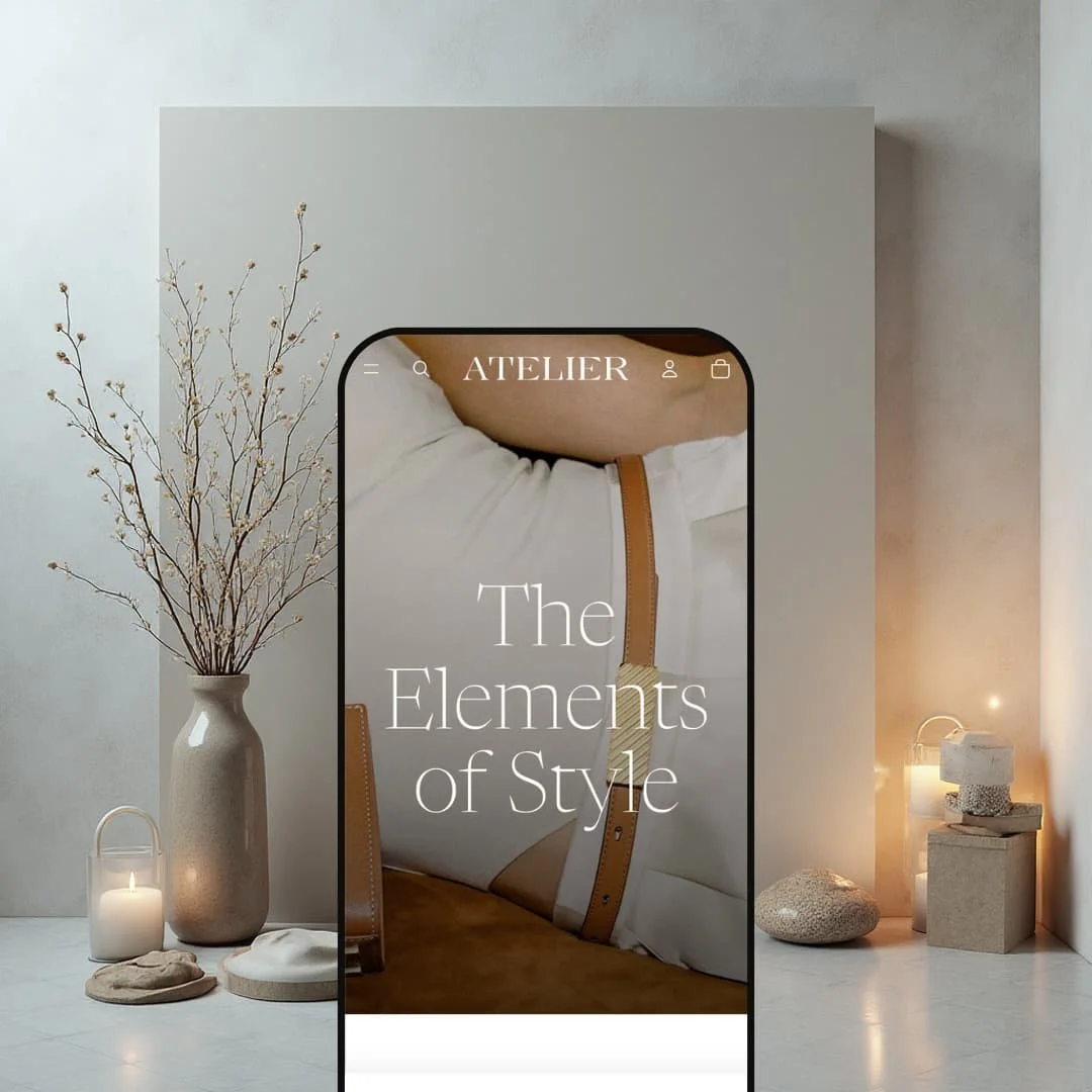
The hero treatment is pure mood-setting. In this demo, the headline sits on top of a large lifestyle image and immediately establishes the brand voice without needing a wall of text. It’s a strong fit for merchants who sell products where perceived quality matters, because the layout communicates premium positioning before you’ve even clicked into a collection.
The section rhythm on the homepage is staged to feel curated rather than busy. The category list is presented almost like a navigation feature in its own right, with oversized type and plenty of breathing room. That framing makes the store feel easy to enter from multiple angles, especially for shoppers who don’t want to “search” so much as browse.
Product discovery in this demo is intentionally clean. Product cards prioritize the photo, name, and price first, while the quick shopping entry point is kept discreet instead of turning every card into a button cluster. The impact is a grid that reads like a lookbook, which is great for visual merchandising and premium collections.
Navigation is staged as a wide, image-forward dropdown experience. In this preset demo, top-level categories expand into roomy panels with sub-links and thumbnail previews, which makes the header feel like a curated storefront rather than a simple list of links. For shoppers, that reduces the “where do I go next?” moment because the menu itself acts like a preview shelf.
The product page staging also fits the theme’s editorial bias. In the demo, the layout balances a large image area with a clear purchase area, and the supporting information is structured so it doesn’t fight for attention. That “mechanics second, aesthetics first” presentation works well when your product pages need to feel calm and premium while still providing the details a buyer expects.
Where it stumbles
In this demo staging, some of the interactive shopping affordances are intentionally subtle. That’s consistent with the minimalist direction, but it can create a discoverability hurdle for shoppers who expect obvious “quick shop” style buttons on product cards. The trade-off is clear: you gain a cleaner grid, but you may rely more on shopper curiosity and hover behavior.
The preset’s restraint can also feel a little too quiet if your business depends on constant promotional messaging. This demo doesn’t lean on loud callouts or dense, campaign-style blocks. If your brand is more hype-driven, you might find the default pacing a bit reserved until you re-stage the content and emphasis.
Niche Suitability
-
Premium accessories, luxury fashion, and product lines where imagery and brand atmosphere do most of the conversion work. The Default demo’s calm hierarchy and boutique-like browsing flow pair well with high-AOV products that benefit from slow, confident decision-making.
Not Ideal For
-
Merchants who want a highly promotional storefront feel out of the box, or stores whose merchandising strategy depends on very overt, always-visible “deal” style cues. If your catalog needs a louder retail cadence, the Default staging may feel too restrained until you reconfigure how content and calls-to-action are surfaced.
Final Recommendation
-
Atelier is best for merchants selling premium goods where atmosphere and photography are key conversion drivers. If your store benefits from calm browsing, curated navigation, and a minimal aesthetic that signals quality, the theme’s core structure supports that well.
-
If you want an out-of-the-box storefront that feels loud, campaign-heavy, or content-rich across every page type, Atelier’s default approach may feel too reserved. Stores that need extremely explicit prompts and high-visibility shopping controls everywhere may prefer a more overtly “retail” theme style.
-
Medium — the storefront experience is already polished, but getting the most out of it depends on how well you stage photography and content hierarchy. If you want richer editorial/content layouts beyond the default text-first templates, expect additional setup work.
★ 7.0/10
Rating
-
Core shopping flows are strong: quick shopping overlays, a structured product page, and an understated cross-sell pattern. The main functional friction is that cart feedback stays relatively quiet, and the no-results search presentation can feel mixed.
6
-
The browsing flow feels consistent across pages, and navigation is designed to help shoppers move through categories without guesswork. The UI choices favor clarity over complexity, which keeps the experience approachable for most catalogs.
8
-
The layout philosophy is simple and tap-friendly in spirit: big imagery, clear hierarchy, and limited visual clutter. Because the product experience leans heavily on large media, it’s worth validating how quickly mobile shoppers can reach and reuse key purchase controls in your own preview.
8
-
Interactions such as overlays and image-focused browsing felt smooth during hands-on use. Nothing in the demo flow felt unusually sluggish or jittery.
8
-
The minimalist direction is executed well, and the overall structure supports a premium brand mood. Informational pages are more basic visually, so merchants who want highly varied content presentation may need additional setup to get the same richness there.
5
FAQ
〰️
FAQ 〰️
-
👑 Yes. In the Default demo, the oversized serif typography, calm spacing, and image-led layout make the store feel like a premium boutique rather than a discount-first storefront.
-
📱Atelier is designed with modern responsive expectations in mind, and the demo’s UI stays simple rather than dense. The one thing to sanity-check in your own preview is the product buying flow on long, image-heavy pages, since the experience is intentionally photo-forward.
-
🎨 The Default demo shows how much the theme’s mood is driven by typography, spacing, and photography choices. Even without changing the core structure, you can steer the brand feel significantly by re-staging the hero, adjusting visual hierarchy, and curating product imagery to match your positioning.
-
⚡ In hands-on use, interactions like opening product overlays and navigating between browsing states felt smooth. The theme’s minimal layout also avoids a “too many moving parts” feeling, which helps the storefront stay responsive.
-
👕 It handles variants in a shopper-safe way. In the quick shopping overlay flow, multi-option items required a selection before completing the add-to-cart action, which helps prevent mistakes while keeping the path to purchase short.
-
🔎 Atelier doesn’t surface storefront “SEO widgets,” so SEO work still largely lives in your Shopify product and page setup. What the demo does show is clean, consistent page structure, including clear product naming at the top of product pages and neatly organized supporting information.
-
💱 Yes, through Shopify’s built-in translation and Markets capabilities. Whether shoppers see a language or currency selector in the header or footer depends on how you configure Markets and your storefront controls; the demo header prioritized search, account, and cart access.
-
⚙️ Yes, Shopify apps can integrate into a theme as app blocks or app embeds (when the theme/app are compatible), and some apps integrate by adding code to the theme.
-
🛒 Yes, the Theme Store listing provides a “View demo” experience, and you can also click “Try theme” to add the theme to your Theme library in Shopify admin so you can preview it there.
This review is based on hands‑on testing of the publicly available preset demo of the Atelier Shopify theme as of 26 December 2025. Theme features, preset availability and performance may change with updates from the developer.