
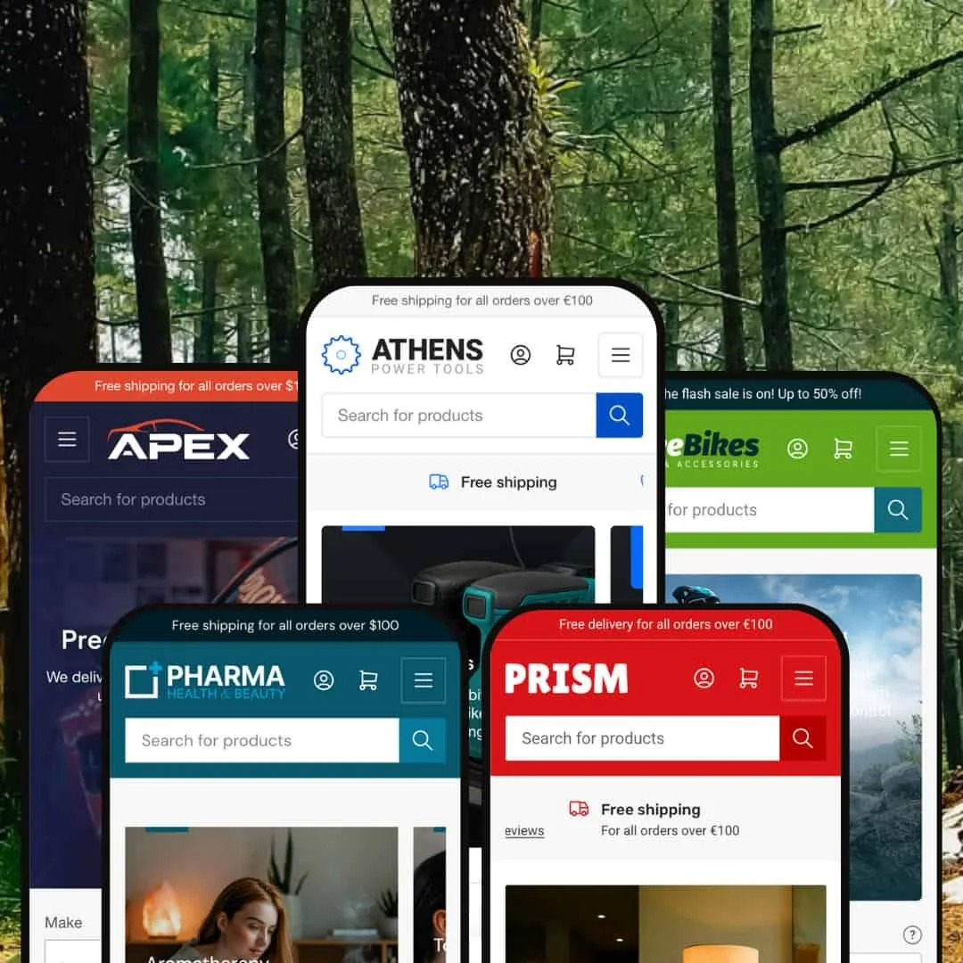
Athens presents itself as a precision-engineered Shopify theme built primarily for hardware, tools, and equipment shops, though its five presets demonstrate range across bicycles, wellness, lighting, and automotive parts. Developed by Truly Fine Pixels and priced at $300 USD, it showcases 37+ flexible sections and multilingual support with RTL. In testing, Athens kept a consistent core across demos while letting each preset adopt a distinct visual personality and domain-specific merchandising.
Pros.
〰️
Pros. 〰️
✚ Flexible presets, consistent core
Across Default, Spoke, Pharm, Prism, and Apex, Athens varies its aesthetic while keeping familiar shopping mechanics. Teams can switch industries without relearning fundamentals, and shoppers benefit from predictable behaviors across pages and presets.
✚ Guided selection tools for complex catalogs
Presets demonstrate purpose-built product selection aids—like domain-specific finders and clear goal-or category-led entry points—that steer customers toward feasible choices quickly. For technical or high-SKU assortments, that guidance shortens the path from browse to confident comparison.
✚ Deep product-detail architecture
There is clear space for specifications, “what’s in the box,” and downloadable documents where applicable. That scaffolding supports considered purchases and reduces pre-sale support exchanges.
✚ Checkout-adjacent flow that keeps momentum
Cart interactions occur in a drawer, allowing quantity tweaks and quick returns to browsing without hard context switches. On larger catalogs, that continuity reduces drop-offs from reloading and back-and-forth navigation.
✚ Trust and service modules placed near decisions
Consult-an-expert prompts, warranty cues, store-locator blocks, and testimonials appear close to purchase friction points. Well-timed reassurance helps nudge expensive or technical items over the line.
Cons.
〰️
Cons. 〰️
− Navigation density and competing merchandising
Some demos stack announcements, promos, and category entry points in the same viewport. When everything talks at once, nothing leads, and shoppers must work harder to decide where to click.
− Visual repetition that dilutes highlights
Recurring “top picks” patterns and banner styles can flatten hierarchy on long homepages. Without varied pacing, strong offers and hero products don’t stand out.
− Setup overhead to reach the polished look
Athens’ breadth means more decisions—copy, imagery, section order—before a store feels cohesive. Teams without a clear content plan may need extra time to curate modules into a sharp narrative.
-
The Default preset targets tool and hardware retailers with an industrial aesthetic and plain-spoken merchandising. It emphasizes practical product storytelling that aligns with how tool buyers compare specs and contents.
What works in this preset
The visual language is decisively industrial. Hero imagery, textures, and typography present tools as precision instruments, which immediately frames the catalog as professional-grade rather than hobbyist. For merchants selling equipment, that first impression helps justify price points and sets expectations for performance and durability.
Product storytelling leans into specifications and what’s in the box. On key PDPs, the demo spells out technical details and included components in a way that mirrors how pros evaluate purchases. The net effect is fewer pre-purchase questions and faster validation that an item will do the job.
Reassurance messaging is foregrounded. Warranty mentions, quality notes, and delivery expectations are placed near decision points to reduce doubt at the moment of add-to-cart. For higher-ticket or safety-critical items, those cues can smooth the path to checkout.
Where it stumbles
The deals section can feel visually flat, with offers presented at similar weights that don’t guide the eye toward the best value. Without a clearer hierarchy, shoppers may scan more and feel less confident they’ve spotted the standout promotion.
Promotional copy repeats across multiple blocks. When headline language echoes itself, individual modules lose punch, and the page’s rhythm becomes predictable rather than persuasive.
-
Spoke reshapes Athens into a bicycle retail experience with selection aids and service-centric content. It balances performance imagery with community and after-sale signals.
What works in this preset
The hero area alternates sport contexts—climbs, sprints, city commutes—with direct calls-to-action. That motion gives the catalog energy, but more importantly, it helps riders self-identify and jump into the right part of the store with intent.
Service content is unusually prominent for a theme demo. Dedicated sections for repairs, servicing, and exchange programs reassure buyers that maintenance and support exist beyond the sale. That reduces hesitation on bigger purchases and encourages local loyalty,
Content modules expand and collapse cleanly on product pages, keeping details like shipping and warranty organized without overwhelming the viewer. It’s easier to stay focused on choosing a bike while still accessing depth when needed.
Where it stumbles
Category pages can feel busy when promotional banners overlap with navigation. When merchandising and wayfinding compete for attention, shoppers need extra effort to stay oriented.
Inconsistent price presentation across items (some “From” prices, some exact amounts) creates small moments of uncertainty. When numbers don’t read the same way, it slows comparisons.
Collection pages sometimes rely on minimal imagery for close models. With fewer visual cues, riders must click deeper to spot differences, which stretches the evaluation journey.
-
Pharm adapts Athens for health and wellness with outcome-based navigation and tidy, supplement-friendly layouts. It aims for clarity and trust over hype.
What works in this preset
Health-goal navigation (e.g., Energy, Digestion, Heart) reframes the store around customer outcomes. That mental model helps non-expert shoppers translate symptoms or aspirations into a shortlist of products they can evaluate calmly.
Vitamin tabs give habitual buyers a fast lane. By aligning to familiar categories like B, C, and E, returning customers can restock without wading through encyclopedic menus, which improves repeat-purchase flow.
Multiple store locations and local pickup information surface right in the browsing experience. When an address and phone number are only a glance away, Pharm supports hybrid behaviors—order online, pick up in person—without forcing shoppers to hunt for contact pages. Clear product-benefit bullets and downloadable instruction PDFs further reduce uncertainty before checkout.
Where it stumbles
Large result sets (for example, common vitamin categories) appear without stronger pagination or scoping cues. Faced with many near-identical options, shoppers spend longer to reach a confident choice.
Generic imagery across similar supplements makes it harder to differentiate products at a glance. Without more distinct visuals, customers must lean on text and specifications more than necessary.
Despite selling wellness products, educational content remains relatively light. More context around use cases would help first-time buyers choose responsibly.
-
Prism showcases Athens for lighting and home decor, leaning on mood, rooms, and ambiance rather than raw specs.
What works in this preset
Room-based shopping (living room, kitchen, bath, etc.) flips the catalog into a designer’s mental model. Shoppers picture the space first, then explore fixtures that make sense for that context; the friction to assemble a cohesive look drops noticeably.
Mood-driven sections like “Warm up your living space” act as mini-stories. They bundle images and microcopy to suggest use cases, so even undecided visitors can sense how a product will feel at home before they know lumen counts or bulb bases.
Testimonials and a brand story add warmth. Real-name quotes alongside maker histories make a functional purchase feel personal, which is often the difference between “nice” and “I want this exact one.”
Where it stumbles
Repeated “top picks by category” patterns appear across the page. Without variation in pacing or layout, the eye can glaze over, and strong items don’t get the spotlight they deserve.
Some product pages provide less of the technical detail that lighting shoppers may expect. When specs are thin, buyers click around more to confirm compatibility.
A broad brand showcase appears with little hierarchy. When everything is presented at similar visual weight, shoppers struggle to know where to begin.
-
Apex positions Athens for performance automotive parts, focusing on compatibility and measurable gains.
What works in this preset
A performance-rating display surfaces numerical cues like stopping power or weight savings at a glance. Framing benefits as scores helps spec-driven shoppers prioritize upgrades and compare options quickly.
Prominent financing information reduces sticker shock on bigger builds. When payment flexibility is visible near primary calls-to-action, consideration lengths shorten and carts feel more attainable.
Category tabbing into areas like Wheels & Brakes, Aero & Exterior, and Cockpit & Interior narrows focus without breaking the browsing flow. Enthusiasts can stay “in the zone” within their project area and explore logically.
Where it stumbles
Pricing hidden behind login creates friction for casual browsing. When costs aren’t visible, window-shoppers hesitate to shortlist items, which slows momentum toward add-to-cart.
Niche Suitability
Not Ideal For
-
E-commerce businesses in specialized industries (tools, bicycles, health supplements, lighting, automotive) that require comprehensive product catalogs, detailed filtering, and industry-specific functionality. The theme particularly suits B2B retailers and businesses with complex product variants.
-
Fashion retailers, luxury brands, food/beverage stores, or businesses requiring minimalist aesthetics. The theme's industrial foundation and complex navigation may not suit markets prioritizing visual storytelling over functional complexity.
-
Medium to High - While Athens provides extensive customization options, merchants will need significant time to configure the 37+ sections, set up industry-specific filters, and organize complex product catalogs effectively.
Final Recommendation
★ 8.2/10
Rating
-
Exceptional range including timed promotions, selection aids, rich product-detail structures, and a fast cart flow. These extend standard Shopify mechanics with domain-aware enhancements.
9
-
Powerful but demanding. The abundance of options and content decisions creates a learning curve and meaningful setup time.
7
-
Responsive across devices with interactive elements maintaining usability on smaller screens without feeling trimmed.
8
-
Loads efficiently for a feature-rich theme; interactive modules respond snappily and cart interactions remain smooth.
8
-
Five distinct, industry-tuned presets showcase breadth. The 37+ sections enable deep customization while keeping a professional baseline.
9
FAQ
〰️
FAQ 〰️
-
👑 Absolutely - the Default preset specifically targets tool and hardware retailers with comprehensive product specifications, bulk ordering tables, and trust badges that emphasize warranty and quality assurance.
-
📱Yes, all presets maintain functionality across devices, with interactive elements like the bike finder widget and vehicle selector working seamlessly on mobile during testing.
-
🎨 Highly customizable with 37+ flexible sections allowing extensive brand personalization. Each preset demonstrates dramatically different visual personalities while using the same core theme framework.
-
⚡ Performance remains strong despite feature-rich functionality. The Prism preset's countdown timers update smoothly, and the Apex preset's performance rating displays load instantly.
-
👕 Excellent variant support with radio buttons in Spoke preset for bike specifications and dropdown selectors in Default preset for color and material combinations.
-
🔎 Standard Shopify SEO features are present, with the Pharm preset demonstrating clear product categorization and the Default preset showing comprehensive product specifications that support search visibility.
-
💱 Yes, the theme includes built-in translations and RTL support specifically mentioned for global expansion, with EU translations available in English, French, Italian, German, and Spanish.
-
⚙️ The theme supports standard Shopify app integration, as evidenced by the Instagram integration in the Pharm preset and the video player functionality in the Spoke preset.
-
🛒 Yes, all five presets offer fully functional demos allowing comprehensive testing before purchase, as demonstrated through the extensive hands-on testing conducted across Default, Spoke, Pharm, Prism, and Apex presets.
This review is based on hands-on testing of the publicly available "Default," "Spoke," "Pharm," "Prism," and "Apex" preset demos of the Athens Shopify theme as of October 11, 2025. Theme features, preset availability, and performance can change with subsequent updates from the theme developer.