
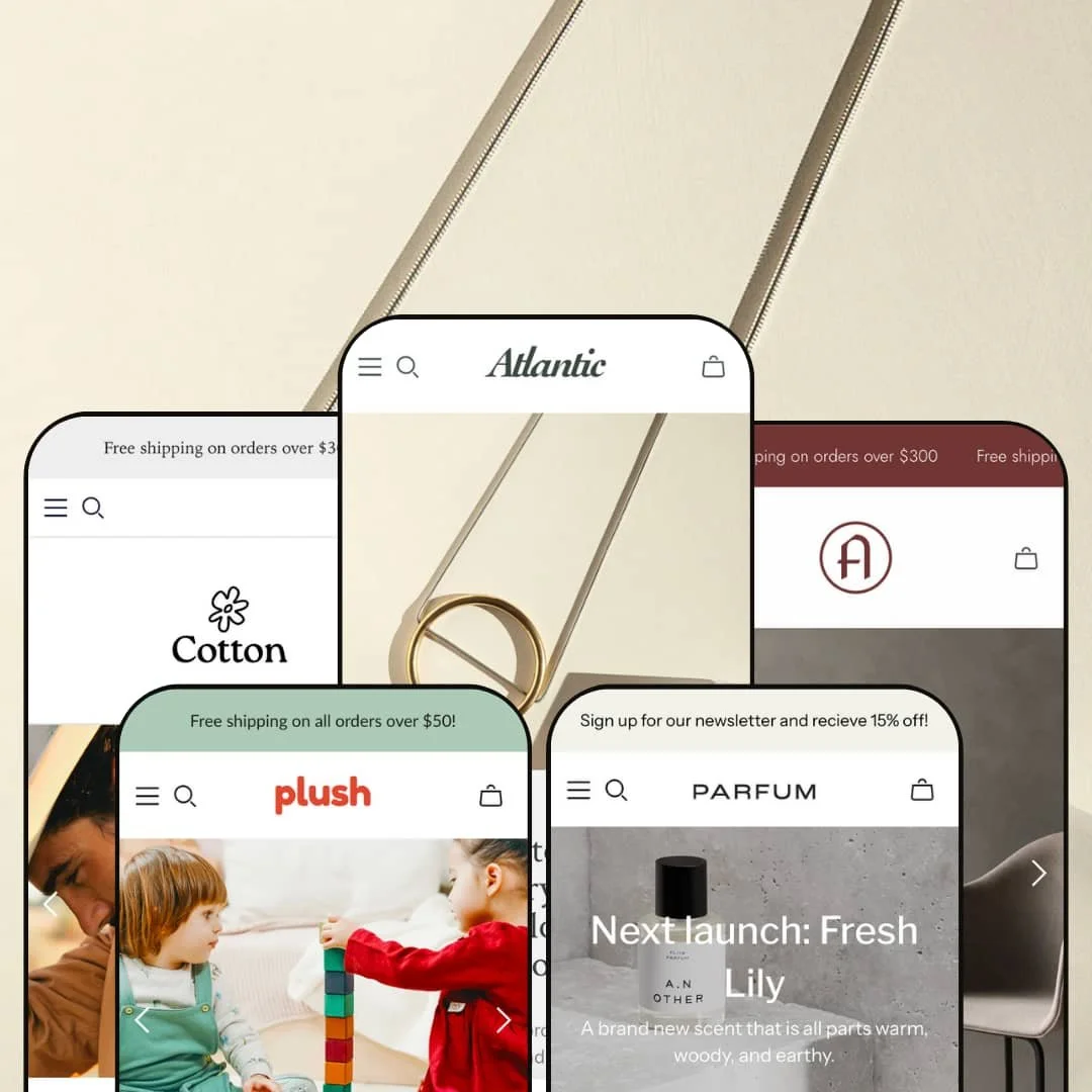
Atlantic is a polished Shopify theme that balances flexibility with a clear shopping focus. The demos deliver a strong first impression: large hero imagery with concise headlines sets the tone, while each preset’s color palette supports its product storytelling. Navigation is anchored by a sticky header and a mega menu that expose deep categories without overwhelming the page. Product grids lean on hover states and Quickshop overlays to keep shoppers on the current page while they explore variants, sizes, or quantities. Throughout the theme, a clear typographic hierarchy and ample white space make browsing feel calm but purposeful.
Pros.
〰️
Pros. 〰️
✚ Fast add‑to‑cart flows with Quickshop and cart drawer
Across the tested demos, Atlantic consistently leans on Quickshop overlays and a slide‑out cart drawer to keep shoppers in context while they add items. Instead of sending visitors straight to a full cart page, the theme lets them review product details in a modal, adjust quantities, and then see a compact drawer summary. This pattern reduces page loads and makes it easier for shoppers to build a basket without losing their place in a collection or story.
✚ Clear navigation with sticky headers and structured menus
The theme uses a sticky header and well‑structured menus so primary navigation is always within reach. In presets like Chic, Cotton and Atrium, multi‑column menu layouts break categories into understandable groups while still feeling visually light. For shoppers, this means fewer dead ends and a clearer mental map of where to go next, which is especially helpful when browsing on larger catalogs.
✚ Detailed product pages with variant support and supporting content
Across presets, product pages surface the essentials in a tidy, predictable layout: images, core details, price and options, followed by more detailed content. Where products have variants, selectors for size, material or volume sit near the main call to action so decisions feel straightforward. Supporting sections such as additional information, care details or related products extend the page without cluttering the primary purchase path, giving shoppers the depth they need when they want it.
✚ Helpful search and discovery patterns
Atlantic’s search experience supports discovery by pairing a search box with structured results pages. When a shopper commits to a query, results show as product grids with consistent styling and straightforward sorting options. Paired with clear category navigation, this helps visitors move from broad interest to specific items without feeling lost in the catalog.
✚ Polished error and empty states
The theme’s handling of edge cases like 404 pages, empty carts and no‑results searches is visually cohesive with the rest of the storefront. Messages are readable and on‑brand rather than generic system output. That coherence reduces the jarring feeling when a shopper hits a dead end and makes it more likely they will navigate back into the catalog instead of leaving entirely.
✚ Flexible presets, consistent core
Atlantic offers multiple presets that range from jewelry to toys, outerwear, fragrance and furniture, yet the underlying shopping patterns remain consistent. Each style changes palette, typography and imagery while still relying on the same cart, product and navigation mechanics, which makes it easier for merchants to switch aesthetics without retraining their customers. This combination of varied looks and a stable core experience is one of the theme’s more subtle strengths.
Cons.
〰️
Cons. 〰️
🚫 Limited use of rich media and motion
Across the demos, Atlantic leans almost entirely on static imagery and text. There are no video heroes or strongly animated sections showcased, which can make campaigns feel less dynamic than on themes that foreground motion. For merchants who want to tell product stories through video or rely heavily on animated merchandising, this may mean extra customization work.
🚫 Subtle Quickshop affordances
While Quickshop overlays are available, their visual affordances are relatively understated. Buttons and overlays tend to fade in gently on hover or appear only after a deliberate click. Shoppers who scroll quickly through a collection may not immediately realize that they can open a richer view without leaving the page, which reduces some of the potential efficiency advantage of the feature.
🚫 Campaigns may require more customization to feel bold
Because the theme’s defaults prioritize calm layouts and generous whitespace, high‑energy promotional campaigns do not jump off the page by default. Merchants who want loud sales events, heavy urgency cues or visually complex landing pages are likely to need additional design passes, custom sections or creative imagery to achieve that feel.
-
The Chic preset frames Atlantic as a home for fine jewelry and small accessories, using dramatic product photography against darker backgrounds to create a luxe, boutique feel. Typography is sharp and minimal, which lets metals, stones and details in the imagery carry most of the visual weight. The overall effect is that collections feel curated rather than crowded.
What works in this preset
Chic leans into high‑contrast hero sections, where jewelry pieces sit against deep backgrounds with restrained copy that feels more like a campaign tagline than a product pitch. This staging helps each launch or feature collection feel like a limited drop rather than just another row of products. The jewelry‑focused content also keeps copy short and evocative, which suits shoppers who are browsing for inspiration rather than ticking off a checklist of specifications. Across the homepage and story content, imagery and typography stay consistent, reinforcing a sense of brand cohesion that fits high‑end positioning.
Where it stumbles
In this preset, any drawbacks that show up tend to be shared across the theme rather than unique to Chic’s styling. The Chic demo itself doesn’t expose obvious preset‑specific weaknesses beyond those broader theme patterns.
-
The Plush preset reimagines Atlantic for children’s toys and puzzles, shifting the aesthetic toward soft pastels, rounded typography and playful imagery. Product cards and hero sections feel approachable and friendly, which mirrors how parents and gift‑givers browse for kids’ products. The tone of the layout is informal and warm rather than refined or editorial.
What works in this preset
Plush uses gentle colors and rounded type to make the storefront look safe and inviting, which is exactly what most toy and baby brands need. Products are photographed in a way that emphasizes texture and character, helping shoppers imagine how items will feel and be used in a home or playroom. Copy is kept short, and the layout gives products plenty of breathing room so that shoppers can quickly scan through options without feeling overwhelmed. Together, these choices make the catalog approachable even for visitors who don’t shop online frequently.
Where it stumbles
In the Plush demo, very few products expose complex options or configurations. Because most items are single‑variant toys or puzzles, it is hard to see how this preset would visually handle more advanced option sets such as sizes, bundles or customizations. That does not mean the theme cannot support them, but merchants with complex catalogs would need to test option‑heavy products themselves rather than relying on the demo for reassurance.
-
The Cotton preset adapts Atlantic for heritage outerwear and lifestyle products, trading in dark jewelry tones for muted earth colors and a more grounded, outdoorsy feel. serif headings and textured imagery hint at durability and craft. On the page, this creates a sense of warmth and reliability that suits brands focused on long‑lasting clothing and gear.
What works in this preset
Cotton leans on weathered textures, lifestyle shots and calm color choices to make the storefront feel like an established outfitter rather than a trend‑driven label. Headings use a more traditional type treatment, which reinforces the sense that these products are meant to last for seasons rather than a single trend cycle. The imagery focuses on context, showing blankets, jackets or accessories in use, helping shoppers imagine them in their own homes or trips. This combination makes it easier to tell a story about comfort and reliability without heavy descriptive copy.
Where it stumbles
The Cotton demo’s focus on classic styling and calm layouts can make the storefront feel slightly reserved. Merchants aiming for bold, fast‑fashion energy or highly promotional visuals might feel constrained by how understated the preset looks out of the box, even though that restraint is an advantage for heritage‑minded brands.
-
The Parfum preset repurposes Atlantic for fragrance and cosmetics, with a clean, minimal aesthetic that suggests purity and care. Hero sections use light backgrounds and delicate accent colors, while product photography focuses on bottles and ingredients. The overall feel is closer to a boutique perfume house or spa than a general beauty retailer.
What works in this preset
Parfum uses whitespace and restrained color to keep the focus firmly on product and story. Headlines and body copy are set with plenty of breathing room, which helps relatively small objects like fragrance bottles feel important on the page. A dedicated perfumer or story page deepens the narrative by introducing creators and scent profiles, giving shoppers a reason to linger and read rather than bouncing after a quick skim. The combination of light backgrounds and refined typography makes even simple product grids feel elevated.
Where it stumbles
Any shortcomings visible in Parfum are largely shared across the theme rather than stemming from this preset’s styling alone. The demo is tightly focused on a small range of fragrances, so merchants with more sprawling beauty assortments might not see their own complexity reflected here.
-
Atrium adapts Atlantic to modern furniture and home goods, using neutral color palettes and restrained typography to mirror the clean lines of contemporary interiors. Product photography emphasizes form and materials, with plenty of whitespace so individual items can stand out. The overall experience feels like browsing a curated design showroom rather than a general home store.
What works in this preset
Atrium’s strongest asset is how well the visual system matches a modern design brand. Category names such as Living, Dining and Furniture appear in a clear, structured navigation that echoes how shoppers think about furnishing a home. Product cards are spacious, with images that give room for textures like wood grain, fabric and metal finishes to be visible. The About page leans into visual storytelling about the brand’s design philosophy, supporting higher‑ticket purchases where trust and taste matter. Together, these choices make the store feel curated, which is important when asking shoppers to make expensive decisions online.
Where it stumbles
Because Atrium keeps its presentation deliberately minimal, a very large or highly promotional catalog could start to feel repetitive if every section leans on the same quiet layout. The preset is visually consistent, but that consistency can also limit how dramatic seasonal campaigns or bold promotions can look without additional customization.
Niche Suitability
Not Ideal For
-
Atlantic is best suited to brands that value a clean, structured shopping experience and want their imagery and products to do most of the talking. Jewelry, toys, apparel, fragrance and furniture merchants who resonate with the presets’ aesthetics can get a coherent, professional storefront without intensive setup.
-
Merchants who rely on heavy video storytelling, bold motion design or very aggressive promotional layouts may find Atlantic’s defaults too restrained. If your brand lives and dies on highly animated homepage experiences or complex, campaign‑specific layouts, a theme that foregrounds rich media out of the box might be a better starting point.
-
Low — Most of Atlantic’s value comes from its out‑of‑the‑box structure and presets rather than deep configuration. Merchants can achieve a coherent, professional storefront by choosing the right preset, supplying strong imagery and adjusting basic settings, reserving more advanced customization work for later.
Final Recommendation
Rating
★ 8.0/10
-
Supports Quickshop, cart drawer, structured menus and detailed product layouts; lacks rich media sections like video heroes or prominent animations.
8
-
Navigation, product pages and cart flows are predictable and consistent across presets, so both admins and shoppers face a short learning curve.
9
-
Core flows such as navigation, product viewing and cart drawer access translate cleanly to smaller screens, though interactions still lean on modals.
8
-
The demos feel responsive and fluid, with modals and carts opening quickly and without obvious lag.
8
-
Five presets cover several common verticals, but very bold or experimental branding will likely require custom imagery and some design tweaks.
7
FAQ
〰️
FAQ 〰️
-
👑 Atlantic’s presets are geared toward particular niches: Chic works well for jewelry and accessories; Plush leans into children’s toys and puzzles; Cotton targets apparel and lifestyle goods; Parfum suits fragrance and beauty; and Atrium aligns with furniture and home decor. Choosing the closest preset to your niche reduces the amount of design work needed.
-
📱The demos adapt layouts to smaller screens without breaking the shopping flow, keeping navigation, product information and cart access clear. Quickshop and cart drawer patterns remain available, so shoppers do not need to relearn how to move through the store on a phone.
-
🎨 Within each preset you can adjust colors, typography choices and imagery to match your brand, while still benefiting from the preset’s underlying layout decisions. Because the core structure is consistent, you can shift between aesthetics over time without rebuilding fundamental page templates.
-
⚡ In testing, page loads, Quickshop overlays and cart drawer interactions felt prompt and smooth. The relatively restrained use of heavy media helps keep perceived performance snappy even on pages with multiple sections.
-
👕 Where products include variants such as sizes, materials or volumes, selectors are surfaced near the main call to action on the product page and inside Quickshop. This keeps option choices closely tied to the decision to add an item, rather than burying them deeper in the layout.
-
🔎 Atlantic follows standard Shopify patterns for headings, copy and URLs, and its layouts give you room to add descriptive text to key pages. Blog content and structured product information can be surfaced without disrupting the core shopping path, which supports ongoing SEO work.
-
💱 Atlantic relies on Shopify’s standard Markets and translation features for language and currency support, so you configure those aspects in Shopify itself or via compatible apps. The theme’s layouts are neutral enough that translated text and localized prices can usually slot in without breaking the design.
-
⚙️ Because Atlantic builds on standard Shopify sections and cart behavior, most mainstream apps for reviews, upsells, translations and analytics should integrate cleanly. As with any theme, more complex apps that inject custom UI should be tested on a staging store before you go live.
-
🛒 You can explore live demos for each preset and install the theme in trial mode through the Shopify Theme Store. That trial setup lets you test the theme with your own products and settings before publishing it to your live storefront.
This review is based on hands‑on testing of the publicly available ‘Chic’, ‘Plush’, ‘Cotton’, ‘Parfum’ and ‘Atrium’ demos of the Atlantic Shopify theme as of 2025‑11‑23. Theme features, style availability, and performance can change with subsequent updates.