
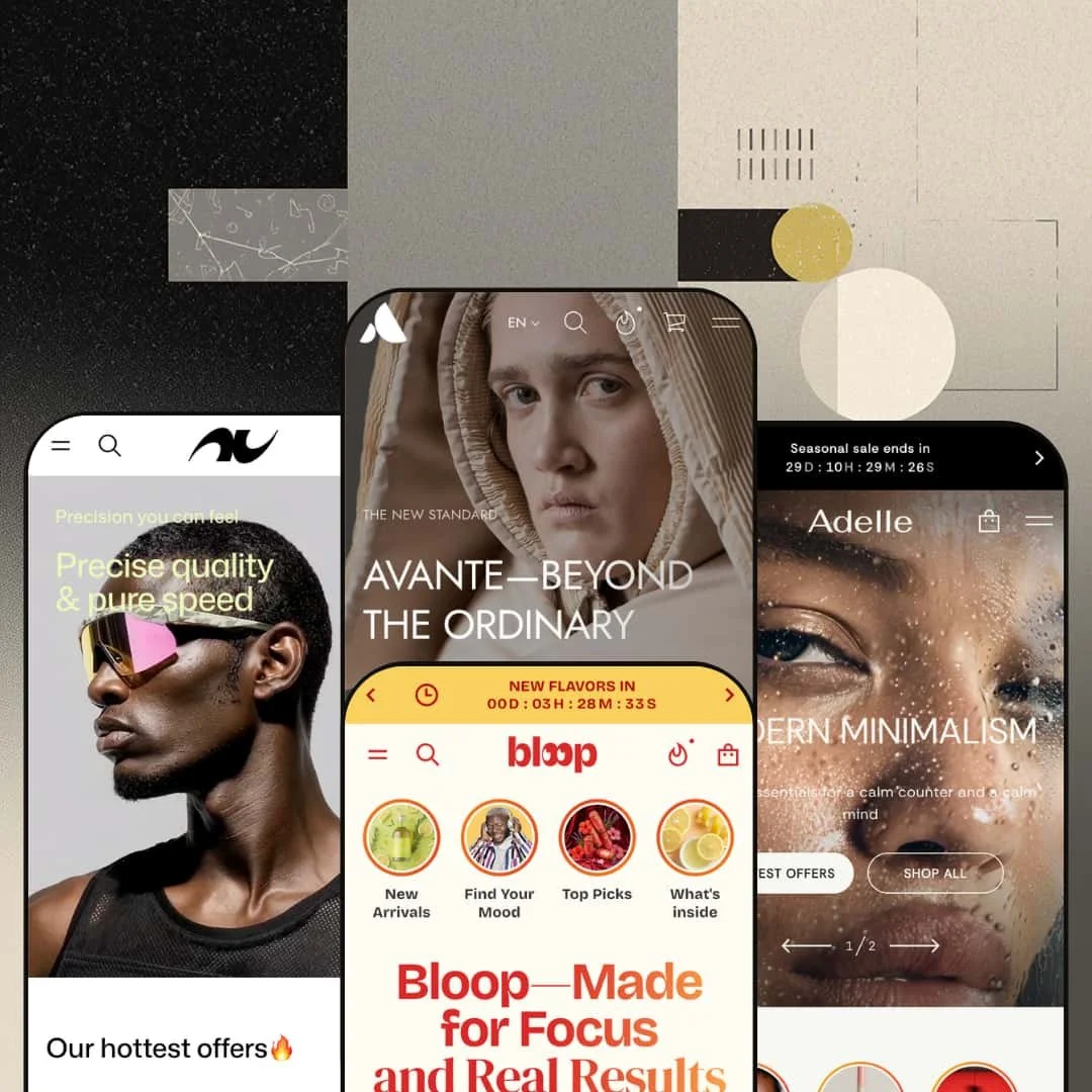
Most premium Shopify themes pick a vertical and commit. Avante does the opposite, shipping five finished storefronts that span, among others, avant-garde fashion, functional beverages, minimalist beauty, and performance sportswear, each with its own merchandising logic rather than a recolored hero. That breadth is the pitch and the risk: the real question is whether a theme built to be five things can still feel purpose-built for the one store you are launching. Built on Online Store 2.0 architecture, it leans on a deep, swappable section library to make that case.
One purchase, five working storefronts
Agencies and multi-brand operators are the obvious winners here. A single Avante license styles a fashion label, a beverage brand, a beauty line, and a sportswear store, and the demos prove each direction rather than gesturing at it: Bloop sorts by benefit and ingredient, Vortex sorts by tops, bottoms, and accessories with a size-led product page, and they read as different businesses instead of one business in four coats of paint. For a solo merchant still deciding how to position a new brand, that range doubles as a low-cost way to test which vertical's merchandising logic actually fits the catalog before committing to a build. It is breadth you can use.
A product page that adapts to what you sell
The product template carries variant-grouped galleries, tabbed information panels, and slots that change job by vertical. On Bloop that slot holds an ingredients-and-calories panel; on Vortex it holds a per-size measurement breakdown; on Adelle it holds a gift-package toggle and a colorway-grouped gallery that swaps imagery as you click each shade. For merchants with spec-driven or variant-heavy catalogs, apparel running color-by-size matrices, supplements that live or die on their ingredient story, that single template absorbs work you would otherwise stitch together from add-ons and custom code. That is the theme's strongest surface.
The urgency toolkit is already built in
Countdown timers, low-stock counters, pre-order states, promo tiles, and copy-to-clipboard discount codes ship as native sections and product states. Across the demos they are not decoration: Bloop runs a launch countdown above a copyable code, the fashion preset stages a 48-hour flash sale, and Vortex frames a hot-drops timer over its sale grid. For drop-driven and restock-driven brands, beverage labels timing flavor launches, apparel brands running limited race-day capsules, these levers are the difference between a static catalog and a store that manufactures deadlines. No extra cart app required.
Built to run as a brand publication
What if the storefront doubled as the brand's magazine? Avante is built for that. Every preset ships an events module with add-to-calendar, a press or featured-in wall, customer-story sections, and blog formats tuned to the vertical, recipes for Bloop, a Run Lab content hub with care guides and fabric science for Vortex. For community-led and content-marketing-heavy brands, run clubs, wellness lines with a point of view, the theme treats editorial as a first-class surface instead of an afterthought bolted under the product grid. That is rare. It rewards brands with something to say.
A generalist, not a specialist
The same range that sells Avante means no single preset arrives pre-tuned to a narrow operating model. A subscription-first beverage brand that wants native auto-replenish, or a wholesale-enabled operation that needs tiered B2B pricing surfaced on the page, will be adding that logic on top of a general-purpose section library rather than inheriting it. Flexibility cuts both ways. Buy this for breadth; if you want a theme that already thinks like your vertical, you will be doing some of that thinking yourself.
Native personalization has a hard ceiling
Vortex demonstrates custom product options with a file upload, pitched for printing a team or club logo onto a tank. But read the theme's own on-page note. Those options cannot change the price, and they cannot be tracked against inventory. A logo upload that can't charge for the logo is half a feature. For made-to-order and personalized-goods merchants, monogrammed accessories, engraved pieces, or limited custom runs that need a hard stock cap, that ceiling means the native tool only covers free, unlimited add-ons, and anything billable or quantity-limited has to move to a third-party app.
What it takes to launch
Plan a full imagery pass, because the demo visuals are AI-generated placeholders rather than reusable assets, plus a multi-section copy rewrite across the hero, story, events, testimonial, and press blocks, and per-product metafield population for whatever data your vertical needs, ingredient panels, size tables, or technology callouts. Budget extra time if you adopt the bundled European-language translations or restage the mega menu around your own category tree.
-
What works in this preset
Click into Avante and you land in a fashion editorial, not a shop grid. The product cards play transformation clips on the conceptual DZHUS catalog, lookbook and featured-piece sections carry the storytelling, and a season archive runs down the side like a magazine index. It reads like a runway brand. For a label that sells through image and narrative, the staging does the heavy lifting before a single price appears.
The mega menu carries image tiles across shop-by-color, shop-by-price, and shop-by-size, with a predictive search overlay sitting behind the header icon. Each dropdown previews the destination with a representative garment, so a shopper browsing by color sees the look rather than a text list. That visual navigation suits a catalog where the silhouette is the selling point.
Pre-order, sale, and last-chance badges stack cleanly on the cards without crowding the layout. On the product page, color swatches sit above a size selector, and the gallery opens into a lightbox for close inspection of cut and construction. It is a tidy variant experience for apparel that runs color and size together.
Where it stumbles
This preset is staged for a conceptual, gallery-led label, and it commits hard to that idea. For a high-volume, conversion-first apparel merchant working a large everyday catalog, the lookbook pacing reads more runway than store, and the long editorial passages slow the path to browsing. You would restage toward grid-first collections, shorten the storytelling, and give filtering the lead role this demo hands to editorial.
-
What works in this preset
Bloop is the preset that best shows how far the product page bends. I clicked into a can and found a full nutrition-style panel: an ingredients list, a volume figure, and a calorie range, sitting beside a low-stock note that read "Only 4 left in stock." A quantity stepper, a trust-badge row for claims like no artificial sweeteners, and a curated bundles section round out a page built for consumables. None of it feels bolted on.
A three-axis mega menu sorts the catalog by type, by benefit, and by ingredient, each axis fronted by a photographed tile. For a wellness brand whose buyers shop by outcome rather than category, that benefit-led entry point is the right default. The same image-rich treatment carries into the footer navigation.
The storytelling leans into wellness without feeling thin. A recipes blog turns products into cocktails, a founder quote anchors the brand, and an events module with add-to-calendar buttons promotes real-world activations like a skate competition. Short, confident, on-brand. It treats a drinks line as a lifestyle, which is exactly how that category sells.
Where it stumbles
The merchandising logic here is tuned to consumables that sell on claims: benefits, ingredients, formats. A food merchant outside that lane, a bakery or a packaged-snack brand, inherits slots built around benefit-and-ingredient sorting that map awkwardly onto their catalog. You would repurpose the shop-by-benefit and ingredient sections rather than use them as shipped, which is more reframing than a quick content swap.
-
What works in this preset
Adelle is the calm one. I scrolled past a before-and-after slider and a numbered morning-routine block that walks through cleanse, rinse, and pat with real instructional copy, then landed on a wall of customer quotes. The whole preset is paced for minimalist capsule beauty, where restraint is the brand. It looks expensive without trying hard.
Colorway-grouped galleries swap imagery as you select each shade, so a five-shade lip oil shows its own model and swatch per option instead of a generic stock photo. A gift-package toggle sits on the product page, and a low-stock line ("Only 10 left in stock") nudges without shouting. For shade-driven cosmetics, that per-variant media is the detail that converts.
Deep category nesting gives the menu real shape. Face opens into Radiance, Sets, and Accessories; Eyes, Cheeks, and Lips each branch the same way, so a tidy catalog still navigates with precision. It is a menu built for editing, not sprawl.
Where it stumbles
The pacing assumes a tightly edited, modest-SKU catalog. A large beauty retailer carrying hundreds of shades across many brands gets a layout that favors curation over dense browsing, and the demo puts hero storytelling well ahead of filtered grids. A deep catalog leans hard on the mega menu and collection filters, pressure Adelle's curated rhythm is not built to absorb, so that calm pacing becomes something you fight rather than inherit.
-
What works in this preset
Vortex opens with a scroll that behaves like a film reel. I scrolled and the hero advanced through four framed statements, precision, sharpness, pace, clarity, before the catalog appeared, each paired with motion and a runner mid-stride. A shop-the-look section then assembles full outfits, and a "Complete your gear" rail cross-sells with shoppable video reels. It sets a premium, kinetic tone immediately.
The product page pairs color swatches and sizes with a per-size measurement breakdown, listing chest ranges and fit notes for XS through L. A fourteen-image gallery regroups by colorway as you switch shades, so the violet, pink, and azure versions each show their own packshots and lifestyle frames. That is genuine variant merchandising, not a single photo with a dropdown.
Run Lab is the standout content move. I went looking for filler and found a care-and-washing guide instead, alongside run-club listings, a layering guide, fabric technology columns, and community events with add-to-calendar buttons. It is a content hub a real performance brand would actually maintain.
Where it stumbles
The whole preset assumes a single house brand with a manifesto. A multi-brand sporting-goods retailer reselling third-party labels inherits storytelling sections, Run Lab, fabric science, and a founder voice that all presume one owned brand. Carrying many brands means gutting or genericizing those sections, which strips out much of what makes the preset distinctive in the first place.
It is a reconfiguration engine, not a set of skins
Read the four demos side by side and the difference is in merchandising logic, not paint: benefit-and-ingredient sorting on Bloop, size-led browsing on Vortex, shade-grouped galleries on Adelle. The takeaway is that one section system was built to be re-pointed at genuinely different selling models, which takes real engineering, not a five-way palette swap. That adaptability, above any single feature, is what the price buys.
The demos commit to whole brands
Every preset arrives with named founders, press walls, events, content hubs, and written editorial rather than placeholder filler. The design philosophy is a believable brand on day zero, which means the demo functions as a working blueprint instead of a hollow shell. For a buyer evaluating fit, that completeness makes it easy to see exactly how the theme behaves under a real brand's weight.
Motion is treated as merchandising
Across presets, video is load-bearing: product cards autoplay clips, heroes are video, the product gallery interleaves motion, and shoppable reels sit beneath the listing. For brands whose products sell through movement, a fabric flexing, a liquid pouring, a product being applied, that consistency is genuinely useful, and it holds at a level of polish that is uncommon at this tier.
A shared spine underneath the variety
For all the vertical range, the section order repeats from preset to preset: hero, image-with-products, story, testimonials, events, press, newsletter. The contents differ; the running order rarely does. A merchant who wants a storefront that feels genuinely unlike the demo has to break that sequence, and reordering the page is real layout work, not a quick restyle within the existing flow.
Built for brands, not big catalogs
Every demo optimizes for a curated, story-first range with a modest SKU count. None model catalog operations at scale: thousand-SKU collections, faceted filtering, bulk merchandising. A retailer running a deep, multi-brand catalog gets a system whose center of gravity is the brand story, and will lean on Shopify's filtering and search far beyond what any demo demonstrates.
★ 8.0/10
Rating
-
Variant-grouped product pages, tabbed data slots that flex by vertical, a native urgency kit, and events and content modules give it unusual reach. The custom-options ceiling, no price change and no inventory tracking, is the one real gap.
9
-
A preset hands you a finished starting point, but the section density plus per-product metafield and mega-menu setup make for a genuine learning curve rather than a quick launch.
7
-
Image-rich slide-out menus, mobile-specific hero assets, and responsive product galleries carry across the presets, with the same variant-grouped media intact on smaller screens.
8
-
Media-heavy by design, autoplay card videos, video heroes, and shoppable reels, balanced by lazy-loading and webp assets; large catalogs will need deliberate restraint.
7
-
Five presets, a 45-plus-section library, colorway-grouped galleries, before-and-after sliders, and image hotspots cover a wide design range; the shared section order is the main limit.
9
Frequently Asked Questions
-
The sections are theme-wide, so any block from one preset can be dropped into another. Presets are starting points, not walled gardens, so you can pull Vortex's shop-the-look into a Bloop-style layout if you want a hybrid.
-
Pick the preset whose sorting logic matches your catalog, then restyle. A supplement brand is closest to Bloop, since the benefit-and-ingredient slots and the nutrition-style product panel already map to how those products sell.
-
Yes. The Bloop demo assembles curated sets and mix-packs from grouped products, and that section logic carries to any preset, so a brand selling kits or starter sets can build simple bundles without a dedicated bundling app.
-
The media is heavy by design, but it is lazy-loaded and served as webp, so the bigger variable is your own additions. On large collections, trim card-level videos and keep heroes to a single clip.
-
Built in. Size information lives in the product tabs as an editable breakdown, so you populate the measurements per product rather than installing a separate size-chart tool.
-
It ships pre-translated interface strings for five European languages (English, French, Italian, German, Spanish) plus right-to-left support. Your actual product and page copy is translated through Shopify's own localization, not the theme.
This review is based on hands-on testing of the publicly available preset demos of the Avante Shopify theme as of June 2026. Theme features, preset availability, and performance can change with subsequent updates from the theme developer.