
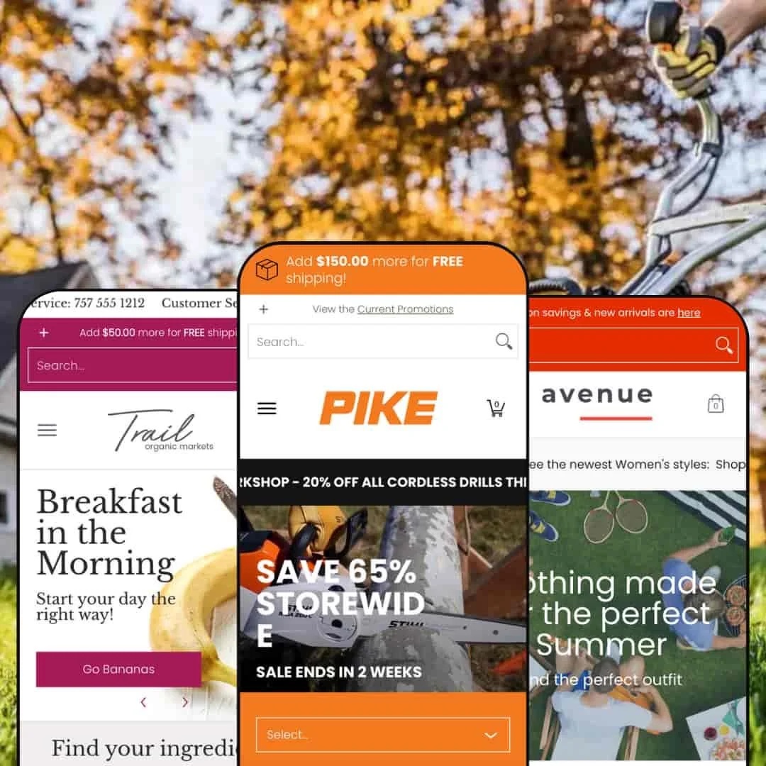
Avenue is a feature-rich Shopify theme designed for stores with large product catalogs that need strong product discovery, thoughtful merchandising, and clear organization. Built by Red Plug Design Co., this $380 theme is positioned for merchants who sell many SKUs and need to guide shoppers quickly to the right item. It ships with three presets aimed at different industries: Default (fashion and accessories), Pike (hardware and industrial equipment), and Trail (fresh food and grocery). Each preset shows how Avenue can adapt its tone, layout, and merchandising for a specific vertical without changing the underlying structure of the store.
Pros.
〰️
Pros. 〰️
✚ Comparison and decision support
Avenue encourages informed choice for high-consideration items. Shoppers can mark items for head-to-head evaluation and view a comparison-style breakdown that highlights meaningful differences. That kind of guided decision flow is especially useful for technical products where a small spec difference (bar size, engine output, run time) can change the purchase.
✚ Conversion-focused merchandising
The theme does not just list products; it actively sells them. Fashion-style “Shop the Look” hotspots invite multi-item outfits. Countdown-style promo messaging frames discounts as time-sensitive. Testimonial panels, sourcing callouts, and cart messages that nudge higher order values work together with VIP-style newsletter framing to build trust and push basket size without feeling purely transactional.
✚ Industry range without custom development
Avenue shows three very different storefront personalities — fashion boutique, industrial tool counter, neighborhood grocer — without breaking its core structure. That range matters for merchants who don’t want to hire a developer for a ground-up redesign just to speak to a different audience. You can start from the preset closest to your market and then tweak rather than rebuild.
✚ Responsive feel and interactive feedback
During testing, image swaps on color selection happened instantly and navigation between category groupings felt smooth. Page-to-page transitions felt quick and did not stall or flicker. That immediacy makes the store feel modern and reduces the “click, wait, reload, repeat” rhythm that can frustrate mobile shoppers.
Cons.
〰️
Cons. 〰️
− Quick Shop inconsistency
In the Default fashion preset, the Quick Shop button behaved poorly. Instead of opening a focused product modal or letting shoppers add right away, it snapped back to the page top and forced a full product page visit. Pike, by contrast, surfaced clearer “Add to Cart,” “Pre-Order,” or “Sold Out” states. That inconsistency means merchants may need to audit and adjust the Quick Shop experience after install.
− Setup and catalog prep
Avenue’s strongest tricks rely on clean product data. Comparison-style buying, spec-driven presentation, and cart incentive messaging all assume well-structured tags, metafields, and inventory states. Merchants with sloppy product data will have to do real housekeeping before the theme can shine.
− Density on small screens
When Avenue leans into deep technical detail, the result can feel busy on a phone. Long stacks of spec options and many near-similar SKUs demand careful scrolling and accurate tapping on mobile. Casual shoppers may get tired before they reach Add to Cart, especially in heavy industrial catalogs.
-
The Default preset presents Avenue as a fashion storefront. The styling centers on lifestyle photography, outfit storytelling, and gendered merchandising for men’s and women’s collections. It feels like an apparel boutique that wants you to complete an entire look, not just buy one SKU.
What works in this preset
The most striking element is the “Shop the Look” presentation. Full-bleed lifestyle photos include multiple interactive hotspots so a shopper can explore an entire outfit directly on the image and pick pieces one by one. This creates a styled editorial moment instead of a plain grid, and it encourages multi-item baskets because the shopper is nudged to buy the whole ensemble rather than a single shirt.
The homepage merchandising is split very deliberately by audience. Women’s categories and Men’s categories are surfaced in organized blocks, and each block is further broken into focused product groupings like Tanks, Dresses, Sunglasses, T-Shirts, and Shorts. This layout gives both audiences real above-the-fold attention, which is useful for fashion retailers that serve multiple genders and don’t want one side of the catalog buried under the other.
Color-driven variant shopping is woven directly into the product cards. Shoppers can click through up to seven swatches and watch the featured image update instantly to match the selected color. For apparel and accessories, that instant visual confirmation reduces friction because you don’t have to open a product page just to see if the bag or tank top comes in the shade you prefer. It lets shoppers browse options with far less back-and-forth.
-
The Pike preset reframes Avenue as an industrial equipment catalog. The tone is practical and professional: safety boots, chainsaws, pro-use gear, and replacement parts are surfaced like mission-critical tools. Instead of lifestyle outfits, Pike leans into category authority and technical clarity.
What works in this preset
Pike’s homepage and collection structure read like an equipment showroom for serious buyers. Categories such as chainsaws, kits, boots, rescue gear, and accessories are presented in a way that feels organized for working professionals, not casual hobbyists. The interface leans on clear product naming and real-world use cases (Farm & Ranch, Professional, Rescue), so a shopper can immediately self-identify with a use scenario and move toward the right class of tool without guessing.
Navigation for browsing product families feels intentional. Pike uses a horizontal set of category circles with previous and next controls so shoppers can flip through related equipment types without scrolling a giant wall of content. For an industrial or hardware merchant with many near-identical SKUs, this keeps the catalog scannable instead of overwhelming and helps customers stay oriented inside a dense tool lineup.
Where it stumbles
The preset throws a huge amount of technical detail at the shopper. Multiple specification groupings such as engine power, bar size, and run time get surfaced at once, which is great for professionals who know exactly what they’re comparing but can be intimidating for casual buyers. That intensity becomes even harder on a phone, because long stacks of options and spec labels demand a lot of vertical scrolling and precision tapping on smaller screens. Casual shoppers can feel overloaded before they ever reach Add to Cart.
-
The Trail preset shifts Avenue into grocery and fresh food. The tone is friendly and local: produce, meat, seafood, and bakery items are framed around freshness, sourcing, and service. Instead of specs or outfits, the message is trust, quality, and availability.
What works in this preset
Trail uses customer service and human contact as part of the selling story. A real phone number sits right in the header, which implies accountability for freshness, sourcing, or substitutions. That approach matters in food, where shoppers care whether the salmon is good today, not just whether the store “offers seafood.” It creates a sense that there’s someone you can call if a question comes up about quality.
Trail leans on social proof and sourcing credibility instead of tech specs. Testimonial callouts praise service, pricing, and store quality. Dedicated blocks for meat, seafood, fruit, and vegetables underline freshness and origin, and that framing reassures shoppers who care about quality and sourcing rather than brand names. The tone is “we’re proud of what we stock,” not “we’re running a warehouse.”
Where it stumbles
Trail’s homepage surfaces only a small slice of actual inventory. Featured products stop after a handful of items, then push you to click through for the rest. That works for scarcity-driven bakery drops, but it can slow down discovery if a shopper wants to fill an entire cart from one screen and would prefer to see more items immediately.
Pricing communication for food could be clearer. Items are sometimes presented with “From” pricing without obvious unit context (per pound, per piece, etc.), which matters a lot in fresh grocery. A shopper comparing tomatoes or salmon may want to understand price per kilogram before adding anything to cart.
Niche Suitability
Not Ideal For
-
Avenue is best for merchants with large assortments — fashion labels with seasonal drops in many colors, hard goods sellers with spec-driven SKUs, and specialty grocers with rotating fresh stock. If you need to guide shoppers toward the right item instead of hoping they scroll endlessly, Avenue fits that job.
-
Stores built around a single hero product or a tiny lineup may not benefit from Avenue’s depth. If your winning story is “one product, one landing page, buy now,” the extra merchandising layers, comparison flows, and cart incentives can feel like overhead rather than leverage.
-
Medium: Avenue can look polished quickly, but its best moments — guided discovery, comparison flows, urgency messages, cart progress prompts — depend on accurate product tags, thoughtful collections, and consistent availability states. Expect to invest time in catalog structure and merchandising before you publish.
Final Recommendation
★ 7.8/10
Rating
-
Product comparison tools provide advanced functionality. Quick Shop issues in the Default demo prevent a perfect score.
8
-
The interface is feature-rich and requires a learning curve for both merchants and customers. Setup complexity is balanced by intuitive navigation once configured properly.
7
-
Touch interactions such as swatch selection and basic add-to-cart flows work smoothly on a phone, though dense option stacks may require extra scrolling on smaller screens.
7
-
Page transitions felt smooth, and variant image changes happened quickly. Interactive elements responded promptly during testing with minimal loading delays.
8
-
Three dramatically different presets demonstrate exceptional versatility. The theme adapts from fashion retail to technical equipment to grocery store aesthetics while maintaining functional consistency.
9
FAQ
〰️
FAQ 〰️
-
👑 Yes. The Default preset is built around styled outfits, color swatch previews, and gender-specific merchandising blocks that surface women’s and men’s products side by side.
-
📱Core interactions such as swatch selection, navigation, and basic add-to-cart flows worked smoothly on a phone during testing. Dense option stacks can still require extra scrolling on smaller screens, especially in technical catalogs.
-
🎨 The three presets show radically different personalities — boutique fashion, pro hardware, and neighborhood grocer. That range suggests strong flexibility in typography, color, iconography, and homepage block order without needing custom development.
-
⚡ During testing, product images swapped instantly when a new color was selected, and navigating between category groupings felt fast. Page-to-page movement did not stall or flicker.
-
👕 Yes. Variant-aware buttons surface states like Add to Cart, Pre-Order, or Sold Out, and swatches on product cards let shoppers preview different colors or options before clicking through.
-
🔎 Avenue follows Shopify’s standard SEO structure and encourages logical collection hierarchies, breadcrumb-style navigation, and clear category naming. That organization helps search engines understand the catalog.
-
💱 In testing, language and currency selectors appeared in the header, which shows that storefronts can present shoppers with localized choices directly in the chrome.
-
⚙️ Yes. Avenue leaves visual space for app-driven enhancements such as loyalty blocks, reviews, upsell widgets, or similar add-ons without shattering the core layout. Its modular sections make it straightforward to slot in extra functionality.
-
🛒 Yes. You can explore live demos for the Default, Pike, and Trail presets through the Shopify Theme Store before you buy, which lets you test navigation, merchandising, and cart behavior against your own use case.
This review is based on hands-on testing of the publicly available “Default”, “Pike”, and “Trail” preset demos of the Avenue Shopify theme as of October 29, 2025. Theme features, preset availability, and performance can change with subsequent updates from the theme developer.