
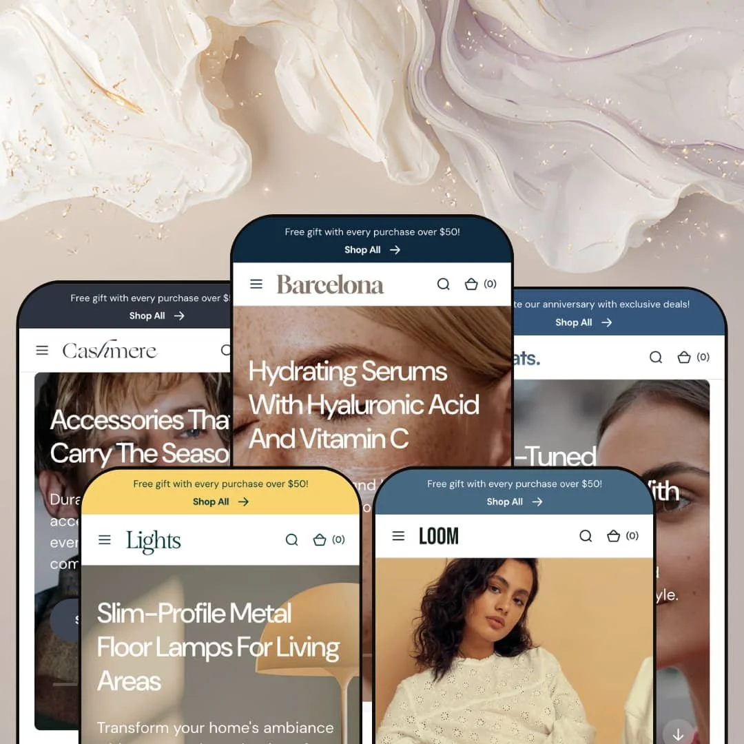
Most premium themes pick one industry and build everything around it. Barcelona goes the other way, shipping five fully-staged presets that sell beauty, apparel, cashmere accessories, designer lighting, and audio gear from a single Online Store 2.0 codebase. I clicked through all five before forming an opinion, and the throughline is unmistakable: this is a visual-merchandising theme first, with the storefront treated like a styled magazine spread. Whether that range is worth $380 comes down entirely to how many of those storefronts you will actually use.
Five storefronts, one purchase
Agencies and multi-brand operators are the obvious winners here. Barcelona ships five presets that sell beauty, apparel, cashmere accessories, designer lighting, and audio gear, each with its own navigation, collection taxonomy, and demo voice. For a multi-brand operator or an agency spinning up several client stores across unrelated categories, one license quietly covers briefs that would otherwise mean buying three or four separate themes. The range is the real headline.
A real light and dark switch
A light/dark toggle sits in the header on every preset, not buried in a settings panel. Shoppers flip the whole storefront between schemes, and the theme keeps both versions properly styled rather than just inverting colors. For electronics or jewelry sellers whose considered-purchase buyers browse long evening sessions on a phone, a genuine dark mode is a comfort feature rather than a gimmick. I clicked it on every demo. It holds up.
A merchandising kit, not a single trick
The section library is where the premium price starts to make sense. Beyond the usual heroes and carousels, the theme ships a before/after image slider, image hotspots and product markers, a Compare section, and a countdown, all available to every preset as a coordinated merchandising kit. For a considered-purchase catalog of roughly 20 to 200 SKUs in beauty, lighting, or audio, that range means most visual-selling moves are already in the section picker instead of bolted on later. You build with parts, not plugins.
Navigation and footer pull their weight
The header and footer are treated as selling space, not chrome. A dual mega-menu pairs an image-led product menu with a sections-and-pages menu, a multi-message announcement bar rotates promos up top, and the footer stacks newsletter, currency- and language-selector UI, and payment and social rows. For a catalog-heavy store running deep menus and several customer-facing policies, both ends of the page stay organized instead of turning into link soup. The product-tile menu is the standout. It pushes featured items straight from the nav.
Those five-star quotes aren't reviews
Every preset features a testimonials block with star ratings, names, faces, and glowing one-liners. It looks like a review system. It isn't. Those entries are editorial content the merchant types in, with a flat 5.00 and no review count or verified badge anywhere, and collecting real customer feedback still means installing an app such as Judge.me, Loox, or Yotpo. For a lighting or audio merchant whose considered-purchase buyers scan review counts before committing to a $300 order, that styled social proof can promise confidence the store cannot yet back up.
Premium sticker, but the commerce add-ons are still apps
At $380, Barcelona sits in premium territory, and it earns that on presentation rather than commerce machinery. Wishlists, subscriptions, loyalty, and bundle logic are not in the box; they remain apps in any theme, this one included. For a subscription-driven beauty brand or a repeat-buyer wellness store counting on recurring billing and saved favorites, the theme dresses the storefront beautifully but leaves the retention layer to add-ons you budget separately. Map your app stack first.
The demos are heavy, and weight has a price
Polish here means volume. The beauty and apparel homepages stack a dozen or more full-width sections before the footer: multiple sliders, several product carousels, an Instagram grid, big lifestyle photography. Lazy-loading helps, but for a merchant on a mid-tier plan whose impulse-buy shoppers arrive mostly on phones over patchy mobile data, the default layouts will need section trimming and image compression to stay quick. Beautiful is not the same as fast.
What it takes to launch
Plan a multi-day content pass before launch: rewrite hero captions, the brand-story section, FAQ entries, and journal posts in your own voice, and swap every demo image, since the presets borrow photography licensed from real brands. Populate product fields and metafields so the Compare section and product tabs render with real data, clear the demo's placeholder section headings, and set currency and promotional badges to match your market. Multi-region sellers should budget extra time to translate the interface strings.
-
What works in this preset
Opening the beauty storefront, the first thing I noticed was restraint. Generous whitespace, soft photography, and a calm three-slide hero set a spa-like tone that suits skincare and wellness without straining for it. A numbered brand-story section then walks the visitor from origin to mission in four tidy steps, which is a smart way to build trust for ingredient-led products that live or die on credibility. It feels considered.
A featured "Item of the Week" block anchors the page with a multi-image gallery, a quantity picker, and a live stock count reading nine in stock. For a small skincare or makeup catalog leaning on a hero product and repeat-buyer regulars, that single-product spotlight gives one SKU the room to sell itself properly. The grid around it stays clean.
-
What works in this preset
Color swatches sit right on the product cards here. Browsing the apparel storefront, each tile surfaces its named options (black, brown, beige) so shoppers register variant choice before they ever open a product, which matters in fashion where the first decision is usually about color. Split-panel hero imagery gives the page a lookbook feel from the top.
A "shop the look" lookbook bundles complete outfits and links each piece back to its product page, which is exactly the kind of cross-sell a seasonal apparel catalog wants. For a seasonal womenswear label with cross-shopping buyers who add several items per order, that styled-outfit section nudges basket size in the right direction. It earns its place.
Where it stumbles
Fit is everything here. There is no dedicated size-guide module in the theme, so a clothing merchant has to build size charts and fit notes into product tabs or a custom block, because the demo stages neither on its own. For a sizing-sensitive womenswear catalog with return-wary first-time buyers, that gap is worth planning around early.
-
What works in this preset
This is where the theme's premium instincts show clearest. The cashmere storefront carries higher price points (stoles and throws between roughly $165 and $310) inside a calm, uncluttered grid that lets each piece breathe, and the restraint reads as expensive in precisely the way a luxury accessories brand needs. Named-color options appear on every card. Nothing shouts.
Tight collection naming (scarves, stoles, throws, accessories) keeps a catalog of near-identical items easy to navigate. For a luxury-accessories seller with a focused range and considered, gift-driven buyers, that clear taxonomy does quiet work in helping someone find the right weight and weave. The whole thing feels intentional.
Where it stumbles
The grid flattens texture. Cashmere pieces look alike at thumbnail size, and lifestyle imagery alone will not tell a fine merino from a heavier lambswool, which is the exact distinction a considered buyer is paying for. The theme leans on product tabs to carry material and care detail; the demo does not foreground them, so that texture storytelling becomes the merchant's job before launch. For a quality-led luxury catalog with considered, repeat buyers, that detail work is not optional.
-
What works in this preset
The lighting preset opens with a three-slide hero and a clean collection grid split into ceiling, table, and floor. It is the most home-and-interiors of the five, and the airy presentation flatters sculptural objects whose appeal is largely visual, with higher-ticket fixtures (some past $600) given the space they deserve. Color options ride along on the cards too.
Picture a lamp glowing in a styled room rather than floating on a white background. A "gallery of inspirations" lookbook leans into that room-context imagery, which is how lighting actually sells. For a home-and-decor catalog with design-conscious buyers planning a room rather than grabbing an impulse buy, seeing a fixture in a real setting does far more than a studio shot could. Context is the pitch.
-
What works in this preset
A short product video does the talking on the audio storefront. Rather than a static banner, the preset drops in a looping clip of the gear in use, which is a strong fit for headphones and speakers that gain from a sense of motion and scale. The cards suit electronics. Their dark-mode look flatters glossy, blacked-out gadgets.
New-in and bestseller carousels rotate fresh and proven gear into view, and a benefit-icon row spells out shipping and returns up front. For an electronics seller whose comparison-heavy, deal-seeking buyers chase the latest drop, those rows keep launches and markdowns visible without manual merchandising every week. The page stays busy in a good way.
Where it stumbles
I went looking for spec tables and found mood instead. The audio preset merchandises gadgets the way the other presets merchandise fashion: lifestyle imagery, a hero video, and a single short blurb per product, when electronics buyers usually decide on numbers like drivers, codecs, and battery life. The theme has the parts for that, namely product tabs and the Compare section, but the demo foregrounds none of them, so a specs-driven audio merchant has real reframing to do before launch. That mismatch is the catch.
The component quality survives every category
Read the five presets back to back and the same building blocks (hero, collection carousel, testimonials, footer) hold their finish whether they are selling fifteen-dollar lip balm or six-hundred-dollar floor lamps. Nothing looks cheaper when the catalog changes. That consistency is the clearest argument that this is a mature, well-kept theme rather than a pretty one-off.
A point of view it commits to
Across every storefront the theme makes the same bet: lifestyle imagery, generous whitespace, and editorial pacing over dense data and tables. You only see that identity clearly once the same DNA shows up in skincare, knitwear, lighting, and headphones alike. That focus is a feature.
It scales down as cleanly as it scales up
The section count is yours to set. A tiny boutique can run a four-section homepage; a broad catalog can run fourteen, and both read intentional because the same library bends to either ambition. For a one-product brand and a multi-collection retailer alike, the theme rarely feels too big or too thin.
A house style you can't fully escape
The strength has a shadow. The brand-story block, the benefit-icon row, and the Instagram collage recur in nearly the same positions in every preset, so by the second storefront the rhythm feels familiar. A brand chasing a layout that looks like no one else's will find the theme's strong personality pushing back.
A curated front door, standard rooms behind it
The center of gravity is the homepage. Collection and filtering depth is Shopify's baseline, not a place the theme invests, so a large, filter-dependent catalog gets a gorgeous entrance and conventional navigation once shoppers go deeper. The theme rewards curation far more than it rewards browsing a long tail.
Breadth is the product, so single-vertical buyers overpay
Breadth is the bet. The premium price buys range and polish, not one category-defining feature, and if you will only ever run one of the five storefronts, you are paying for four you will never touch while a cheaper single-purpose theme might serve that one vertical just as well. The math only really works when the range is the point.
★ 8.2/10
Rating
-
A deep, theme-wide section set (before/after, hotspots, Compare, countdown, lookbook, featured product) plus a light/dark system and pre-translated EU interface strings (EN, FR, IT, DE, ES); reviews, wishlists, and subscriptions stay app-side.
9
-
The Online Store 2.0 editor and fully-built presets give a strong starting point, though the sheer number of sections to configure means a real learning curve before a store feels finished.
8
-
Responsive across all five presets with a slide-out cart and a stacked mobile menu; the same media density that shapes desktop will need trimming to feel light on phones.
8
-
Lazy-loading is in place, but long, image-rich, carousel-heavy homepages mean speed depends on disciplined section trimming and compressed assets.
7
-
Five presets, a light/dark system, and a broad section library flex across very different catalogs, as long as you stay inside the theme's lifestyle-led visual language.
9
Frequently Asked Questions
-
Start from the closest catalog shape, not the closest industry. A jewelry label, for instance, sits comfortably on Cashmere's accessory grid or Barcelona's beauty layout, since both handle small, image-led products well.
-
No. It is part of the theme's color-scheme system; you style both schemes once and the header switch appears for shoppers automatically.
-
Yes. The slideshow and the split-screen slideshow are both sections you can place, reorder, or swap, so different pages can open differently.
-
No. The imagery and product copy are demo content, much of it licensed from real brands, and you replace all of it with your own before launch.
-
Only if you reproduce the demo's volume of copy, collections, and imagery. The preset is a fully-dressed example, not a shortcut around the content work.
-
No. It is a merchandising section you populate through product fields and metafields; it presents the data you give it rather than generating comparisons on its own.
This review is based on hands-on testing of the publicly available preset demos of the Barcelona Shopify theme as of June 24 2026. Theme features, preset availability, and performance can change with subsequent updates from the theme developer.