
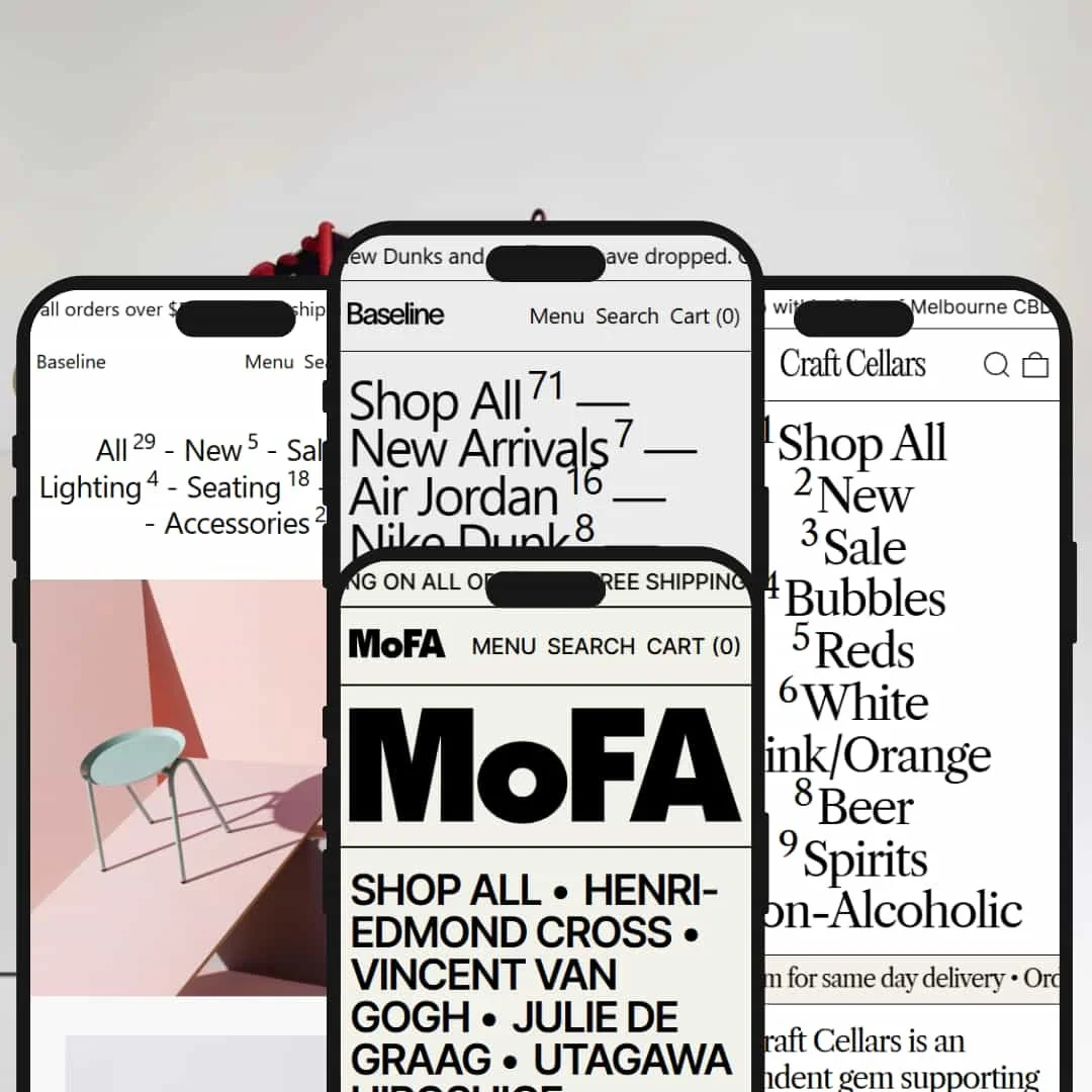
Baseline is a typography-focused Shopify theme that brings brutalist-influenced design to commerce. Built by Switch Themes, it delivers a modular approach to storefronts through blocks, grids, and confident type. The theme costs $360 and ships with four presets that show range across different retail contexts.
During testing, Baseline stood out for visual storytelling: spacious layouts, oversized type, and clear content hierarchy guide shoppers to the next action. Core capabilities—cart drawer, product recommendations, blog pages, breadcrumbs, and variant handling—were consistent across the demos while each preset staged them differently to match brand voice.
Pros.
〰️
Pros. 〰️
✚ Flexible presets, consistent core
flexible preset options that maintain core functionality while offering distinct aesthetic approaches. Each demo re-stages the same building blocks, so merchants can explore styles without sacrificing the familiar product page, cart drawer, or content patterns. That consistency shortens onboarding for teams and keeps shopper behavior predictable.
✚ Typography-first storytelling
Large, legible type and generous spacing make messages clear, fast. Headlines and hero paragraphs carry brand voice without clogging the layout, which helps brand-led stores differentiate while staying usable.
✚ Clean product pages and cart flow
Left-aligned galleries with a focused details column keep pages scannable. The cart opens in a drawer, quantities adjust in place, and recommendations sit where shoppers expect them. The flow reduces context switching and keeps momentum.
✚ Modular sections and content blocks
Hero messages, featured collections, testimonials, and blog previews slot in as needed. Merchants can compose pages like spreads—no custom code required—so campaigns and seasonal pivots stay lightweight.
✚ Documentation and support
Clear theme docs and responsive support make setup smoother. Merchant feedback consistently highlights helpful guidance, which lowers the barrier for non-developers.
Cons.
〰️
Cons. 〰️
− Product density trade-off
Big type and spacious blocks look premium, yet fewer items appear per screen. Catalogs that rely on high tile counts will need careful curation and navigation aids.
− Typography intensity in certain presets
When every element shouts, some shoppers tune out. Brands should temper casing, size, and pacing to avoid fatigue on long pages.
− Setup time for convenience features
Out of the box, some conveniences are staged conservatively. Expect to spend time tailoring header behavior, menus, and card interactions to match your audience’s habits.
-
A streetwear-leaning composition that blends editorial copy with product grids and light motion, creating a curated feel without clutter. The opening statement sets a voice, then hands off to featured products and content.
What works in this preset
The text-forward hero sets expectations in seconds. Leading with a clear paragraph gives new visitors a reason to care, and the surrounding white space makes the message easy to scan. For brands with a point of view, this staging feels natural and trustworthy.
A horizontal product-name marquee adds pace. The ticker introduces motion without demanding clicks, which helps pull the eye down the page. By the time shoppers reach the first grid, they have already sampled the catalog language and are primed to browse.
Social proof and content land cleanly. A three-up testimonial block humanizes the store, while a blog preview tees up deeper reading. Together they add credibility and give returning visitors something fresh to engage with beyond the grid.
Where it stumbles
Hover states are intentionally subtle. The cards look calm, yet that restraint can make interactivity less obvious to fast scrollers. Some shoppers may miss that every tile is clickable and rely on text links instead.
Large text blocks reduce above-the-fold density. The opening copy reads well, but it pushes product tiles down for first-time visitors who arrive to buy fast. Brands should balance the hero length with their audience’s browsing habits.
-
A curation-first layout that foregrounds brand values and featured collections. The page flows from layered announcements to an introductory statement, then into hero imagery and a clear “On Sale” spotlight.
What works in this preset
Two announcement bars give space for both offer and mission. Used together, they let merchants separate a short-term promo from a long-term story. The effect feels crafted rather than noisy.
The brand statement earns attention before the first grid. It frames the catalog through provenance and taste, which suits specialty food and beverage. Shoppers understand the promise before they compare bottles.
Featured collection blocks act as anchors. Large imagery with direct calls to action keeps the page skimmable, while the sale section creates an obvious place for deal-seekers to land. The rhythm alternates nicely between copy and product.
Where it stumbles
The opening copy can delay product discovery for decisive buyers. When the message runs long, items drop below the first scroll and impulse clicks slow down. Edit ruthlessly for clarity.
Spacing is generous, which trims visible inventory on each screen. It looks premium, yet some shoppers will scroll more to reach what they want. That trade-off should be intentional.
-
A minimal, gallery-calm presentation that lets materials and form do the talking. It opens with restrained copy, then moves into generous product imagery and a hero feature block.
What works in this preset
White space is the design. Objects feel considered, and the pauses between blocks make details pop. For home goods and furniture, that calm helps items feel substantial.
A hero feature section spotlights a single product with room to breathe. The image scales large, the description reads like a note from the designer, and the call-to-action is unmistakable. It is an elegant way to create a “campaign” moment without code.
Category marquees add gentle motion. They preview range without overwhelming the page, and they keep the minimalist pacing intact. The effect is museum-quiet rather than kinetic.
Where it stumbles
Minimalism cuts both ways. With fewer tiles visible per screen, first-time visitors may need an extra scroll to grasp breadth. Merchants should curate the first grid carefully.
Large hero blocks can push routine content down. When everything is big, nothing is urgent; consider shortening copy on returning-visitor paths.
-
A bold, type-driven canvas that reads like a gallery poster wall. All-caps banners, oversized artist names, and confident copy set a clear curatorial stance.
What works in this preset
The scrolling text banner makes an immediate statement. It establishes tone in a single line and keeps energy high without distracting interaction. It feels editorial rather than salesy.
“New Additions” treats names as design. The typography itself becomes the hook, so listings feel like headlines rather than labels. For art and books, that move fits the medium.
Content blocks and featured collections break the type with imagery at the right moments. The page never loses its graphic spine, yet shoppers still get strong visual anchors. The balance keeps attention moving.
Where it stumbles
Typography intensity can overwhelm text-averse shoppers. If visitors expect large imagery first, the wall of type may slow them down. Merchants should tune sizes and casing for approachability.
Product density is intentionally low. The aesthetic breathes, but fewer items show per screen. Plan navigation and linking to help explorers jump faster.
Niche Suitability
Not Ideal For
-
Fashion and footwear, home decor and furniture, craft beverage, art and books, and creative studios selling physical goods. Brands that care about voice and storytelling will get the most from Baseline’s composition tools.
-
Very large catalogs that prize maximum grid density on every screen, or stores whose audiences expect image-first, low-copy experiences out of the gate.
-
Medium — The section-based editor keeps layout changes approachable, but dialing typography, navigation, and content pacing to your audience takes thoughtful setup and testing.
Final Recommendation
★ 8.2/10
Rating
-
Cart drawer, recommendations, blogs, breadcrumbs, and variant handling are implemented cleanly. Core interactions feel steady across presets and keep shoppers in flow.
8
-
The section-based editor makes layout and content updates straightforward. Documentation is clear and support is responsive. Expect some learning curve while shaping navigation and header behavior to taste.
8
-
Responsive layouts held up during testing. Menus, product pages, and the cart drawer behaved predictably on small screens, with smooth gestures and readable type.
8
-
Pages loaded quickly and interactive elements responded without lag. Horizontal marquees and transitions ran smoothly during typical browse-add-checkout paths.
8
-
Four distinct presets plus granular control over typography, spacing, color, and blocks provide visual range. Merchants can adapt the same core structure to very different brand personalities.
9
FAQ
〰️
FAQ 〰️
-
👑 Yes. The Default preset shows how a text-forward hero, light motion, and social proof can frame limited drops. Product pages handled size options cleanly, and the cart drawer kept the flow uninterrupted.
-
📱Yes. Layouts adapt cleanly to small screens, with readable type, a reliable cart drawer, and predictable navigation. Header behavior can be tuned in settings to match audience expectations.
-
🎨 Very. The four presets demonstrate range, and the section-based editor lets you adjust typography, spacing, and content blocks without code. Most visual changes are point-and-click.
-
⚡ In testing, pages felt quick and interactions were immediate. Cart, animations, and page transitions stayed smooth even on long homepages.
-
👕 Yes. We observed dropdowns for sizes and bundles, plus color swatches where appropriate. Selected variants and prices updated clearly, and the cart drawer displayed choices without confusion.
-
🔎 Baseline includes blog functionality with clean article layouts and breadcrumb navigation that clarifies structure. Standard Shopify SEO fields—titles, descriptions, alt text—remain accessible in the admin.
-
💱 Yes. Baseline works with Shopify Markets for multi-language and multi-currency. Selectors can be enabled via Shopify settings or apps, and the theme accommodates them within its layouts.
-
⚙️ Yes. Built on Online Store 2.0, it supports app blocks and embeds. Reviews, wishlists, and chat tools slot into pages without custom code.
-
🛒 Yes. You can install and customize it in an unlimited free trial, then pay the one-time $360 when you go live.
This review is based on hands-on testing of the publicly available “Default,” “Editorial,” “Austere,” and “Brutalist” preset demos of the Baseline Shopify theme as of October 24, 2025. Theme features, preset availability, and performance can change with subsequent updates from the theme developer.