
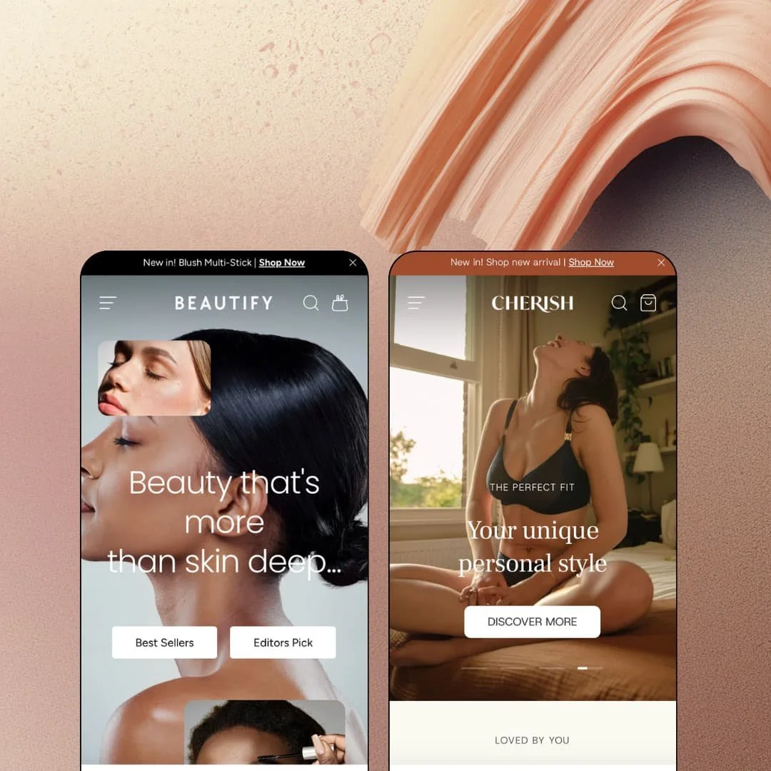
Most beauty themes treat shade selection as a swatch-colour problem. Beautify treats it as a catalog-architecture problem, linking separate products into one listing so each lipstick shade keeps its own page, imagery and inventory while presenting as a single swatch row. That decision shapes everything else in this $430, two-preset theme from Clean Canvas, for better on the product page and for worse on the collection grid. It runs on Online Store 2.0 with section groups rather than nested theme blocks, and the developer has said in its own documentation that this is a deliberate choice.
One listing, many products
Beautify links separate products into one swatch group: the Creme Lipstick exists as nine products (Berry Red, True Cherry Red, Dark Plum Mauve and so on), and each card shows all nine as a swatch row while linking to its own URL. Each shade is its own product. That means each keeps its own images, stock and sale state, so Classic Red can sit at £24 on sale while Berry Red stays at £35 without a shared listing dragging either one along. For cosmetics brands running 20 to 80 shades with per-shade photography and a considered-purchase buyer who wants to see the exact tone, this is the feature the theme was built around.
The menu sells before the page does
The mega menu carries three block families: link columns, image promo tiles and live product cards. Cherish's Briefs tab runs three link columns (Brief Style, Cherish Favourites, Collection) beside two image tiles for High Waisted and Thongs, and its Bras tab splits into Non Wired, Wired and T-Shirt sub-tabs, each staging product cards with price and rating line. Two hovers, one product. For intimates and apparel brands with 100 to 300 SKUs organised by construction type and a repeat buyer who already knows her style, the menu removes a collection page from the path.
Video where the doubt is
What convinces someone to buy a bra they can't try on? Cherish answers with a five-clip "Social proof" video row placed between the buy box and the description accordion, each clip with its own pause and mute control, and the same section type carries a brand film on the homepage. It's a theme section, not an embed hack. For DTC brands with a creator or UGC pipeline selling considered-purchase items like foundation or fitted underwear, it puts the persuasion asset at the moment of hesitation instead of on a separate page.
A cart drawer that keeps selling
Dawn's cart drawer shows line items, a note field and a checkout button, and that's the whole surface. Beautify's drawer adds a "You might like" rail beneath the order summary; in Cherish it opens with an editorial image tile and a line of copy, then four product cards with quick-shop triggers. The rail is configurable per preset. For impulse-buy categories with sub-$40 add-ons (briefs, brushes, lip liners) and a 30 to 80 SKU catalog where cross-sell depth matters, that's the last upsell before checkout, handled inside the theme.
Combined listings multiply your catalog
Every colour is a product. The flip side of one-listing-many-products is that collections fill with siblings: Cherish's Bras collection reports 29 items, the first page shows Stretch Full Cover Bra four times in four colours and Lift Balcony Bra three times, and the Colour filter counts Pink at nine. That's clutter dressed as choice. For apparel or cosmetics merchants with 200+ SKUs whose review counts, inventory reporting and collection sorting all assume one product per style, this architecture means either restructuring the catalog around it or accepting grids that repeat.
Online Store 2.0 by choice, at a 2025 launch price
Beautify shipped in July 2025 on the Online Store 2.0 section-and-block model, and Clean Canvas states in its own support documentation that it does not intend to rebuild its themes in a nested-blocks fashion. That's a defensible editing philosophy. At $430, though, agencies and holding-company operators running several storefronts who have standardised on Horizon-era nested composition and AI block generation will find sections with fixed block types and roughly two nesting levels, so custom seasonal landing pages route through the developer's section library or through code.
Two presets, two body-adjacent verticals
Cosmetics and intimates share a vocabulary: shade, undertone, cup, fit, before-and-after, quiz. Beautify knows who it's for. A home-goods or electronics merchant buying at this price gets a beauty theme they'll spend a week stripping back, with swatch rows designed for undertone codes, a shade-finder quiz template and before/after sliders that have nowhere to go. For furniture or gadget brands with spec-driven products, 50 to 500 SKUs and comparison-shopping buyers, there's little here that speaks to how their customers decide.
What it takes to launch
Expect two to three days: a copy and imagery pass across a section-dense homepage in either preset, product-linking work to configure combined listings and swatch metafields, quiz-flow authoring, size-chart content, and for EU merchants a review of the shipped translation strings.
-
What works in this preset
I opened the Shop menu expecting a link list and got a merchandising surface instead. The Cosmetics tab stages live product tiles for the New In collection, each carrying its undertone-coded swatch row (Alabaster C, Ivory NC, Vanilla CW) before you've reached a collection page, and a Shade Finder entry sits in the same menu rather than in the footer. A shopper who knows her undertone can shortlist from the nav. That's a smart place to put a quiz link.
The before/after slider sits mid-homepage under a "Better with Beautify" heading with a drag handle, and directly below it a countdown block runs a "Body Glow coming soon" pre-order push with day, hour, minute and second cells and a Pre-order button. Both are theme sections. Together they hand a launch-driven cosmetics line two conversion devices without an app install, which matters for brands that live on drop cadence.
"Crease-resistant." "Natural sun-kissed glow." Every product card carries a one-line subtitle under the name, and the demo uses it for benefit copy rather than SKU codes. Combined with badge stacking (New arrival plus Editors Pick on the same card), the grid reads like a beauty counter rather than an inventory list. I spent time in the Get the Look section, which tabs Face, Lips and Eyes with two products per tab; it's a lookbook that doesn't need a lookbook photo.
Where it stumbles
The preset stages colour cosmetics almost exclusively: lips, eyes, face, brushes. Skincare merchants, the second half of the theme's stated audience, get no staged routine-builder page or ingredient-led product presentation in this demo, so they'll be assembling that story from the generic section library rather than copying a template. The tools are there; the example isn't.
-
What works in this preset
Intimates are a sizing problem before they're a style problem, and Cherish is built around that. The featured-product section on the homepage opens a size guide in place, tabbed into band and cup tables with a fit-tip line and a contact link, so the sizing conversation happens before the shopper commits to a product page. Sizes run XS to XXL as buttons with colour buttons beside them. Nothing hides behind a click.
The homepage runs a four-slide hero with a kicker, heading and single CTA per slide, then alternates commerce blocks with editorial devices: a headline with product thumbnails set inline between the words, a looping Cherish wordmark band, and two collection tiles whose titles scroll as a ticker with a cup-range subtitle underneath. It's a lot of motion. None of it fights the photography because the palette stays to blush, sage and navy.
I scrolled the Bralette 2 Pack page from top to bottom. A Staff Favorite badge, a one-line tagline and three icon bullets (Soft & Breathable, Flattering Fit, Organic Material) sit above the buy box, description and key features fold into accordions below it, and a sticky bar tracks the chosen size and colour as you move down toward the recommendations rail. The page has a spine. For a $36 two-pack that's the right amount of persuasion.
Where it stumbles
Cherish is sold as the clothing preset, but everything staged is underwear and sleepwear. A general apparel merchant will find a mega menu whose depth is organised around bra construction (non-wired, wired, T-shirt), collection tiles built on cup ranges and a Fit Finder tuned to band and cup measurement, with no staged outfit grouping or seasonal edit page to copy from. The fashion positioning is a promise the demo doesn't cash.
Guided selling runs through every template
Both presets route a quiz into the header menu, the footer's Help column, a homepage banner, the product page foot and the collection page foot. Shade Finder in one, Fit Finder in the other. A shopper who doesn't know what to buy is never more than one screen from being asked. That consistency is what separates Beautify from a section library with a quiz bolted on.
Editorial pacing between commerce blocks
Read both homepages in sequence and the rhythm is identical: product rail, editorial device, product rail. Marquee text bands, wordmark loops, headlines with images set between the words, a draggable comparison slider. The devices vary, the cadence doesn't. It keeps a long page from reading like a warehouse aisle, and it's the theme's real design signature rather than any single section.
Card density defaults to busy
In both presets the default product card carries a stacked badge pair, a swatch row (nine chips on a lipstick), a rating line, the name, a variant subtitle and a price, and that anatomy repeats on the homepage, inside the menu and in the cart drawer. On a 30-SKU boutique that's rich. On a 300-SKU grid the merchant will be turning elements off rather than on, and the demos give no example of the quieter version.
A thin public track record for the ask
Fourteen months after launch the Theme Store shows 83% positive across six reviews, five positive and one negative; the negative concerns translations, and the developer replied that translations aren't theme-related. I don't read that as a warning. I read it as too little data to lean on either way, and at $430 a buyer would reasonably want more than six data points before committing.
★ 7.4/10
Rating
-
Combined listings, quiz sections, video rows, countdown with pre-order state and in-menu product cards all ship inside the theme; the review widget under the product tabs is app territory.
8
-
Section-and-block editing is familiar and well documented, but combined-listing setup and quiz authoring are multi-step jobs a merchant won't finish in an afternoon.
7
-
Collection pages offer a one- or two-column layout toggle, the sticky variant bar follows the buy box, and the menu collapses into a tabbed drawer with sub-tabs intact.
8
-
Product and collection pages run lean; both homepages carry hero slideshows, looping marquees, video and a countdown, which is a lot to ask of a first paint.
7
-
The section library is deep and the two presets show real range within a beauty vocabulary; outside that vocabulary the defaults push back.
7
Frequently Asked Questions
-
No. Shopify's version is a Plus-only app; Beautify's links ordinary products at theme level and works on any plan, but the siblings stay separate products in search and collections.
-
Not necessarily. The demos mix text chips with uploaded swatch graphics; Cherish uses small composite images for two-colour multipacks while the cosmetics preset relies on labelled text chips.
-
The rating line on cards and the review placement under the product accordions are theme layout; the review widget itself, with its rating breakdown and "Write a review" link, comes from an app.
-
The Cherish demo paginates (page 1 of 3 on Bras); infinite scroll is a listed theme option, so it's a setting rather than a limitation.
-
The theme changes the card badge and button state (Body Glow and Classic Boxer are both tagged Pre-order in the demos) and pairs it with a countdown; deposits or delayed charging still need an app.
-
English, French, Italian, German and Spanish strings ship in the box; the Cherish demo exposes four of them in its region and language selector alongside five regions.
This review is based on hands-on testing of the publicly available preset demos of the Beautify Shopify theme as of September 24 2026. Theme features, preset availability, and performance can change with subsequent updates from the theme developer.