
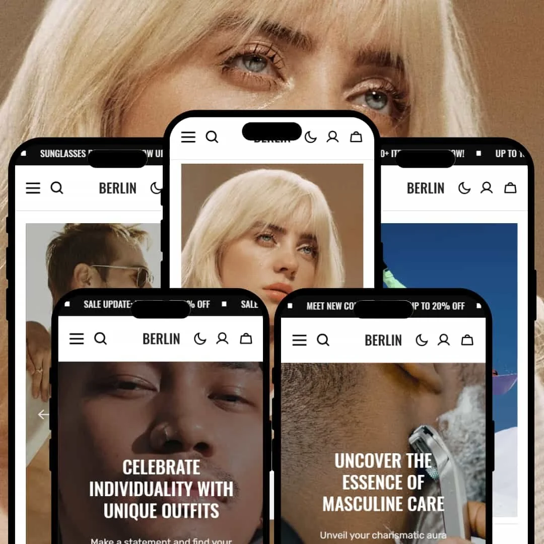
The Berlin Shopify theme is a visually-driven and highly polished theme designed for brands that prioritize storytelling and high-quality imagery. With five distinct presets, it offers a versatile foundation that can be adapted to niches ranging from streetwear to high fashion and even digital products. Its core design philosophy revolves around clean lines, editorial layouts, and impactful visuals, making it a strong choice for stores aiming for a premium, modern aesthetic.
Pros.
〰️
Pros. 〰️
✚ Excellent Visual Merchandising Tools: The theme provides built-in features like "Shop the Look" image hotspots and consistently implemented Quick View modals. This allows brands to sell a lifestyle, not just products, which can directly increase AOV and customer engagement.
✚ Powerful Navigation & Discovery: A well-implemented mega menu allows large-catalog stores to create clear, visually-rich navigation paths. This streamlines the user journey from the homepage, which can lower bounce rates.
✚ Built-in Conversion Optimization Tools: Features like accordion tabs for detailed product info, visible in-stock counters, and high-visibility countdown timers are available across the theme. These tools help answer customer questions and create urgency, which can improve conversion rates.
✚ Unified, Premium Design Language: Across all presets, the theme’s animations, typography hierarchy, and generous spacing work in concert to create a cohesive, high-end feel. This consistent quality enhances brand perception and can support premium pricing.
Cons.
〰️
Cons. 〰️
− The Minimalist Trap: This is the theme's core strategic weakness. Its clean, editorial aesthetic is beautiful in demos but is entirely dependent on professional, high-quality photography and a strong brand identity. Merchants without these assets will find their sites look empty and unprofessional, making this a high-risk choice for brands on a budget.
− Underdeveloped Content & Discovery Features: For a theme that excels at presentation, its underlying discovery tools are basic. The blog templates are simplistic, and collection page filters are text-only, lacking visual options like color swatches. This can create friction for users trying to browse large catalogs.
− Hidden Capabilities Require Merchant Discovery: While powerful, some of the theme's features, like color swatches, are not demonstrated in the live demos. This requires merchants to explore the theme editor deeply to unlock its full power, which could be a hurdle for less experienced users.
-
The Berlin preset is tailored for modern apparel and lifestyle brands that need a clean, grid-based layout to showcase their collections effectively.
⊕ Pros
✚ Balanced Asymmetrical Grid: The homepage layout skillfully balances a clean grid with asymmetrical elements. This creates a visually interesting flow that draws the eye across different products and collections without feeling cluttered, perfect for showcasing hero pieces.
✚ Clear Call-to-Action Hierarchy: From the bold hero button to the "Shop Best Sellers" links, the preset establishes a clear path for the user. It effectively guides new visitors toward key shopping areas, which can help reduce bounce rates.
✚ "Comfortable" and Professional Feel: The preset's combination of ample white space, clean lines, and high-quality typography creates a sense of professionalism and trust. It feels established and confident, which supports premium pricing.
⊖ Cons
− Heavily Reliant on Photography Style: The minimal layout requires a very consistent and professional photography style. If a merchant's product shots vary in lighting, background, or quality, the grid's clean aesthetic will be immediately compromised.
− Lacks a Strong "Wow" Factor: While clean and professional, the Berlin preset is arguably the "safest" of the five. It lacks a standout, unique design feature and could be perceived as generic without strong brand assets to make it memorable.
-
The Slope preset is engineered for outdoor gear, sportswear, and adventure-focused brands, using bold, high-impact visuals to create an energetic and immersive feel.
⊕ Pros
✚ Impactful Visual Storytelling: The homepage excels at telling a brand story through its layout. It seamlessly integrates large-format images and videos with product grids, perfect for brands that sell a lifestyle, not just a product, which can boost brand affinity.
✚ Action-Oriented Design: The preset uses bold fonts, high-contrast colors, and dynamic layouts that create a sense of energy and movement. This aesthetic perfectly matches the high-performance nature of sportswear and adventure gear.
✚ Prominent Feature Highlights: The design provides ample space for large icons and text to highlight key product features like waterproofing or durability. This helps communicate value for technical products and builds purchase confidence.
⊖ Cons
− Product Details are Buried: On product pages, critical specifications are often housed in accordion tabs below the fold. This requires shoppers to scroll and click to find vital information, adding friction to the buying process and potentially increasing page exits.
− Can Feel Overwhelming: The bold, high-energy design can be overwhelming for brands with a more subtle or minimalist aesthetic. The layout is opinionated and doesn't easily lend itself to a quiet, understated brand identity.
-
The Lens preset is a masterclass in minimalist, editorial design. It is perfectly sculpted for high-fashion, eyewear, jewelry, and luxury accessory brands where the product is a work of art.
⊕ Pros
✚ Elegant Editorial Layout: The preset uses generous white space, asymmetrical grids, and sophisticated typography to create a true lookbook feel. This elevates brand perception and justifies premium price points.
✚ Focus on Brand Narrative: The layout is masterfully designed for brand storytelling. The "About Us" and mission sections are treated as core design elements, allowing brands to forge a strong connection with customers.
✚ Immersive, Distraction-Free Browse: With its minimal navigation and focus on visuals, the preset creates an immersive shopping experience. It encourages unhurried exploration, which is ideal for luxury goods where consideration times are longer.
⊖ Cons
− Absolutely Requires Professional Assets: This is not a suggestion; it's a requirement. The design's minimalism will expose any flaws in photography or branding, making it unsuitable for stores without a significant budget for visual assets.
− Low-Contrast Text (Staging Issue): In the demo, the choice of light grey text over light backgrounds results in poor readability and potential accessibility issues. Merchants must be diligent in selecting colors to ensure their site is legible.
− Subtle Navigation: The minimalist header can make navigation feel hidden to less tech-savvy users. The lack of traditional, bold menu links could lead to frustration and a higher bounce rate for some demographics.
-
The Shave preset is designed for efficiency and clarity, catering to men's grooming, cosmetics, and wellness brands with a wide range of products.
⊕ Pros
✚ Conversion-Focused Homepage Grid: The layout prioritizes getting users to products quickly. A tight grid for best sellers and collections is placed high on the page, reducing clicks and immediately presenting the product range.
✚ Clear, No-Nonsense Product Display: The design avoids unnecessary flair, focusing instead on presenting products, prices, and "Add to Cart" buttons clearly. This straightforward approach is effective for utility-driven products where customers value efficiency.
✚ Masculine & Trustworthy Aesthetic: The use of a darker color palette, strong fonts, and a structured layout creates a sense of trust and authority. It’s a design that aligns well with the target demographic for men's grooming and wellness.
⊖ Cons
− Visually Uninspired Design: Compared to the other presets, Shave's design feels more conventional and template-like. It lacks the "wow" factor of Lens or Slope, relying more on functionality than a unique visual identity.
− Dense Mobile View: While efficient on desktop, the tight product grid can feel dense and require significant scrolling on mobile screens. This may lead to Browse fatigue for users on smaller devices.
-
The Stereo preset is uniquely crafted for music, vinyl records, art prints, and other creative or digital products, with a design that emphasizes discovery and artist branding.
⊕ Pros
✚ Perfect for Media & Creative Products: The layout is built around showcasing cover art, making it ideal for selling vinyl, books, digital downloads, or posters. It puts the creative work front and center, which is exactly what fans and collectors want to see.
✚ Engaging Genre-Based Discovery: The homepage features visually-driven sections for different genres, allowing users to dive into their specific interests immediately. This is far more engaging than a simple text menu and encourages deeper site exploration.
✚ Atmospheric Dark Mode Design: The dark aesthetic feels modern and immersive, creating a perfect mood for Browse music or art. It makes colorful album art and product images pop, enhancing the perceived quality of the products.
⊖ Cons
− Niche Rigidity: The design is so specifically tailored to media products that it would be very difficult to adapt for other industries, like apparel or home goods. Its inflexibility is its greatest weakness for any store outside its target niche.
− Low-Contrast Fonts (Staging Issue): As staged in the demo, some of the thin, light-colored fonts on the dark background can be difficult to read. Merchants must carefully select font weights and colors to ensure accessibility.
Niche Suitability
Not Ideal For
Final Recommendation
-
This theme is perfect for design-conscious brands in fashion, accessories, outdoor gear, and creative industries that have a strong visual identity and professional photography. Merchants who want to build an immersive, editorial-style experience will find Berlin to be an exceptional tool.
-
Bargain-focused retailers, dropshippers with inconsistent product images, and service-based businesses should probably avoid this theme. Its reliance on premium aesthetics makes it a poor fit for brands competing on price, and its layout is not optimized for text-heavy service descriptions.
-
High. To achieve the polished look of the demos, merchants will need to invest significant time and resources in creating high-quality photography, compelling brand copy, and a cohesive design strategy. This is not a "plug-and-play" theme for beginners.
★ 8.0/10
Rating
-
The theme includes powerful built-in features like mega menus and a consistent quick view. It presents Shopify's standard features well, though advanced filter types depend on app configuration.
8
-
For the end-user, it's very intuitive. For the merchant, achieving the demo's polish requires a steep learning curve and high-quality assets.
7
-
The theme is fluid and fast on mobile. Large tap targets and a clean slide-out cart make for an excellent mobile shopping experience across all presets.
9
-
Based on perceived speed, interactive elements like modals and drawers load instantly, and page transitions feel smooth and responsive during hands-on testing.
9
-
While the presets are distinct, they all share a core minimalist DNA. The theme is highly flexible within its modern, editorial style but would be difficult to force into a completely different aesthetic.
7
FAQ
〰️
FAQ 〰️
-
👑 Yes, it's exceptionally well-suited for apparel, especially the Berlin, Lens, and Slope presets, which are designed for fashion and lifestyle branding.
-
📱Absolutely. Testing revealed a consistently smooth and intuitive mobile experience with a responsive design and fast-loading interactive elements.
-
🎨 It's highly customizable for brands that fit its modern aesthetic. You have full control over colors, typography, and layouts, but it's difficult to stray from its core minimalist design.
-
⚡Performance is a key strength. In hands-on testing, pages loaded quickly, and interactive features like the quick-view modals and slide-out cart were instant and lag-free.
-
👕Yes. The theme supports color swatches and dropdown menus for variants. The Stereo preset, in particular, shows how well it can handle complex variants for products like vinyl records.
-
🔎 The theme follows Shopify's standard SEO best practices for page titles, meta descriptions, and alt text. No advanced or unique SEO tools are built-in.
-
💱Yes, a language and currency switcher was visible and functional in the demo, allowing merchants to use Shopify Markets for international selling.
-
⚙️ Yes, as a modern Shopify theme, it's designed to be compatible with the vast majority of apps on the Shopify App Store for added functionality.
-
🛒 Yes, you can add the Berlin theme to your Shopify store and customize it with your own products for free. You only pay if you decide to publish it.
Disclaimer: This review is based on hands-on testing of the publicly available "Berlin", "Slope", "Lens", "Shave", and "Stereo" preset demos of the Berlin Shopify theme as of July 4, 2025. Theme features, preset availability, and performance can change with subsequent updates from the theme developer.