
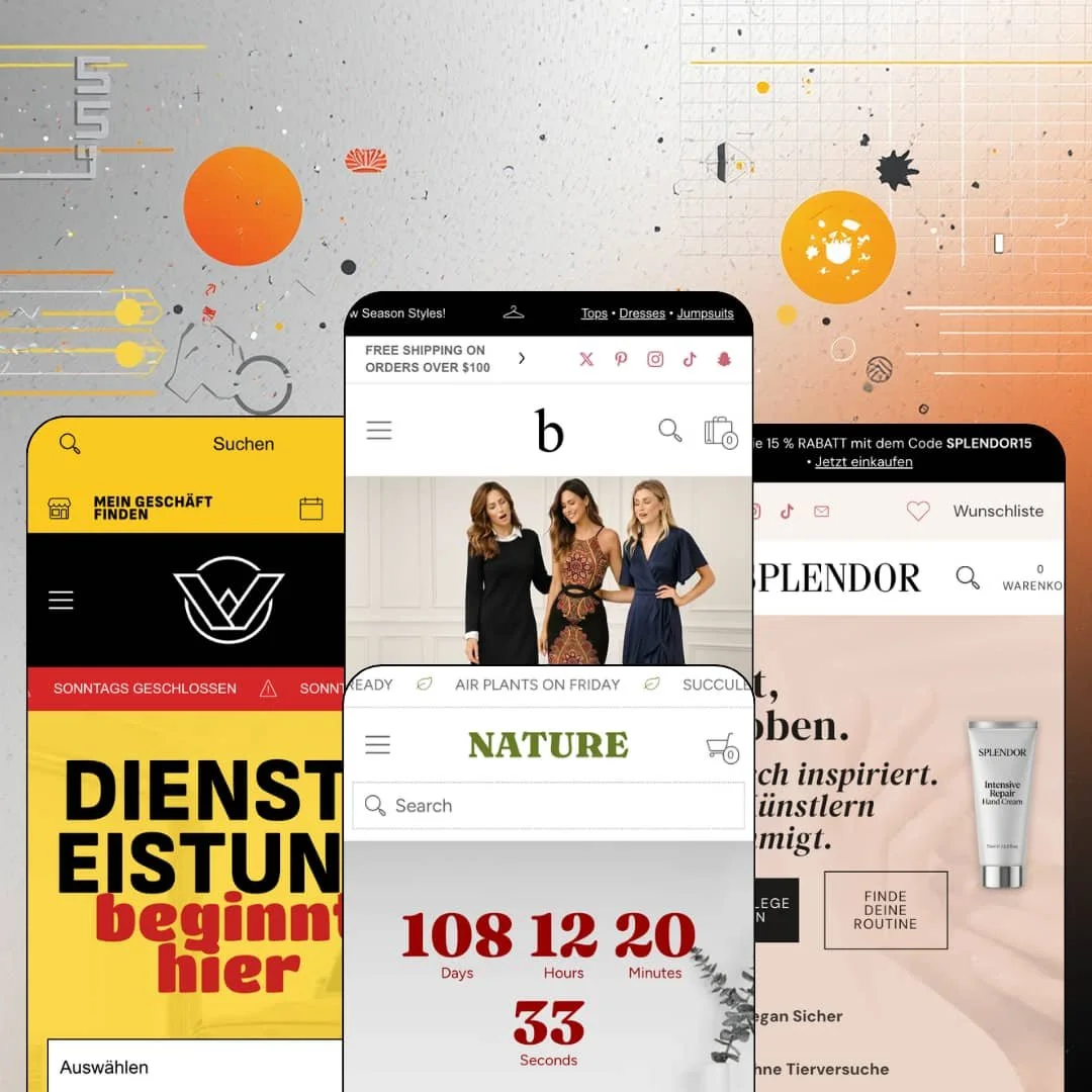
There's a phone number in the header of every demo store, next to posted hours and a Directions link that opens Google Maps. Red Plug Design Co. built Bespoke, a $320 Online Store 2.0 theme, around a specific premise: plenty of Shopify merchants also unlock a physical door every morning. Four presets span fashion, beauty, auto repair, and home & garden, and each one behaves like a neighborhood business that happens to sell online. That framing shaped almost everything I found worth writing about.
The mega menu is a selling floor
Bespoke's navigation panels hold image tiles with captions, product-level deep links, promo tiles, and full taxonomy columns; the auto demo stages a 25%-off motor oil tile with its own Buy Now button inside the menu, and the beauty demo routes an entire skincare routine as clickable steps, Step 1: Cleanse through Step 4: Moisturize. Shoppers get merchandising and guidance before a single page loads. That compresses discovery. For merchants running 30 to 100 SKU catalogs in guided-choice verticals like beauty or automotive, the menu alone can carry the browse-to-product journey.
When did a cart drawer last try to close a wholesale order?
Bespoke's drawer stacks a progress bar toward the free-shipping threshold, an order-notes field, a PO number field, and a Share the Cart link that emails the cart's contents to someone else, and the auto demo even drops a Save $25 oil-change offer tile with a Schedule button into the empty state. The cart stops being a receipt. It becomes a place where orders get bigger, get approved, or get handed to whoever holds the company card, which is exactly what shops with wholesale-adjacent ordering and steady repeat buyers need from that surface.
A storefront that answers the phone
The header carries a support drawer with a call link, email, posted hours, a Directions link, and an Ask a question entry point, consistent across all four demos. The website behaves like a front desk. For single- or two-location retailers in service-adjacent verticals, garden centers, garages, salons with retail shelves, that layer does the reassurance work a pure-DTC theme leaves to a buried contact page, and it comes staged rather than bolted on.
A buy box built for the last thirty seconds
Around the add-to-cart button, Bespoke coordinates a conversion-feature bundle: a per-product countdown with distinct pre-sale and live-sale messaging, a stock counter with an editable restock string ("Only 6 in stock! New stock arrives soon!"), a quantity stepper that reports how many units already sit in the cart, and a free-shipping progress line repeated inside the buy box itself. Each element answers a hesitation. Together they suit flash-drop and seasonal-sale merchants moving impulse-priced goods, where the decision window is short and every nudge near the button counts.
Social proof is presentation, not machinery
Rating lines like "4.9 / 5.0 based on 32 reviews" render as styled text with no review engine behind them, and the testimonial sections across the demos are hand-typed quotes with uploaded portraits and pasted social links. The stars are stickers. Beauty and skincare brands selling considered purchases will still need a review app before those numbers mean anything, and the polish of the display makes the gap easier to miss during evaluation than it should be.
It sells services it cannot schedule
Every CTA that promises a booking, Schedule on the styling panel, APPOINTMENTS in the garage header, Attend Workshop in the garden demo, resolves to a collection or a locations page. No calendar exists. No time-slot picker, no capacity logic, nothing. A merchant can take payment for an oil change or a consult, then coordinate the actual timing by phone or through an app. This kept bugging me across all four demos, because appointment-driven operations in services and hospitality are precisely who the staging courts hardest.
Online Store 2.0 architecture at a 2026 premium price
Dawn is free. Shopify's baseline theme sits on the same Online Store 2.0 generation, so Bespoke's $320 buys staging depth, the retail layer, and the section library rather than a newer architecture, and the block-nesting ceiling of OS 2.0 applies here just as it does there. Budget-conscious founders launching sub-30-SKU stores should price that honestly: the money pays for merchandising range they may not fill for a year.
Limited track record
Three Theme Store reviews exist. All positive, but three is a thin sample for a $320 commitment since the January 2025 launch. Version 6.0.0 in July 2026 shows active development, including a newly added preset, yet single-brand operators planning evergreen, multi-year builds are betting on support quality that a small merchant base hasn't stress-tested at scale.
What it takes to launch
Expect a multi-day media and copy pass before launch: replacing video heroes, populating paired desktop and mobile image slots, restaging countdowns, promo tiles, menu story panels, and icon rows, and rewriting per-vertical navigation and section copy across whichever preset you adopt.
-
What works in this preset
The homepage opens on a looping video hero captioned "Unique • Handcrafted • You," and the editorial energy holds from there. Collection tiles for dresses, tops, and jumpsuits play as small videos rather than stills, a photo-album collage breaks up the grid, and a press-logo band scrolls continuously beneath the sale banner, which gives a boutique demo the pacing of a campaign site instead of a catalog page.
I clicked through to the Cut Out Neck Florals dress and stayed a while. Fifteen gallery images. A care-icon strip renders Machine wash, Tumble dry, and 100% cotton from the theme's set of sixty-plus fashion icons, and the "Goes well with..." accordion holds complete product cards, swatches included, so a shopper can weigh the matching wedges without ever leaving the tab stack.
Navigation doubles as a lookbook shelf. The Lookbooks dropdown lists Chic, Boho, and Chill entries with short editorial blurbs, while the Services item opens a full story panel, image band, styling pitch, and a Schedule button, that sells the brand's personal-styling arm from inside the menu bar.
Where it stumbles
The "dress For the Day" featured row leads with an out-of-stock velvet dress in position one. For a preset selling elevated conversion, opening the money section on something nobody can buy is a staging choice that works against its own pitch.
-
What works in this preset
"Clinically inspired. Artist approved." sets the register, and the Trending row backs it up: cards carry short benefit descriptions, prices, and shade swatches labeled Fair Neutral, Medium Sand, and Deep Cocoa right in the grid. Browsing reads like scanning a well-organized shelf. Shade choice starts before the product page does.
The transformation grammar beauty brands rely on is staged end to end. A "Results You Can See" before/after slider anchors the mid-page, three numbered routine tiles walk Cleanse, Treat, Hydrate, and a hashtag-tagged social wall plus a retailer logo marquee close the argument that this brand exists beyond its own site.
Beauty-specific product data gets real estate too. The foundation page surfaces SKU and barcode above the price, and How to Use and Ingredients accordions carry an actual INCI-style ingredient list rather than a paragraph of adjectives, which matters for shoppers who read labels before they buy anything for their skin.
Where it stumbles
After a merchandising-dense top half, the demo stages the footer Help column with a single Search link. The closing band reads bare against everything above it, and merchants adopting this preset will want to rebuild that column before launch.
-
What works in this preset
You can put a brake job in a shopping cart. Workshop prices services as products, and its cards swap lifestyle photography for benefit-icon rows, Certified technicians, Trusted service, Exclusive savings, which turns a tire-rotation listing into a small trust argument rather than a bare price tag.
The hero runs a guided finder: three stacked dropdowns that start at Maintenance, Repair, Parts, or Tires and narrow from there, so a stressed car owner lands on the right service page without touching the menu. It's the most direct homepage in the family. The rest of the page keeps the urgency going with a live countdown block and a sludge before/after slider.
Local-business staging is the loudest here. FIND MY STORE and APPOINTMENTS tiles sit in the header beside posted hours, the Locations menu item opens a two-shop panel with Google Maps links for each garage, and a "CLOSED ON SUNDAYS" ticker loops across the page like a hand-painted sign.
Where it stumbles
The Theme Store copy positions Workshop for parts stores and large catalogs, but the demo offers no vehicle fitment path, no year, make, or model selection anywhere. The finder narrows by service category instead, which suits a garage and leaves a genuine parts retailer to solve compatibility on their own.
-
What works in this preset
A ticker announces succulents ready for pickup and air plants arriving Friday, and that inventory-as-conversation voice continues down into the grid, where a sold-out terrarium card carries its own "More stock arrives Feb 6" line beside Charcoal, Concrete, and Walnut swatch options. Restock talk becomes storefront personality.
The garden-center identity runs deep: marquees of illustrated succulents drift between sections, a "Build a Terrarium" banner promotes the DIY angle, two before/after sliders ship with their own mobile crops, and a Come Visit block lists both store locations above a four-badge trust row. Even the blog gets a menu panel of its own, with a "Read the First Post" deep-link that treats content as a first-class destination.
One purchase, four genuinely different stores
The presets don't recolor a shared homepage skeleton. Fashion gets editorial video pacing, beauty gets transformation proof, auto gets guided finders and urgency, garden gets local warmth. Only reading all four reveals how far the same section library can bend before it breaks character.
Motion is the house style
Tickers, logo marquees, looping video tiles, drifting illustration bands, and slide-to-compare imagery recur in every preset. The family has a kinetic signature that most static screenshot galleries won't capture. It reads as a coherent identity rather than scattered animation settings.
Mobile gets its own art direction
Across the demos, sections accept dedicated mobile image crops alongside desktop art, and the presets actually use them. Small screens receive purpose-built compositions instead of center-cropped desktop leftovers. That discipline only becomes visible once you compare the pairs preset by preset.
Everything is hand-fed
Story panels, testimonial cards, benefit-icon rows, and press bands are individually staged assets rather than metafield-driven data. A catalog growing past the low hundreds means manually tending every one of those merchandising surfaces, product by product, season by season.
The identity runs on media you must keep producing
The theme's character depends on custom video, paired image crops, and comparison photography as an ongoing brand practice, not a one-time launch task. Brands without a steady content pipeline will watch the kinetic personality flatten into an ordinary grid within a season or two.
Listed industries the presets never visit
The Theme Store tags Bespoke for jewelry & accessories and food & drink, yet no preset stages either vertical. Merchants in those categories buy on faith that a fashion, beauty, auto, and garden library translates to their shelf.
Rating
★ 8.0/10
-
The menu merchandising, cart stack, retail layer, and buy-box bundle are genuinely deep; booking and review mechanics remain app territory despite staging that implies otherwise.
8
-
Conventional editor controls, but the density of staged surfaces (menu panels, icon rows, paired mobile assets) means many slots to fill before anything looks finished.
7
-
Dedicated mobile image slots appear throughout, the demos ship purpose-made mobile art, and the drawer navigation carries the full menu-panel content.
8
-
Media-heavy homepages with looping video and multiple marquee bands, offset by lazy-loaded imagery and disciplined section counts on product pages.
8
-
Four verticals from one library, a build-your-own section with twenty block types, and a sixty-plus icon set give unusual range for a single license.
9
Frequently Asked Questions
-
No. Its APPOINTMENTS link routes to a locations page, so actual scheduling needs a booking app or a phone call after checkout.
-
The cart accepts a PO number and order notes, which helps invoice-driven buyers; quantity pricing is listed as a Shopify Plus feature, and true wholesale price lists live at the platform level.
-
It generates an email containing a link to the current cart, useful for gift hints, approval flows, or handing a purchase to whoever pays.
-
Version 6.0.0 from July 2026 added a fourth preset and new features; the family has grown steadily since the January 2025 launch, so check the changelog for what's current.
-
They ship as fashion and care symbols, but the same badge-row pattern runs service icons in the auto demo, so any vertical can build trust rows from it.
-
Yes. The appointments tiles, story panels, and locations staging are optional configuration, and a pure product store can simply leave that layer off.
This review is based on hands-on testing of the publicly available preset demos of the Bespoke Shopify theme as of August 2026. Theme features, preset availability, and performance can change with subsequent updates from the theme developer.