
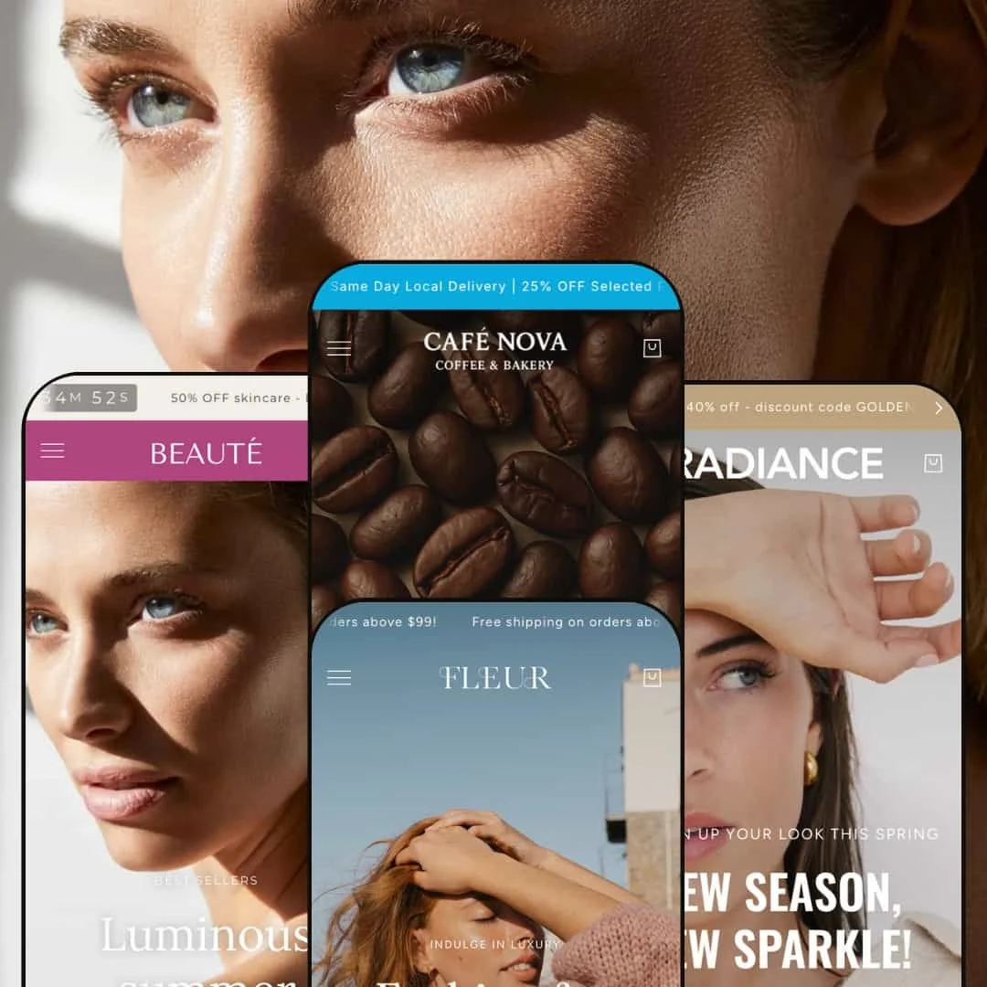
Blockshop is a multi‑preset Shopify theme that leans hard into visual storytelling. Beauty, Fleur, Radiance and Cafe all pair a sticky header and announcement bar with large imagery and long homepages, but each one stages that structure for a different vertical: beauty and wellness, fashion, jewellery and food. Across the demos we saw a recurring pattern of hero media, curated product rows and cross‑sell sections, all framed by slide‑out carts and predictive search. The result is a theme that feels premium and immersive rather than purely utilitarian, though the emphasis on high‑resolution media demands some care around performance and content curation.
Pros.
〰️
Pros. 〰️
✚ Rich merchandising modules
Blockshop’s presets all lean on a deep library of merchandising sections: shop‑the‑look blocks, cross‑sell rows, product recommendations, FAQ accordions and testimonial bands. In practice this lets merchants turn the homepage and product pages into mini campaigns rather than static catalogues, encouraging browsing and multi‑item baskets without relying on third‑party apps.
✚ Navigation and search structure
Each preset uses a sticky header with structured navigation and a search overlay that can surface products from anywhere in the catalog. For shoppers this means there’s always a clear route back to primary categories or a targeted search, even when the page below is filled with dense storytelling content.
✚ Cart drawer and checkout flow
Across demos, adding an item either from product grids or from product pages triggers a slide‑out cart with quantity steppers and a free‑shipping progress bar, paired with a full cart page for more detailed editing. That consistency helps shoppers understand where they are in the purchase journey and makes incremental basket building feel low‑friction.
✚ Story‑driven layouts and imagery
Blockshop is unapologetically visual: video heroes, full‑width photography and editorial sections show up in every preset, just tuned to each vertical. When merchants supply strong creative, the theme makes even small assortments feel curated and brand‑led, which is valuable for new labels trying to stand out from commodity competitors.
✚ Preset variety across verticals
With Beauty, Fleur, Radiance and Cafe, Blockshop ships four distinct visual directions tuned to beauty, fashion, jewellery and food. That range gives merchants a starting point that already aligns with their industry while preserving the same underlying mechanics, so teams can change “mood” without relearning how carts, menus or product sections behave.
Cons.
〰️
Cons. 〰️
🚫 Heavy media and load times
The same design choices that make Blockshop feel premium—video heroes, large photos, dense content sections—also mean page weight climbs quickly. On slower connections and older devices, that can translate into sluggish first loads or stuttering scroll, so merchants will need to be disciplined about optimising media and trimming unused sections.
🚫 Long, section‑dense pages
All four demos showcase long homepages and deep product pages that stack many blocks in sequence. This gives lots of surface area for storytelling but also increases the risk of cognitive overload and scroll fatigue, particularly for returning visitors who already know what they want.
🚫 Search overlay focus on products
The search overlay in Blockshop’s demos is heavily product‑centric, emphasising suggestions and product‑type results over static pages. That’s perfectly adequate for straightforward retail, but brands that rely on longer‑form content such as policies, fit guides or editorial features may find those assets harder to surface organically from search alone.
-
Beauty is the most overtly “skincare” of the presets, using soft colour, airy typography and luminous photography to sell the idea of transformation. The homepage strings together a video hero, routine‑focused product blocks and editorial content in a long, story‑like scroll that feels closer to a campaign landing page than a simple category feed.
What works in this preset
Beauty’s opening sequence combines a video hero with bold, campaign‑style copy and immediately introduces the brand as a modern skincare label rather than a simple product grid. That first screen sets expectations for a more considered routine, which works well for higher‑priced or ritual‑oriented beauty products.
Further down the homepage, Beauty uses a before‑and‑after slider to show treatment results in a way that feels more clinical than lifestyle photography alone. That single interaction reinforces the idea that the brand is performance‑driven, which can help justify premium pricing or subscription‑style offers.
Beauty’s shop‑the‑look collage frames products as part of a curated regimen: a roller, mask and serum are clustered together around a model shot rather than presented in isolation. This staging communicates routine building and encourages multi‑item baskets without relying on generic “frequently bought together” widgets.
On the product side, the Conditioning Mask page leans heavily into ingredient storytelling. The structure moves from hero image to key ingredient callouts, then into a “Glow guide”‑style section that shows how the product fits into a wider routine. Shoppers who want reassurance about formulas and usage get it without having to leave the page for a blog post.
Beauty’s About page continues the editorial approach with founder portraits and narrative text rather than a generic block of copy. That continuity between homepage, product page and About page makes the brand feel more coherent and helps Beauty stand out from more template‑driven beauty themes.
Where it stumbles
Beauty repeats its newsletter ask in both the mid‑page content and footer, but without much variation in value proposition between the two. The duplication makes the second form easy to skim past, and merchants will likely want to customise one of those placements so the message feels more intentional and less like leftover scaffolding.
-
Fleur takes Blockshop’s structure and dresses it for fashion, leaning on full‑bleed photography and generous white space to create a boutique feel. Typography is more prominent here, with product names and headings treated almost like magazine cover lines over large editorial imagery.
What works in this preset
Fleur’s homepage hero feels like the opening spread of a lookbook, with models shown in motion and copy that focuses on seasons and mood rather than single products. That immediately positions the store as a clothing label with a point of view, not just a catalogue of garments.
Midway down the page, a feature block built around the Xena knit set effectively blends editorial and commerce: a large lifestyle shot sits next to a compact product card with price and key details. Shoppers can move from inspiration to purchase without being dropped into a busy collection grid, which is particularly useful for highlighting limited collections.
Fleur’s storytelling continues with an “Our Story” and brand‑values section that uses alternating image and text blocks instead of a single wall of copy. The visual rhythm matches what you’d expect from a print editorial and helps keep shoppers engaged long enough to finish the narrative.
The Journal integration in Fleur is styled to match the apparel focus. Article previews on the homepage and in the Journal menu pick up the same typography and image treatment as the main catalog, so the transition from shopping to reading is smooth. That makes it easy for a brand to mix fit guides, trend stories and behind‑the‑scenes content into the same browsing session without breaking the visual narrative.
Where it stumbles
Within Fleur, most of the rough edges we saw are shared with the other presets and relate to overall media weight rather than anything unique to this style. Out of the four demos, Fleur is the one that leans hardest into full‑width imagery, so merchants using it will want to be especially disciplined about optimising photos and trimming sections that don’t serve a clear story.
-
Radiance re‑uses Blockshop’s long‑scroll structure but swaps in a jewellery‑focused aesthetic: warm metallic tones, close‑up shots of pieces on skin and a refined serif for headings. The homepage feels like a campaign for a boutique jeweller, with lifestyle shots and product callouts woven together.
What works in this preset
Radiance’s colour palette and typography do most of the heavy lifting: the warm golds and soft neutrals make even placeholder products feel like fine jewellery. That visual framing helps smaller or mid‑priced brands borrow some of the cues of luxury without having to invest in heavy custom work.
The shop‑the‑look module on Radiance’s homepage is particularly well‑suited to jewellery, overlaying hotspots on a close‑up model image to call out specific earrings, necklaces and bracelets. For shoppers, this bridges the gap between how a piece looks worn and how it appears in isolation in the product grid.
Category tiles for earrings, rings and necklaces break up the homepage and act as clear signposts for people arriving with a specific item type in mind. Because these tiles are more visually striking than plain collection links, they reward browsing without making the page feel like a generic product wall.
Radiance’s About page reinforces the jewellery story with imagery that mixes product close‑ups and studio shots. For small brands in particular, that extra bit of narrative can make the difference between “interesting product” and “brand I want to follow.”
Where it stumbles
Most of Radiance’s potential friction points mirror the general considerations discussed in the conclusion, especially around media weight and the length of the homepage. Merchants choosing Radiance will want to keep those theme‑wide trade‑offs in mind when deciding how many sections and large images to enable at once.
-
Cafe repurposes Blockshop for a deli‑style food and beverage experience. The aesthetic is playful and bold, with a bright orange announcement bar, chunky type and packaging‑centric photography. The homepage behaves like a hybrid between a grocery storefront and a restaurant menu.
What works in this preset
Cafe opens with a hero that feels like a promotion board in a well‑designed deli: strong colour, clear offers and bold product imagery. That immediate emphasis on bundles and specials matches how many food shoppers think and helps spotlight high‑margin items.
One of Cafe’s most distinctive touches is its integrated meal‑kit and pantry sections, where variants such as different fillings or proteins are selectable directly in the featured block. Shoppers can assemble a kit without being pushed into a dense category page, which is ideal for subscription boxes or curated grocery packs.
Throughout the homepage, Cafe uses packaging photography as the design backbone: crisp product shots of jars, chips and chocolate bars are given plenty of breathing room. This keeps the experience fun and tactile, echoing the feeling of browsing shelves in a physical store.
Cafe’s blog content is tightly aligned with the vertical, using posts like “Diners and dreams” to extend the brand beyond the product grid. That kind of editorial is particularly effective in food, where recipe ideas and pairing suggestions can directly drive additional purchases.
Where it stumbles
Cafe uses a persistent “stay in the flavor loop” style sign‑up popup that appears early in the homepage experience. On a demo store it feels like noise; in production it could easily interrupt first‑time visitors before they understand the offer, so merchants may want to delay or restage it.
Some of Cafe’s integrated product blocks behave more like mini order forms than traditional product cards and do not consistently link to full product pages. That staging works for regular customers who already know the items, but it can make it harder for new shoppers to discover detailed information or larger imagery when they want it.
Niche Suitability
Not Ideal For
-
Blockshop is ideal for brand‑led merchants in beauty, fashion, jewellery and food who want their storefront to feel like a campaign site rather than a plain catalogue. If you have strong photography, clear stories around collections and a willingness to lean into long‑form layouts, the theme’s structure will support that direction.
-
Stores that prioritise dense comparison tables, ultra‑fast utilitarian browsing or highly technical product information may be better served by a more stripped‑back theme. If most visitors arrive with a SKU in hand and simply want the fastest path to checkout, Blockshop’s emphasis on storytelling can feel like unnecessary ornamentation.
-
Medium — Blockshop provides a rich palette of presets and sections out of the box, but making them sing requires deliberate content strategy, careful media optimisation and ongoing curation. Teams willing to invest that effort will get a highly branded storefront; teams seeking a “set and forget” experience may struggle.
Final Recommendation
★ 7.4/10
Rating
-
Blockshop covers standard commerce needs and adds merchandising extras like shop‑the‑look sections, FAQ accordions and cross‑sell rows, which reduce reliance on apps.
8
-
The admin experience benefits from consistent section behaviour across presets, but the number of options means merchants need to spend time pruning and ordering blocks to avoid visual overload.
7
-
Heavy imagery and video can slow initial loads on mobile connections if merchants do not optimise assets, even though the underlying interactions remain smooth once pages are loaded.
7
-
In all demos, pages feel visually smooth once loaded, but their overall weight and the use of large hero media make performance highly dependent on merchant discipline around assets.
6
-
Four distinct presets plus a broad library of sections give designers plenty of ways to express a brand while keeping the underlying mechanics consistent and predictable.
9
FAQ
〰️
FAQ 〰️
-
👑 Yes. Blockshop is staged for skincare and wellness, Fleur for fashion, Radiance for jewellery and accessories, and Cafe for food and beverage. Those starting points can be adapted, but each preset brings copy and imagery patterns that clearly favour its default vertical.
-
📱The main consideration on mobile is asset weight: the more video and high‑resolution imagery you use, the more important mobile‑specific optimisation becomes, because that media can slow the first impression even if the rest of the experience feels smooth.
-
🎨 Colours, typography and section ordering are configurable in all presets, and most key modules—heroes, product rows, testimonials, FAQs—can be added or removed per template. You can use a preset as a starting point and still arrive at a storefront that feels distinct from the demo.
-
⚡ Within a session, interactions such as opening the cart drawer or loading a quick‑view panel feel responsive. Initial page loads, especially on media‑heavy homepages, can feel slower if assets are not compressed, so performance tuning is very much a shared responsibility between theme and merchant.
-
👕 Variants are surfaced prominently on product pages and, in some presets, directly in featured blocks or quick‑view panels. Shoppers can choose pack sizes, colours or sizes before adding to cart, and the cart drawer reflects those choices with quantity controls
-
🔎 The theme outputs clean URLs, supports meta titles and descriptions and includes styled 404 and no‑results pages that keep visitors oriented. As with any Shopify theme, the real SEO impact comes from how merchants structure collections, internal links and content.
-
💱 Blockshop relies on Shopify’s Markets and translation tooling, so languages and currencies are handled at the store level rather than by the theme itself. In the demos this shows up as a simple selector in the header, but any deeper localisation comes from Shopify’s configuration, not from additional theme logic.
-
⚙️ Because Blockshop relies on standard cart and section patterns, most Shopify apps that respect theme app blocks should integrate cleanly. More opinionated design customisations or heavy third‑party scripts may need developer oversight to maintain performance and layout.
-
🛒 Yes. You can install Blockshop from the Shopify Theme Store and try it on your own store before publishing, and you can browse the live demos for each preset to see how the theme behaves with different kinds of content.
This review is based on hands‑on testing of the publicly available ‘Blockshop (Beauty)’, ‘Fleur’, ‘Radiance’ and ‘Cafe’ demos of the Blockshop Shopify theme as of 2025‑11‑21. Theme features, style availability, and performance can change with subsequent updates.