
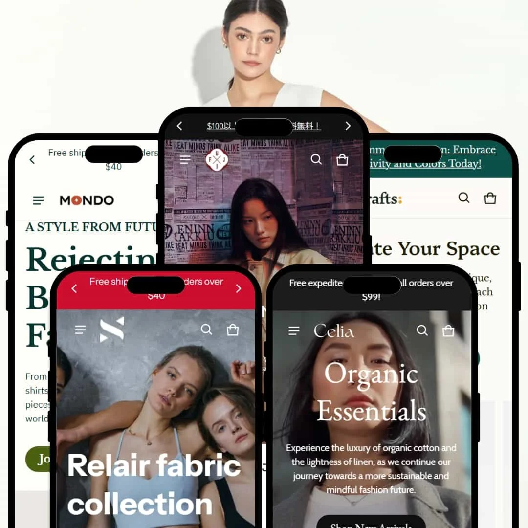
This review takes a hands-on look at Blum across five official presets (Blum, Solie, Totem, Fuji, Monti). We focus on staging choices unique to each preset while consolidating theme-level mechanics in the Conclusion. Expect notes on fast add paths, a capable cart drawer, story-led sections, and urgency patterns. We also flag trade-offs like shallow quick view, hover-born interactions on mobile, and the risk of visual clutter when art direction is weak. Prefer the short version? Jump to the Conclusion for strengths, weaknesses, and who this theme suits.
Pros.
〰️
Pros. 〰️
✚ Fast add paths and anchored CTAs
Across presets, shoppers can add quickly and keep purchase intent in view thanks to quick-add flows and a sticky add bar on product pages. That reduces pogo-sticking and supports impulse decisions when sizing is clear.
✚Well-equipped cart drawer
The slide-out cart supplies live context—quantity controls, note and discount fields, plus a free-shipping progress cue—so adjustments happen without page hops. It feels modern and keeps momentum.
✚ Story-first merchandising modules
Lookbooks, collages, and timeline-style sections help brands show how products live in the real world. Used well, they elevate average AOV because shoppers buy the outfit, not just the item.
✚ Built-in urgency patterns
Countdowns and promotional tickers are available out of the box, letting merchants run drops and flash sales without bolting on extra apps. It’s a simple way to create a reason to act now.
Cons.
〰️
Cons. 〰️
− Shallow quick-view in some demos
Several demos limit the quick-view to an image gallery, so price and add-to-cart live behind an extra click on the PDP. For comparison shoppers, that’s a small but real speed bump.
− Decorative flourishes can overwhelm
Diagonal tickers, starbursts, and layered frames add personality, yet they quickly crowd the canvas if photography is inconsistent. Art direction becomes a prerequisite, not a nice-to-have.
− Hover-triggered elements add taps on touch
Interactions that begin on hover translate to extra taps on phones and tablets. It’s not a blocker, but it dilutes the “one-tap” ideal on mobile.
-
A relaxed, editorial preset with muted beige-tan tones and serif displays that put lifestyle imagery first. The pacing feels unhurried, encouraging exploration over dense product grids.
What works in this preset
Spacing and typography create an airy magazine vibe, so product storytelling lands softly and looks premium.
The dual-CTA hero plus overlapping imagery build a gentle funnel into “New Arrivals” without breaking the mood. The pacing supports slower browsing and discovery.
Where it stumbles
Layered, overlapping visuals can occasionally obscure a call-to-action on small screens. The aesthetic rewards careful art direction; weaker images make the page feel busy rather than refined.
-
Athleisure energy, bold reds, slanted banners, and kinetic headlines give Solie a “drop day” personality. The layout is built to drum up urgency and motion.
What works in this preset
Diagonal promotional bands and assertive type set an unmistakably sporty tone, which helps performance claims feel credible. The hero sequencing puts newness front and center without burying the buy path.
The preset’s pacing (hero → category exposure) mirrors the way sportswear shoppers skim for drops, then drill into a tight set of options. It feels purpose-built for launches.
Where it stumbles
On smaller screens, stacked motion elements and angled graphics can feel noisy. Brands with minimalist identities may see the styling clash with a quieter voice.
-
Totem leans earthy and artisanal, with handmade textures and process-first storytelling. It feels crafted, not manufactured.
What works in this preset
Typography and warm color choices flatter wood, ceramics, textiles, and other tactile goods.
Curation over volume is the implicit message, which suits smaller catalogs that want each piece to carry weight. The look underscores provenance and care.
Where it stumbles
Decorative flourishes (tickers, starbursts, layered frames) can steal attention from products if imagery is inconsistent. The look demands consistent art direction to avoid visual clutter.
-
A Japanese streetwear lens: clean grids, restrained type, red accenting, and urban imagery. The personality is contemporary and youth-leaning.
What works in this preset
The stripped-back composition lets lifestyle images and labels do the talking, which suits drop-driven apparel. Category tiles make quick work of getting to outerwear, tops, and more.
The demo’s language choices and label styling amplify the subculture vibe, so brand voice reads instantly on first load. It feels curated rather than corporate.
Where it stumbles
The lean aesthetic puts pressure on product photography; mediocre images flatten the effect. Stores with formal branding may find the street tone off-message.
-
An inclusive, gender-neutral preset that pairs earthy greens and deep blues with activism-forward storytelling. Community, mentorship, and purpose sit alongside products.
What works in this preset
Bright accent moments and editorial headlines keep the page from reading like a manifesto. The balance of mission and merch is the signature.
Earthy greens and deep blues set a welcoming tone, and the neutral staging supports broad appeal. Community and purpose sit alongside product without drowning it out.
Where it stumbles
With many editorial sections in sequence, the scroll gets long. Merchants need to prune aggressively to avoid burying core SKUs.
Niche Suitability
Not Ideal For
-
Blum suits fashion, lifestyle, streetwear, and craft brands that trade on imagery, story, and curated drops. If your photography is strong and your launch calendar is lively, the theme’s modules feel like a force multiplier.
-
If your store needs dense comparison or a stripped-down, utilitarian grid, an ultra-lean theme may be a better match. Brands without robust visuals will also find the large media canvases unforgiving.
-
Medium — the theme reduces app dependence with rich modules, yet it demands consistent photography and thoughtful curation to shine.
Final Recommendation
★ 8.2/10
Rating
-
Quick-add flows, sticky purchase bars, urgency modules, and storytelling sections go beyond the basics while staying coherent.
9
-
Once you learn the sections, building pages is fast. Some interactions still ask for extra taps on mobile.
8
-
Core CTAs stay visible and feel smooth in use; hover-born mechanics add slight friction on touch devices.
8
-
Demos load briskly and overlays respond cleanly in testing; heavy media can slow weaker connections, so optimization matters.
8
-
Presets span minimal to maximal, letting brands remix sections to taste; results hinge on consistent art direction.
8
FAQ
〰️
FAQ 〰️
-
👑 Yes. Presets are tuned for apparel, lifestyle, streetwear, and crafted goods where imagery and story do the selling.
-
📱Core CTAs stay visible, though certain elements that start on hover become extra taps on touch.
-
🎨 You can mix sections, adjust colors and type, and stage pages to match your brand voice without code. The stronger the photography, the more premium it reads.
-
⚡ In demo testing, pages felt quick and overlays were responsive. Large images and video should still be compressed for best results.
-
👕 Yes. Variant selection and quantity adjustments are clear in the purchase flow, so size and color choices feel low-friction.
-
🔎 Behavior varies by preset. Some flows jump straight to the product page, while others surface a light layer first.
-
💱 You’ll find countdowns and promo tickers available, which makes drops and flash sales easier to stage.
-
⚙️ Yes. Lookbooks, collages, and timeline-style sections help you frame products in context, not just in isolation.
-
🛒 Shopify previews let you test the theme in your store and explore all presets via the developer demos before committing.
This review reflects hands-on testing of the Blum theme’s public demos as of 16 September 2025, focusing on how presets differ in staging rather than core capability. Features and availability may change with updates from the developer.