
Boost is a paid Shopify theme for merchants who want a flexible storefront that prioritizes quick-add shopping, rich on-site search, and strong visual storytelling. Across all presets you’ll find a polished cart drawer, consistent product media behavior, and clean typography that keeps shoppers oriented. First impressions are confident: each demo opens with a large hero that pushes a clear call-to-action, supported by sensible hierarchy and sale cues that feel integrated rather than shouty.
Pros.
〰️
Pros. 〰️
✚ Quick-buy that respects variants. Product cards can lead into a variant-selection step, then add to cart without forcing a full page load. Shoppers build baskets faster, and comparison stays in view.
✚ Polished cart experience. After an add, a drawer summarizes the basket and keeps momentum toward checkout. It feels modern and reduces context switching.
✚ Instant, helpful search. A full-page overlay provides real-time suggestions as you type and keeps results tidy, which reduces pogo-sticking between pages.
✚ Storytelling is first-class. Presets include dedicated pages such as Our Story, Mission, or editorial showcases. That gives brands space to explain values and campaigns, not just list products.
✚ Merchandising helpers where they matter. Clear promo banners, size-chart links, and benefit icon blocks surface right on shopping paths. Those touches answer common questions before friction builds.
Cons.
〰️
Cons. 〰️
− Entry points feel inconsistent at times. Depending on product complexity, cards may open a modal or jump to the detail page. Expect to tune that flow so it matches your audience’s expectations.
− Modal layering and close controls. Image viewers and quick-buy can stack; closing requires attention to small targets. It’s workable, yet less graceful than it could be.
− Discount emphasis reads subtle. Sale price styling and badges are tasteful but understated. Brands that live on promotions may want to push those cues harder.
− Add-confirmation lacks visual reassurance. The post-add banner is text-forward and omits thumbnails. Some shoppers prefer a small image to confirm they added the right item.
− Hero variety inside presets is narrow. You can rotate content easily, but base compositions repeat. Distinctive photography and copy do more of the differentiation work.
-
Spark frames a playful, child-friendly aesthetic with pastel colors, rounded shapes, and whimsical illustrations. The tone is light and friendly, which suits brands that sell cute or giftable goods rather than austere luxury.
What works in this preset
Spark’s palette leans soft and candy-like, which makes product photos pop without heavy outlines. Pastels pair with gentle shadows and rounded buttons so the whole surface feels approachable.
Illustration and icon accents give Spark a toy-shop charm. Decorative stars and doodles are used sparingly around heroes and headings, so pages feel alive while product cards stay readable.
Typography choices skew friendly and legible. Headlines are slightly chunky, body text is steady, and spacing keeps busy grids from feeling cramped. That balance is helpful when you carry many small SKUs.
Spark’s home hero favors wide imagery with clear, centered CTAs. It’s straightforward to swap photography and keep the same rhythm, which helps non-designers refresh the page without redesigning it.
Where it stumbles
The same playful palette that sells joy can undersell premium positioning. If you trade in high-end goods, you’ll need to rework colors and tone to avoid a too-cute vibe.
Hero variation inside this preset is limited stylistically. You can rotate images and copy, yet the base composition stays similar, so brands must lean on photography to create distinction.
-
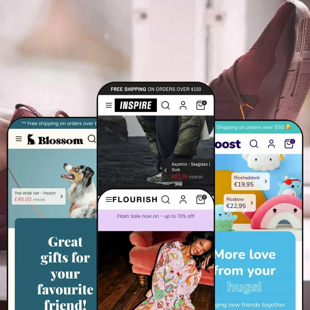
Flourish serves a romantic, boutique mood. Soft colors, airy spacing, and elegant photography place accessories and textiles in their best light.
What works in this preset
The hero uses lifestyle scenes with brief, aspirational copy. This invites slower browsing and frames products as part of a look, not just standalone items.
Product detail pages are arranged for contemplation: ample white space, calm headings, and descriptive sections that balance story with utility. Scarves, jewelry, and similar pieces feel curated rather than stacked.
Where it stumbles
Pastel headings on white can drift into low contrast depending on your brand colors. Some merchants will want to deepen tones or weight to improve readability without losing the boutique feel.
-
Blossom brings a bright, pet-centered vibe with colorful imagery and cheerful copy. It’s friendly, upbeat, and designed to make benefits obvious at a glance.
What works in this preset
The color system is lively and optimistic, giving pet products a warm, approachable frame. Photography that features animals immediately communicates use-case and sparks an emotional pull.
Copy tone stays supportive and clear. Short headlines and straightforward labels keep attention on products while reinforcing the cheerful brand personality.
Where it stumbles
The exuberant palette can skew juvenile if you sell premium or clinical goods. Re-skinning colors and toning down highlights is often required to match a sober identity.
Because the palette is opinionated, introducing monochrome or muted branding takes deliberate adjustments to backgrounds, buttons, and accents. Without that, visuals may clash.
-
Inspire channels a modern athletic look with bold type, dark accents, and dramatic product imagery. Sneakers and apparel feel fast and current.
What works in this preset
Full-screen hero sections and lifestyle photography create momentum right away. Prominent CTAs and strong crops make it simple to steer attention toward key drops.
Product pages mix spec-style accordions with a clear buy area and a visible stock counter. For gear-driven shoppers, this conveys readiness without turning the page into a wall of text.
Where it stumbles
The dark overlay and heavy imagery look great yet can feel too intense for light or delicate products. Media discipline becomes important; otherwise pages grow weighty and distract from details.
Niche Suitability
Not Ideal For
-
Fashion, accessories, pet supplies, toys, and similar visual categories that benefit from quick-add flows and brand storytelling.
-
Strictly corporate or ultra-minimal brands, and catalogs that demand extremely rigid, high-contrast layouts with heavy editorial control over every module.
-
Medium. Most features are plug-and-play, yet dialing hero tone, color systems, and the add-to-cart flow takes configuration time. Expect to adjust media and a few interface details to align with your brand.
Final Recommendation
★ 7.6/10
Rating
-
Quick-add, strong search, variant swatches, and a modern cart drawer are implemented cleanly. The pieces click together without odd detours.
8
-
The demos show intuitive navigation and sensible defaults. Minor inconsistencies around modals and entry points may require setup and testing to get just right.
7
-
Menus collapse cleanly, tap targets feel reasonable, and cart actions remain responsive. Overall responsiveness is solid across presets.
8
-
Interactions are snappy. Media-heavy compositions, especially in editorial or campaign pages, benefit from disciplined image optimization.
7
-
Four distinct presets range from playful to athletic. Section-based layouts and configurable swatches give ample control over branding without a ground-up rebuild.
8
FAQ
〰️
FAQ 〰️
-
👑 Yes. Flourish and Inspire show how scarves and sneakers are presented with clear product media and straightforward purchase flows.
-
📱The demos scale down gracefully. Navigation stays predictable, quick-add remains accessible, and sliders swipe smoothly.
-
🎨 Presets are starting points. Color, fonts, and sections can be adjusted in the theme editor to re-skin the site without code.
-
⚡ Generally yes. Cart actions feel instant and page transitions are smooth. Media-heavy pages should use compressed images to keep things crisp.
-
👕 Variant swatches appear on product pages and can be surfaced in quick-buy flows, so shoppers choose options before adding to cart.
-
🔎 You get the basics such as blogs, meta fields, and structured content areas. For advanced SEO management, plan on complementary apps or workflows.
-
💱 It integrates with Shopify’s Markets and multi-language features. A currency selector appears in the demos, while language support follows your store’s Shopify settings.
-
⚙️ Yes. During testing, Shop Pay worked smoothly and the cart experience remained stable, which suggests good app friendliness.
-
🛒 You can preview Boost in the Shopify Theme Store and explore each preset via the live demos used for this review.
This review is based on hands-on testing of the publicly available “Spark,” “Flourish,” “Blossom,” and “Inspire” demo presets of the Boost Shopify theme as of 31 October 2025. Theme features, preset availability, and performance can change with developer updates.