
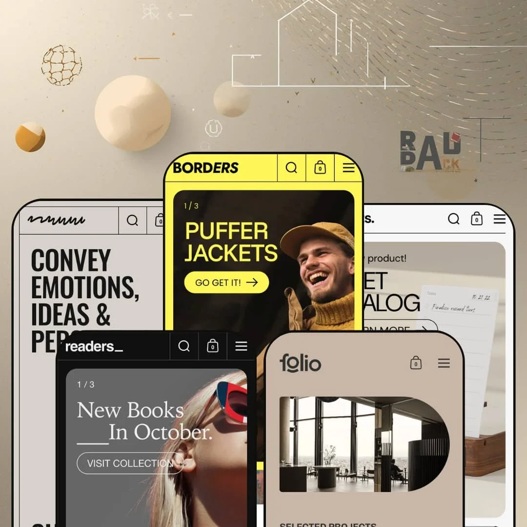
A streetwear label, a stationery shop, a bookstore, an architecture studio, and an art gallery: Borders presents all five as preset demos, and none of them reads like one template wearing different outfits. The connective tissue is a grid-and-borders engine that lets you draw frames at the section and page level, an Online Store 2.0 build from Krown Themes that treats layout structure as the primary creative lever. The flexibility is obvious inside thirty seconds. The real question for a $380 theme is whether that openness still pays off once the demo photography is stripped away.
The borders engine is a design tool, not a coat of paint
The feature the theme is named for is the one that earns the headline. Borders lets you control the grid at a section and page level, drawing or removing frames, setting padding and corner radius, and switching between a full-width, boxed, or fixed 1360px layout with margins that shrink responsively on mobile. That sounds cosmetic until you watch it hold five unrelated businesses together without any of them looking like the same template. For a design-led brand selling on aesthetic, fashion, homeware or art, at a mid-to-premium price point, it's the rare theme control that shapes identity instead of just spacing.
Card-level quick buy that shortens the path
Impulse-led apparel and objects shoppers rarely want a detour. Borders wires quick buy into the product card: open the card and the size, colour or material selectors appear in place, add-to-cart included, with no product-page round trip. On the streetwear and homeware demos a shopper can fill a cart from the grid alone. For a variant-heavy catalogue with cross-shopping buyers, apparel sizes and furniture finishes alike, that shaved step is the difference between a browse and a basket.
Five presets that are five businesses
Borders ships five presets that are five different companies, not five recolours of one homepage: a streetwear shop, a stationery brand, a dark bookstore, an architecture portfolio and an art gallery, each with its own header logic, section mix and pacing. The range comes from a single licence. For an agency building varied client stores, or a founder running several small single-brand shops across unrelated categories, that spread of credible starting points covers verticals most themes don't attempt from one purchase.
In-context selling: lookbooks, hotspots and a before/after slider
Borders gathers the sections that show a product in its setting rather than on a plain card, and they share one job. Image hotspots tag shoppable points onto a lifestyle shot, lookbooks lay out editorial spreads, and a before/after slider wipes between two states of the same image. For categories where the buyer needs to picture the result, furniture in a room, apparel on a body, a renovation or a beauty transformation, this trio replaces the kind of in-context merchandising a store would otherwise stitch together section by section.
The control that makes it powerful is the control you have to learn
Borders hands you the grid and steps back. Section and page-level border controls, a multi-scheme colour system, responsive margins and per-section design settings add up to a lot of switches before a page looks intentional. Used well, it's the theme's whole appeal; pointed at it cold, it's enough rope to make a mess. A solo founder running a small single-brand catalogue without design help should expect to spend real time learning the system before the storefront matches the demo, where a more opinionated, guided theme would have made more of those decisions for them.
Built for curated catalogues, not big-box volume
Every demo sells a tightly edited assortment with room to breathe. The design language (heavy borders, large imagery, generous spacing) is built to flatter a curated range, and the homepages all assume a story per product rather than a thousand SKUs to sort. Filtering and collection
-
What works in this preset
The flagship demo runs a Scandinavian streetwear brand, and it leans into volume. A three-slide hero stacks puffer jackets, Aztec prints and crewnecks before you scroll an inch, then the page rolls through a shop-by-category carousel, a featured grid, an on-sale rail and a complete-the-look block. The product cards are interactive: I clicked one and it let me choose a size and add to cart without ever leaving the grid. For an impulse-driven apparel catalogue with deep size and colour variants, that pace suits the product.
What keeps it from feeling like a flat product dump is the editorial padding between the rails. A "Goes Well Together" section pairs items into outfits, brand-story panels carry the sustainability narrative, and an Instagram strip closes the page. It sells a lifestyle, not a SKU list. That fits a label with a point of view and a small-to-mid apparel range, far less a bare-bones discount outlet.
Where it stumbles
All that density cuts both ways. The flagship is tuned for a catalogue with enough products to fill carousel after carousel, and a brand launching with a tight capsule of a dozen pieces will find the homepage asking for more inventory than it has. That's a fit question, not a flaw: the layout wants volume, so a lean drop-model label has to either trim sections or risk a page that looks half-stocked.
-
What works in this preset
Objekts sells design objects, and it drops the tempo. The pace is calmer here. The hero is a set of promo tiles rather than a slideshow, pointing at a stationery launch, a tray bundle and a plywood clock; I scrolled on and a muted product video played under a "desk, simplified" line, which suits a catalogue of considered, tactile homeware. Material swatches do real work, switching pieces between walnut and maple straight from the card.
The preset also shows off the theme's long-form product block. One section gives a single item, the Analog Weekly Kit, an eight-image gallery beside a full description and an add-to-cart, closer to a mini landing page than a card. A journal row and a curated best-sellers grid round it out. For a small homeware or stationery brand that sells on craft and detail, this is the register that flatters the product.
-
What works in this preset
Readers flips to a dark palette and a stripped-back header, the closest the family gets to a magazine. It looks like a real bookshop. Genres live in a slide-out menu, the hero rotates between new releases and a Monocle design issue, and a category band lists counts by genre. The dark scheme gives book covers and editorial photography room to carry the page.
The standout is a built-in book-review block. I went looking for a blog and found a scored book review instead: a cover image beside a written critique and a clean "9 / 10", the sort of editorial credibility a bookshop or small publisher trades on. A magazine-style feed runs below it. For a content-led catalogue, books, zines, niche print, where the writing sells as much as the product, this layout treats criticism as a first-class section rather than a bolted-on blog.
-
What works in this preset
Folio is the boldest reframe: a Nordic architecture studio, where the "products" are buildings. The header strips down to four words, the hero runs full-bleed interiors, and a Selected Projects grid tags each entry with a year and a discipline like Residential or Hospitality. Big statement typography does the talking. I noticed the commerce chrome almost disappears here, which is the point for a practice selling its taste before any object.
Underneath the portfolio, the theme still sells. A featured-book block gives a monograph a five-image gallery and a long, well-written description, then a product carousel offers grinders, vases and lamps with quiet sale badges. A team section and a press row add the studio's human and editorial layers. For an agency or a single-brand studio that wants a portfolio and a shop in one skin, Folio shows the theme bending all the way toward presentation.
Where it stumbles
The portfolio framing is gorgeous and a little evasive. Those project entries are staged at zero price with no real buy path, so the layout that makes the studio look established also models no transaction for its headline work. A practice that actually wants to sell commissions or prints has to graft a commerce flow onto a section built to present rather than convert, which is more design work than the polished demo lets on.
-
What works in this preset
Mosaic sells original art, and it carries itself like a gallery wall. The grid does the framing. The hero is pure statement text, "transcend the boundaries," before any product appears, and the artworks grid hangs single pieces priced from a few hundred euros up into five figures, each card swapping to a second image on hover to frame the work in a room. The boxed grid that names the theme is at its most literal here.
Around the art, the preset builds an artist rather than a store. An "about the author" block runs the painter's bio beside four reassurances a serious buyer needs: handmade, original, framed-or-rolled, insured. I spent a moment on the past-exhibitions row, which lists shows with dates and lends provenance. For a solo artist or a small gallery moving high-value, single-edition work to considered buyers, the layout sells trust as hard as it sells the image.
One system, not five layouts
The reward for comparing all five presets is realising they run on the same machine. The colour schemes, the border-and-grid engine and the section library behave identically whether you start from the gallery or the bookstore, so the skills you build on one preset transfer straight to any other. The flexibility never splinters into five separate themes you'd have to relearn. That coherence only becomes visible once you've moved between the presets.
Storytelling is treated as commerce
Across every preset, the brand narrative gets first-class layout space instead of a buried about page. A book review with a score, an architecture studio's team and press, an artist's exhibition history, a streetwear label's sustainability story: in each case the theme builds editorial sections beside the shop, not after it. For brands that sell on identity as much as on price, that's a structural bias worth paying for.
The demos are doing some of the selling
It's worth separating the theme from its content. The presets borrow world-class source material, Norm Architects' photography, UGMONK's product shots, a gallery's artwork, and a good share of the impact comes from that imagery sitting inside the grid. The structure is what you're buying; the art direction is not. A brand without that calibre of photography inherits the layout and still has to supply the magic itself.
Borders has a strong accent, and accents divide
The signature is also a constraint. The framed, boxed, grid-first look is the whole identity, and it isn't a neutral canvas you can fully switch off; even the airiest preset still reads as Borders. A brand chasing a borderless, edge-to-edge, almost invisible storefront will be fighting the one thing the theme exists to do. Love the frame and it's a gift; want it gone, and this isn't your theme.
★ 8.2/10
Rating
-
A broad section library with real standouts: card-level quick buy, lookbooks, image hotspots, a before/after slider and long-form product showcases, plus combined-listing support for Plus stores.
9
-
The grid, border and multi-scheme colour controls are powerful but deep; getting a page to match the demo takes patience and design judgement.
7
-
Layouts adapt cleanly to small screens, the menu collapses into a slide-out drawer, and a remove-margins-on-mobile option reclaims space the bordered grid would otherwise eat.
9
-
The homepages stay reasonably lean, with images lazy-loading down the page and a restrained section count rather than everything firing at once.
8
-
This is the theme's reason to exist: section and page-level borders, stackable colour schemes, boxed or full-width layouts, and five presets that prove the range.
8
Frequently Asked Questions
-
Not if you use the mobile margin controls. The grid keeps its frames, but margins shrink responsively, and you can drop them entirely on mobile to give products edge-to-edge space.
-
No. All five presets pull from the same section library and colour-scheme system, so you can rebuild any preset's look from whichever one you install first.
-
No, those come from a separate review app. Borders supplies the product-card and product-page layout plus the spot for ratings to sit; the reviews themselves are app territory.
-
Yes. The Mosaic and Folio presets model single-edition, high-value items like art and design pieces, while Borders and Objekts handle deep size, colour and material variants, all from the same theme.
-
No. It's an Online Store 2.0 theme using the sections-and-blocks model, not the newer nested theme-blocks generation. For most stores that's a non-issue; it mainly affects deep block-level customisation.
-
Yes. The theme includes right-to-left CSS support and ships pre-translated UI strings for several European languages, with Arabic and Hebrew available in the demo's language selector.
This review is based on hands-on testing of the publicly available preset demos of the Borders Shopify theme as of June 20 2026. Theme features, preset availability, and performance can change with subsequent updates from the theme developer.