
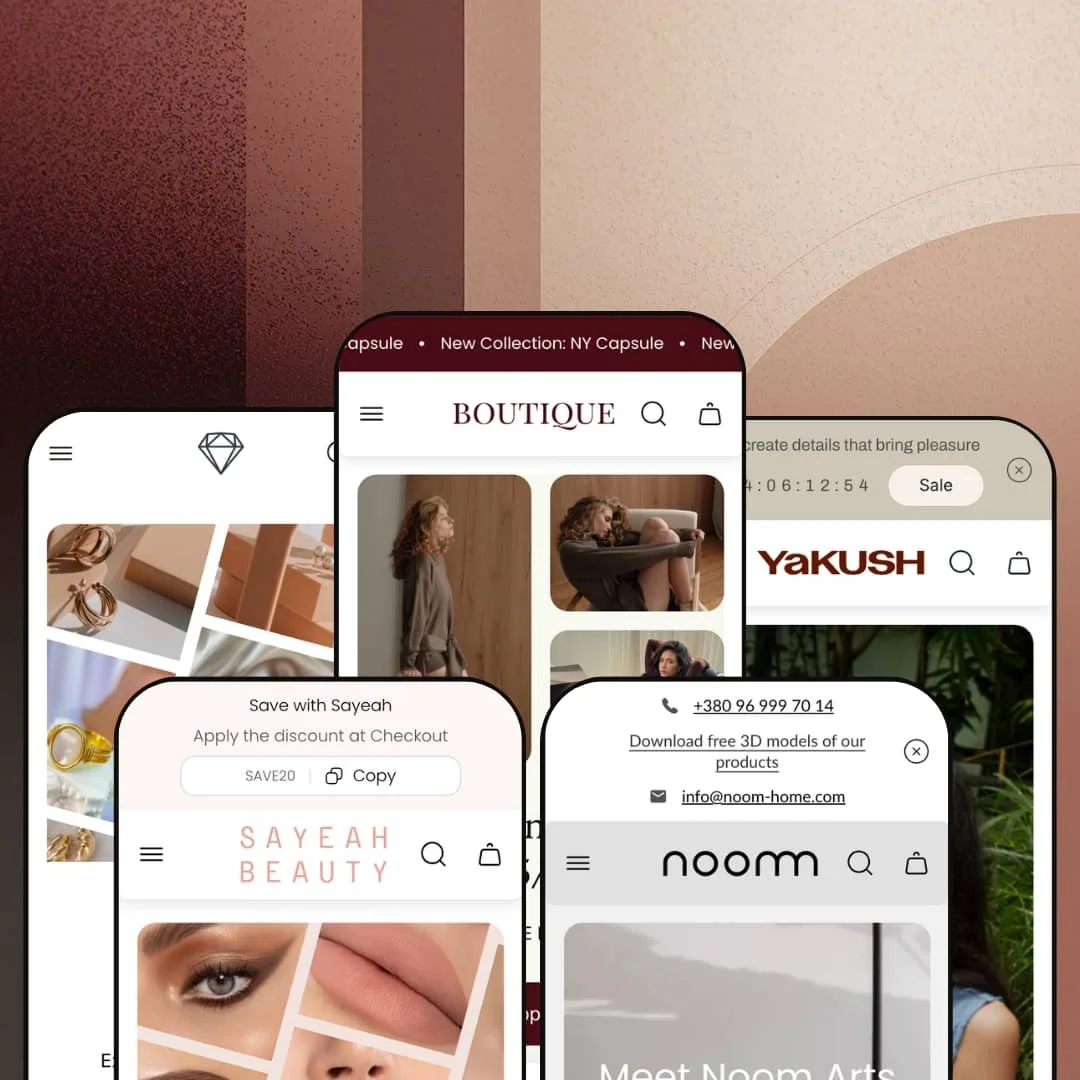
Most boutique-positioned Shopify themes pick one vertical and commit, then ship one or two coordinated presets around that choice. Boutique by UTD takes the opposite bet — five fully realized presets at $160, spanning clothing, design furniture, handmade glassware, color cosmetics, and luxury jewelry. The theme runs on Online Store 2.0 architecture and sits at version 2.2.2 as of January 2026, with active updates from UTD. Whether the spread works for you depends on whether you want a focused vertical-specific theme or a flexible toolkit you'll meaningfully reconfigure per brand.
Five presets, five verticals, one price
Boutique ships five presets at one license fee. Each preset carries its own brand voice, color palette, typography, and section emphasis across The Lace clothing, Noom design furniture, YAKUSH handmade glassware, SAYEAH color cosmetics, and Aurum luxury jewelry. For agencies running 2-5 client builds at once across multiple categories, or for holding-company merchants spanning fashion through home goods, the per-preset cost amortizes quickly compared to buying separate themes.
Cart drawer carries genuine merchandising surface
The cart drawer ships with discount code input, cart notes field, gift-product add-on toggle, terms-and-conditions checkbox, recommended-products carousel, upsell-products section, and a tax-included shipping note — all consistent across the preset demos I tested. For single-brand DTC merchants with 50-200 SKUs and impulse-driven product mix, the consolidated drawer surface replaces the install-and-configure work of multiple drawer apps with native theme sections.
Visual merchandising kit, not just sections
Lookbook sections, image hotspots, before-after image slider, and the 3-product bundle builder all deploy as native theme components, and I watched them work in the Boutique and Jade preset demos. These aren't decorative add-ons. For 50-200 SKU stores in clothing, beauty, jewelry, or home decor where cross-attached purchases drive average order value, the section library actively replaces what would otherwise be a paid bundle-app install plus integration work.
EU-translation shipping covers five languages at launch
For multi-language European merchants the EU translation set ships from day one. The theme carries pre-loaded EN/FR/IT/DE/ES translations for theme UI strings: button labels, form text, structural copy. Shopify Markets still handles product-data localization and currency conversion, but the theme's own UI layer doesn't need translator turnaround before a multi-language launch goes live. For European DTC brands serving 3-5 EU countries from a single Shopify store, that's a launch-week accelerator that few BUDGET-tier themes match.
No vertical-specific depth in any preset
Five presets, five verticals, but each preset is a re-styling of the same section library rather than vertical-specific tooling. The jewelry preset doesn't ship a ring-sizer or birthstone selector; the furniture preset doesn't ship material-sample workflows or assembly diagrams; the cosmetics preset doesn't ship a shade-matcher. For 200+ SKU jewelry brands needing ring-sizing tools, or for furniture merchants requiring material-sample ordering workflows, you'll be back to apps for the vertical-specific work that competitor themes designed for one vertical sometimes include natively.
B2B workflow tooling is thin
The feature list shows "Combined listing" and "Quantity pricing" as Shopify Plus features, but doesn't include dedicated B2B workflows like quote requests, customer-specific catalogs, or net-terms order options. For wholesale-enabled merchants running B2B alongside DTC, or for Shopify Plus brands with 100+ SKU B2B catalogs needing customer-specific catalog views, expect to layer apps on top of the theme rather than configure within it.
Section density assumes editorial brand voice
Every preset I scrolled carries 10-15 distinct content sections on the homepage: lookbooks, founder bios, press coverage, multi-frame video, image-rotating quote loops, lifestyle photography blocks. The assumption baked into the section design is that the merchant operates an editorial DTC brand with content-production capacity. If your brand voice isn't editorial, half the theme is wasted. For drop-model merchants, discount-driven catalogs, or pure-functional stores with no internal content team, you'll strip sections rather than fill them.
What it takes to launch
Expect 2-3 days for full demo overhaul: brand-specific copy and imagery replacement across multiple homepage sections, mega menu re-staging to match catalog depth, store locator and contact entries, section pruning to match catalog size, and EU-translation review if launching multi-language. Presets that import editorial brand storytelling will need a sustained copy pass across hero captions, About-page narrative, FAQ entries, and metafield population before launch.
-
What works in this preset
Click through this preset's product cards and you arrive somewhere unusual: a "Shop by Look" hotspot grid that maps four lifestyle scenes to underlying product collections. Each scene anchors a separate set of products and clicks through to the corresponding collection. For clothing brands where the buy decision starts with the styled outfit rather than the standalone garment, that's a section doing real merchandising work.
The "Buy more pay less" bundle builder sits below. Three product slots accept inline variant choices, the discount applies on selection, and the configuration is theme-native rather than a third-party install. I tested the slots across two sweater variants and a vest, and the discount math reconciled automatically.
Beyond merchandising, the preset carries a multi-location store locator block. Four physical locations show with images, addresses, phone numbers, and shopping-mall context. The Lace's Kyiv and Lviv stores populate the demo, and the section's structure supports up to 4-6 locations cleanly.
Where it stumbles
The mega menu's vertical sprawl is striking. One open dropdown shows fifty-plus individual product links nested under category headers, with sub-sub-navigation underneath. For boutiques with under 30 SKUs, the structure feels built for a much larger catalog and requires aggressive trimming before launch.
-
What works in this preset
Press coverage gets its own section, populated with four real events: Collectible Fair Brussels, Milan Design Week, London Design Fair, and i am u are NYC. Each event shows with imagery, dates, location, and a short editorial paragraph. For design-forward brands building credibility through showroom appearances and design-week participation, this section type isn't optional decoration; it's how the brand explains itself.
I clicked through to a product page expecting standard variant pickers, and found Bar / Counter / Regular as the size axis on a Gropius chair, alongside Material (Oak/Maple) and Color. The variant model adapts to furniture-specific options rather than forcing apparel-style sizing onto a chair listing.
The size guide modal pairs that with a measurement diagram, model parameters, and a short paragraph on how to measure bar versus counter versus regular chair heights. The educational tone fits the design-furniture vertical specifically.
Where it stumbles
The hero is video-heavy and asset-dense. Two product videos render in the lookbook section, alongside lifestyle photography that's clearly studio-shot. Brands without a video production budget or professional studio photography will struggle to fill this preset without it looking diminished.
-
What works in this preset
The tabbed product section consolidates New Arrivals, Best Sellers, and On Sale into a single component on the homepage. Tabs swap inline without page reload, and each tab carries 4-6 product cards with sale badges and color-swatch indicators. For brands with high SKU velocity (handmade, seasonal drops, limited runs), the single-component multi-cohort surface saves homepage real estate.
I noticed the Reflections preset carries a multi-frame "Buy the Look" section with 1/2, 2/2 navigation between lifestyle scenes. Each scene pairs with three or four product cards underneath, so shoppers can scroll through several styled vignettes rather than getting one lookbook image and stopping.
Where it stumbles
The page is dense. Counted end-to-end, the demo homepage carries fifteen-plus distinct content sections including founder bio, brand-origin storytelling, video, multi-cohort product tabs, and Instagram grid. For glassware brands with under 30 SKUs, you'll spend setup time pruning rather than filling.
-
What works in this preset
A copy-to-clipboard discount code sits in the announcement bar. The code shows as "SAVE20" with a Copy button next to it. One click and the code lands in clipboard ready for checkout paste. That's a small mechanic, but for impulse-buy cosmetics shoppers it removes a friction step.
The testimonial section pairs customer quotes with the specific product they're reviewing, linked through to the product page. Three testimonials with photo, name, customer status, quote text, and linked product card. For beauty merchants where review proximity to product drives conversion, the pairing matters more than a separate reviews page.
Where it stumbles
The default currency in the demo is AED rather than USD or EUR, with a multi-currency dropdown carrying 25+ options. The Jade demo's MENA-region default makes sense for a SAYEAH-specific live store but reads as confusing on first preset preview for merchants outside the region.
-
What works in this preset
Aurum is the theme's luxury-positioned preset, framed by UTD for jewelry and diverse high-end collections. The Theme Store description highlights soft transitions, polished typography, and conversion-focused merchandising sections.
The same theme-wide section library carries across to Aurum: cart drawer merchandising hooks, mega menu architecture, lookbook and image-hotspot blocks, swatch filters, and the bundle builder are all part of the shared Boutique theme inheritance available to this preset.
Capability convergence across verticals
Across all five preset demos I tested, the same baseline section library shows up: cart drawer with merchandising hooks, mega menu architecture, lookbook and hotspot sections, bundle builder, predictive search overlay, video sections, multi-image storytelling blocks. The variation between presets is staging — color, typography, content emphasis, photography style. The capability layer is shared. That's a meta-architectural choice worth flagging: one tunable theme re-skinned across five brand voices, rather than five separately maintained theme bases.
Price-to-feature density is unusually high for the BUDGET tier
For a $160 license, the included feature surface is dense relative to what BUDGET-tier themes typically carry. Lookbook sections, image hotspots, bundle builder, press coverage block, before-after sliders, multi-axis variant pickers, RTL support, EU translations, age verifier, back-in-stock alerts, and quick-buy options all ship as theme features. The BUDGET tier usually trades off feature depth for accessibility. Boutique doesn't make that trade as steeply.
Active developer trajectory and support signal
The theme reached version 2.2.2 in January 2026, with updates spanning new section types (a Quiz section was added in the latest release), variant picker improvements, sold-out text on dropdown variants, and badge additions on the product template. UTD's published Theme Store reviews consistently reference the support team's responsiveness as a differentiator, with multiple reviewers citing Custom Mega Menu support and tutorial-grade response quality. For merchants making a multi-year theme commitment, the update cadence and support trajectory carry weight that feature lists alone don't capture.
Generalist positioning forces an "average" ceiling
Each preset works for its named vertical but doesn't go deep enough to compete with a single-vertical theme purpose-built for that category. That's not a flaw in execution; it's the cost of the strategic bet. Merchants who eventually scale into a focused single-vertical brand identity will outgrow Boutique's section library and start needing the vertical-specific tools that didn't ship.
Editorial brand voice is structural, not optional
Whichever preset you pick, the visual rhythm assumes editorial DTC brand framing: founder narratives, lifestyle photography, press placements, sustained-attention storytelling. Even merchants who populate every section will find that without editorial-quality content production capacity, the sections look diminished. Functional, discount-led, or pure-grid-and-filter merchants will leave the editorial scaffolding empty no matter how many sections they configure.
★ 8.0/10
Rating
-
Cart drawer merchandising, mega menu, lookbooks, image hotspots, bundle builder, and press coverage block all ship as native sections. Feature density is genuinely high for the price.
9
-
Five preset starting points each carry deep demo content. Setup is more substantial than for a focused single-preset theme, though OS 2.0 section editing is straightforward once content is replaced.
7
-
Mobile mega menu uses nested back-button stacking. Cart drawer transitions cleanly to a sticky bottom checkout button. Hero sections compress sensibly across all observed presets.
8
-
Lazy-loaded imagery throughout, video sections deferred, restrained third-party script load. Section-dense homepages add weight that section pruning would address.
7
-
Five preset starting points spanning clothing, furniture, handmade, cosmetics, and luxury, with shared section library tunable per brand.
9
Frequently Asked Questions
-
The mega menu's nested architecture is built for 100+ SKU catalogs with multi-level categorization. For smaller catalogs, you'll need to trim aggressively or switch to a simpler flat navigation pattern before launch.
-
The theme lists "Combined listing" and "Quantity pricing" as Shopify Plus features, and the Noom preset's product page (with Bar/Counter/Regular size selectors and detailed measurement modal) hints at B2B-flavored merchandising. Dedicated B2B workflows like quote requests, customer-specific catalogs, or net-terms ordering aren't shipped natively.
-
The bundle builder (labeled "Buy more pay less" in Boutique and "Save in Bundle" in Jade) shows three product slots inline with variant pickers. Shoppers pick a product, choose variants in-place, and the configured discount applies automatically on selection. It's theme-native, not a third-party bundling app.
-
Per UTD's positioning Aurum is "feature-rich, adaptable, designed for luxury and diverse collections." The preset is jewelry-leaning visually but uses the same theme-wide section library as the others. Repurposing for luxury watches, premium leather goods, or comparable luxury catalogs is structurally feasible.
-
Multi-currency rendering is a Shopify Markets-level capability, not theme. The theme renders the country and currency selector UI, and the Reflections, Noom, and Jade preset demos surface 25+ currencies in their selector dropdowns. Boutique's preset demo runs a leaner four-currency dropdown by default.
-
Dawn is Shopify's free baseline with minimal merchandising sections, a single preset, and basic cart functionality. Boutique at $160 adds lookbook sections, image hotspots, bundle builders, cart-drawer merchandising hooks, press coverage block, before-after sliders, video sections, and four additional preset starting points. For merchants who'd otherwise pay for multiple drawer and bundle apps, the step-up makes financial sense.
-
UTD's documentation references over a decade of theme, storefront, and Shopify app development. The Boutique theme launched in November 2024 and reached version 2.2.2 by January 2026 with active updates and support responsiveness consistently cited in Theme Store reviews.
This review is based on hands-on testing of the publicly available preset demos of the Boutique Shopify theme as of May 2026. Theme features, preset availability, and performance can change with subsequent updates from the theme developer.