
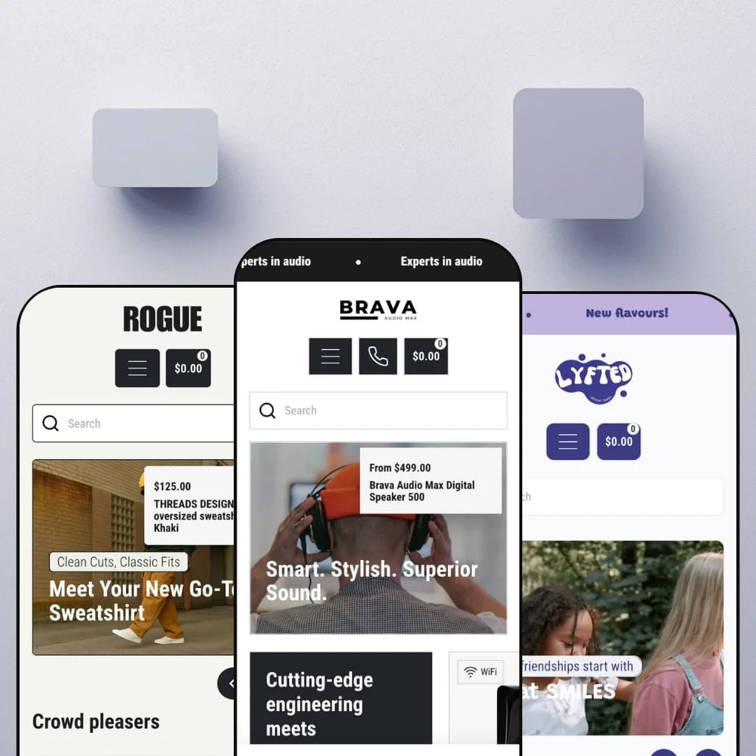
Most Shopify themes that ship multiple presets just recolor the same storefront. Brava points you at three different industries instead: a speaker brand, a teeth-whitening line, and a menswear label, all from a single $220 license. Built on Online Store 2.0, it leans on a 25-plus-section library and a handful of merchandising tools (product bundles, before/after sliders, image hotspots) to make that range credible. The real question is whether one theme can carry audio specs, beauty claims, and apparel sizing without one of those storefronts feeling like an afterthought.
A mega menu built to sell, not just list
Brava's header runs a true mega menu, with nested collection and product links sitting alongside a promotional image tile ("Save 10%") right inside the dropdown. That turns the header into a merchandising surface, putting featured products and a promo banner in front of a shopper the instant they open a menu rather than making them dig. That's navigation doing double duty. For a multi-collection catalog, mid-market apparel or electronics brands carrying 50-plus SKUs across several categories, it's the difference between a menu that files products away and one that pushes them.
Product bundling that ships with the theme
For a brand whose margin depends on attach-rate, electronics shops selling cables and chargers next to a hero device, or beauty lines selling kits, the native bundle section is a standout tool. It groups complementary items into one add-to-cart action with a single combined price, and because it's part of the theme, a small DTC team gets it without bolting on and maintaining a separate app. Set it up once and it works. That's real value for a lean operation watching its stack.
A swatch system that holds across very different product types
Across the presets the variant picker renders options as visual color swatches and tactile size buttons instead of stacked dropdowns, and it stays composed whether the axis is connectivity-and-color or size-and-color. For shoppers, choosing a variant becomes a glance-and-tap rather than a hunt through nested menus, which matters most where color is the purchase driver. Color is a glance, not a hunt. Jewelry, apparel, and accessories sellers, anywhere a buyer shops with their eyes and wants to see the option before selecting it, get a picker that fits how the category actually sells.
A genuinely broad section library
Set Brava next to Dawn, Shopify's free theme, and the gap I kept noticing is the section toolkit. Where Dawn gives you a clean but spare set of building blocks, Brava ships well over twenty sections, bundles, before/after sliders, image hotspots, press strips, UGC video rows, promo tiles, that let one theme furnish a speaker store, a beauty brand, and a menswear label without custom code. For a lean team selling across more than one category without a developer on retainer, that breadth is the point. It's a lot of kit for $220.
Built for boutique catalogs, not big ones
All three presets stage tight catalogs, a handful of speakers, a few whitener flavors, one sweatshirt in ten colors, and the whole design language is tuned for that focus. The theme lists filtering, sorting, and infinite scroll, but nothing in the demos exercises them against a deep catalog, so a merchant running hundreds or thousands of SKUs can't gauge how collection browsing holds up at scale from what's shown. The demos stay small. For a large-catalog electronics or apparel retailer with heavy filter-driven discovery needs, that's an open question, and the boutique-first visual rhythm may fight a sprawling inventory.
A thin, aging review record
Brava carries a perfect score, but read the fine print: three reviews, all from 2023. Three reviews isn't a track record; it's a footnote. That leaves a prospective buyer little signal about how the developer handles support, bug fixes, or compatibility today, beyond a lone January 2026 patch note. For a merchant leaning on the vendor through launch, the kind of small team that can't absorb a stalled support thread, the thin and aging history is worth weighing before committing.
Three presets, three verticals, and not much in between
The range is unusually wide but shallow in count: three presets, each built tightly around its industry, audio, oral-care beauty, menswear. You're starting from someone else's vertical. If you sell furniture, jewelry, food, or anything off that map, you're adapting a vertical-specific demo rather than starting from a neutral base, which means more re-theming up front. For a merchant outside the three showcased categories, especially a considered-purchase brand that needs the storefront to feel native to its niche, that gap means extra setup before the theme reads as theirs.
What it takes to launch
Plan a multi-day pass to swap demo imagery and write real copy across heroes, FAQ entries, About-page narrative, and benefit rows, plus consistency work on brand naming and placeholder fields, before any of the three presets is launch-ready. Budget extra time if you're adapting a preset to a vertical it wasn't built for.
-
What works in this preset
The bundle block is the part that earns its place. Brava's homepage groups the flagship speaker with a USB-C cable and a 60W wall charger, each one toggleable, into a single combined add-to-cart with a total that updates as you select. For an audio brand, accessory attach-rate is where the margin lives, so surfacing that kit on the homepage rather than leaving a shopper to find it is a meaningful lever. It works.
You land on a storefront that knows it's selling one hero product. The hero leads with "Smart. Stylish. Superior Sound." over a single speaker, and everything beneath it is built to push you toward that SKU and its variants rather than scatter attention across a wide catalog. Clicking into the FAQ, I found the questions a speaker buyer actually asks, Dolby Atmos compatibility and Bluetooth pairing, answered in plain language. That focus fits a single-flagship electronics brand.
One detail I liked: the before/after image comparison slider, which the demo uses to show the speaker from two angles. It does honest work in electronics, where a shopper wants to inspect ports, finish, and physical scale before committing the full $499 the flagship asks. The trust-badge row beneath it (free worldwide shipping, designed-in-Melbourne, 24/7 support) handles conventional reassurance cleanly without overstaying. Nothing here is loud.
Where it stumbles
The Brava preset bets everything on a single flagship. Its whole rhythm (hero speaker, bundle block, prose FAQ, one before/after) is tuned for a brand with one star SKU and a few accessories, which is exactly how the demo is staged. A merchant arriving with a deeper audio lineup of headphones, soundbars, and multiple speaker tiers will find the single-hero structure needs real reworking before it fits, because the layout funnels attention toward one product rather than helping a shopper navigate a range. That's a positioning choice, not a flaw, but it narrows who the preset suits out of the box.
-
What works in this preset
Beauty lives or dies on proof, and Lyfted builds its homepage around that fact. A 1080p video hero opens on smiling faces, then a "Featured in" press strip and a "Socially approved" row of vertical UGC-style videos do the social-proof legwork a teeth-whitening brand needs to overcome skepticism. The before/after slider, the same theme section Brava used for hardware, here does the job it was made for: a whiter smile against a baseline. Proof is the pitch here.
What surprised me was how much editorial Lyfted carries. Between the product carousels sit short health-education blocks, enamel safety, gum health, the confidence angle, that frame whitening as oral wellness rather than vanity. It's a smart content play for a category fighting the "is this safe?" objection, and the FAQ extends it with concrete answers about hydrated silica, peroxide-free formulas, and vegan sourcing. The preset reads like a brand with a point of view.
The footer carries a working country and language selector, with the demo set to Australian and US dollars side by side. That selector is the theme rendering Shopify's market switcher, and Lyfted places it where an international beauty shopper expects to find it, in the footer, styled to match. The newsletter block leans on a giveaway hook ("enter for a chance to win") rather than a flat "subscribe," which suits an impulse-friendly beauty price point. Small touches, but they fit the vertical.
Where it stumbles
Lyfted's polish is front-loaded onto the homepage. The video hero, press strip, and UGC row carry real persuasive weight, but the demo's product pages are staged lean, often a single image, a short blurb, and one default variant, so the moment a shopper clicks through to buy, the storytelling drops off a cliff. A beauty brand converting on ingredient trust and a results timeline would need to build those product-page sections out itself to hold the momentum the homepage creates. The tools are there; the demo just doesn't model them at the product level.
-
What works in this preset
Pick any sweatshirt in the Rogue demo and the full grid opens up. Each style runs a three-size by ten-color matrix, thirty variants in all, rendered as size buttons and color swatches with a neat "+7" overflow so the buy box stays tight. Apparel lives on this interaction. Rogue handles it cleanly: choose Large, choose Maroon, and the selection resolves without a single dropdown.
There's a bit of urgency baked in, too. A couple of styles run a compare-at price, the strikethrough $125 sliding to $95 under an "On sale" badge, which is exactly the lever a drop-driven menswear label pulls. The "Which colour works?" block puts the swatch picker out front as a styling prompt instead of a buried option, nudging shoppers to browse across colorways. For a catalog that wins by selling one silhouette in ten colors, that's the right instinct.
Where it stumbles
Rogue models one silhouette, and little beyond it. The whole demo is a single oversized sweatshirt in ten colors, so the preset's rhythm (hero, crowd-pleasers carousel, color-swatch prompt) is tuned for a mono-product brand rather than a full menswear range. A label arriving with jackets, trousers, tees, and accessories across seasons would need to re-stage the navigation into real category menus and build out section variety before the catalog feels shoppable by department. It's a sharp starting point for one hero product, but that focus is narrow by design.
Range that actually spans industries
Read all three presets back to back and the spread is the headline: a hardware brand, a cosmetics brand, and an apparel brand that genuinely look like they belong to different companies. That's a different design philosophy from the usual one-vertical theme dressed in alternate palettes, and it signals a system flexible enough to be re-pointed at a fourth or fifth industry with work. The theme's character is adaptability, not a single signature look.
Sections that map to how each vertical actually converts
What ties the presets together is that the merchandising sections line up with each category's real conversion lever: attach-rate bundling for electronics, before/after and social proof for beauty, swatch-and-size handling for apparel. The theme isn't just handing over generic blocks; the toolkit happens to contain the specific persuasion mechanics each of these industries leans on. That coherence is the strongest argument for choosing it over a prettier but shallower template.
Flexible, but without a strong opinion of its own
The same adaptability that lets Brava cover three industries means it doesn't carry a bold design signature the way a single-vertical premium theme can. Across the presets the layouts are competent and clean but rarely surprising, and the personality you notice comes mostly from the demo content, not from a distinctive point of view of its own. A brand chasing an unmistakable, opinionated storefront will likely treat this as a capable foundation to build on rather than a finished aesthetic.
Breadth bought at the cost of vertical depth
Covering three industries from one theme is a spreading bet, and the trade shows up as breadth over depth. None of the three storefronts gets the deeply specialized, category-specific tooling a theme built for that single vertical can justify, because the engineering is shared across all of them. For a merchant who wants the most specialized apparel, electronics, or beauty experience available rather than a strong generalist, a dedicated single-vertical theme may go deeper, even if it can't match Brava's range.
Rating
★ 7.6/10
-
A deep, genuinely useful merchandising toolkit: native bundling, before/after sliders, image hotspots, swatch-and-size variant handling, press and UGC sections, and sale-badge support. It loses a point because the depth is broad rather than specialized in any single vertical.
8
-
The Online Store 2.0 section editor and a 25-plus-section library make assembly approachable. Points come off for the heavier demo-content cleanup and the work of adapting a vertical-specific preset to a different industry.
7
-
Touch-friendly color swatches and size buttons, a slide-out cart, and a clean mobile menu give all three storefronts a solid handheld baseline.
8
-
Pages stay reasonably lean with lazy-loaded imagery and restrained section counts, though Lyfted's video-led hero and the image-heavy product carousels add weight worth optimizing before launch.
7
-
Twenty-plus theme-wide sections plus three industry presets give real layout range across very different storefronts. The ceiling is a flexible generalist look rather than one bold, opinionated aesthetic.
8
Frequently Asked Questions
-
No. The demos lean on press logos and UGC-style videos for social proof, not star-rating widgets. Customer reviews on Shopify almost always come from a separate app such as Judge.me or Loox, which you'd install and wire in yourself.
-
The theme renders the country and language selector you see in the Lyfted and Rogue footers (set to AUD and USD), but the actual currency conversion and translations run on Shopify Markets, configured at the store level rather than inside the theme. The theme's job is showing the switcher; Markets does the converting.
-
Neither shows up in the demos, and both are typically app-driven on Shopify. A consumable brand like the teeth-whitening preset would add subscriptions through an app such as Recharge; a wishlist would come from a separate app too.
-
Yes. The single $220 license includes the Brava, Lyfted, and Rogue presets, so you can start from whichever sits closest to your industry and restyle from there.
-
Yes. The menswear preset references a Size Guide on each product page, and a size-chart module ships with the theme, so apparel sellers can attach measurements without reaching for an app.
-
Pick the closest in catalog shape, not just industry. A single-hero brand maps to Brava, a content-and-proof brand to Lyfted, and a many-variant catalog to Rogue, then restyle from that base.
This review is based on hands-on testing of the publicly available preset demos of the Brava Shopify theme as of June 28, 2026. Theme features, preset availability, and performance can change with subsequent updates from the theme developer.