
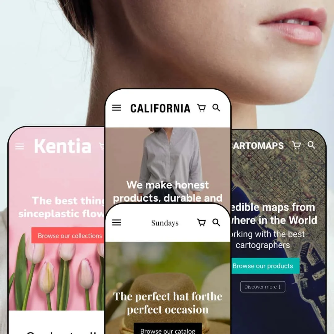
The California theme positions itself as a clean, lifestyle‑oriented design for merchants selling physical goods. Across all presets the theme leans on a sticky header that stays in view as you scroll, a prominent hero section with a headline and call‑to‑action, tidy product grids with simple Buy buttons and a slide‑out cart drawer that keeps shoppers on the page. Merchants can change colours, fonts and layout blocks through the theme editor; mega‑menu support, multi‑level navigation and a search overlay with product suggestions are also available. Shoppers are guided toward products via editorial sections and category tiles rather than dense catalogs, and each product page uses accordions for ancillary information. On first impression the generous hero images, muted palettes and concise typography lead the eye toward the central call‑to‑action while conveying an artisanal brand mood.
Pros.
〰️
Pros. 〰️
✚ Flexible presets, consistent core
flexible preset options that maintain core functionality while offering distinct aesthetic approaches. Each preset changes the mood—modern, cartographic, gift‑oriented, botanical—without disrupting the shopping mechanics, so teams can pursue look and feel while keeping the same checkout path.
✚ Storytelling‑first structure
Hero sections, editorial blocks and visual category tiles guide discovery with intention. That approach draws attention to brand values and materials before the shopper dives into product detail, which suits craft‑minded catalogs.
✚ Cart flow that keeps shoppers on the page
A slide‑out cart drawer appears immediately after adding an item, with quantity controls and clear calls to check out. Keeping the cart in a drawer reduces back‑and‑forth page loads and preserves context during purchase.
✚ Navigation that scales sensibly
Mega‑menu support and multi‑level navigation provide an orderly scaffold for mid‑size catalogs. Merchants can stage promo imagery in the menu to spotlight collections without sending visitors on detours.
✚ Built‑in content modules
The theme’s blog layout, FAQ blocks and multi‑section About pages give merchants ample editorial surfaces. Content can live in the same visual system as the store, improving cohesion and reducing reliance on extra apps for basic storytelling.
Cons.
〰️
Cons. 〰️
🚫 No grid‑level quick‑add or quick‑view
Product cards do not offer one‑click add or a lightweight preview. Repeat customers must click through to product pages for every purchase, which adds taps in fast‑moving scenarios.
🚫 Single‑image product cards
Secondary imagery on the grid is not supported by default. Shoppers must open product pages to see alternate angles or context shots.
🚫 Tall header + big hero on small screens
The sticky header combined with oversized hero photography can compress the initial viewport on phones. Important content may sit just below the fold unless merchants trim hero height.
🚫 No built‑in size‑chart component
Stores selling sized apparel will need to embed a page or install an app for fit guidance. That adds a small setup task for teams with detailed sizing needs.
🚫 Performance depends on image discipline
Large hero assets can slow first paint if not compressed. Merchants should keep banner files lean to maintain a snappy feel across the storefront.
-
This preset targets modern clothing and home‑goods brands. Its palette of warm neutrals and airy typography creates a welcoming, ethically minded feel that matches the demo’s emphasis on slow fashion.
What works in this preset
The aesthetic is tightly curated. Warm neutrals, spacious type and unfussy blocks form a relaxed, humane storefront that foregrounds materials and provenance. That tone supports copy about slow fashion without the layout ever feeling heavy.
A dedicated “Radical Transparency” section uses six illustrated icons to surface sourcing and manufacturing values. By turning policy into simple visual cues, the page keeps momentum while still communicating depth; shoppers get a quick read on what the brand stands for.
-
Cartomaps is styled for customized map prints and other niche artwork. A bold aerial hero and neutral tones give the prints center stage, while copy lines explain the proposition in plain language.
What works in this preset
The opening hero pairs a succinct tagline with two clear calls‑to‑action—“Browse our products” and “Discover more.” That split gives first‑time visitors a direct route to the catalog or a softer path into the brand story, reducing indecision on landing.
A “Why our prints are different?” block distills selling points into icon‑backed statements. In a category where paper quality and map coverage matter, that shorthand clarifies value without sending shoppers down a rabbit hole of specs.
Where it stumbles
Some “Discover more” buttons anchor to lower sections of the page rather than opening a new view. That behavior can surprise visitors who expect a fresh page and may briefly lose their sense of place.
-
Lane caters to accessory and apparel brands, especially hat‑forward or seasonal lines. Earthy tones and lifestyle photography set a relaxed, gift‑friendly mood.
What works in this preset
The hero zeroes in on a featured hat with a straightforward call‑to‑action. It pulls the eye into the catalog immediately and frames the product with warm, natural textures.
The palette and photography read as sun‑baked and tactile. That tone pairs well with natural fibres and seasonal accessories, supporting a relaxed, gift‑friendly mood.
-
Kentia targets art, botanicals and home‑decor. A pastel palette and floral imagery create a calm storefront suited to lifestyle and wellness‑adjacent products.
What works in this preset
A floral hero with soft colours sets a tranquil tone right away. That mood matches botanical prints and plant‑adjacent goods, inviting slower exploration without clutter.
The product grid is intentionally minimal. By stripping visual noise and using gentle badges, it keeps the focus on the artwork itself rather than on interface chrome.
Where it stumbles
The pastel palette and light fonts can reduce contrast over very light imagery. Brands should test headlines and buttons against their own photography to ensure readability remains strong.
Niche Suitability
Not Ideal For
-
Lifestyle, fashion, art and home‑decor brands that value narrative, craftsmanship and a calm visual language. If your catalog benefits from editorial framing and you prefer a content‑first approach, California is a comfortable fit.
-
Merchants who prioritize rapid, one‑click shopping from the grid or rely on multi‑image product cards for quick comparison may prefer a theme with aggressive on‑card interactions.
-
Medium — To shine, California needs high‑quality imagery and thoughtful copy to populate its editorial sections. The section library is straightforward, but crafting the story and tuning hero assets will take a bit of time.
Final Recommendation
★ 7.2/10
Rating
-
Covers core Shopify features like multi‑level navigation, variant selectors and a slide‑out cart drawer; lacks quick‑add and secondary images on product cards.
7
-
Intuitive section blocks and clear page templates make setup straightforward; merchants can adjust colours, fonts and content without coding.
8
-
On phones, tall headers and large hero images can push content below the fold; there’s no mobile‑specific quick‑add.
7
-
Pages load briskly when images are optimised; high‑resolution hero banners may slow initial load if not compressed.
7
-
Four distinct presets offer varied aesthetics while retaining a cohesive feel; extensive section options allow merchants to create unique layouts without altering the code.
7
FAQ
〰️
FAQ 〰️
-
👑 Yes. The Kentia preset in particular uses pastel imagery and a calm layout that suits botanical prints and décor, while the default preset can showcase home goods with editorial storytelling.
-
📱The layout adapts to smaller screens and the cart drawer still functions, but large hero images and tall headers mean some content sits below the fold. No mobile‑specific quick‑add is provided.
-
🎨 Yes. You can change colours, fonts, images and content blocks in the theme editor; variant swatches and section order can also be adjusted without code.
-
⚡ Performance is solid with optimised images; however, high‑resolution hero banners can slow down first paint. The slide‑out cart drawer appears instantly after adding an item.
-
👕 Yes. Product pages support colour and size selectors, update the price accordingly and include Add to cart and Buy it now buttons. There is no quick‑add for variant selection from the grid.
-
🔎 Standard Shopify SEO settings (meta tags, alt text, structured data) are available. The built‑in blog and clean HTML aid content‑driven SEO, but there are no advanced SEO features beyond what Shopify provides.
-
💱 Yes. The header includes language and currency selectors, allowing shoppers to switch locale; translation content can be added via Shopify’s Translate & Adapt system.
-
⚙️ California is compatible with most Shopify apps. The slide‑out cart is configurable, and merchants can add apps for reviews, size charts or marketing pop‑ups as needed.
-
🛒 You can explore live demos for each preset on the Shopify Theme Store. When purchased, themes come with an unlimited trial period in your own store until you publish.
This review is based on hands‑on testing of the publicly available “California (Default), Cartomaps (Disruptor), Sundays (Lane) and Kentia (Anthologist)” preset demos of the California Shopify theme as of 15 November 2025. Theme features, preset availability and performance can change with subsequent updates from the theme developer.