
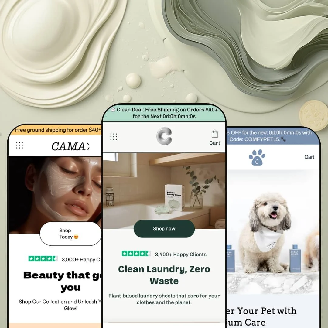
Filed under home goods on the Theme Store, this theme's three demo stores sell laundry sheets, face serum, and dog shampoo. None of those belong in a living room, and that mismatch is the most honest thing about Cama. It isn't really a home theme. It's a conversion build for single-product and small-catalog DTC brands, running on Shopify's Online Store 2.0 architecture and leaning on a short list of persuasion-focused sections to carry each store.
The comparison table is a real selling tool
Cama's comparison section turns up in all three demos and takes a different shape in each: a four-row eco checklist against "Traditional Detergent" in the laundry store, a four-column grid naming Kiehl's, Neutrogena, and L'Oreal in the beauty store, and an eight-row "Us vs Them" matrix in the pet store. That range lets a differentiation-led brand argue its case on the page instead of hoping a shopper does the homework. For a single-product or small-catalog DTC seller whose pitch is "why us, not the incumbent," this section often carries the argument.
Native before/after sliders for results-driven products
A before/after image slider ships with the theme: two images, one handle, no app required. The laundry demo runs one on both its homepage and product page, and the beauty demo sets another into the cleanser page beneath the description. For skincare, grooming, or cleaning brands where the proof is the transformation, that slider answers the buyer's main question before they ever reach for the reviews. Considered purchases turn on exactly this kind of evidence.
A promo kit tuned for launches
Cama bundles its urgency tools into one working set: a countdown timer in the announcement bar, a multi-message bar that rotates offers, and sale badges that state the saving in cash. The pet demo counts down to a coded discount (COMFYPET15), and the laundry demo cycles three announcements above the fold. Run together, they hand a flash sale or a launch window the time-pressure and the headline it needs without a single line of code. For a single-product brand leaning on drops and limited promos, the kit is ready the day you install it.
If you haven't settled your store's shape yet, this library bends
The same roughly twenty sections produce a one-product landing page, a dense multi-collection beauty store, and a stripped pet shop without any of them looking borrowed. A small team can start in one shape and move toward another as the catalog grows, rather than being locked into the layout it launched with. That flexibility suits an early brand that expects its structure to change inside the first year.
A generalist, with no vertical specialization
Cama is built to sell almost anything, and the cost of that reach is specialization. The three presets span eco-household, beauty, and pet care on one shared toolkit that ships no category-specific sections: no apparel size guide, no jewelry try-on, no food subscription module, no furniture room-planner. A merchant who needs tooling particular to their vertical will be building or sourcing it themselves. For apparel, jewelry, or food brands that lean on category-native features and expect them included, this absence is worth weighing before purchase.
Built for funnels, not big catalogs
Every demo here is shaped like a funnel, not a storefront. The navigation stays shallow at three or four top-level links, the homepages march toward a single buying decision, and the merchandising sections favor persuasion over dense browsing. Filtering and swatch filters do exist in the theme, but neither the section emphasis nor any demo shows it handling hundreds of SKUs across many categories. For a retailer running 500+ products or a multi-category range, the burden of proving this theme scales falls on you, not the demos.
The distinctiveness rides on two sections
Strip the comparison table and the before/after slider out of Cama, and what's left is tidy but ordinary. The hero, featured collection, testimonial wall, newsletter block, blog feed, and video section are all competent and all recognizable from plenty of other themes. Those two signature sections do most of the work of justifying a $240 price, which is a fine trade if they happen to be the two you need. For a buyer cross-shopping themes on feature depth at the mid-market tier, the standout here is narrow rather than broad.
What it takes to launch
Expect a full pass on copy and imagery across hero captions, the comparison table's competitor rows, testimonial sourcing, and product galleries, plus metafield population for product descriptions and a real before/after photo set before any of the signature sections earn their place. Budget one to two days.
-
What works in this preset
You land on one product and the store never lets you forget it. The whole preset is one funnel built around a single item, a box of reusable laundry sheets, and every section bends toward that one decision. The hero sets the eco pitch, a comparison table lines the sheets up against traditional detergent, and the FAQ closes the loop on the practical worries (skin sensitivity, cold-water washing, biodegradability). It's tight. For a brand with exactly one hero product and a clear story to tell, this is a clean shape to start from.
The testimonials are the detail that stuck with me. Instead of anonymous five-star quotes, each one names its source, pulled from Instagram DMs and X replies, with a believable mix of praise and mild complaint. One reviewer admits she needed two sheets for heavy loads but kept buying anyway. The candor lands. It reads as more trustworthy than a wall of perfect ratings, and for a young brand trying to earn that first purchase, the honesty does quiet, useful work.
The product page handles the actual buying decision with a two-axis picker. Scent comes first (Fresh Linen or Unscented), then pack size (12, 32, or 96 loads), and the price updates per combination from £4.99 up to £28.99. Quantity stepper, tax line, sticky purchase area: the essentials all sit where a shopper expects them. Nothing fancy. The page just gets out of its own way.
Where it stumbles
The single-product commitment is also the preset's ceiling. Everything here assumes one hero item, so the moment a merchant adds a second line, the shape that makes this demo feel focused starts to work against them. There's no natural slot for a growing range, and the comparison-and-FAQ rhythm that suits one product would want rebuilding for several. For a brand that plans to expand within a year, that trade-off is worth weighing before settling on this preset.
-
What works in this preset
This is the demo that shows the theme at full stretch. The Vanity homepage stacks nearly everything Cama owns into one beauty storefront: a hero, a best-sellers row, a gift-card block, a founder story dated to 2016, a product video with sound, a new-arrivals collection, a long testimonial wall, recent blog posts, and a closing trust-badge row. It's a lot. I scrolled a while before reaching the footer. If you want proof the section library has range, here it is.
I clicked into the search and it earned its keep. The predictive overlay leads with three popular searches (Cream, Oil, Skin) and then surfaces featured products right inside the dropdown, so a shopper who roughly knows what she wants gets a head start. On the product pages, the comparison table goes all in: it names real competitors down the row, setting "Us" beside Kiehl's, Neutrogena, and L'Oreal on price and ingredients. Bold staging for a demo. It shows a merchant exactly how aggressive the section can get.
The promo mechanics are tuned for beauty margins. Sale prices show the strike-through alongside a savings badge that does the math for you ("Save 10%, a €3,00 value"), and unit pricing breaks cost down per 10ml for the products that carry it. For a skincare range that lives on discounting and repeat purchase, that pricing clarity removes a small point of friction at the right moment. It's a sensible default.
Where it stumbles
The density cuts both ways. A first-time visitor travels past gift cards, company history, and an autoplay video before reaching the new arrivals most of them came for, and the homepage's through-line gets diffuse along the way. For a considered-purchase beauty shopper, that's a fair amount of preamble before the products do the talking. The sections are all competent; the running order is what asks for an edit.
-
What works in this preset
Here the theme does the opposite of Vanity, and strips almost everything away. The Critter homepage runs lean: a hero, a three-clip product-video gallery, a small featured-products row, one "safe for everyone" content panel, and a stats strip (45-day trial, 100,000+ bottles sold). The build moves fast and stays light. For a pet brand with two or three products and confidence in its visuals, that economy is a feature, not a shortfall.
The product gallery is where Critter puts its money. The pet-shampoo page carries six photographs plus thumbnails, a generous spread for a single bottle, and the imagery (credited to a real grooming brand, Clean Coats) is genuinely strong. Below it, an eight-row comparison table checks "Us" against "Them" on everything from pH balance to cruelty-free sourcing. That's the fullest version of the section across the three demos. It shows how far the table stretches once a merchant fills it out.
The offer structure pushes bundles. The shampoo runs at a 33% saving with the badge spelling out the €9,00 you keep, and a "Get all" bundle gathers the whole line into one discounted purchase. For a small pet range working to lift average order value, that bundle-and-saving pairing is a sensible lever. Simple, and it fits the catalog.
Where it stumbles
The pared-back staging is a choice, not a limit, but it leaves the homepage short on story. Critter rides on video and price where the same theme makes longer narrative sections available, so the persuasion load shifts almost entirely onto the product page. A pet parent weighing this brand against the shelf option gets strong imagery and a discount, with little on the homepage about why this shampoo earns a spot in the bathroom. Merchants choosing this preset will likely want to add a section or two of their own reasoning before launch.
One design language across very different stores
Read the three demos back to back and the striking thing is how consistent they feel. Detergent, face serum, dog shampoo are utterly different products, yet the typography, spacing, and section rhythm stay recognizably one theme throughout. A merchant inherits a professional aesthetic baseline that holds whatever the catalog, and that consistency is genuinely uncommon to get for free. The design rarely fights the vertical you point it at.
It rewards a clear single-product story
The sharpest demo is also the simplest: the laundry preset, built around one hero product, is the most convincing of the three. Cama performs best when a merchant arrives with one strong product and a story to match. Point it at a focused proposition and it sings; hand it a sprawling, unfocused range and the same sections start to feel like filler. The theme has a clear opinion about how it wants to be used.
A short track record
Cama sits at 86% positive across just seven reviews, too small a sample to say much about how the theme and its support hold up at scale. The reviews that exist are encouraging, and several single out the developer's responsiveness by name. It simply hasn't been in enough stores long enough to build a record a cautious buyer can lean on. That's not a red flag, only a known unknown.
Its best sections need you to bring the goods
Read across all three demos and a pattern surfaces: Cama's strongest moments depend on content the merchant has to create. The comparison table only persuades with honest, populated competitor data; the before/after slider only works with real, convincing photography; the testimonial sections only land with genuine social proof. The theme hands over an excellent frame, then waits for substance it can't supply. The power here is conditional, and the condition is your own material.
★ 7.8/10
Rating
-
The comparison table, before/after slider, and promo kit give real merchandising range for the tier; the depth is concentrated in a few sections rather than spread across the library.
8
-
Clear presets and around twenty sections make assembly approachable, though the signature sections need real content populated before they do anything.
7
-
Mobile-first build with a slide-out cart and sticky purchase areas; the funnel-shaped layouts compress cleanly on a phone.
8
-
The focused demos run lean on lazy-loaded imagery and restrained section counts; the dense beauty preset naturally carries more weight.
8
-
The same library credibly builds a one-product page, a full beauty catalog, and a lean pet shop, even if the visual signature stays narrow.
8
Frequently Asked Questions
-
Yes, and the laundry preset is the proof. It runs as a single-product funnel where the product page effectively is the store, comparison table and FAQ included.
-
It's native to Cama, no app required. You provide the two images, and the slider appears in two of the three demos out of the box.
-
No. Those come from a separate reviews app rather than the theme; Cama leaves the space for that app to render, but it doesn't generate ratings itself.
-
Five: English, French, Italian, German, and Spanish, plus right-to-left layout support for languages that need it.
-
Yes. The announcement bar and a countdown section are built in, as the pet and laundry demos both show with their timed discounts.
-
If you have one hero product, start with Cama; the Vanity preset fits a small beauty-style range with a fuller homepage, and Critter suits a tight two-or-three-product line.
This review is based on hands-on testing of the publicly available preset demos of the Cama Shopify theme as of June 27 2026. Theme features, preset availability, and performance can change with subsequent updates from the theme developer.