
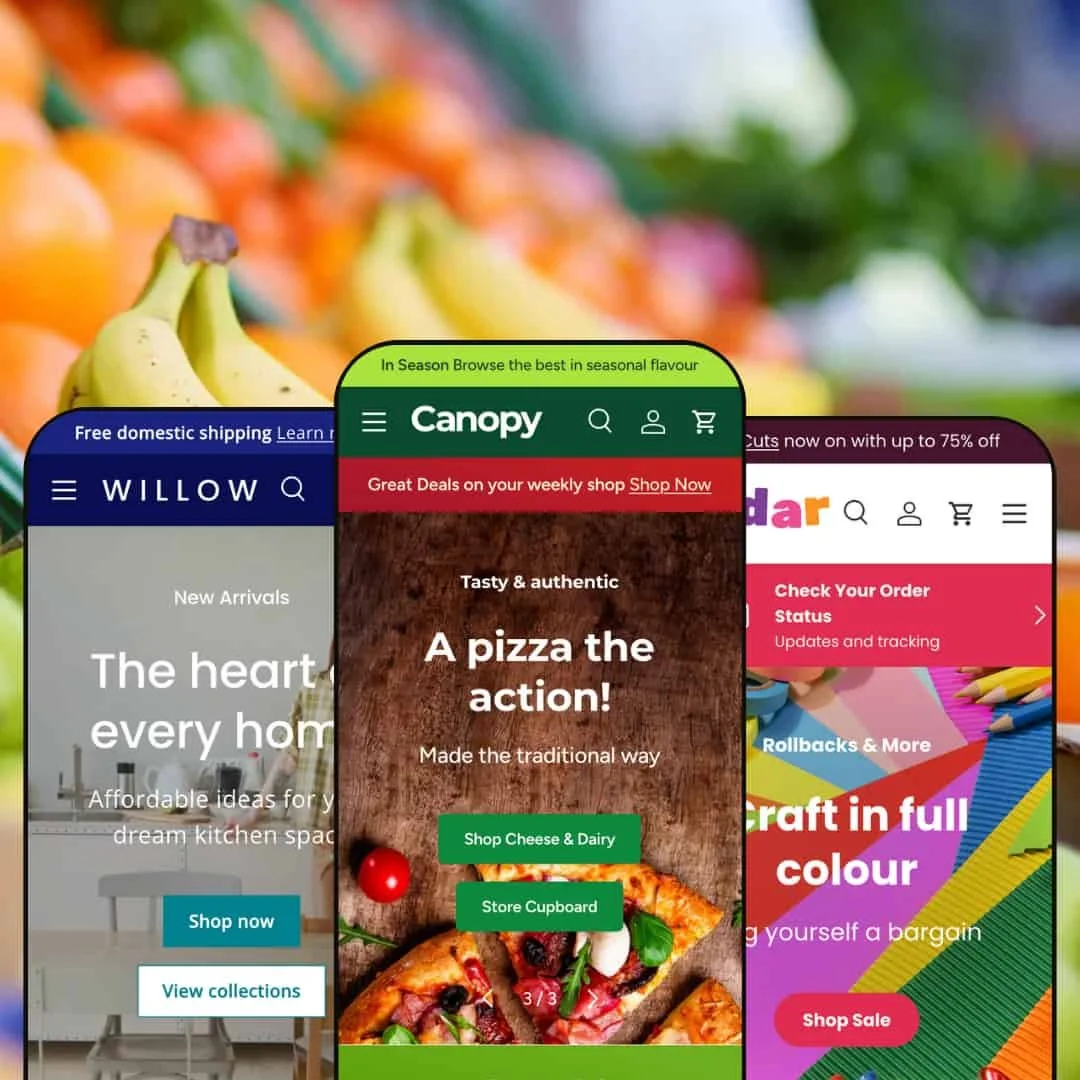
Canopy is an Amazon‑inspired theme aimed at shops with big catalogues. Across all presets you get a prominent search bar, a mega‑menu for deep navigation and a slide‑out cart that stays visible while you browse. Shoppers can add single‑variant items instantly or choose variants via a side panel. My first impression is that the theme immediately drives visitors toward a call‑to‑action: bold hero images and large headlines pull attention, while the sticky header, search and cart icons keep core actions within reach.
Pros.
〰️
Pros. 〰️
✚ Flexible presets, consistent core
flexible preset options that maintain core functionality while offering distinct aesthetic approaches. In practice, you can switch the “skin” from market‑fresh to playful to refined without relearning core shopping mechanics. Teams get creative freedom while retaining predictable UX across catalogues and campaigns.
✚ Search and navigation that scale
The prominent search bar surfaces suggestions as you type, and the mega‑menu handles deep category trees cleanly. Optional voice input adds a small convenience layer for multitasking shoppers. Together, these elements keep large assortments navigable and reduce pogo‑sticking between pages. Category sliders give quick entry points into popular groups without relying on the header.
✚ Variant‑aware quick add with a helpful cart drawer
Single‑variant items add to cart immediately, while multi‑variant items open a side panel for swatch selection and quantity controls. The cart drawer reflects changes in place, shows progress toward free shipping and suggests complementary products. That shortens the path from browse to basket and nudges order value upward without forcing a full page load.
✚ Product pages built for detail
Galleries, badges (such as “locally sourced” or “new”), accordion tabs for specifications or nutrition, and rating distribution charts help shoppers decide with confidence. A specification table is available for materials and dimensions when precision matters. You can present nuance without resorting to long, unreadable blocks of text.
✚ Content and story, not just listings
Recipe and blog sections invite editorial storytelling alongside products, while About‑page blocks support brand narrative and values. This mix of utility and inspiration keeps the store from feeling purely transactional. It also provides ongoing content hooks for newsletters and search‑driven traffic.
✚ Promotion‑ready merchandising
Countdown timers and prominent promo banners give merchants simple ways to spotlight limited‑time offers. Used judiciously, they create urgency and direct attention to curated bundles or launches. The theme’s structure makes it easy to refresh these placements as campaigns change.
Cons.
〰️
Cons. 〰️
− Gating that can interrupt flow
An age‑verification modal appears on entry in the demos. For non‑restricted goods, that extra step can feel like friction and may cost momentum on first visit.
− An over‑present cart drawer in edge contexts
The slide‑out cart persists across many pages, even error states such as 404. While consistency is useful, the overlay can distract from recovery actions when a page isn’t found.
− Promotion stacking at the top of the page
Multiple announcement bars, discount strips and badges can crowd the header if everything is enabled at once. Without restraint, the first screen risks looking more like a bulletin board than a store.
− Comparison that lacks a destination
A compare checkbox appears on product cards, but there’s no obvious comparison page in the demos. Shoppers may not understand what the feature does, which weakens its value.
− Occasional variant and limit quirks
In testing, a variant panel sometimes left the add‑to‑cart button disabled until a specific image was clicked, and a saucepan test in Willow displayed a “maximum quantity already in your cart” message after adding only one. These edge cases are fixable with staging attention, yet they can confuse purchasers in the moment.
-
Natural positions Canopy as a grocery and fresh‑food storefront. Soft colours and friendly typography evoke a farmer’s market, while lifestyle photography highlights produce and ready‑made meals. The page feels busy in a good way, guiding you from seasonal heroes into helpful content blocks.
What works in this preset
The visual direction leans into a market‑fresh palette and typography that feels warm and approachable. Lifestyle imagery of produce and prepared meals adds context to price and size, so shoppers can picture the items in use. The overall tone supports everyday baskets rather than one‑off splurges.
The homepage rotates through seasonal hero images with large headlines and clear calls to action. This rhythm sets up weekly promotions and gives merchants room to swap creative quickly, without losing the page’s structure or momentum. The result is a storefront that looks alive when campaigns change.
Typography and colour choices carry the “fresh market” idea into product sections. Even when the grid fills with everyday staples, the styling keeps the page feeling friendly rather than utilitarian. It’s an aesthetic that favours repeat shops and pantry refills.
-
Cedar takes a playful turn with bright colours and crafted illustrations. It feels tailored to art supply, toy or stationery merchants, where a bit of whimsy is part of the sell. The tone is energetic and encourages exploration.
What works in this preset
A lively palette and friendly type choices suggest creativity without veering into childish. That helps brands that serve kids and adults alike, such as makers, crafters and design‑led stationery shops. The look communicates “fun” while keeping products front and center.
Bright colours paired with crafted illustrations set a clear mood for creative categories. This combination feels purpose‑built for art supplies and toys, where playfulness is a feature, not a distraction. It signals what the store is about the moment the page loads.
The typography keeps the staging upbeat without tipping into novelty. Headings read confidently on colour, while body copy remains clean and simple. The net effect is a cheerful interface that still feels shoppable.
-
Willow offers a refined, modern look geared toward homeware and lifestyle brands. A dark blue header and clean typography sit alongside warm kitchen imagery and subtle product palettes. The overall effect is polished yet approachable.
What works in this preset
The header’s darker tone frames the page and helps the central logo read clearly on both light and photo‑heavy sections. Paired with measured letter‑spacing and quiet colour accents, it channels a modern‑home magazine rather than a warehouse catalogue. That suits cookware and decor where taste is part of the purchase.
A hero shot of a charcuterie board invites customers to “shop cookware” with little explanation needed. It tells a story in one frame, which is useful for entertaining‑led assortments. Merchants can swap the shot by season without rebuilding the layout.
Careful spacing and restrained colour choices keep the grid feeling calm. Combined with the editorial‑leaning hero, the page stays tasteful even when merchandising multiple categories. It’s a composed presentation that flatters higher‑consideration items.
Niche Suitability
Not Ideal For
-
Shops with broad catalogues in groceries, crafts and homeware that value strong search, variant handling and integrated content. The theme shines when you need to educate, inspire and convert in a single flow.
-
Very small catalogues or minimalist brands that don’t need big‑store navigation and heavy promotional modules. If your identity relies on extreme restraint, a lighter theme may suit you better.
-
Medium — You’ll curate mega‑menus, tune promotional placements and keep content blocks fresh so the header doesn’t feel crowded. Expect to test variant panels and the cart overlay across key product types to avoid edge‑case friction.
Final Recommendation
★ 8.6/10
Rating
-
A comprehensive feature set including mega‑menus, quick‑add variants and integrated blogs.
9
-
Once configured, navigation and cart flows are intuitive, though the multitude of bars and banners may require careful setup.
8
-
Sticky headers and thumb‑friendly buttons work well on smaller screens; the cart drawer feels smooth.
9
-
Pages load cleanly with animations, but heavy imagery and multiple sliders may impact speed slightly.
8
-
A wide range of sections and presets offers versatility; most features can be enabled or disabled through settings.
9
FAQ
〰️
FAQ 〰️
-
👑 Yes. The Natural preset showcases a grocery staging with a mega‑menu and a prominent search bar, making it well suited to fresh‑food retailers
-
📱Navigation stays sticky, the cart drawer slides smoothly and grids adapt cleanly. Buttons and swatches are comfortably tappable.
-
🎨 You can customise colours, typography and section layouts, and each preset provides a different aesthetic; the craft preset even uses playful illustrations.
-
⚡ Performance is generally good, though large hero images and multiple carousels may increase load time if not optimised.
-
👕 Yes. Single‑variant items add directly to the cart, while multi‑variant items open a side panel for swatch selection.
-
🔎 Editorial sections such as recipes and blogs help with content marketing, and the markup supports standard Shopify SEO features.
-
💱 Yes. The header can include language and currency selectors, and the theme works with Shopify’s multi‑currency and translation tools.
-
⚙️ The theme follows Shopify conventions, so most apps and extensions should integrate without issues.
-
🛒 Yes. You can explore live demos for Natural, Cedar and Willow before purchasing, and Shopify’s Theme Store offers a free trial period.
This review is based on hands‑on testing of the publicly available “Natural (default), Cedar and Willow” preset demos of the Canopy Shopify theme as of 13 November 2025. Theme features, preset availability and performance can change with updates from the developer.