
Carbon leads with an image-first, editorial storefront feel. The homepage leans on oversized photography, clean typography, and a muted neutral backdrop to push attention toward bold, high-contrast buttons and collection entry points. It reads like a modern streetwear or lifestyle brand site where the visuals do a lot of the selling, and the layout is intentionally minimal so products and storytelling blocks can breathe.
Pros.
〰️
Pros. 〰️
✚ On-page shopping flow stays cohesive
Carbon’s shopping experience is structured so shoppers can interact and keep moving without feeling yanked across too many pages. The quick-view pattern and the way add-to-cart transitions are staged support a smoother “browse, check, add” rhythm. For curated collections, that reduction in friction matters because it keeps attention on the products, not the navigation.
✚ Cart experience is built to encourage bigger baskets
The demo surfaces a cart drawer and pairs it with a progress-style incentive toward free shipping. Mechanically, it keeps shoppers in the same context while still making the cart feel present and actionable. As a result, it can nudge add-on behaviour without needing an external app-like layer to do the persuasion.
✚ Product pages support inspection without clutter
Carbon’s product layout supports common variant selection patterns and stages product information in structured, expandable sections. The buying area stays clear, and the page is designed to keep key elements within reach as you scroll. This works well for apparel shoppers who need size and colour confidence before they purchase.
✚ Strong editorial toolkit for brand storytelling
The preset demonstrates that Carbon isn’t limited to “collection and product” pages. It stages editorial-style content blocks on About-style pages, mixing narrative, media, and testimonial-like moments. For brands that sell identity as much as inventory, this is one of Carbon’s most commercially useful strengths.
✚ Navigation and search feel integrated, not tacked on
Carbon presents navigation in a clean top header with a structured mega-menu approach, and the search experience opens as an overlay rather than a jarring page jump. That makes the store feel like a designed experience instead of a set of separate templates. It’s a subtle strength, but it’s the kind that shapes trust and ease-of-browsing over time.
Cons.
〰️
Cons. 〰️
🚫 Only one preset limits starting-point variety
In practical terms, Carbon’s biggest limitation is that you don’t get multiple preset styles to choose from. You can still customize, but you’re starting from one opinionated foundation rather than picking from several distinct “ready-made” looks. If you want a theme that offers different visual directions out of the box, this is a real drawback.
🚫 Performance is highly dependent on asset discipline
The demo’s premium feel is built on large imagery and visual pacing. That comes with a cost: if a merchant doesn’t compress images and stay disciplined with media choices, the storefront can feel slow. Carbon can look excellent, but it asks for more performance hygiene than lighter, more utilitarian themes.
🚫 Key interactions can be easy to miss in this staging
Carbon often prefers clean presentation over obvious affordances. In the Default demo, quick-view access and other shortcuts are visually understated, which is consistent with the aesthetic but not always ideal for shoppers who want speed. Merchants may need to think carefully about discoverability so “clean” doesn’t become “hidden.”
-
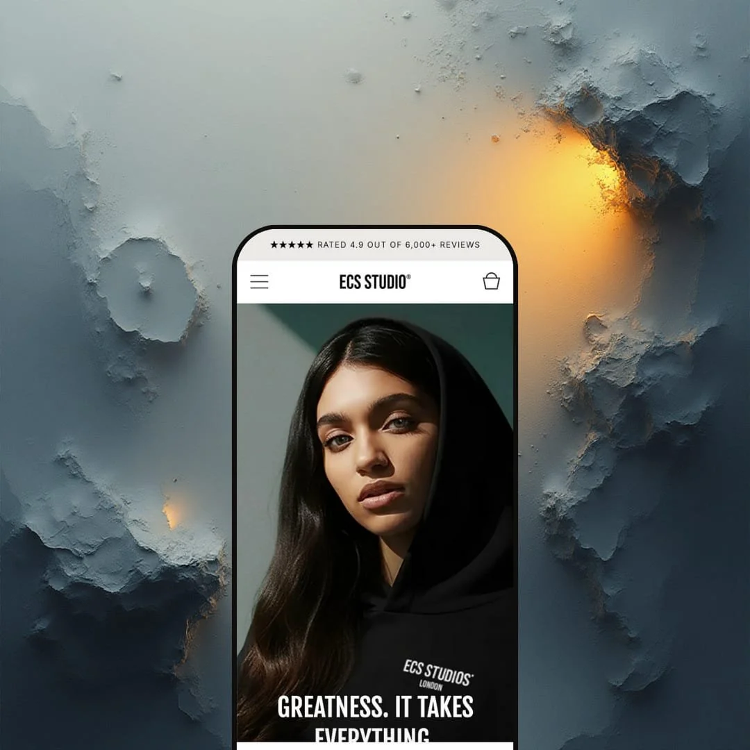
The landing hero uses full-bleed imagery with a bold headline and a direct “Explore now” style CTA, which makes the next click feel obvious rather than optional. The colour palette stays neutral (light backgrounds with black text and occasional accent moments), so the product photography carries most of the mood. Typography is clean and modern, with large headings and smaller supporting lines that keep the page feeling premium instead of busy.
What works in this preset
This demo is staged like a lookbook. The homepage rhythm prioritizes big visual blocks and clean whitespace, so it feels curated instead of catalog-like. That’s a good match for brands selling fewer, higher-priced items, where the job of the page is to build desire, not just list products.
Product browsing is also presented in a “quiet” way. Cards are large and image-forward, and the interface avoids cluttered overlays. In this demo staging, the quick-view entry point appears as a small eye icon on hover, which keeps the grid visually clean and on-brand for a luxury-minimal aesthetic.
The product page experience feels built for shoppers who want to inspect before they commit. The demo leans into high-resolution imagery and a structured buying layout, and it stages key details (like sustainability and product specifics) in expandable sections so the page doesn’t turn into one long wall of text.
Editorial content is a major part of this preset’s personality. The About page is laid out like a brand story page, using modular blocks to mix narrative, media, and social proof. In practice, it makes the store feel less like “just products” and more like a label with a point of view.
Where it stumbles
The same image-first approach that makes Carbon feel premium can make it feel heavier. In hands-on use, large photography and decorative motion moments contributed to visible sluggishness during first-load situations. If your audience is browsing on weaker connections, performance optimization won’t be optional.
Discoverability is also a small friction point in this demo staging. The product grid stays intentionally clean, but that means key interactions (like quick view) are visually understated. Shoppers who don’t naturally hover around product imagery may never notice the shortcut and will default to clicking into product pages instead.
Finally, the demo’s CTA language is repetitive. Multiple sections lean on similar “Explore now” style phrasing, which can start to blur together on a long scroll. It’s not a functional problem, but it does make the site feel more template-driven until a merchant rewrites and sharpens the messaging.
Niche Suitability
-
Fashion, streetwear, and lifestyle brands that have strong photography and want a curated, editorial storefront. If your brand benefits from storytelling pages and a “magazine-like” pace, the Default preset staging fits naturally.
Not Ideal For
-
Merchants running high-volume catalogs, aggressive discounting, or “utility-first” shopping where speed and dense information matter more than atmosphere. This demo’s visual weight and minimal UI cues will feel slower and less direct for efficiency-focused shoppers.
-
Carbon is best for brands where photography and story are core conversion drivers: streetwear, lifestyle apparel, and boutique fashion labels that want a curated, premium storefront experience.
-
If you need multiple presets, fast setup with minimal customization, or a theme that prioritizes dense information and raw shopping efficiency, Carbon will likely feel like extra work.
-
High — Carbon’s structure is strong, but merchants will need to invest in image optimization, copy refinement, and intentional configuration to get the best conversion outcome from the single preset foundation
★ 7.0/10
Rating
-
The core shopping flow is capable and modern, with quick-view-style browsing, an on-page cart experience, and structured product pages. The feature set is solid, but it’s not “everything and the kitchen sink,” and some value depends on how merchants configure and stage it.
7
-
The layout is straightforward once you understand it, but Carbon’s minimal presentation means some interactions aren’t instantly obvious. Expect to spend time polishing section order, CTA copy, and how shoppers discover the faster buying paths.
6
-
The demo is clearly designed with clean layouts and large visual blocks, which typically translate well to smaller screens. Still, key interactions are staged subtly on desktop (like hover-revealed quick view), so merchants should verify touch-device discoverability and flow in their own testing.
8
-
Carbon’s visual weight is a real tradeoff. The demo relies heavily on large imagery and decorative pacing, and that contributed to visible slow moments during hands-on use. Merchants should plan for image compression and careful media usage.
8
-
Carbon can be customized, but it’s a strongly opinionated aesthetic and there’s only one preset starting point. You can push it in different directions, yet it will take more work than a theme that offers multiple preset styles out of the box.
6
FAQ
〰️
FAQ 〰️
-
👑 Yes. The Default demo is staged like a modern lookbook, which suits apparel and lifestyle brands that rely on photography and brand story to sell, not just dense product listings.
-
📱It appears designed for clean, scrollable layouts that typically work well on phones. However, Carbon’s demo relies on subtle interaction cues on desktop, so merchants should confirm how those cues translate on touch devices during their own preview.
-
🎨 You can adjust brand-facing elements like colours, typography, and section composition through Shopify’s editor. The bigger factor is that Carbon has a strong built-in mood, so customization is less about “can you change it” and more about “how much work you want to do to shift the vibe.”
-
⚡ The experience depends heavily on media. In hands-on testing, image-heavy sections contributed to noticeable slow moments, especially on first-load situations, so performance work should be part of the launch plan.
-
👕 Yes. The demo’s product pages and quick-view flow are staged around variant selection, making it easier to pick size and colour without feeling lost or forced into multiple page reloads.
-
🔎 Carbon relies on Shopify’s standard SEO fields (titles, descriptions, and structure). It gives you a clean foundation, but strong SEO outcomes still depend on how well merchants write and structure their content.
-
💱 Yes, via Shopify’s built-in Markets and localization features. Carbon doesn’t make this a “preset feature”; it’s configured through Shopify, and the theme should follow those settings when enabled.
-
⚙️ In general, yes. Carbon’s layout leaves room for common app-driven needs like reviews, upsells, and subscription-style widgets, though merchants should always test app compatibility with overlays and cart-drawer experiences.
-
🛒 A live demo is available to preview the storefront experience before committing. That’s the safest way to validate how Carbon’s single preset foundation feels for your products and brand assets.
This review is based on hands-on testing of the publicly available preset demo of the Carbon Shopify theme as of 26 December 2025. Theme features, preset availability, and performance can change with subsequent updates from the theme developer.