
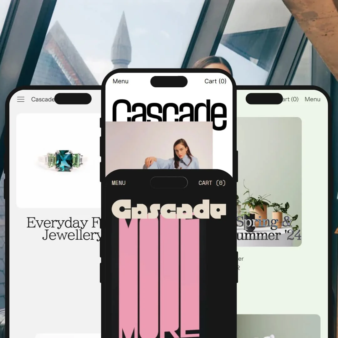
Cascade targets visually led brands that want flexible, editorial layouts for images, text, and products. Each preset opens with a bold visual statement—either a hero image or a clean collection grid—so products take center stage without clutter. The palette and typography are restrained yet purposeful, guiding attention toward calls-to-action while leaving room for brand storytelling.
Pros.
〰️
Pros. 〰️
✚ Scroll-first, image-led storytelling
Cascade’s layouts prioritize big, cinematic imagery and smooth pacing. Shoppers land in a brand world quickly, then slip into product exploration without abrupt jumps. This flow supports higher-consideration purchases and elevates perceived quality.
✚ Consistent cart experience
A modern slide-out cart keeps context during add-to-cart moments and reduces back-and-forth page loads. The styling stays coherent across flows, so the cart feels like part of the brand rather than a utility overlay.
✚ Editorial building blocks
Lookbooks, journal/blog patterns, and press-style sections appear across presets. Merchants can weave credibility and narrative between product rows, which is helpful for launches, collaborations, and content programs.
✚ Solid PDP merchandising
Product pages handle multi-variant configurations smoothly and pair them with related items. This supports confident selection without burying shoppers in options, keeping the focus on the product story.
✚ Flexible layouts without chaos
Sections and blocks are plentiful, yet spacing and type scale keep pages readable. Merchants can compose unique pages while maintaining a clean visual baseline, which prevents visual drift as the catalog grows.
Cons.
〰️
Cons. 〰️
− Sparse grids can increase scroll depth
Big imagery reduces items per row. Large catalogues may feel slower to skim, especially for comparison-minded shoppers.
− Subtle navigation cues can hide depth
Small affordances—like a discreet arrow next to “Shop”—risk being overlooked. Important destinations work better when their triggers are unmistakable.
− Opinionated typography in Phase
The all-caps system defines Phase’s identity but narrows brand fit. If your voice relies on softer, mixed-case nuance, that preset may require extra curation.
− Demo-only currency quirks
Minor currency presentation oddities appeared in demo data. They didn’t affect flows and are unlikely to persist in production configurations.
-
Default leans into an editorial grid that feels contemporary and fashion-forward. Layout choices emphasize a magazine sensibility, letting imagery and short captions do the heavy lifting. The look is cohesive and deliberately minimal, which helps product shots pop.
What works in this preset
The vertical “Lookbook/Gazette” navigation pattern gives Default a distinct editorial cadence. As shoppers move through clusters of images and captions, the page feels like a sequence of spreads rather than a conventional storefront. That narrative framing invites longer browsing and supports brand voice.
Borderless collection cards keep the grid visually continuous. Without heavy frames, color and fabric textures flow from one tile to the next, which flatters apparel photography. The effect is modern and reduces visual noise, so calls-to-action stand out when needed.
Journal and story anchors appear throughout the header and menus in tasteful, repeatable ways. These links knit together articles, features, and product pages as a single ecosystem. For brands that publish regularly, the structure makes it natural to surface campaigns without feeling promotional.
Where it stumbles
The strong editorial surface can compete with first-time buyer intent. If the journal links take center stage on landing, some visitors may wander into reading rather than moving toward product selection, so merchandising discipline matters.
-
Swell feels tactile and warm, reading like a studio’s portfolio rather than a storefront template. Visual segments are stacked vertically with generous breathing room, which suits natural materials and home goods. The tone is inviting and craft-oriented.
What works in this preset
Photography is staged to highlight texture—glazes, grain, fabric, patina—and the layout leaves space for that detail. Large images alongside concise copy create an unhurried pace that flatters handmade or slow-made products. The result communicates care without long explanations.
About and journal surfaces are woven into navigation as peers of shop pages. This keeps brand origin stories, maker notes, and process features close to the commerce path. For lifestyle brands with point-of-view, the structure showcases identity without bolting on a blog.
Section rhythm favors vertically persistent clusters: product families, studio notes, and small promos. The pattern helps categories with many adjacent accessories feel coherent on scroll. It reads naturally on phones and retains the “atelier” tone on desktop.
-
Sequence aims for a premium boutique feel through deliberate whitespace and elevated card styling. The grid stays flat and orderly, giving each item a calm stage. Copy blocks act as companions rather than headlines, which suits higher-consideration purchases.
What works in this preset
Card balance—image area, title weight, and price placement—gives jewelry and accessories room to breathe. The visual quiet signals care and quality without ornate decoration. It also makes variant-driven items feel less crowded.
Size-guide and shipping context is presented as polished, in-place content. The presentation feels like part of the brand rather than an afterthought. Shoppers evaluating fit or provenance can get answers without losing the premium mood.
Editorial pages sit beside the catalog as “companion stories.” Instead of ending the funnel, these pages function like short look-ins to craft, sourcing, or styling. The framing supports luxury positioning where education helps close the gap to purchase.
Where it stumbles
If the “About” narrative becomes very long, it can overshadow the shopping path within this restrained layout. The remedy is mostly editorial: keep story blocks tight and link out when depth is truly needed.
-
Phase is built for posters, prints, and visual catalogs with striking typographic framing. The grid is deep and rhythmic, so art thumbnails feel like a wall rather than a spreadsheet. Motion is used sparingly to add personality.
What works in this preset
Large-format tiles prioritize artwork over interface chrome. Titles and options are present but deferential, which benefits limited editions and variant-rich prints. The composition preserves the gallery feel even as catalogs grow.
Lightweight transitions on section changes add a curated vibe. Movement punctuates scroll without calling attention to itself, and it helps break long pages into digestible scenes. For art sellers, the motion reads like a brand signature.
Newsletter and first-look hooks are positioned as welcome mats, not pop-ups. In a poster catalog, those touches make sense: collectors expect drops and early access. The placement supports list growth while staying on-brand.
Niche Suitability
Not Ideal For
-
Visually led brands that value editorial storytelling—fashion, jewelry, lifestyle studios, art and poster catalogs. Teams that publish regularly will find the content structure accelerates campaigns and product launches.
-
Ultra-dense commodity catalogs that rely on raw list density, or single-product stores seeking extreme simplicity. If your brand avoids blog or story surfaces entirely, a bare-bones template may fit better.
-
Medium — There are many section and layout choices to dial in, but defaults are sensible. Most branding and storytelling can be achieved in the editor without custom code.
Final Recommendation
★ 8.6/10
Rating
-
Core commerce flows worked consistently across presets. Quick add from grids and product pages was immediate, and the cart drawer felt stable during rapid toggling. Section flexibility for testimonials, blogs, and lookbooks enabled deep customization without code. Advanced options, notes, and upsell elements behaved predictably. Parity between grid and product views was maintained during stress tests.
9
-
Setup is straightforward for anyone familiar with Shopify’s editor. Major sections are draggable blocks, so home, about, and editorial pages can be rearranged quickly. Inline tips and placeholders reduce confusion. Power users will appreciate the breadth of options, though first-timers may need a short acclimation period in content-heavy presets.
8
-
Navigation, search, quick add, and cart behaved reliably across common test widths. Sticky header and announcement behavior remained within configuration expectations and did not fail under normal use. Minor edge cases at ultra-narrow widths require content care but did not block purchasing or browsing.
8
-
Grids of 30+ items and image-rich homepages remained responsive in tests. Add-to-cart transitions were fluid and free of reflows. Lazy loading and deferring non-critical assets help sustain speed as catalogs scale.
9
-
Modular blocks across presets allow extensive layout variation without code. Typography, color, and hierarchy can be tuned globally or per section. Both highly visual and editorial stores can achieve a tailored look while keeping the theme’s clean structure intact.
9
FAQ
〰️
FAQ 〰️
-
👑 Yes. The Phase preset presents large, uninterrupted grids for artwork, and the same visual clarity carries through more boutique-oriented presets like Sequence.
-
📱Yes. Search, collection scroll, add-to-cart, and cart access behaved smoothly across common iPhone and Pixel test widths. Minor crowding at the narrowest widths did not block purchases.
-
🎨 Extensively. Presets let you set palettes, upload fonts, and reorder rich sections such as about, testimonials, FAQs, blogs, and galleries without code.
-
⚡ Exceptionally in testing. Image-heavy homepages, grid scroll, and all modal functions stayed responsive, even when collections grew large.
-
👕 Cleanly. Single- and multi-variant products supported smooth option selection. Quick add and in-page option panels were stable during rapid changes.
-
🔎 Yes. Journal/blog modules, FAQ blocks, and customizable about pages are well integrated. Most storytelling needs can be met directly in the editor.
-
💱 Yes. Switching is available via standard Shopify integrations, and placement can be configured in the theme settings.
-
⚙️ Yes. Standard apps, metafields, and reviews/cart add-ons functioned without layout breaks in tests.
-
🛒 Public demos are available for all presets. You can exercise the key shopping flows—browsing, adding to cart, and navigating content—before committing.
This review is based on hands-on testing of the publicly available “Default” preset demo of the Studio Shopify theme as of October 18, 2025. Theme features, preset availability, and performance can change with subsequent updates from the theme developer.