
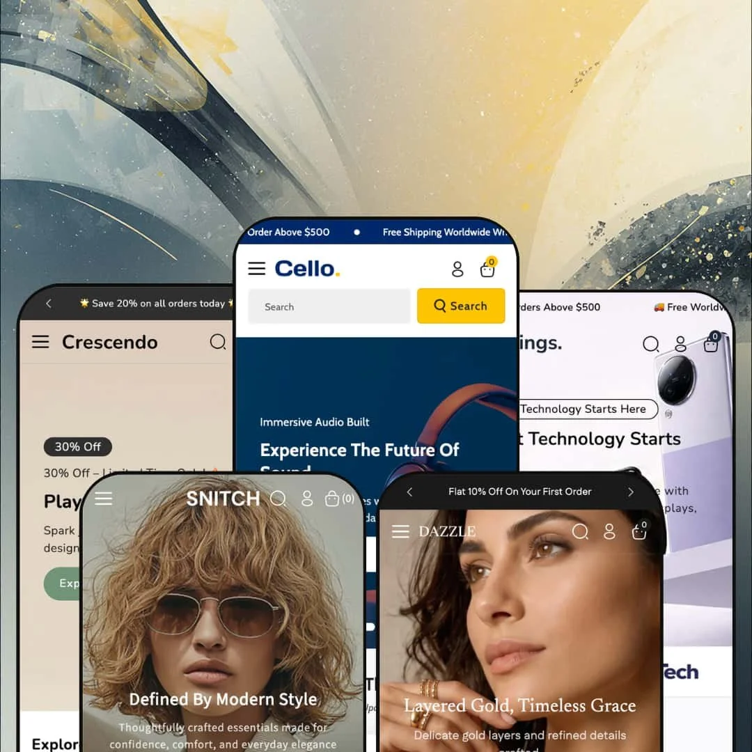
Most themes under $200 commit to a single storefront identity and build everything around it. Cello takes the other bet: one license, five fully dressed preset demos covering electronics, home appliances, jewelry, fashion, and toys. It's built on Shopify's Online Store 2.0 architecture, so the section editing and template structure will be familiar to anyone who's worked with a modern theme. The open question is whether breadth stretched this wide leaves any single vertical underserved.
Five storefronts from one license
If you run an agency spinning up stores for different clients, or you're a merchant still weighing which category to commit to, Cello's core pitch lands differently than most. One $160 purchase ships five production-ready preset demos, each dressed for its own vertical: electronics, appliances, jewelry, apparel, and toys. This isn't one look recolored five times. Each preset carries its own menu structure, demo catalog, and homepage layout, which makes the theme a low-risk way to audition a storefront identity before you invest in building it out.
A mega-menu system built for big catalogs
The mega menu is the theme's strongest shared component. Across the presets it runs multi-column layouts with descriptive sub-text under collection links, embedded promo tiles, and clean two-level nesting that stays readable. For a store carrying hundreds of SKUs across many categories, that turns the main navigation into a working merchandising surface rather than a plain list of links a shopper has to dig through. Electronics and appliance retailers with broad, multi-category catalogs and 200-plus SKUs will get the most from it.
A coordinated cart and cross-sell flow
The slide-out cart drawer does several jobs at once. It pairs a free-shipping progress prompt ("spend $500 more for free shipping") with a "You might like" cross-sell row and an order-notes field, all without leaving the page. Treated as a unit, it's a tidy way to lift average order value at the moment of intent. Stores running impulse-friendly, cross-shoppable catalogs, think accessories, audio, or fashion add-ons, benefit most from having the upsell prompt and the shipping incentive sitting right there in the cart drawer where the decision actually happens.
Product pages that handle complexity
Where Dawn gives you a competent but pared-back product page, Cello's goes further for complicated catalogs. The featured spotlight I tested ran a fifteen-image gallery with a zoom lightbox, three stacked variant axes, a live stock count, and a trust-point row beneath the add-to-cart button. For electronics merchants with multi-attribute variants, a single laptop spanning color, storage, and chip options, this layout replaces what would otherwise be a paid configurator install plus integration work. It's the kind of presentation a high-consideration catalog needs.
A generalist by design, with the trade-offs that brings
Cello's reach across five verticals is also its ceiling. Every preset draws from one shared section library, so the merchandising tools are the same whether you're selling $5 puzzles or $1,800 laptops, and the theme ships no vertical-bespoke module that a single-category specialist would hard-wire. A dedicated jewelry theme might build in a ring-size converter; a dedicated furniture theme, a room visualizer. Cello expects you to approximate those with its general-purpose sections. Merchants in a vertical with specialized display needs, high-consideration categories or anything requiring category-specific tooling, should weigh that gap before buying.
The merchandising defaults lean hard on urgency
Read all five demos in a row and one habit jumps out: the theme loves a countdown and a sale badge. Flash-sale language, save-tags, and timers are baked into the default section staging across verticals, which suits deal-driven retail but sits wrong for a premium or heritage brand. For a premium brand, that default is just noise. You can switch these cues off, but expect to spend real time restyling toward restraint before launch.
Built on Online Store 2.0, a generation behind the newest architecture
One forward-looking note: Cello is an Online Store 2.0 theme, not one built on Shopify's newer Theme Blocks architecture. For the overwhelming majority of stores that distinction won't matter, and OS 2.0 remains fully supported and capable. But if you specifically want the deepest nested-block layouts or AI-assisted block generation that the latest generation of themes offers, Cello sits one step back from that frontier. That gap is narrow today. Merchants planning heavy, deeply-nested custom layouts, or agencies standardizing on the newest tooling, should factor that in.
What it takes to launch
Plan for a multi-day build: a full copy pass across hero captions, promo tiles, blog posts, and the About and FAQ pages; replacing the demo catalog, including brand-referencing sample products, with your own products and licensed imagery; and populating product options, metafields, and category content for whichever single preset you choose. The five-preset breadth means most of that work happens after you've picked your direction, not before.
-
What works in this preset
Open the Cello demo and the merchandising hits immediately. The homepage stacks a hero slideshow, a curated best-sellers grid, a deal carousel with quick-look and color swatches, and a countdown-driven offer block before you've scrolled past the fold twice. For an electronics catalog spanning audio, mobile, laptops, and smart devices, that density does real work: it gives a high-SKU store somewhere to put everything without the page feeling empty. I clicked through several product cards and the second-image-on-hover swap fired cleanly each time.
Past the fold, the deal sections keep coming. A four-tile promo grid runs themed offers ("Boost Workflow, 20% Off", "Wireless Comfort from $99"), each with its own image and call-to-action, and a separate countdown block frames a time-boxed sale. It's a lot of merchandising real estate. For a store that relies on rotating promotions and a steady drumbeat of deals, that's exactly the homepage that keeps shoppers scrolling and clicking through to collections.
Where it stumbles
The Cello demo's main risk is its own enthusiasm. The homepage runs long, stacking hero, best-sellers, deal carousels, a countdown block, and multiple promo grids in sequence, which gives a big catalog room to breathe but can bury hero products under sheer page length. A focused electronics brand would probably trim several sections to shorten the path to checkout. More isn't always better here.
-
What works in this preset
Strings goes broad. It widens the catalog into home electronics and full-size appliances, and the navigation is built to match. The "Shop" mega menu runs six columns deep, grouping computer accessories, mobile accessories, smart headsets, and wearables, while a second "Appliances" menu carries short descriptive lines under each collection link plus promo tiles for washing machines, refrigerators, and televisions. I went looking for how far the nesting went and found a tidy two-level structure that won't overwhelm a shopper.
That breadth is the point of this preset. It's aimed at a general-electronics or appliance retailer carrying everything from $15 cables to four-figure refrigerators, and the shared section library gives each price tier a home. The collection-tile promos do a nice job pointing shoppers toward category landing pages rather than dumping them into one giant grid.
Where it stumbles
Big appliances and tiny accessories get the same card treatment, and that's where the preset shows its generalist roots. A refrigerator or washing machine is a considered, spec-led purchase, but the demo presents it with the quick-impulse product card built for cables and chargers. Selling high-consideration appliances well through Strings means building out your own spec tables and usage-information content. The fix is content, not code.
-
What works in this preset
Dazzle is where the theme dresses up. The palette goes soft and editorial for a jewelry catalog, with a six-column "Jewellery" mega menu sorting rings, earrings, pendants, bracelets, and a dedicated diamond collection. The announcement bar rotates multiple messages with a pause control. For a jeweler with a wide SKU range across categories, the navigation depth is the immediate draw.
What sells the jewelry framing is restraint. The product cards here skip the loud save-badges and let white space and photography do the talking, and the diamond-collection grouping in the menu gives a high-margin category its own front door. Demo pricing sits mostly between $20 and $35, so this reads as accessible fashion jewelry rather than fine-jewelry investment pieces.
-
What works in this preset
The Snitch demo puts the mega menu to its most ambitious use. Its "Men's" panel embeds full product tiles, cards with images and prices, directly inside the navigation, so a shopper can jump from menu to product without a collection page in between. The broader "Cloth" menu runs eight columns spanning top wear, bottom wear, western wear, denim, and activewear. It's the same component, staged harder.
I scrolled through the apparel cards looking for the variant behavior fashion stores depend on, and the color-swatch pickers and second-image hover were both present and responsive. Demo pricing runs $44 to $130, squarely mid-market apparel. The shared size-chart modal is available for fit guidance, though it's a generic chart rather than a true fit-finder.
-
What works in this preset
Crescendo is the most purely fun of the five. It dresses the theme for a toy and games store, with a playful palette, a six-column "Games" menu, and a simpler flat "Toys" dropdown for quick category jumps. A rotating announcement bar pushes a "Save 20%" message with a pause control. Demo products sit at pocket-money prices, mostly $5 to $16, which fits impulse-driven kids' retail well.
The dual-menu setup is a smart touch here. Parents browsing for a specific toy type get the flat "Toys" list, while those exploring by play category get the deeper "Games" mega menu, and both land on the same collections. For a kids' store leaning on impulse buys and gift-shopping, the low-friction navigation and bright card design keep the experience lively.
One design system that holds five identities
The most impressive thing about Cello isn't any single feature; it's that one shared system convincingly becomes five different stores. The same underlying sections render as a tech superstore, an appliance retailer, a jewelry boutique, an apparel shop, and a toy store, and each reads as purpose-built rather than recycled. That coherence across very different verticals is hard to pull off, and it's the clearest signal of careful design work underneath.
Strong value at the budget tier
Measured against its $160 price, Cello delivers unusual range. The budget tier sets a modest bar, and Cello clears it by shipping five vertical-ready demos and a deep shared component set rather than a single look. For a merchant watching startup costs, that value density is the headline, and it's the main reason to shortlist the theme.
The hard part starts after you buy
Cello's breadth defers the real decision to you. The theme hands over five directions but no guidance on which to take, and once you commit, the bulk of the work, narrowing five demos' worth of possibility down to one focused store, lands on your side. Buyers expecting a near-turnkey launch should reset that expectation. The breadth cuts both ways.
A shared skeleton, redressed per vertical
Read the demos closely and the same layout rhythm recurs: hero, then deal or feature grids, then collection tiles, then newsletter. It's an efficient backbone, and it's why one theme can serve so many categories, but it also means the layout itself doesn't reinvent per vertical. A merchant wanting a distinctive storefront for their category will be restyling a familiar skeleton rather than starting from a category-native layout. Competent and consistent, but not bespoke.
★ 8.4/10
Rating
-
A deep, theme-wide library: multi-column mega menu, slide-out cart with cross-sell, multi-axis variants, countdowns, quick view, and trust rows cover most merchandising needs.
9
-
Standard Online Store 2.0 section editing is approachable, but dressing five presets and swapping a large demo catalog adds real setup time.
8
-
Dedicated mobile logo assets and a slide-out mobile menu show mobile-specific attention, and the layouts adapt cleanly to a narrow viewport.
8
-
Lazy-loaded imagery and webp assets keep things reasonable, though the demo's dense, section-heavy homepages add weight worth trimming.
8
-
Five distinct presets plus a shared component set give a lot of room to restyle across very different verticals.
9
Frequently Asked Questions
-
Presets are starting points you apply and then customize, so switching after you've built out content means re-staging much of that work. Pick the vertical closest to your catalog first, then commit to it.
-
The demo catalog is for display only. Several sample products mimic well-known brands, so you'll need to replace them with your own products and licensed imagery before launch.
-
Because it's an Online Store 2.0 theme, the homepage is built from sections you can reorder, add, or remove in the editor. The dense demo layouts are a starting arrangement, not a locked one.
-
Yes. Those are section-level settings you can disable or restyle, which matters if your brand leans premium rather than promotional.
-
It's one shared component configured differently per demo, from simple dropdowns to panels with embedded product tiles. You restyle and repopulate it rather than rebuild it.
-
Product video is on the theme's feature list and fits naturally into the gallery alongside images, useful for electronics demos or apparel movement clips.
This review is based on hands-on testing of the publicly available preset demos of the Cello Shopify theme as of June 13 2026. Theme features, preset availability, and performance can change with subsequent updates from the theme developer.