
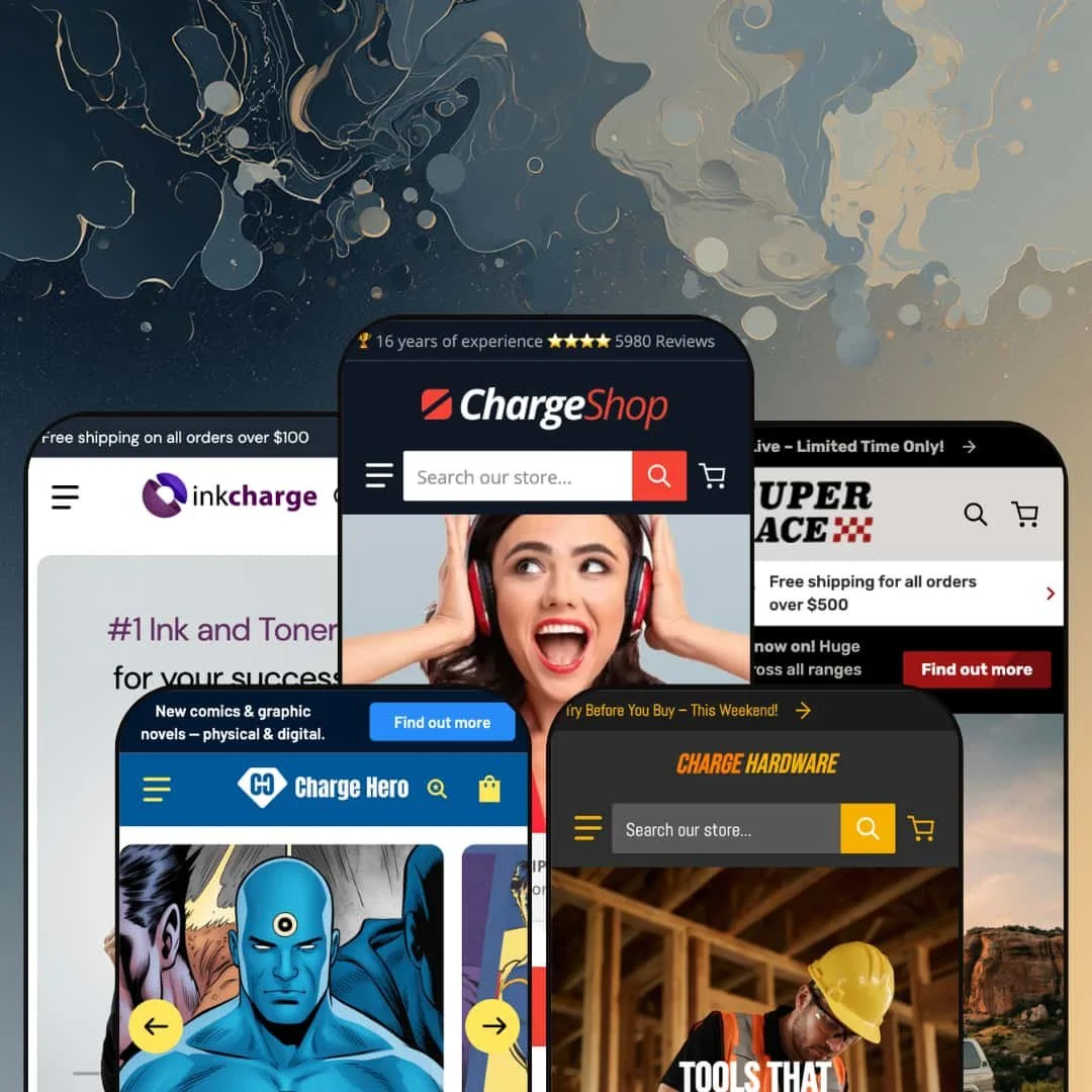
Most theme demos try to look like every store at once. Charge does the opposite: Swissuplabs stages five complete storefronts covering electronics, office supply, off-road parts, tools, and comics, and lets each one commit fully to its vertical. It's an Online Store 2.0 theme priced at $170, which puts an unusual amount of hard-goods retail machinery at the low end of the paid-theme range. The real question is whether one design engine can honestly carry five different shops, and after several hours across the demos, the answer is mostly yes, with one big caveat about who this theme is actually for.
Side-by-side product comparison, built in
Charge ships a working product-comparison system: an "Add to compare" control on product pages, a compare drawer that collects selections, and a table view rendering SKU, price, rating, and description rows, like the cordless drill kits lined up spec-against-spec in the tools demo. It works today, in the demos, with real data. For electronics and tools merchants with 50 to 500 SKUs and considered-purchase buyers who cross-reference specs before committing, this section replaces what would otherwise be a paid comparison-app install plus the integration work of making it match the theme.
Cross-sell that shows the math
The theme's basket-building tools function as one coordinated kit rather than scattered widgets. The Frequently Bought Together block on product pages presents a checkbox list of companion products with a live combined total, $707.98 for the staged headphone bundle, and one button to add the whole set; collection and menu cards carry quantity steppers plus direct add-to-cart so accessories never require a page visit. It shortens every path to the cart. For consumables sellers with repeat-buyer patterns, think ink, filters, cables, and for accessory-heavy electronics catalogs, this is where the theme earns its price.
A mega menu that merchandises, not just navigates
Menus here are selling surfaces. The electronics demo's Departments panel nests categories three levels deep while reserving a column for a promotional image tile with offer copy, and other menu panels render live product listings complete with prices, discount badges, and review counts. That means the highest-traffic UI element in the store doubles as a campaign slot. Multi-department retailers with catalogs past 500 SKUs, and multi-brand operations that need to route shoppers by brand as well as by category, will get daily use out of this depth.
Five verticals for one budget-tier price
How many storefronts should $170 buy? Charge answers with five, each staged as a complete shop with its own catalog logic, homepage sequencing, and vertical-appropriate sections, from a parts finder to a publisher-sorted comic rack. The practical value is a head start: whichever hard-goods direction a merchant takes, one of these demos is already most of the way there. Agencies building stores for multiple hard-goods clients, and single-brand owners in electronics or tools who want a proven layout instead of a blank canvas, get outsized value at this list price.
The volume knob only goes up
Every scroll is a pitch. Countdown-equipped newsletter popups, scrolling marquee tickers, stacked discount badges, dual sale pricing, and flash-sale announcement bars run through the demos as the default register, and this kept bugging me the longer I browsed, because the theme never demonstrates a quieter gear. Luxury-tier brands and considered-purchase categories like fine jewelry or premium beauty, where urgency cues actively erode trust, would spend their setup time stripping this theme back rather than building it up.
Hard goods or bust
All five presets speak the same commercial language: spec-driven physical retail. Apparel and beauty merchants get nothing staged for them, and drop-model fashion brands built on lookbooks, editorial imagery, and hype cycles will find that although the underlying pieces like color swatches and image galleries exist in the feature list, no demo shows those pieces assembled into a storefront that thinks the way their customers shop. That's a real gap. Buying Charge for a fashion store means doing the vertical translation yourself, alone, without a reference.
The best features are data-hungry
The comparison tables, attribute filters, and spec tabs only render what your product data feeds them. Empty metafields mean empty rows. A merchant running a 500-plus SKU catalog across multiple brands inherits an ongoing data discipline, populating specifications, filterable attributes, and comparison fields per product forever, because every new SKU that skips the process quietly degrades the exact features that justified choosing this theme in the first place.
What it takes to launch
Expect a multi-day pass regardless of preset: replacing hero and promotional copy throughout, populating spec metafields so comparison rows and attribute filters render with real data, re-staging the mega menu panels for your catalog, reconfiguring popup and countdown sections, and reviewing translated interface strings and price-display settings for your market.
-
What works in this preset
Shopping this demo feels like browsing a mid-size electronics chain, in a good way. Departments nest three levels deep, sale collections sit one click away, and the whole storefront assumes you came to buy something specific rather than to be seduced. I clicked into the headphones collection and found the filter sidebar doing serious work: a price-range input, brand checkboxes with live product counts, and attribute filters for connectivity, audio connection type, and earphone features like noise cancellation. That is catalog navigation built for people who shop by spec sheet.
Video gets treated as a selling tool here. A full-width collage section pairs a brand film with a purchasable product card, sale price and discount badge included, so the shopper can move from watching to buying without leaving the section. The collection page even embeds its own promotional carousel above the product grid, which turns a normally utilitarian page into another merchandising slot for whatever the store wants to push that week.
-
What works in this preset
"Request a quote" sits in the main navigation, one click from anywhere. That single link changes the character of the storefront, because it signals to office managers and procurement buyers that this shop expects repeat orders and bulk conversations, not just single-cart checkouts. The demo backs it up with consumable-friendly staging: ink and toner collections front and center, discount percentages on cartridge packs, and a reorder-shaped browsing flow.
The homepage stages a comparison table loaded with three ink cartridges, showing SKU, price, rating, and description rows side by side. It's a smart placement. A shopper deciding between a CHF 25 cartridge and a CHF 139 four-pack gets the decision framed for them on the landing page, before they've opened a single product page, which is exactly where a consumables store wins or loses the basket.
Where it stumbles
The preset's name works against it. "Gorpcore" is an outdoor-fashion term, and anyone preset-shopping with apparel in mind will open this demo expecting hiking shells and find paper shredders instead. The staging itself is coherent for office supply; the label pointing at it belongs to a completely different vertical, and that mismatch costs the preset clarity at the exact moment a buyer is comparing options.
-
What works in this preset
How do you sell parts that have to fit a specific vehicle? This demo's answer is a dedicated finder block on the homepage with dropdowns for department, car brand, and year feeding a search, plus a category selector built directly into the header search bar so every query can be scoped before it runs. For a parts store, where a wrong-fit order means a return and an angry customer, putting guided narrowing this high on the page is the right structural call.
The merchandising ranges wide without losing the plot. Recovery gear, drawer systems priced past CHF 2,000, and CHF 32 light bars all share one grid language, and the comparison table here is staged with four LED light bars whose descriptions actually argue beam range and use case against each other. It reads like a store that expects customers to deliberate.
Where it stumbles
The finder narrows by department, brand, and year. Real parts retail lives and dies on model-level and engine-level fitment, and that compatibility layer is data the theme cannot invent; a merchant building on this preset either maintains that mapping through disciplined tagging or reaches for a dedicated fitment app. The preset stages the doorway to vehicle-specific shopping more convincingly than the road behind it.
-
What works in this preset
Homepages usually tease products; this one tries to close the sale on the spot. A featured-product section drops an entire buy box into the homepage: gallery, full description, a specifications list down to motor wattage and water flow rate, quantity stepper, add to cart, and an add-to-compare control, all without a click-through. For a tools audience that buys on specs, collapsing the distance between discovery and purchase like this is genuinely useful.
Trust signaling is specific rather than decorative. The top bar cites a review score and order volume, the perks row includes an unusual "post-payment possible" line, and collection tiles display live product counts. Small details, but they add up.
-
What works in this preset
Comic retail runs on release cadence, and this demo is built around it. Collections are organized by publisher imprint, single issues and graphic novels split cleanly, and a Pre-order collection sits in the main menu next to a Subscription tier, which mirrors how actual comic shops segment their pull-list business. The homepage sequences it the same way: newest single issues, then a January pre-order window with its own banner, then a fourteen-day bestseller block.
Product cards here carry quick-view triggers alongside add-to-cart, and I sat up at the mega menu, which lists actual products with prices inside the dropdown panels, so a returning reader can jump straight from "Publishers" to a specific issue. That's navigation doing merchandising work.
Where it stumbles
The subscription staging writes a check the theme can't cash alone. There's a Subscription collection and a countdown block promising that best-selling subscriptions "start soon," but recurring billing is not theme territory; transacting an actual monthly pull-list requires a subscription app on top. A comic merchant drawn in by this preset should budget for that extra piece before treating the demo as a feature promise.
One engine, five skins
Read all five demos back to back and a consistent skeleton emerges: the service-desk header with phone and email, the promo-tile grammar, the video commerce blocks, the compare drawer waiting at the bottom of every page. Switching verticals means restyling, not relearning. For an operator running or planning multiple stores, that consistency is worth more than any single feature, because staff trained on one Charge store can work in all of them.
Video is wired into commerce, not layered on top
Four of the five demos use motion as a merchandising surface: video-first product cards with price and cart button attached, and shoppable video collages that pair a clip with a purchasable product. Most sections that accept video treat it as a first-class selling slot. That's a cross-preset design conviction, and it positions the theme well for merchants whose products demonstrate better than they photograph.
The demos show real retail states
Sold-out badges, pre-order flags, per-variant pricing, quote requests, sale math, bundle totals: the preset family stages the unglamorous mechanics of running a store instead of hiding them behind lifestyle photography. A buyer evaluating Charge can actually see how the theme behaves in the situations that matter, which is rarer among theme demos than it should be.
One aesthetic register
The presets change vertical, never mood. Dense grids, boxed sections, utilitarian chrome, and promotional framing define every demo, so the five-preset purchase buys reach across industries rather than range across brand personalities. A merchant who wants their store to feel airy, editorial, or restrained is fighting the engine's instincts in all five directions at once.
Selling tools, thin storytelling
Across the entire preset family, brand narrative amounts to a text-and-image About block and a row of blog cards. The section library is deep on transactions and shallow on identity, and that trade-off is only visible when you read all five demos and realize none of them ever tries to make you feel something about the store itself. Merchants whose margin depends on brand equity rather than price and selection should weigh that carefully.
★ 7.8/10
Rating
-
A comparison engine, bundle cross-sell with live totals, guided-search staging, and a deep promo toolkit is an unusually complete kit at this list price.
9
-
Sections are straightforward to place, but the signature features reward structured product data; stores without disciplined SKUs and specs will see hollow tables and filters.
7
-
Dedicated mobile hero assets are staged per preset, the cart runs as a slide-out drawer, and collection pages carry a mobile filter-and-sort drawer.
8
-
Imagery ships lazy-loaded in modern formats and pages stay lean by structure, though the busiest demo homepages stack several video sections, so merchant restraint matters.
8
-
The section library is broad and reconfigurable, but it flexes by vertical more than by mood; every arrangement still reads as dense, utilitarian retail.
7
Frequently Asked Questions
-
Yes. An "Add to compare" control sits alongside the add-to-cart button on product pages, feeding a compare drawer that collects selections until the shopper opens the table view.
-
Pre-order badges appear on product cards in the electronics demo, and the comics demo runs an entire Pre-order collection in its main menu; the underlying buy-button behavior follows your Shopify inventory settings.
-
Yes. The tools and off-road demos run video-first product cards where the card itself is a looping clip with the price and cart button rendered beneath it.
-
The office-supply demo places "Request a quote" in the main navigation, routing to a contact form. Actual quoting, net terms, or customer-specific pricing would come from Shopify's B2B tooling or an app on top.
-
Version 3.9.0 shipped on March 24, 2026, and Swissuplabs runs a dedicated documentation portal plus its own support desk, both linked from the Theme Store listing.
-
No. They're theme sections and toggles you control in the editor; several demos simply enable them by default staging, and they can be edited or removed entirely.
This review is based on hands-on testing of the publicly available preset demos of the Charge Shopify theme as of July 2026. Theme features, preset availability, and performance can change with subsequent updates from the theme developer.