
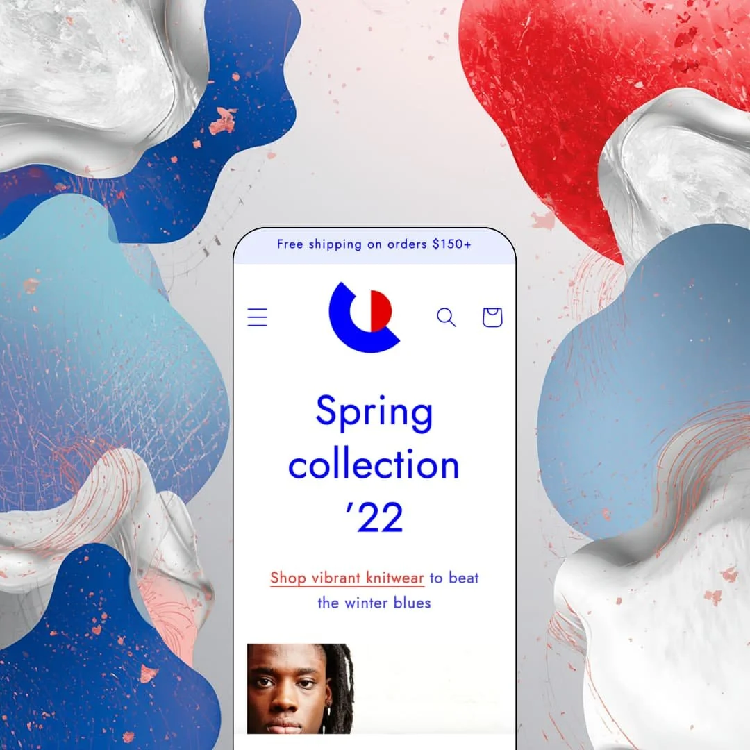
Most free themes chase neutrality so they can serve any store that installs them. Colorblock goes the other way: it commits to loud color, oversized display type, and a lookbook attitude, then dares your brand to keep up. Built by Shopify on Online Store 2.0 architecture and live since May 2022, it currently sits at version 15.5.0 after a June 2026 update. I spent an afternoon in the demo to find out who this personality actually serves.
An editorial section library with an actual point of view
Dawn, Shopify's free baseline, keeps its sections deliberately plain; Colorblock ships collage rows, lookbook layouts, slideshow and image-rollover treatments, and statement-headline bands built to run at poster scale. The difference is intent. Where a merchant would spend days coaxing personality out of a neutral layout, this section set arrives already opinionated about hierarchy, color, and type, which cuts real design time for stores whose brand matches the attitude. For single-brand apparel and lifestyle labels selling on visual identity to browse-heavy shoppers, that head start matters.
Collection filtering that outruns its price tag
Collection pages ship with layered filtering: availability, a price-range input, and merchant-defined option filters like style and size, each showing live product counts, plus nine sort orders from best-selling to date added. For a free theme, that's generous. It means a store can grow from a starter assortment into a few hundred SKUs without bolting on a filtering app, since shoppers can already narrow by the attributes that matter. Stores in the 50 to 300 SKU range running evergreen assortments get the most from this.
A product template that sells considered purchases
The product template goes past the buy box: a multi-image gallery with modal zoom, a size chart reachable both as a dedicated page and from a link beside the description, and blocks for ingredients, usage, and shipping information. Care instructions get their own band. That structure suits merchandise where shoppers hesitate, compare measurements, and read before buying, because the answers to pre-purchase questions live on the page instead of in a support inbox. Premium knitwear, craft goods, and other considered-purchase categories at mid-market to luxury price points are the natural fit.
Navigation built for real category depth
The mega menu carries three levels: a top-level Shop entry opens into four categories, and each category expands into as many as six sub-collections without crowding the layout. That is deep for a free theme. It lets a store spanning clothing, accessories, and homeware expose its full taxonomy from the header, so shoppers browsing across categories never dig through nested pages to change direction. Multi-category stores with mid-sized catalogs and cross-shopping customers will feel the difference daily.
Typography can't be tuned for mobile
Text sizes are set once, globally. On a phone you get whatever the desktop settings produce, and that's it. The developer confirmed as much in a Theme Store reply this year: no mobile-specific text size settings exist, only the overall typography controls. Since this theme leans on oversized display type, headlines that look striking on a laptop can dominate a phone screen, and stores selling to mobile-heavy, impulse-driven audiences in fashion or accessories will feel that mismatch on every campaign page.
Urgency and promotion tooling stays basic
The marketing feature set covers promo banners, cross-selling, and press coverage, then stops. I went looking for a countdown option or a shipping-threshold progress meter and found neither on the official feature list. For evergreen stores that's fine at this price. Merchants built around flash drops, scheduled sales, and restock hype, especially in streetwear-adjacent apparel, will need third-party apps to manufacture the urgency and momentum this theme simply won't generate on its own.
The personality is the commitment
Every layout decision here assumes art-directed photography and a brand voice that can fill a headline set at display scale. Plain pack shots will look lost. Wholesale-leaning operations, utilitarian verticals like tools or electronics, and catalogs shot on white backgrounds without lifestyle imagery will spend their time fighting the design rather than benefiting from it, because neutralizing this much attitude takes more restaging than adopting a quieter theme from the start.
What it takes to launch
Expect a full copy pass across statement headlines, brand-story sections, and the About narrative, plus imagery replacement throughout and mega menu re-staging to match your own catalog structure. Plan one to two days before launch.
-
What works in this preset
The homepage opens with three stacked lifestyle shots, a knitwear model, a sweater draped over a chair, a double-layered look, capped by a full-width statement about spring color. It works. The images do the selling while the typography shouts over them at a scale closer to a print campaign than a web page, and the whole opening scroll reads like a magazine spread rather than a storefront.
Halfway down, the demo stages four linked image tiles labeled Multicolor, Mostly red, Mostly blue, and Mostly yellow, each pointing at a color-based collection. Smart merchandising. The same tile band returns on the product template, so a shopper who bounces off one cardigan gets funneled straight back into browsing by hue instead of hitting a dead end.
I scrolled through the middle of the page expecting product grids and found brand story instead: a three-part band on gender-neutral fit, premium wool, and English manufacturing, followed by an Est. 2014 manifesto set in enormous type. That's confident staging. It shows merchants exactly how to use this theme, treat the homepage as a pitch for the brand and let collections carry the catalog.
Where it stumbles
The Theme Store pitch leans on large catalogs, yet the demo homepage surfaces exactly one product grid, four bestsellers, tucked between a dozen editorial bands. That tension is real. Merchants running deep assortments will keep the navigation and collection tooling but restage most of the homepage toward density, because the demo's staging favors story over stock at nearly every scroll position.
Colorblock is a free theme with a paid theme's confidence: an editorial, color-saturated identity that treats the storefront as a magazine.
The trade-off is baked in, since the same opinionated layouts that give fashion labels an immediate advantage become an obstacle for anyone needing neutral, dense merchandising. Adopting it means adopting its voice, not adapting it to yours.
Its Theme Store track record is short and split, sitting at 50% positive across six reviews. If your photography and voice can match its volume, it's one of the most distinctive storefronts you can install without spending anything.
Rating
★ 6.8/10
-
Filtering, three-level navigation, and a deep product template are generous at no cost; urgency tooling and mobile typography controls are where the ceiling shows.
6
-
Online Store 2.0 sections throughout mean restaging happens entirely in the editor without code, though the editorial layouts demand disciplined copy and imagery to look right.
8
-
The slide-out menu and responsive layouts hold up, but global-only text sizing means the display type can't be reined in for small screens.
6
-
Pages run image-first with restrained scripting and lean section counts, and nothing in the demo suggests heavy third-party weight.
8
-
Strong range within its editorial idiom via color and type controls; pushing it toward a neutral, grid-dense look works against its instincts.
6
Frequently Asked Questions
-
Yes. Version 15.5.0 shipped on June 17, 2026, adding support for standard storefront events plus a new section and block for product disclosures.
-
The demo itself stages homeware categories, wall art, pottery, and seat covers, alongside apparel, so mixed-catalog use is clearly anticipated even though the styling reads fashion-first.
-
Both sit in the cart feature set together with quick buy, so buy-online-pickup-in-store operations don't need extra storefront tooling.
-
A dedicated press coverage section ships with the theme, and the demo runs a Magazine blog alongside it, which suits brands courting media attention.
-
Shopify builds and supports it directly, and the documentation lives in the Shopify Help Center rather than on a third-party site.
-
Yes, both an FAQ page template and a customizable contact form are part of the marketing set.
This review is based on hands-on testing of the publicly available preset demos of the Colorblock Shopify theme as of August 2026. Theme features, preset availability, and performance can change with subsequent updates from the theme developer.