
Colors is a theme with strong opinions. Its presets don’t just restyle the same layout—they shift tone so dramatically that the theme sometimes feels like three unrelated storefronts sharing one engine. The underlying mechanics are solid, but the visual choices range from conventional to aggressively whimsical, which means the theme works best when the brand already fits the preset rather than expecting the preset to adapt.
Pros.
〰️
Pros. 〰️
✚ Consistent interaction model across presets
Once a shopper has learned how Colors behaves on one preset, that knowledge largely transfers to the others. Quick-view overlays, variant selection patterns and the slide-out cart drawer all behave consistently, so the path from product discovery to checkout feels predictable even as the visual language changes. This reduces the cognitive load on returning customers who might encounter different presets across a brand’s various storefronts.
✚ Detail-rich product pages
Product pages in Colors share a strong baseline: accordions for shipping, materials and care information, optional size charts and embedded contact sections. That structure gives merchants room to answer objections directly on the page instead of pushing shoppers to FAQs or support links. For categories such as apparel or framed prints, these details can meaningfully reduce pre-purchase friction.
✚ Structured navigation for larger catalogs
Across presets, Colors pairs a conventional header with a slide-out side drawer and, in the Default demo, a “Collections+” mega menu. That combination scales better than a simple flat menu when a store spans many categories or collections. It lets merchants promote key sections without turning the header into an unreadable list, while still giving determined browsers a way to scan the full taxonomy.
✚ Content and storytelling support
The theme’s demos make room for blogs, about pages and contact layouts that go beyond bare-bones forms. Default and Fluor surface blog content directly from the main navigation, while Delight uses its about and contact pages to weave in values and sustainability messaging. Brands that rely on editorial content or story-driven positioning can therefore stay within the theme’s existing structures rather than bolting on separate content templates.
✚ Preset variety without losing coherence
Colors offers three distinct front-end personalities—campaign-driven Default, minimalist Fluor and illustrated Delight—without abandoning a common structural core. That makes it relatively safe to experiment with presets while keeping cart, search and product page behaviour stable. Merchants who manage multiple brands or sub-brands can reuse operational knowledge even when the surface design changes.
Cons.
〰️
Cons. 〰️
− Some interaction choices feel opaque
The search overlay behaviour in Colors can be less transparent than it should be. Suggestions appear as you type, but the dedicated results page sits behind an extra press of the Enter key, which is not immediately obvious to all shoppers. In bigger catalogs, that subtlety risks slowing down people who use search as their primary navigation tool.
− Inconsistent quick-view presentation
Quick-view panels do not always appear in the same way across products, sometimes opening as bottom sheets and sometimes as side panels. While the functionality remains intact, that inconsistency can momentarily jar users who expect a single, stable pattern. It is not a deal-breaker, but it does chip away at the polish that Colors otherwise aims for.
− Preset aesthetics can be polarising
The visual commitments that make each preset memorable also narrow their appeal. Fluor’s stripped-back pages can feel too sparse for highly promotional retailers, while Delight’s pastel illustrations are difficult to reconcile with industrial or tech brands. Even Default, with its conventional hero-plus-grid structure, leans toward busy campaign layouts that some merchants may find heavier than necessary.
-
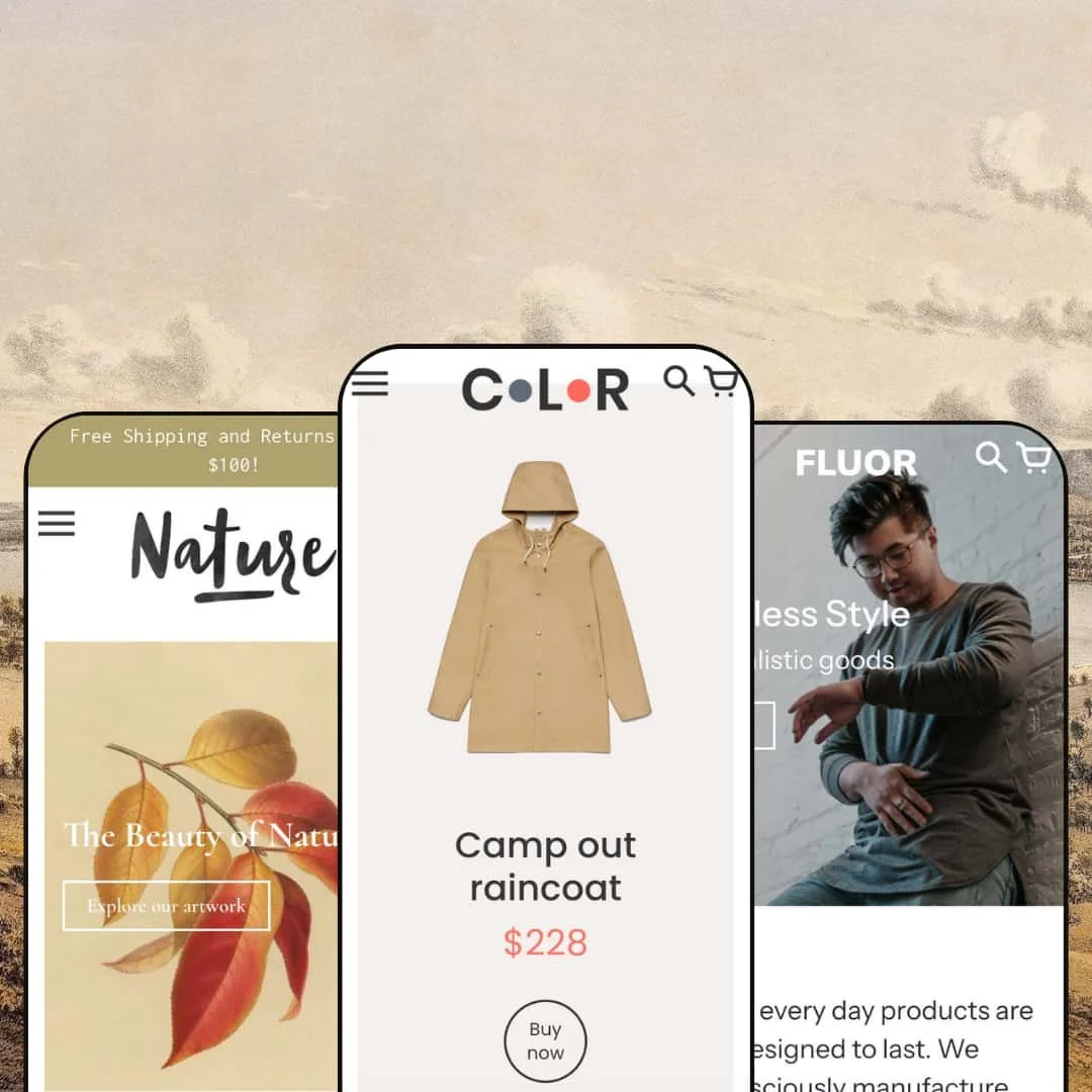
The Default (often labelled “Generic”) preset is Colors at its most straightforward: a traditional multi-category Shopify storefront with a lot of real estate devoted to hero banners and product tiles. It combines a sliding hero, promotional strips and a dense grid so visitors are immediately confronted with breadth rather than a single hero product or story.
What works in this preset
Default’s home page leans into a full-width hero carousel with captions and calls to action. Rotating slides let merchants stage seasonal promotions, marquee collections or campaigns without rewriting the entire layout, and the promotional banners beneath continue that pattern with more targeted offers. For brands that regularly run sales or capsule drops, this gives the front page a familiar “department store landing page” feel that many shoppers understand instantly.
The product grid on the landing page is integrated into this promotional structure rather than feeling like an afterthought tacked on below banners. Featured items sit close enough to the hero slider and promotional strips that the shopper’s eye naturally falls from big narrative imagery into concrete products. That staging suits merchants who want discovery to move quickly from campaign visuals to actual SKUs.
-
Fluor is the restrained sibling in the Colors family. Instead of a sliding hero and dense front page, it opens on a single lifestyle image and concise copy, using a pared-back palette to keep the focus on a small, curated product set.
What works in this preset
The most obvious strength of Fluor is its minimalism. The single hero image with short copy blocks keeps the page calm, making it easier for accessory labels or minimalist fashion brands to let products and photography do the heavy lifting. There is less visual competition between sections, so a small catalog does not feel lost inside an overdesigned layout.
Fluor’s product presentation follows that same low-key approach. Collection pages are built around a straightforward grid that gives each item enough breathing room without heavy graphic framing. For brands that rely on neutral backdrops and careful art direction, this can feel closer to a lookbook than a promotional flyer, and it avoids the “banner clutter” that some merchants dislike in more aggressive presets.
The demo also keeps non-product content relatively quiet. While blog content is available from the main navigation, it sits in a supportive role rather than dominating the layout. This suits stores that want occasional editorial pieces—such as styling notes or collection announcements—without turning the front end into a magazine.
Where it stumbles
The main functional stumble in Fluor is the lack of a visible search icon in the header. Search can still be accessed via the URL structure, but shoppers who expect a magnifying glass icon may not immediately realise it is available, which slows down product discovery in larger catalogs. For brands that rely on power users who jump straight to search, that omission feels at odds with the otherwise careful minimalism.
Fluor’s about and storytelling pages are intentionally concise, which is a double-edged sword. The copy and imagery give a quick introduction to the brand, but they lack the layered narrative and supporting sections present in the Delight demo. Merchants with a complex origin story or sustainability roadmap will probably want to invest additional effort into expanding these pages.
-
The Delight (Nature) preset pushes Colors into a more whimsical direction. It pairs pastel colours with hand-drawn illustrations and nature-themed categories, creating a storefront that feels more like an illustrated print shop than a standard ecommerce grid.
What works in this preset
Delight’s illustrated hero is its most distinctive asset. A large, hand-drawn scene sits above an announcement bar that, in the demo, advertises free shipping, immediately framing the store as friendly and gift-ready. For art, poster and home-decor brands, that first impression aligns with how many buyers already imagine browsing a print catalogue.
Instead of dropping visitors straight into a wall of products, Delight routes navigation through illustrated category tiles such as Birds, Fishes, Flowers, Plants and On Sale. This tile-based approach makes browsing feel like walking through themed rooms rather than scrolling a single homogenised grid. It is a natural fit for merchants who curate their inventory around motifs or collections rather than generic product types.
The strongest narrative work in Colors appears in this preset’s about and contact content. The about page in the demo is structured around sustainability, locally made products and materials, with an integrated “Get in touch” form that makes enquiries feel like part of the story rather than a separate chore. A dedicated contact page reuses this form so that customers do not have to hunt through the site to ask questions about prints or framing.
Where it stumbles
Delight is heavily specialised in both palette and illustration style. The pastel colours and nature-themed artwork are ideal for posters and soft home goods, but they will feel mismatched for industrial, tech or performance-driven brands unless a merchant invests significant time in restyling. The overall mood is gentle and leisurely; brands that depend on sharp contrast and high-impact typography may struggle to bend this preset to their needs.
The demo also downplays editorial content compared with the other presets. There is no obvious blog link in the main navigation, which means content marketing would require some reconfiguration to surface articles effectively. For stores that rely on frequent journal posts or tutorials, that omission may add setup work.
Niche Suitability
Not Ideal For
-
Colors is ideal for multi-category merchants who want a consistent shopping framework but are willing to pick a strong visual stance. Fashion, lifestyle, art, photography and home-decor brands in particular can choose between a promotional default, a minimalist grid or an illustrated, story-driven layout without sacrificing the underlying cart and product behaviours.
-
Merchants who need out-of-the-box ultra-fast quick-add flows, highly specialised B2B catalog tooling or extremely neutral visual scaffolding may find Colors too opinionated. If your priority is a bare-bones, utilitarian storefront that you plan to reshape heavily with custom development, a more stripped theme might be a better starting point.
-
Medium — Colors ships with a solid mix of sections, content templates and presets, but it rewards merchants who are willing to tune imagery, copy and page structure carefully to match each aesthetic. The more your brand leans into the chosen preset’s strengths, the less time you will spend fighting the theme.
Final Recommendation
★ 7.6/10
Rating
-
The theme delivers standard Shopify features (search, cart drawer, mega menu, variant selectors) with thoughtful touches like size charts and quick-view overlays. Fluor’s missing search icon and Delight’s lack of quick-view prevent a higher score.
8
-
Navigation is intuitive thanks to the mega menu and side drawer; however, merchants must learn to configure quick-view panels and manage variant options. Customers on the Fluor preset may struggle to find search.
7
-
Sticky headers, slide-out menus and cart drawers translate well to mobile, and variant selectors remain easy to tap. Nature’s direct product pages are mobile-friendly but may require extra scrolling.
8
-
Animations are smooth, quick-view overlays load quickly, and the cart drawer appears instantly. Large hero images and illustrated tiles are optimised but still require quality images from the merchant.
8
-
Each preset offers a distinct look—from colorful slides to minimalist layouts and pastel illustrations—yet merchants cannot mix these aesthetics within a single store. Customising fonts and colours is easy within the editor, but structural changes (e.g., adding quick-view to Nature) require deeper configuration.
7
FAQ
〰️
FAQ 〰️
-
👑 Yes. The Delight preset uses pastel illustrations, nature-themed category tiles and direct product pages with frame options, which makes it a natural fit for art prints, posters and photography.
-
📱It does. Across presets, sticky headers, slide-out carts and side menus worked smoothly on narrow viewports, and variant selectors remained easy to tap. Only Fluor’s missing search icon may slow down mobile shoppers who rely on search rather than navigation.
-
🎨 Merchants can swap colours, typography, hero images and section layouts within the theme editor. Default’s carousel-driven landing page and Delight’s pastel treatment can both be restyled to match different brand palettes, although the underlying mood of each preset remains visible unless you make substantial changes.
-
⚡ During testing, pages loaded quickly and quick-view overlays appeared almost instantly. The cart drawer kept up even when multiple items were added in succession, so the overall experience felt smooth rather than laggy.
-
👕 Yes. On collection pages, quick-view overlays present size and colour options for multi-variant products, while product pages use swatches or dropdowns alongside stock status indicators. This makes it easy for shoppers to choose the right variant without guesswork.
-
🔎 Colors relies on Shopify’s built-in SEO tooling, including meta fields and descriptive URLs, and it respects heading hierarchies on content and product pages. Blog support in the Default and Fluor demos also gives merchants a straightforward place to publish search-friendly articles.
-
💱 Yes. A globe icon opens a language selector and a currency dropdown is present in the header and footer across presets, so international shoppers can see prices in their preferred currency.
-
⚙️ The theme behaved normally with cart and product interactions during testing, which suggests that standard upsell, review or merchandising apps should slot in without issues. As with any theme, merchants should still test key apps on a staging copy before publishing.
-
🛒 Shopify’s Theme Store lets you preview Colors on your own products before you commit. The live Default, Fluor and Delight demos offer a good sense of how each preset behaves and which sections are available.
This review is based on hands-on testing of the publicly available “Default,” “Fluor” and “Delight” preset demos of the Colors Shopify theme as of 12 Nov 2025. Theme features, preset availability and performance can change with subsequent updates from the theme developer.