
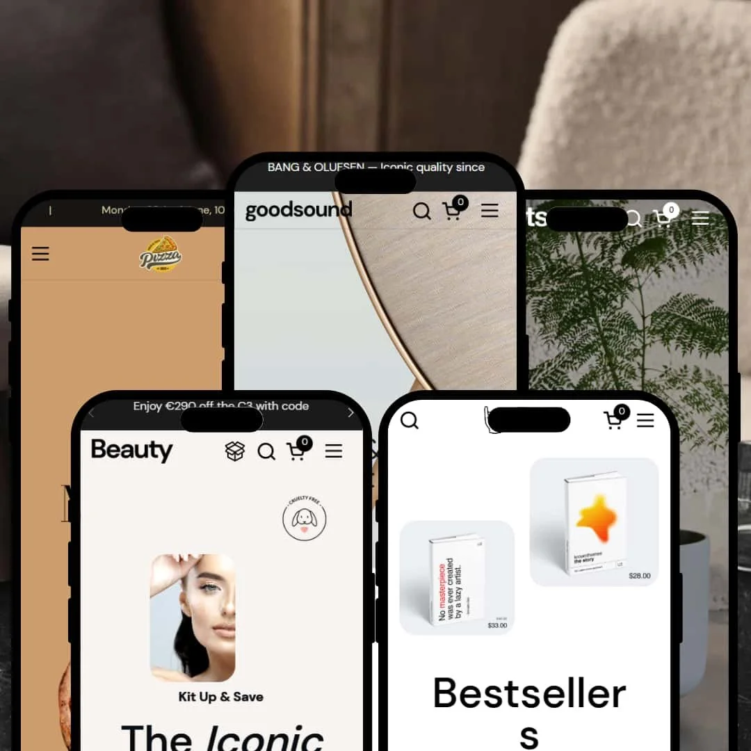
Combine is a multipurpose Shopify theme built for physical goods, kits, and even restaurant menus. Across its demos you’ll find a slide-out cart with cross-sell suggestions, bundle builders, product badges, and tidy navigation, all wrapped in a storytelling-first layout that leans on large imagery and refined typography. In practice it foregrounds variant selection and staged promotions while keeping checkout friction relatively low—though the absence of grid-level quick-add means browsing can take extra taps.
Pros.
〰️
Pros. 〰️
✚ Bundle builders and set-level promotions
Combine bakes in dynamic bundling—from “choose three” kits to “buy X, save Y” offers—and stages them prominently. That shifts the average order value conversation from app-stack to theme, letting merchants merchandise routines and sets as a first-class shopping path.
✚ Polished slide-out cart that nudges add-ons
The cart drawer opens smoothly and supports steppers, discount inputs, free-shipping progress, and “Often Bought Together” recommendations. It functions as a lightweight cross-sell canvas, catching momentum right when shoppers commit.
✚ Storytelling-first design system
Large photography, refined typography, and modular editorial blocks give every preset a narrative spine—home goods, beauty, jewellery, tech, even food. That coherence helps brands project taste and context, not just price and SKU.
✚ Variant clarity and product-page focus
From clear “Add to cart/Choose options” cues to sticky purchase controls, product pages keep action visible as you browse images. It reduces hunt time for key decisions and keeps the page feeling alive rather than static.
✚ Flexible staging across niches
The five presets demonstrate a wide staging range without custom code, from editorial tech to restaurant menu. That versatility makes Combine a credible starting point for curated catalogs and story-rich brands.
Cons.
〰️
Cons. 〰️
− No grid-level quick-add or quick-view
Across presets, shoppers generally need to open product pages to buy, inflating click counts and slowing list-to-cart flows. For big catalogs or replenishment-heavy stores, that added friction matters.
− Cart feedback varies by context
Adding from some lists triggers only a small toast; other actions open the drawer. That inconsistency forces users to learn the cart’s “rules” instead of staying focused on the basket.
− Heavy, image-led pages
Hero-scale imagery and tall editorial sections look gorgeous but tax mobile data and older devices. Without careful optimisation, the first impression can be a spinner.
− Pop-ups can collide with core UI
Promotional or newsletter pop-ups occasionally overlap important controls like add-to-cart. When engagement tools block purchase, friction wins.
-
Neutral tones, generous white space, and lifestyle photography set a calm, upscale pitch for home-goods and lifestyle brands. The preset’s hero leans hard into a curated presentation that frames the store’s value proposition from the first scroll.
What works in this preset
The overall art direction—large serif headlines on a neutral backdrop—keeps the merchandising relaxed and premium. That restraint gives price and optioning room to breathe, especially when the catalog skews tactile or décor-led. The type scale also anchors imagery so the page reads like a light editorial spread rather than a dense store grid.
A floating back-to-top affordance appears once you’ve scrolled, which quietly shortens long-page fatigue. On image-heavy home layouts like this, the extra control helps shoppers bounce between sections without hunting for the header. It doubles as a subtle orientation cue when you’re comparing multiple sections in one session.
The neutral palette and airy spacing support lifestyle photography without shouting over it. That balance keeps attention on textures and finishes, which is effective for décor and home accessories that sell on look and feel. It’s a simple recipe that reads considered rather than sparse.
Where it stumbles
The home page can feel crowded once category tiles, carousels, and promo bars all compete above the fold. Secondary sections sink, so newcomers may scroll past useful content or miss that “why us” narrative entirely. The result is an attractive first impression with a tendency to bury mid-page value props.
-
Gadget aims for a gallery-like calm that flatters premium electronics and audio. Editorial photography does the heavy lifting, while a spare layout pushes focus to the hero product and its story.
What works in this preset
A luxurious hero slider with high-resolution imagery and dual “Learn more/Buy now” CTAs gives the landing a high-end edge. It feels more like a product introduction than a sales pitch, letting aspirational shoppers linger. The pacing helps brands stage a flagship item without overwhelming specs.
Illustrated category icons (earphones, speakers, headphones, and more) provide a clear jump-off to key collections. That simple visual vocabulary speeds path-to-product without undercutting the premium tone. It turns the landing into a tidy launchpad rather than a wall of tiles.
The editorial product grid pairs a statement image with a column of tiles, a magazine-like rhythm that elevates perceived value. It’s ideal for brands where finish and design are as persuasive as specs. The asymmetry also breaks scroll fatigue by changing tempo section-to-section.
Minimalist product pages keep selectors and copy tight so the photography leads. When the object is beautiful—and expensive—this restraint reads as confidence rather than omission. It’s a cleaner route to desire than stacking feature callouts.
Where it stumbles
Product tiles skew sparse on badges and ratings, which blunts urgency on promos and leaves shoppers guessing about social proof. The clean surface looks premium, but it trims useful micro-signals during comparison. That can slow decisive buyers who scan for quick cues.
-
Blush is all softness: pastels, delicate serifs, and inviting layouts that suggest self-care without saying it out loud. The hero introduces bestsellers through scroll-snap panels that mix text and imagery without resorting to video.
What works in this preset
A playful scroll-snap hero advances laterally as you scroll down, creating motion with almost no cognitive overhead. The effect draws attention to the most merchandisable sets and shades without putting a video on your data plan. It feels lively without turning the page into a slideshow.
Variant options appear as pill-shaped buttons labeled by skin-type (“Dry,” “Sensitive,” “Combination”), which matches the aesthetic and aids tap accuracy on mobile. That attention to micro-UI keeps the look gentle without sacrificing clarity. It’s a small gesture that makes selection feel personal.
The pastel palette and serif typography create a cohesive, comfort-first tone that suits self-care narratives. Imagery breathes, copy stays light, and the whole page feels like a guided ritual rather than a hard sell. It’s an easy canvas for before/after storytelling and shade discovery.
Where it stumbles
Navigation splits across “Our Kits,” “Bestsellers,” and “Build Your Kit,” which can feel like three doors to similar destinations. New shoppers may hesitate rather than click through, and the duplication can dilute the sense of a single, obvious path. Clarifying labels or consolidating entry points would reduce that brief pause.
-
Ring is built for jewellery and accessories where craft and taste do the persuading. A mosaic of large lifestyle images (“Bracelets,” “Earrings,” “Necklaces,” “Rings”) serves as a visual index and frames the brand world first.
What works in this preset
A stylish category mosaic acts like a magazine contents page—one glance, four destinations—which reduces bounce-around time on first visits. It also sets the mood for premium price points. The arrangement reads curated rather than catalogued.
An explicit “Appointment” link in the navigation nudges higher-touch sales motions such as consultations. For bespoke or high-ticket items, it’s a friction-reducing cue that there’s a human behind the polish. That signal supports trust at luxury price tiers.
Mid-page story sections (“Timeless elegance & exquisite craftsmanship”) deepen the emotional pitch without drowning the grid. When the product is tiny on screen, narrative does work that thumbnails can’t. The copy blocks also pace the scroll.
Lightweight product listings keep only the essentials—name, material, price—so the item remains the star. That restraint aligns with luxury presentation and encourages exploratory clicking. It’s an elegant way to avoid clutter.
High-contrast serif headings with generous letter-spacing feel luxe and improve legibility. It’s a small typographic decision with outsized impact on perceived brand quality. The look holds together across sections.
Where it stumbles
Cards omit ratings, badges, and variant previews, so shoppers must click to learn about sizes or finishes. On larger assortments, that missing glanceable info adds up to extra page loads. It can slow comparison for browsers who skim.
On small screens, the oversized category images push products far down, inflating the first meaningful scroll. Tall editorial sections can also make the catalogue itself feel hidden, which may frustrate task-oriented visitors.
-
Bites reads like a digital menu for a physical venue—rich browns, full-bleed food photography, and clear paths to reservations. It still supports online selling but prioritises presentation over grid-based shopping.
What works in this preset
Top-level links for “Our Menu” and “Reservations” surface venue-first needs such as hours and booking. That directness respects diner intent and avoids burying utility behind a shop-led IA. It’s the right priority for hospitality.
Each dish gets its own large section with photo, ingredient list, allergen notes, and price—essentially a printable menu on screen. The format is scannable, appetising, and shareable with a friend in a single screenshot. It turns the homepage into a conversation piece.
A warm, appetising palette aligns with hospitality and makes the food photography pop. The tone is cohesive enough to carry a single-venue brand or a tight set of concepts. It’s easy to extend the look across campaigns.
A repeating announcement bar keeps locals informed about new locations or events. For hospitality, that’s a low-effort way to keep the home page timely without rebuilding sections. It’s simple and effective as a house-keeping tool.
Where it stumbles
There’s little in the way of e-commerce tooling: no dense product grids or side-by-side views, which makes multi-item ordering clumsy. It’s lovely as a menu; it’s less convincing as a high-volume shopfront, so expect more steps for basket building.
Add-to-cart is hidden behind a “Shop” link rather than presented inline with dishes, so the conversion path isn’t obvious from the primary menu sections. That extra detour can lose casual takeaway intent when attention is short.
Prices sit subtly at the bottom right of each section, which is elegant but easy to miss. On mobile, that subtlety can read as confusion, especially during quick decisions.
Each dish takes a full viewport; without a back-to-top control the scroll gets long. The show-don’t-tell pacing fits a tasting menu, less so a quick lunchtime decision.
Readability dips where text meets coloured backgrounds, which can dent accessibility. Small contrast fixes would pay outsized dividends here by keeping the appetite high and the effort low.
Niche Suitability
Not Ideal For
-
Brands that sell through story—craft, heritage, routine, or hospitality—and want to bundle products prominently while maintaining a premium editorial look. Curated catalogs (small to medium) that benefit from a paced, design-led browse will feel at home.
-
Merchants with very large product ranges that depend on fast, high-volume grid workflows—quick-add and dense, glanceable badges—will fight the theme’s slower, narrative cadence. If speed over storytelling is the mandate, it’s the wrong canvas.
-
The theme ships with many sections and presets, but matching the demo polish requires excellent photography, deliberate storytelling, and careful configuration of bundles and cart cross-sells. Merchants willing to invest in creative assets will unlock the most value.
Final Recommendation
★ 7.4/10
Rating
-
Covers core commerce plus bundle builders and upsells out of the box; quick-add is inconsistent across presets, but the cart drawer and variant selectors are well executed.
8
-
Modular sections and presets are approachable, yet cart behaviour inconsistencies and the lack of quick-add slow down shopping.
7
-
Heavy imagery and overlapping pop-ups can hinder mobile browsing; sticky headers would improve navigation.
7
-
Loads smoothly on modern connections, though high-resolution media and animations can strain slower devices.
7
-
Five distinct presets show broad versatility—from tech to food—with little need for custom CSS to achieve unique looks.
8
FAQ
〰️
FAQ 〰️
-
On mobile, the slide-out cart behaves smoothly, but tall imagery can make pages feel heavy on weaker networks. Expect a polished feel with occasional slowdowns on media-dense sections.
-
Highly. You can rearrange sections, swap imagery, and change colours and fonts without code; the presets demonstrate how far you can push the look with the same underlying system.
-
Performance is solid on fast connections, but the reliance on large photos and animations can raise first-load costs. Compression and lazy loading are recommended.
-
Yes. Product pages include variant selectors and quantity controls, and the cart reflects variant choices clearly.
-
The theme uses semantic HTML and lets you edit meta titles and alt text. It doesn’t add rich-snippet extras itself, but it plays fine with standard Shopify SEO tooling.
-
Generally, shoppers need to open product pages to buy; list-to-cart flows involve extra taps and quick-view isn’t a consistent path across presets. That’s a design trade-off in favour of storytelling.
-
Very. The theme prominently stages “choose-X-save-Y” style offers and kit merchandising, making set-building a first-class path rather than an afterthought.
-
It supports steppers, discount inputs, free-shipping progress, and “Often Bought Together” recommendations. Used thoughtfully, it catches momentum right when shoppers commit.
-
Promotional or newsletter pop-ups can occasionally overlap important controls like add-to-cart. Keep placements conservative so engagement tools don’t block purchase.
This review is based on hands-on testing of the publicly available Default, Gadget, Blush, Ring, and Bites preset demos of the Combine Shopify theme as of 24 September 2025. Theme features, preset availability, and performance can change with subsequent updates from the theme developer.