
Concept doesn’t just hand you a storefront—it hands you a toolkit. A sticky header, guided search overlay, and a conversion-minded cart drawer (with spend meter and upsells) are there from the jump, ready to flip on in any preset. You also get heavier lifts like bundle builders, spec icon grids, designer bios, and map sections, so storytelling and technical selling live side by side. Both demos open with big, confidence-first hero media that quickly funnels you to products or categories. The message is clear: if you can curate the pieces, this theme will let you stage almost any retail narrative without reaching for an app store crutch.
Pros.
〰️
Pros. 〰️
✚ Native "Build Your Bundle" Functionality: This is the theme's standout feature. Observed in both the Harmony (audio) and Inova (furniture) demos, this integrated module allows customers to build their own product packages, driving up Average Order Value significantly. This is functionality that typically requires a costly third-party app, making it a massive value-add.
✚ Excellent Product Specification Layouts: Both presets demonstrate a superior ability to handle complex product information. Harmony uses a "Product Highlights" icon bar , while Inova uses clean accordions. This shared strength makes the theme ideal for brands selling high-consideration or technical products.
✚ Integrated Social Commerce: Both presets prominently feature a "Shop the Feed" section, showing a clear, theme-wide integration for merchants leveraging Instagram to drive sales.
✚ High-Value Native Functionality: The theme includes multiple interactive modules like a "Build a Bundle" section, a "Before/After" image slider, and "Shop the Look" image hotspots. These are tools merchants often pay for with separate monthly app subscriptions; including them natively saves money and improves site cohesion, directly impacting profitability.
✚ Cohesive & Polished Animation Language: From the smooth slide-out cart to the elegant "revealing footer" effect seen on all demos, the theme's animations are consistent and premium. This unified motion design enhances brand perception and builds shopper confidence, which can lead to higher conversion rates.
✚ Seamless Mobile Experience: All global interactive features, including the complex bundle builder and quick view modals, work flawlessly on mobile. By maintaining full functionality with large, clear tap targets, the theme protects the user experience on all devices, preventing the loss of mobile sales.
Cons.
〰️
Cons. 〰️
− The Minimalist Trap: The theme's greatest strength—its clean, visual-heavy design—is also its biggest strategic weakness. For merchants without a strong brand identity and professional photography, the theme's reliance on stunning visuals can backfire, making their store look sparse or unprofessional. This creates a high barrier to entry and can damage customer trust if not executed well.
− Requires Merchant Diligence on Navigation: Minor usability issues were observed in the navigation structure of both presets (ambiguous icons, underwhelming mega menu styling). This pattern suggests merchants must be diligent in configuring their menus clearly and effectively to avoid creating user friction that could increase bounce rates.
− Inconsistent Call-to-Action (CTA) Hierarchy: Across the presets, there is evidence of inconsistent CTA design. Inova uses conflicting solid and outline button styles for primary actions , while Harmony places a cross-sell table directly above its main "Add to cart" button. This suggests merchants must be diligent in their configuration to ensure a clear path to purchase.
-
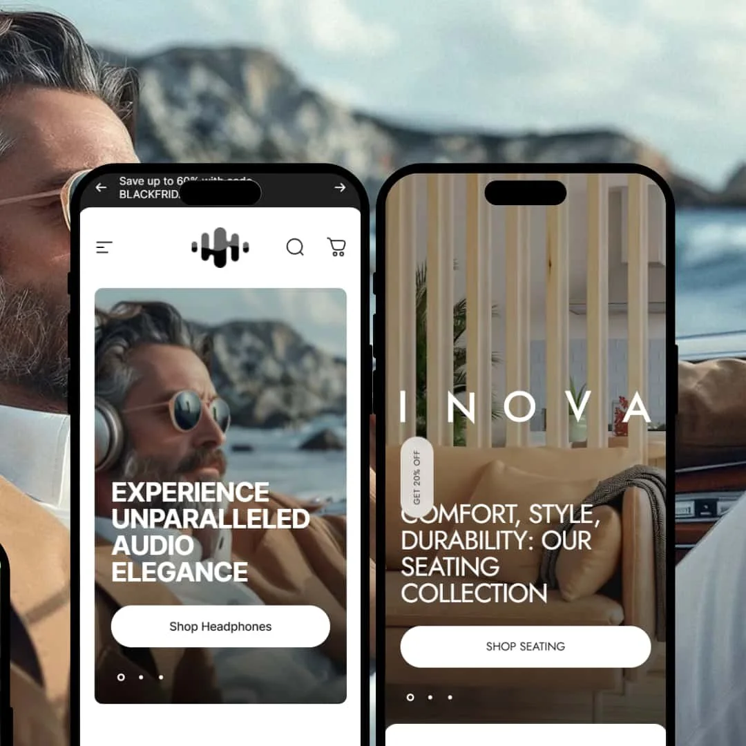
The Harmony preset is correctly identified as being engineered for premium electronics and audio equipment brands. Its design is clean, modern, and focused on showcasing technical specifications and high-quality product imagery.
⊕ Pros
✚ Product Highlights Icon Bar: Directly below the product title, a dedicated bar with clear icons summarizes key technical specifications like "Driver size," "Weight," and "Battery". This is a unique and highly effective way to communicate essential features above the fold.
✚ Built-in "Popular Upgrades" Table: The product page includes a native table for cross-selling related items like "Ear cushions" and a "Steel Case". This integrated feature encourages users to increase their order value directly from the main product page.
✚ Multi-Section Product Details: The product page is broken into numerous well-designed sections, including "Tech Specs," FAQs with a contact form, and an "Included in the Box" graphic, creating a comprehensive and scannable user experience for complex products.
⊖ Cons
− Potentially Confusing CTA Zone: The "Popular upgrades" table is located directly above the main "Add to cart" button. This placement could distract or confuse some users, potentially drawing attention away from the primary conversion action.
− Standard Header Layout: The preset utilizes a conventional header design with a left-aligned logo and centered navigation links. While highly functional, this standard layout lacks a distinct design element to differentiate the brand presentation.
-
The Inova preset is designed for a high-end, modern furniture and home decor store. The aesthetic is minimalist, architectural, and rooted in Scandinavian design principles.
⊕ Pros
✚ Clean Accordion for Product Specs: The product page effectively organizes extensive product details into clean, collapsible accordion tabs for "PRODUCT INFORMATION," "MATERIAL," and "CARE INSTRUCTIONS". This is an ideal way to present important purchase information without cluttering the page.
✚ Strong Visual Category Grid: The homepage features a prominent and well-styled grid for navigating main categories like "SEATING," "SOFAS," and "LIGHTING". This provides a clear and visually engaging path for users to begin Browse.
✚ Prominent "View All Collections" CTA: Placed high on the homepage, a clear "VIEW ALL COLLECTIONS" button encourages users to dive deeper into the catalog, a key action for stores with multiple product categories.
⊖ Cons
− nconsistent Button Hierarchy: The product page features a solid brown "ADD TO CART" button but a secondary, outline-style "BUY IT NOW" button directly below it. This inconsistent styling can create visual confusion and weaken the perceived importance of the primary call-to-action.
Niche Suitability
Not Ideal For
Final Recommendation
-
This theme is ideal for design-conscious DTC brands with strong photography that sell technical or high-consideration products. Retailers in electronics, furniture, and other niches who want to encourage multi-product orders will benefit immensely from the native "Build Your Bundle" feature.
-
Brands without a significant budget for professional photography will struggle to make this theme look good. High-volume, low-price retailers may also find the design too spacious and not optimized for rapid Browse of extensive catalogs.
-
Medium. While the theme provides powerful built-in sections, achieving the polished, premium look of the demos is heavily dependent on professional, high-quality photography.
★ 8.4/10
Rating
-
The inclusion of a native "Build Your Bundle" module is a best-in-class feature that elevates this theme above its competition and can directly increase AOV.
10
-
While the theme sections are powerful, the "Minimalist Trap" means there is a medium-to-high level of effort required in asset creation to make a store look professional.
7
-
Based on hands-on testing, the mobile experience was excellent. All interactive features, including the complex bundle builder, were fully functional and intuitive on smaller screens.
9
-
During live testing, interactive elements were highly responsive and pages loaded without noticeable lag. The theme feels fluid and well-optimized.
8
-
The theme offers two very different aesthetic starting points and the global bundle feature is highly adaptable, providing significant flexibility for different markets.
8
FAQ
〰️
FAQ 〰️
-
👑 It is highly suitable for industries with technical or high-consideration products like electronics and furniture, thanks to its detailed product page layouts and bundle-building feature.
-
📱Yes, based on hands-on testing, it provides an excellent mobile experience where all interactive features are fully functional and intuitive.
-
🎨 It is highly customizable but requires a strong brand identity and professional photography to be effective.
-
⚡Based on live testing, performance is very good. Interactive elements are fast, and page transitions feel fluid.
-
👕Yes, the theme has robust support for product variants. It can display options like different colors using visual swatches and different sizes using clear, functional selectors on product pages and within other theme modules.
-
🔎 The theme supports all of Shopify’s native SEO features, which is standard for all themes in the theme store.
-
💱Yes, a language and currency selector is visible in the footer of both presets, confirming support for Shopify Markets
-
⚙️ Yes, as a modern Shopify theme, it is compatible with the app block ecosystem.
-
🛒 Yes, all themes on the Shopify Theme Store can be trialed for free before you decide to purchase and publish.
Disclaimer: This review is based on hands-on testing of the publicly available "Harmony" and "Inova" preset demos of the Concept Shopify theme as of June 20, 2025. Theme features, preset availability, and performance can change with subsequent updates from the theme developer.