
Most premium Shopify themes make a single bet: one vertical, one aesthetic, one customer to win. Copenhagen makes five. Apparent Collective ships this Online Store 2.0 theme with preset demos spanning clothing, furniture, beauty, jewelry, and wall art, each genuinely staged for its own vertical rather than recoloured. At $380, the question is whether the breadth pays off or whether one of the five is enough reason to choose it.
A twenty-five section content library that scales across niches
The section library is the substance of what Copenhagen offers. Twenty-five section types render across every preset, including slideshow, video banner, image hotspot/product markers, collection tabs, before/after, blockquote, brands strip, countdown, popular products, product slider, social media collage, split screen slideshow, and video banner, and the demos prove they hold up across five different verticals without looking out of place. For merchants who'll be building out homepage rhythm beyond what the preset ships, having this much native variety means fewer apps and fewer custom Liquid commissions. For DTC brands planning content depth (lookbook tiles, editorial banners, video heroes, before/after testimonials) it's most of the merchandising work pre-built.
Three product page layouts as a per-product merchant choice
Every preset's mega menu exposes three product page layouts: 2 Columns, Stacked, and Thumbnails Carousel. The merchant chooses which layout each product uses, which means a beauty brand can run Stacked for routine sets and 2 Columns for single-product features inside the same store, or a furniture brand can use Thumbnails Carousel for hero pieces and Stacked for accessories. Most Premium-tier themes commit you to one PDP layout across the entire catalogue; Copenhagen treats it as a per-product editorial decision. For stores with mixed catalog types (hero products plus utility products, or premium products plus accessories), that flexibility is rare at this tier.
A native conversion stack that usually arrives as apps
Countdown timer with header-after-countdown rollover copy, promo popups (newsletter capture with 10% off, age verifier configured), product markers/image hotspots, before/after image sliders, sticky cart, quick buy, and stock counter all ship native. For a merchant tier that typically installs three or four apps to assemble this stack (countdown app, popup app, scarcity app, free-shipping bar app), having it consolidated inside the theme cuts both monthly subscription cost and the section-bloat that comes from app-injected widgets. For DTC brands running aggressive merchandising, this is most of why you'd choose Copenhagen over a quieter-looking competitor.
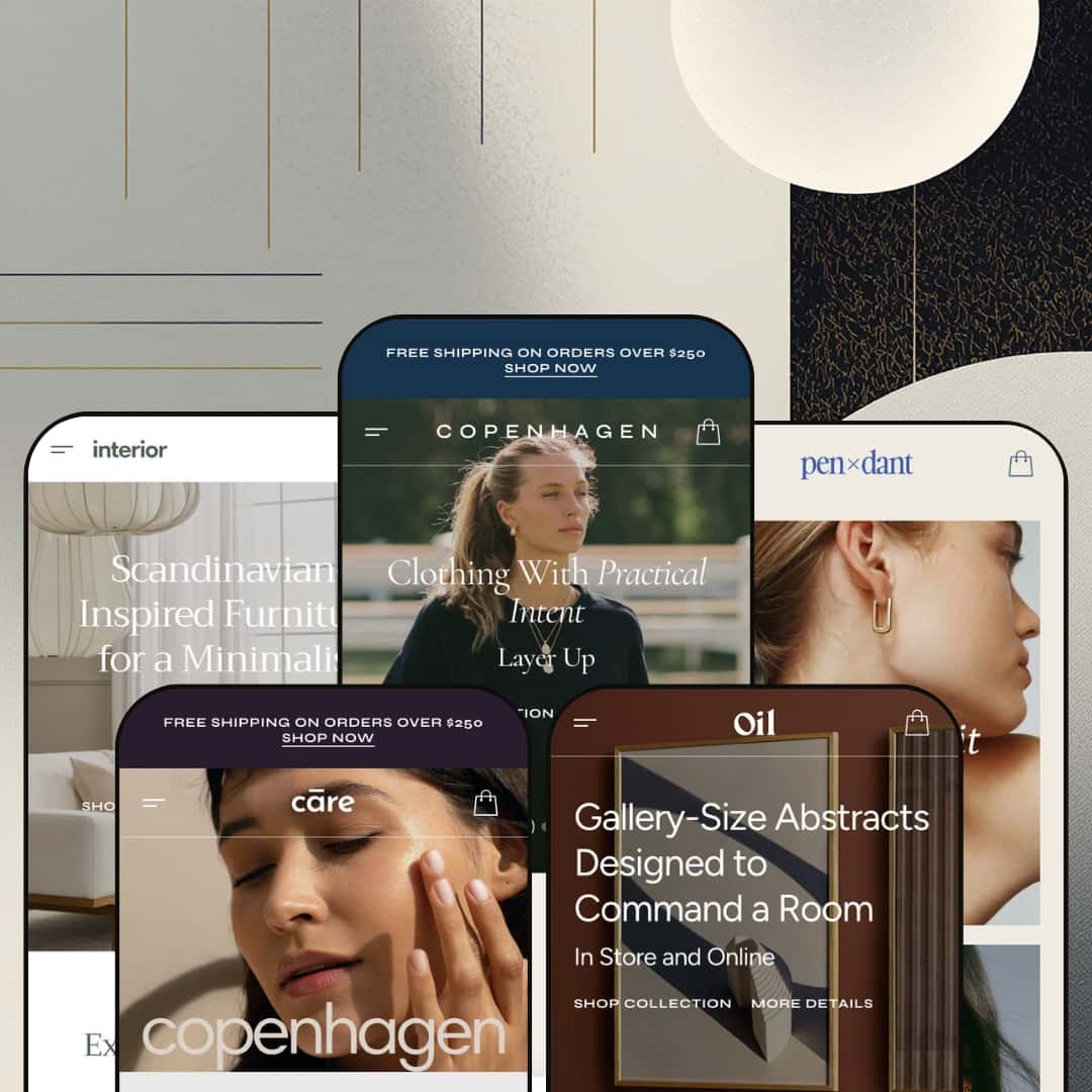
Five real verticals under one license, not five recolours
For brands that haven't committed to a final vertical, or for agencies building multiple stores from one theme purchase, the preset range is the headline value. Copenhagen Primary (clothing/bags), Almond (furniture), Delicate (beauty/wellness), Champagne (jewelry), and Sand (art prints) aren't palette swaps of the same homepage; each preset uses different section orders, different hero patterns, different about-us treatments, and different product detail expressions. For boutique merchants exploring positioning across categories, or for studios serving multiple DTC clients in different niches, the cross-vertical range is what the $380 actually buys.
Demo polish slips in places that shouldn't be left
Across four of the five preset demos, small data issues sit in plain view: a placeholder $0.00 price, an outdated holiday-campaign countdown, a banner typo, a sale-price math slip where the regular price is lower than the sale price, and a leftover product-subtitle placeholder still reading "briefly introduce the main product." For a theme that's been on the Theme Store since March 2024, two years is enough time for these to have been caught. The demo is the sales pitch. It should be airtight.
Each vertical is one direction deep
Copenhagen ships one clothing preset, one furniture preset, one beauty preset, one jewelry preset, one art preset. If a clothing brand wants to preview alternative aesthetics inside the clothing vertical (a darker editorial direction, a brighter pop direction, a more product-grid-heavy direction), there's nothing inside the preset library to test against. Competing themes in the same price tier (themes designed for one vertical) typically ship two to four preset directions inside that vertical. For merchants who've already locked in their niche but are still exploring visual identity, Copenhagen's breadth comes at the cost of depth.
Generic copy repeats across all five presets
Every preset's FAQ block uses the same four questions: "What payment methods do you accept?", "How can I track my order?", "Can I return or exchange an item?", "Do you offer customer support?" Every preset's Advantages section runs the same Worldwide Shipping / 30 Days Free Returns / 24/7 Customer Support card trio. The shared boilerplate copy across niches makes the demos feel templated where they should feel staged, and means more rewrite work for merchants who want their store to read differently from every other Copenhagen install.
What it takes to launch
Replace the niche-specific demo copy across the chosen preset (hero captions, section titles, About Us, FAQ block, Advantages cards), swap demo imagery for branded assets (the demos credit Luna & Rose, Bolia, Purearth, Bul, and Papercollective as image partners; none of those assets are licensed for merchant reuse), populate the variant data for colour swatch rendering, and audit the demo data slips called out above before the store goes live.
-
What works in this preset
"Clothing With Practical Intent. Layer Up." The hero copy on Copenhagen Primary doesn't pretend to be subtle: it leads with italicized accent words inside otherwise plain headlines, and the motif runs across hero captions, section titles ("New Season Favourites"), and banner pulls ("Your Spring Carry"). It's the typographic personality of the preset, and once you notice it, you see it everywhere. The small dressmaking detail gives an editorial layout its identity.
The home page itself is dense without feeling padded. A 3-up hero slideshow opens onto a tops/bottoms/bags collection grid, then a featured product grid with 10 styles, then a brand strip of seven third-party logos (Urban Edge, lumina, Serene, Nexus, PRISM, 12/22, Frame 48), then a category-tabbed Spring 2025 Collection grid that switches between Most Popular / Bottoms / Tops / Dresses without a page reload. Underneath sits a countdown timer, a 3-collection banner row, a numbered Advantages section (Worldwide Shipping / Quality Materials / Trendy Selections), an FAQ block, and a Popular Stories blog feed.
Where it stumbles
The Stripe Texture Shift Dress in the New Season Favourites grid shows Regular price $50.00, Sale price $50.00, then a struck-through Regular price of $35.00 below. The "regular price" sitting below the sale price is lower than the sale price itself, which is the kind of demo data slip that suggests the variant wasn't proof-read before going live. Small, but at a $380 entry it's the wrong kind of detail to leave in.
-
What works in this preset
I scrolled the Almond demo expecting more of the italicized accent motif and found the opposite: clean, unornamented hero copy ("Scandinavian-Inspired Furniture for a Minimalist Home") and a more architectural section rhythm. Same theme, same building blocks, completely different voice. The preset library isn't recoloured between niches; it's rebuilt per vertical.
The standout structural move is the inline Item of the Week section: a full product detail block with thumbnail gallery, variant picker (four colours and four sizes on the Embroidered Plate Holders), and Add to Cart, all rendered inside the homepage scroll rather than linking out to a product page. The Before/After image slider gets used here for furniture staging (empty room to furnished room), which is unusual at this tier; most themes treat that section as a beauty or skincare trope, and Almond's repurposing of it is genuinely creative.
Where it stumbles
The Bestsellers grids across the Interior preset show "Sold out" on most listings, including the headline Sleek Leather Armchair, Wooden Round Table, and Compact Bed Frame Headboard. The product page demos carry placeholder subtitle copy that reads "Here you can briefly introduce the main product." That's a demo-data choice rather than a theme issue, but it makes the most polished preset of the five feel oddly under-finished when a buyer is scanning quickly.
-
What works in this preset
Where Almond is restrained, Delicate goes pastel-luxe. The hero is a centered Copenhagen logo composition rather than a slideshow, the collection grid runs 4-up at full width (Face / Body & Hair / Wellness / Most Popular), and a CLINICALLY PROVEN RESULTS section uses the same Before/After image slider that Almond uses for furniture staging: same component, applied for a beauty hair-treatment claim instead.
Underneath sits an in-page Luxe Body Lotion product detail block with size variant picker, Size Guide link, and shipping info. I scrolled past it twice before clocking that the variant picker is actually live in the homepage scroll, not linking out to a separate PDP. The category-tabbed Leading Picks from Every Category grid lets shoppers move through Body & Hair, Face, Most Popular, and Wellness without a page reload, which matches how beauty browsing actually works.
Where it stumbles
The Stress Relief Tea Mask in the Chosen for You grid shows Regular price $0.00, Sale price $0.00. Other products in the same grid are priced $11 to $45, so it isn't a deliberate staging choice; it's a placeholder that someone forgot to fill. On a Premium-tier theme demo, leaving a $0.00 product live in the headline product grid is the kind of detail that makes a merchant look careless before they've sold a single bottle.
-
What works in this preset
Champagne is the high-glamour entry. "The Gold Edit" runs as the headline hero, the brand strip animates with eight logo variants in light and dark mode, the category-tabbed Leading Picks from Artful Categories grid splits between Chains, Earrings, and Rings, and the Complete Set Elegance carousel pairs matched jewelry pieces. The About Us section swaps the usual two-image split for a self-hosted product video, which lands at this niche because jewelry is a touch-and-light vertical where photography alone doesn't do the work.
The Champagne preset uses real product variant rendering: the Vintage Scrollwork Band ships with three colour variants (White / Orange / Blue) shown as named swatches in the product cards themselves, so shoppers see the variant choice before clicking through. For a vertical where stones, finishes, and metal tones drive purchase decisions, surfacing the variant axis on the card is the right call. I'd steal this trick for any colour-driven catalogue, jewelry or otherwise.
-
What works in this preset
Of the five presets, Sand asks the most of the architecture. It positions Copenhagen for an art-print marketplace rather than a single-brand store: product names carry real artist attributions (Kit Agar, Denis Boudart, Berenice Hernandez, Yanyi Ha, Robin Ahlgren), the Most Celebrated Artworks grid breaks into category tabs by medium (Line Art / Paintings / Illustrations / Graphic), and the About Us reads "Bringing Art to Your Walls – Handpicked Art Pieces" rather than the usual brand-story copy.
The 3-up hero slideshow earns its place here in a way it doesn't in some other presets. Each slide names a real art-marketplace value proposition: "Gallery-Size Abstracts Designed to Command a Room," "Original Watercolors Created by Independent Artists," "Monoline Art Prints for Modern, Minimal Rooms." For art platforms aggregating multiple artists, that hero-as-positioning approach is the right architecture.
Where it stumbles
The countdown timer block is labeled "BLACK FRIDAY" with post-event copy "The Clock Has Run Out – New Offers Coming Soon!" still sitting in the demo. It's a flash-sale section configured for a campaign that ended and never updated. The other Oil-preset typo is smaller: a banner reads "Sale Upt to 50% Off," missing a letter. Both are easy fixes, but easy fixes left unfixed read as inattention.
The five-vertical range is the architecture, not just a feature
The most useful way to read Copenhagen isn't as a theme with five preset skins. It's as five separate single-vertical themes packaged under one license. Each preset uses the section library differently enough that the same homepage components produce genuinely different commercial experiences across clothing, furniture, beauty, jewelry, and wall art. For a studio building multiple stores or a multi-brand operator, the cross-vertical positioning is the value proposition.
Conversion stack consistency across all five verticals
The countdown, promo popups, before/after sliders, sticky cart, quick buy, product markers, and stock counters aren't preset-exclusive. Every native conversion mechanism works inside every vertical demo, so a furniture brand gets the same toolkit as a beauty brand. That consistency means the brand-vertical choice doesn't trade off against merchandising power, which is rare when a theme tries to span this many niches.
Image partnerships per niche signal genuine vertical staging
Each preset credits a different real-brand image partner in its footer: Luna & Rose (clothing on Primary), Bolia (furniture on Almond), Purearth (beauty on Delicate), Bul (jewelry on Champagne), and Papercollective (art prints on Sand). The demos use actual category-specific photography from actual brands in each vertical, not the same stock imagery recoloured. The visual confidence of each preset reflects that sourcing discipline.
Typography motif applies inconsistently across presets
The italicized accent word inside headlines (a recurring Copenhagen signature visible on Primary, Pendant, and parts of Sand) doesn't translate to Almond or Delicate, where the headlines drop the device entirely. For a theme that visibly leans into typographic identity in some presets, the absence of consistent treatment across all five reads as design indecision rather than tonal range. Studios using Copenhagen across multiple client stores will need to make a typography call early.
The breadth-for-depth trade is architectural, not accidental
Apparent Collective spread the preset budget across five niches rather than concentrating it inside one. That's a structural design choice with real consequences for buyers whose primary need is testing aesthetic variations inside their chosen vertical. For agencies and multi-brand operators the trade pays off; for single-brand merchants still iterating on identity, the same trade hurts.
★ 7.4/10
Rating
-
A 25-section library and a native conversion stack (countdown, popups, before/after, product markers, sticky cart) cover most of what merchants typically install apps to assemble.
8
-
The section variety means more merchant decisions to make in the editor; clear demo presets reduce friction, but five-niche flexibility comes with a learning curve.
7
-
Sticky header, slide-out cart drawer, mobile menu pattern with collapsible categories, and dedicated mobile banner assets are all present across presets.
7
-
Image lazy-loading and width-based responsive serving are wired in; the dense section count on each preset homepage means page weight scales fast if every section is enabled.
7
-
Five preset directions across five verticals, 25 section types, and three switchable product page layouts deliver real flexibility, held back from a 9 by the one-direction-per-niche ceiling.
8
Frequently Asked Questions
-
Yes. Each preset's mega menu exposes three switchable layouts (2 Columns, Stacked, Thumbnails Carousel) as a per-product merchant choice. A jewelry brand could use Thumbnails Carousel for hero rings and Stacked for everyday studs inside the same Champagne-preset store.
-
No native reviews component ships with the theme. Reviews on a Copenhagen store are app territory (Judge.me, Loox, Yotpo, Stamped, or the free Shopify Product Reviews replacement). The theme exposes integration points for review-app blocks, but the underlying functionality comes from the app.
-
The Before/After section is part of the global section library (visible in every preset's Features mega menu) and can be added to any preset's homepage or page templates. The Care demo uses it for a hair-treatment claim; the Interior demo uses it for furniture staging; merchants in other niches can repurpose it for whatever transformation story applies.
-
Copenhagen ships pre-translated UI strings for English, French, Italian, German, and Spanish (the "EU translations" listed in the Theme Store feature set), and supports right-to-left rendering. Actual multi-language store rendering and currency switching are handled by Shopify Markets at the platform level; Copenhagen's contribution is the translated theme strings and the rendering of the country/language selector in the header and footer.
-
The theme's marketing on the Shopify Theme Store advertises a 15-minute response window, day or night, including during trial periods. Public reviews from BAS Bride, Studio Sosue, Palos Verdes Tennis Club, and Toni Cabal call out responsiveness as a recurring strength. Support is fielded by the Apparent Collective team based in Valletta, Malta, with contact via apparentcollective.com/help-center or support@apparentcollective.com.
-
Yes. Sections are global to the theme, not locked to presets. The Set of The Day in-page product block from Pendant, the Item of the Week from Interior, the CLINICALLY PROVEN RESULTS Before/After from Care, and the artist-credit Bestsellers grid from Oil are all available to drop into any other preset. The preset boundary is the starting demo composition; the section library is shared.
-
No. Every preset's footer credits a real brand whose product imagery was provided for demo purposes only: Luna & Rose, Bolia, Purearth, Bul, and Papercollective across the five presets respectively. Merchants must replace all demo imagery with their own branded assets before launch.