
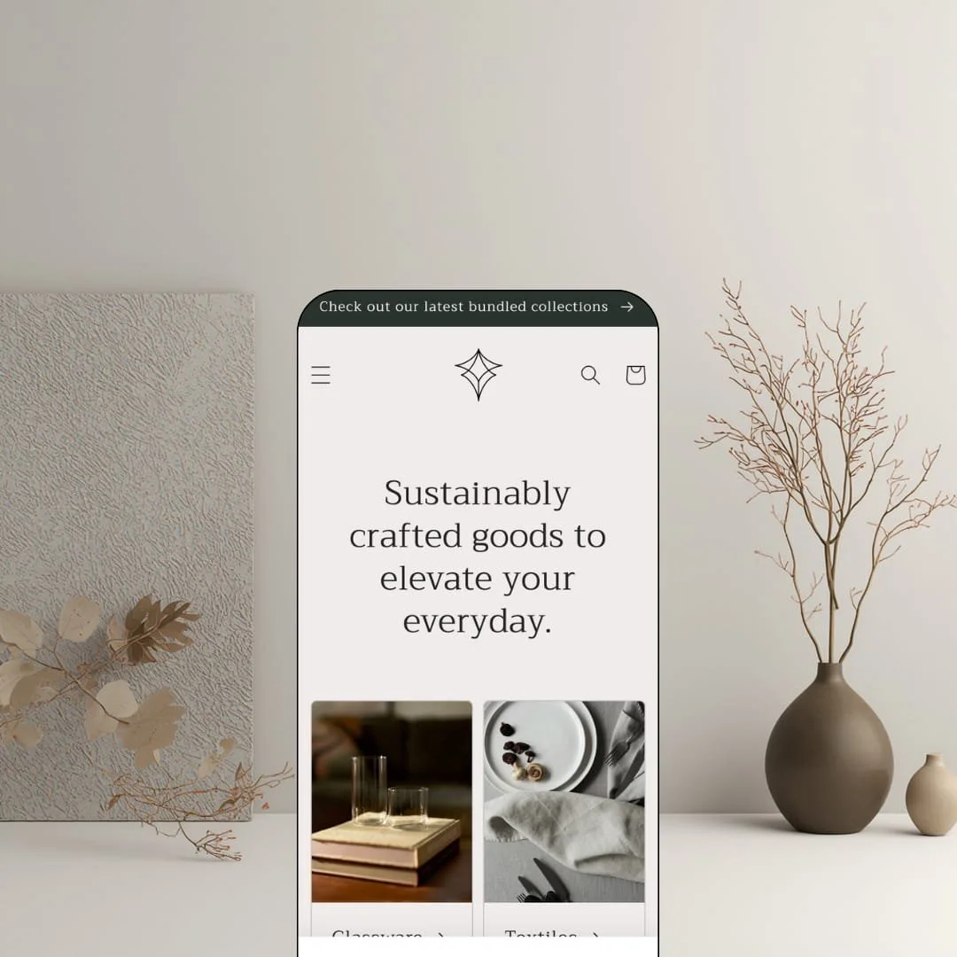
Most free themes try to look expensive. Craft tries to look quiet. It's one of Shopify's own Online Store 2.0 themes, built on serif typography, generous whitespace, and long-form brand storytelling, with a demo staged as a sustainable tableware shop to prove the point. Whether that restraint helps or hurts depends entirely on how much selling pressure your products actually need.
A storytelling section flow that reads like an in-house brand site
Craft's homepage architecture chains editorial sections into a coherent narrative rather than stacking product grids, and the blog feed alone shows the intent: article cards carry an image, a publish date, and a two-line excerpt, styled like a magazine index instead of an afterthought. Trust is the whole sale for handmade goods. Single-brand makers with under-50-SKU catalogs selling considered-purchase homeware get an editorial presence on day one, without paying a designer to fake one.
Structured content rows where the fine print actually fits
Where do care instructions live when your product needs a paragraph of them? Craft answers with collapsible content rows built into the product template, and the demo's Everything Bowls page runs three of them, holding materials, dimensions, and care guidance down to the 450ºF oven rating, all folded beneath the buy area instead of bloating the description. The feature list extends the same pattern to ingredient, nutrition, and usage blocks. No app required. Food-and-drink and skincare merchants whose buyers read labels before they pay get that structure natively.
Color-first merchandising for shade-driven catalogs
Color swatches on product options and swatch-based filtering ship as one coordinated discovery mechanism, and the demo leans into it by splitting dinnerware into five shade collections, Speckled White through Midnight Blue, straight from the main navigation. Shoppers browse by palette before they browse by product. For ceramics and apparel-accessory merchants running 30-to-100-SKU catalogs where one design sells in many colorways, that's the browsing model the catalog actually needs.
A design register that carries premium price points
Bootstrapped single-brand artisan stores selling at luxury-adjacent prices are the clearest winners here. The serif display type, wide margins, and uppercase eyebrow labels give product staging a gallery cadence, and the demo lets a $525 dinnerware bundle sit on the page with no badge, no timer, and no visual apology. Restraint reads as confidence. At a free price, that's a genuine brand asset rather than a compromise.
The aesthetic is a commitment, not a setting
Craft's identity runs deeper than its color tokens: the editorial pacing, airy spacing, and quiet typographic temperament survive any palette you pick in the editor. You can restyle it. You can't make it loud. Flash-drop streetwear brands and impulse-buy gadget stores built on urgency and visual noise will fight the theme at every section, and they'll lose that fight at every scroll depth.
The buy button doesn't follow the story
Product pages front-load the purchase controls and then descend into content: on the demo's Everything Bowls page, the description, three content rows, and a full-width mission band all sit below the add-to-cart, with no sticky bar trailing the reader down. Sticky add-to-cart isn't on the feature list either. For food and supplement brands whose shoppers read to the bottom before deciding, that's a long scroll back up on every purchase, and on mobile it's longer.
Over Dawn, you're mostly choosing a mood
Set Craft's feature list next to Dawn, Shopify's free baseline, and the functional overlap is heavy; what Craft adds is typographic identity, editorial pacing, and its structured content presentation rather than new commerce machinery. That's a legitimate reason to choose it. But be honest about what the choice is. You're picking an aesthetic, not a toolkit, and merchants running 100-plus-SKU catalogs on restock-driven promotion cycles will outgrow both themes at roughly the same point.
What it takes to launch
Expect a full copy and imagery build across homepage sections, About-page narrative, and product content areas, plus navigation build-out and collection structuring before the storefront reads finished. The theme itself configures quickly; the content is the work.
-
What works in this preset
Scrolling the homepage feels closer to reading a small brand magazine than working through a store. I scrolled the full demo top to bottom before opening a single product, and the sequence holds: a one-line announcement bar, collection tiles that pull the opening sentence of each collection's description onto the card, a video feature titled "The details matter," and a rotating trio of customer quotes attributed by name and city. Nothing shouts. For a first-build storefront, that composure is the hardest thing to fake.
The About template is where the storytelling pitch gets specific. Alternating bands of full-width imagery and statement headlines walk through sourcing, durability, and sustainability before closing on a three-column "What inspires us" row, and the page reads like something a copywriter and a photographer spent a week on rather than a template waiting to be filled. It's one page. But it demonstrates exactly the depth a maker brand needs for a founder story.
The product template stages purchase mechanics with the same restraint. On the Everything Bowls page I clicked through a four-image stacked gallery where every photo opens in a full-screen modal, adjusted the quantity through a stepper rather than a dropdown, and found a share control that copies the product link in one tap. Small touches. Together they keep the buying surface calm without making it feel thin.
Where it stumbles
Craft's Theme Store listing files it under jewelry and accessories and under food and drink, yet the demo stages neither. I went looking for anything aimed at those two verticals and found a tableware brand instead: beautiful, on-message, and unhelpful if you sell earrings or espresso beans and want to see your category rendered. Buyers evaluating from the demo have to imagine the translation themselves.
The feature list promises a mega menu, but the demo's navigation stages a single-level dropdown under Dinnerware and flat links everywhere else. That's a staging choice, not a capability gap. It still costs the theme something, because the one navigation pattern a bigger catalog would actually stress is the one the demo never renders.
Craft is a brand-atmosphere theme that happens to cost nothing.
Its defining bet is that composure sells considered goods better than pressure does. The trade-off is that everything it declines to ship, from countdowns to scarcity cues to dense promotional staging, is a door closed for stores that live on momentum, and no setting reopens it.
Its Theme Store record is genuinely mixed, sitting at 57% positive across 47 reviews, which is worth weighing even for a free install. As the launch canvas for a maker brand that will layer apps on later, it earns the slot; as a selling machine, it never applied for the job.
Rating
★ 6.6/10
-
Covers craft-store essentials from size charts to product videos, but the promotional layer is thin and stops at banners.
5
-
A restrained settings surface plus first-party documentation in Shopify's Help Center keeps configuration friction low; the real time cost is content.
8
-
Filtering collapses into a dedicated filter-and-sort drawer and stacked galleries suit small screens; storytelling-length pages ask for more scrolling on a phone.
7
-
The homepage runs lean: restrained section count, lazy-loaded imagery, and no heavy animation layer competing with the content.
8
-
Color, type, and section arrangement are all open, yet every combination still comes out sounding like Craft; the identity is the point and the limit.
5
Frequently Asked Questions
-
Yes. Pickup availability ships in the cart-and-checkout feature group, so merchants with a physical location can surface local collection without an app.
-
No. The layout is category-neutral, and the listing's own industry tags point at jewelry and at food and drink rather than home goods, so the tableware staging is a demo choice, not a constraint.
-
Yes. Version 15.5.0 landed June 17, 2026, adding support for standard storefront events plus a new section and block for product disclosures, which keeps it current with Shopify's release cycle.
-
It ships one. In this demo, product cards are staged clean and don't emphasize quick-buy triggers, so you'd switch it on in the editor rather than see it in action beforehand.
-
Shopify's general support channel, which can escalate to the dedicated theme team. There's no direct line to the theme developers; a designer reply on the listing confirms that routing.
-
The Theme Store files it under "some" products, meaning roughly 11 to 100-plus items, and the demo's six-link navigation reflects that scale honestly.
This review is based on hands-on testing of the publicly available preset demos of the Craft Shopify theme as of August 2026. Theme features, preset availability, and performance can change with subsequent updates from the theme developer.