
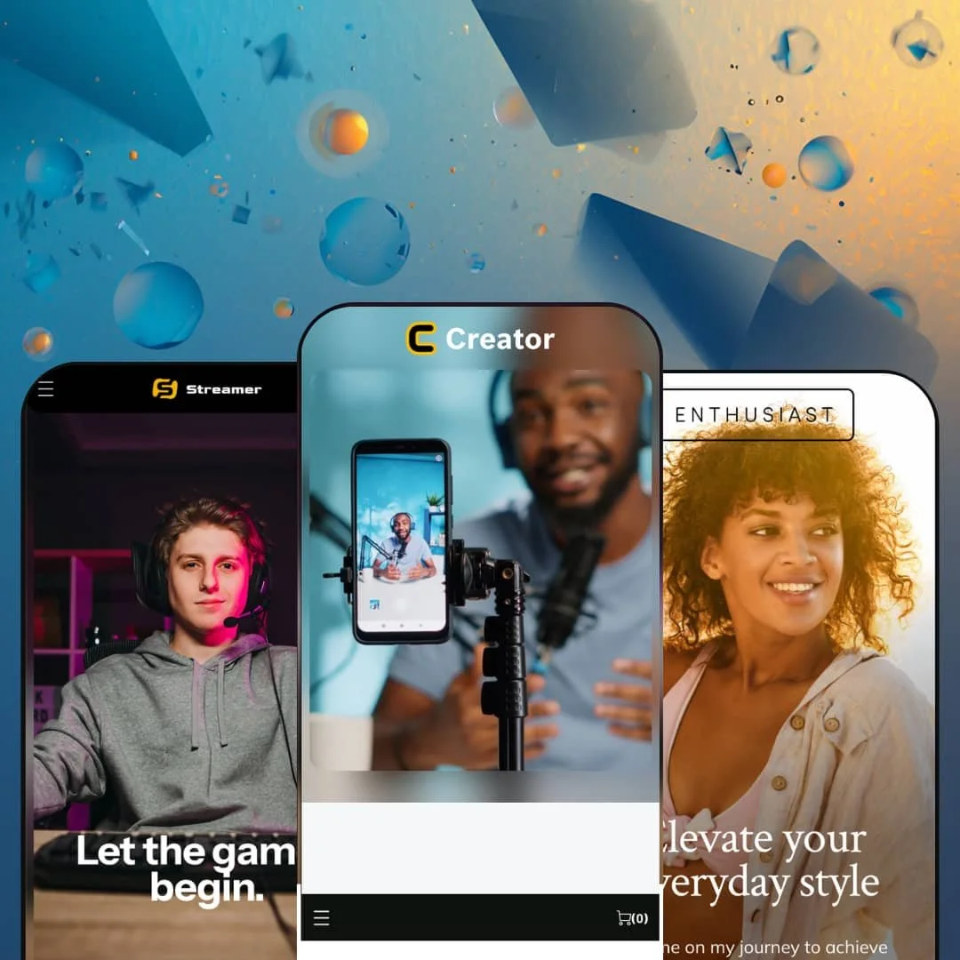
Most premium Shopify themes assume the product is the star. Creator, built by Purple Labs on the Online Store 2.0 architecture, assumes the person selling it is. At $300, it wraps commerce around a personal-brand storefront: video galleries, story-style shoppable sections, event listings, and link-in-bio style social hubs, staged across three creator archetypes. If your revenue depends on an audience that follows a face rather than a catalog, this theme was drawn for you; if it doesn't, you're paying for machinery you'll never turn on.
Story galleries that sell, not just decorate
The story-gallery section is the theme's flagship: tap-through slides in a social-story format, each gallery anchored to a shoppable product list, deployed for makeup categories in one preset and gaming collabs in another. Editorial browsing and add-to-cart intent live in the same component instead of forcing a jump from a lookbook page to a collection page. For drop-model apparel and beauty sellers with impulse-buy audiences under 100 SKUs, this is the section that justifies the theme.
Video as a first-class storefront citizen
Dawn, Shopify's free baseline, gives you a video section you can slot into a page; Creator builds duration-stamped gallery rows, multiple named video collections per homepage, and a dedicated video page template around an entire content library. The result is a storefront that doubles as a channel archive. Podcasters and streamers running small evergreen merch catalogs alongside a large content back-catalog get an architecture that treats both as inventory.
A community hub, not just a contact page
Event listings with dates, venues, and RSVP links, link-in-bio style social hubs, and SMS opt-in blocks function together as one audience-retention kit. Each piece routes a follower somewhere sticky. That coordination matters for merchants whose sales pattern is event-driven and seasonal, think convention appearances and launch parties, and whose buyers are repeat fans rather than one-time searchers.
One purchase, three creator verticals
Creator ships gamer, tech-personality, and beauty-influencer presets from a single $300 license, and the demos prove the section system re-skins convincingly across all three rather than recycling one design with swapped photos. Typography, color, and staging shift the personality completely. Agencies building storefronts for multiple creator clients, and multi-brand operators managing several personality-led shops, effectively get three starting points for one line item.
Commerce rides in the passenger seat
The homepage grammar across every preset is content-first: navigation gives shopping one menu entry among Videos, Blog, and Events, and the template family's center of gravity is pages that don't sell anything directly. That's a deliberate identity. For a merchant whose revenue is catalog-driven, say a 500-SKU apparel brand or an electronics seller courting considered-purchase buyers who compare specs, this architecture works against you on every page, because the theme keeps steering attention toward a personality that, in your case, doesn't exist.
The feature list reads a tier below the price
Count the commerce toolkit and it's compact: quick buy, slide-out cart, mega menu, swatches, size chart, product tabs, the expected staples. It's thin for $300. What's absent is the deeper conversion machinery, no comparison tooling, no advanced cross-sell engine, no back-in-stock treatment, that would let a growth-stage merchant squeeze the theme harder, so mid-market sellers with expanding catalogs and restock-driven sales cycles will feel the ceiling early.
A track record you can't lean on yet
Three Theme Store reviews since a March 2023 launch is a strikingly small sample for a paid theme, even at 100% positive. This kept bugging me while writing everything else. Buyers making a $300 considered purchase, particularly first-time store owners without a developer on call, are betting on support quality and update cadence with very little third-party evidence either way.
What it takes to launch
Expect a multi-day content pass across video libraries, story-gallery slides, event listings, social and SMS destinations, and product copy before launch, since nearly every distinctive section ships as a container you must fill rather than a layout you merely restyle.
-
What works in this preset
You land on content, not a sales pitch. The demo stages a tech personality's storefront where a blog carousel and two labeled video galleries sit above the first product row, and the effect is closer to a channel homepage than a shop, which is exactly the point for an audience that arrives from YouTube rather than Google Shopping. Video cards carry duration stamps like 13:28 and 23:29. It reads like a platform feed on purpose.
The mixed-catalog staging is the quietly clever part. Merch with three color swatches sits one scroll away from $100 online courses shown with slashed compare-at prices, demonstrating that the same product-row section handles physical goods and digital products without any layout contortion, right down to Sale and New badges rendering on both. I clicked into the t-shirt to check variant handling. Color times size resolves into 18 variants with button-group pickers and a clean gallery.
The footer carries real weight here. An about-column with a bio, three menu columns, an SMS opt-in block reading "Text 'tech' to 63432," and a newsletter field all stack into a closing section that keeps the personal-brand voice running to the last pixel of the page instead of handing off to a generic link dump. Small thing. It matters for this vertical.
Where it stumbles
For a preset whose demo sells online courses, the buying experience treats them like t-shirts. There's no staging for what happens after purchase, no access framing, no content-preview treatment on the course product pages, so a digital-product seller has to solve delivery and presentation on their own even though the vertical practically demands it.
-
What works in this preset
"Latest Mods" is where the theme shows its signature move. Story-style galleries open into numbered slides, each slide pairing an image with a "Shop now" link, and each gallery closing with a "Shop this look" product list that turns a piece of scrolling entertainment into a three-item order form. I scrolled through four of these in a row. The pattern holds from apparel to an energy-drink collab without breaking stride, which tells you it's a real section with real settings rather than a one-off design flourish.
The cart is drawer-based and comes wired for creator-brand quirks: an order-instructions field sits inside the slide-out cart itself, so a fan requesting a signed cap doesn't need a separate contact form detour. Checkout stays one tap away. For impulse merch priced under $65, that friction math is the whole game.
The product page for the energy drink keeps discipline in a category that usually invites clutter, presenting Single and 4-Pack sizing, a quantity stepper, and a full ingredients list inside the description without any competing widgets fighting for the buy button. It's plain. But plain converts when the audience already arrived sold.
Where it stumbles
Events are content blocks, not managed objects. Each entry is a hand-typed date label, description, and RSVP link with no auto-archive or calendar wiring behind it, which means a streamer running a busy appearance schedule inherits a manual chore that grows every month, since nothing expires on its own and past entries sit there until someone deletes them.
-
What works in this preset
This is the fullest expression of the theme's homepage grammar. Hero with a direct CTA, category-avatar story galleries ("Enchanting eyes," "Mind and body"), a product row with Sale and Best-seller badges, a video section, a social photo gallery sorted into life categories, blog cards, events, and a partner-logo strip stack into a single page that maps almost one-to-one onto how a beauty influencer's audience already consumes her content. Nothing here needed inventing. It needed assembling, and the assembly is coherent.
The "Partner love" logo row deserves a mention because sponsor proof is currency in this vertical, and giving it a dedicated, understated section beats jamming brand names into body copy. Four logos, no captions, done. It signals legitimacy the way a press bar does for a DTC brand, tuned for merchants whose deals are collaborations rather than media coverage.
Category-avatar navigation on the story galleries earns its keep on mobile logic alone: circular tap targets labeled by theme, mirroring the exact interface muscle memory this preset's shoppers built elsewhere, so browsing by "Luscious lips" versus "Radiant skin" requires zero learning. I went looking for a spot where the metaphor broke. I didn't find one on this homepage.
The section system survives a personality transplant
Reading all three demos back to back reveals the same underlying page vocabulary, hero into videos into stories into events into social hub, carrying a Twitch gamer, a tech podcaster, and a beauty influencer without visible strain. That's the strongest evidence a buyer can get that the flexibility is real rather than staged, because the hardest test of a section library is whether it holds shape when the brand voice changes completely.
The editorial layer is wired to the register
Across the preset family, content sections consistently terminate in a commercial action: story slides carry shop links, video rows sit beside product rows, social hubs feed opt-ins. Nothing is purely ornamental. That through-line is a design philosophy, visible only in aggregate, and it's the reason the content-heavy approach can still function as a store rather than a portfolio.
The theme assumes a face
Every preset's structure presumes a named human at the center: bios, handles, first-person section copy, life-category galleries. Strip the personality out and the surrounding sections lose their reason to exist. This makes Creator unusually hard to repurpose, which limits resale of your setup work if the business ever pivots away from personality-led branding.
Content scales by hand
Videos, stories, and events all live as manually curated theme content rather than feeds, so a creator with years of output can showcase a selection but never a searchable archive. The storefront stays a highlight reel. Anyone expecting their store to grow into a genuine content library will hit that wall structurally, not cosmetically.
★ 7.4/10
Rating
-
The creator-content sections (story galleries, video rows, events, social hubs) are genuinely deep; the core commerce list is compact for the price.
7
-
Sections are fill-in-the-blank containers with obvious slots for images, links, and product lists; the workload is content volume, not configuration complexity.
8
-
Story galleries, circular avatar navigation, and the slide-out cart are mobile-native patterns; the whole design language originates on a phone screen.
8
-
Homepages lean on tiny lazy-loaded thumbnails with videos loading on demand, which keeps initial weight in check despite media-heavy layouts.
7
-
Color, type, and staging re-skin dramatically across presets; the underlying content-feed page structure itself is fixed and hard to escape.
7
Frequently Asked Questions
-
Yes, the Creator preset demo stages $100 online courses beside physical merch in the same product rows, though delivery and customer access to digital content are handled outside the theme.
-
You upload or link video files yourself; the demos use Shopify-hosted MP4s with custom thumbnails and manually entered duration labels on each card.
-
It's a tap-through gallery styled like social-media stories, with numbered slides and an attached product list, and it can be pointed at any category, collab, or lifestyle topic.
-
Version 3.9.0 shipped in December 2025 with editor improvements and compatibility updates, so the release cadence was current as of this review.
-
Purple Labs runs a dedicated documentation site and support portal; the theme's few Theme Store reviews specifically credit fast, hands-on support responses, including custom CSS fixes.
-
Substantially: the gamer preset runs dark with split navigation and collab merchandising, the tech preset leads with blog and podcast rows, and the beauty preset adds partner logos and lifestyle photo galleries.
-
It will function, but bios, social hubs, and first-person section copy permeate every preset, so a faceless brand would spend setup time removing the theme's main idea.
This review is based on hands-on testing of the publicly available preset demos of the Creator Shopify theme as of July 2026. Theme features, preset availability, and performance can change with subsequent updates from the theme developer.