
Dawn is Shopify’s free flagship theme, introduced with Online Store 2.0 as a lightweight, flexible starting point for modern storefronts. As the successor to Debut, it emphasizes speed and clarity; Shopify reports ~35% faster loading versus Debut. The aesthetic is intentionally minimal: large imagery, clean typography, and generous spacing that keeps the focus on products. Out of the box, Dawn includes practical product-page patterns such as tidy detail groupings and a clear, distraction-free layout that works well for fashion, jewelry, and lifestyle brands.
Pros.
〰️
Pros. 〰️
✚ Performance-first foundation
Dawn’s lightweight approach yields a noticeable speed advantage (Shopify cites ~35% faster than Debut). Faster paint and interaction make pages feel responsive, which helps shoppers browse more and bounce less on mobile.
✚ Section-based customization everywhere
Built for Online Store 2.0, Dawn lets merchants add, remove, and reorder sections across many templates, not just the homepage. Non-technical users can shape layouts quickly, so you iterate on design without touching code.
✚Image-forward merchandising
Large, high-resolution visuals sit at the center of the experience. Clear media presentation and simple typography keep attention on materials, fit, and finish—ideal for apparel and accessories.
✚ Variant clarity with visual color options
Color choices can be presented as visual swatches rather than plain text. Shoppers understand options faster and make fewer back-and-forth clicks when comparing looks.
✚ Product detail UX that stays tidy
Key specifications sit close at hand yet remain unobtrusive until needed. Pages read quickly at first glance, then expand smoothly when details matter.
✚ Helpful, built-in nudges to explore
Inline add-to-cart confirmation provides immediate feedback without disrupting the session, and related-items blocks introduce alternatives in context. Together they encourage an extra click or two without breaking flow.
Cons.
〰️
Cons. 〰️
− Minimalism can feel sparse for technical catalogs
The same restraint that flatters fashion can underserve products that rely on dense specs or comparison tables. Those merchants may prefer a canvas that invites more copy, icons, and structured data above the fold.
− Conservative demo staging for complex stores
Out of the box, the Default preset presents a very lean arrangement. Brands with many categories or deep hierarchies will spend additional time enriching navigation and homepage structure so shoppers can see breadth immediately.
− Limited visual drama by default
If you want a bolder, high-impact editorial look, Dawn’s neutral baseline requires extra art direction and section composition. It’s achievable, but not instant.
-
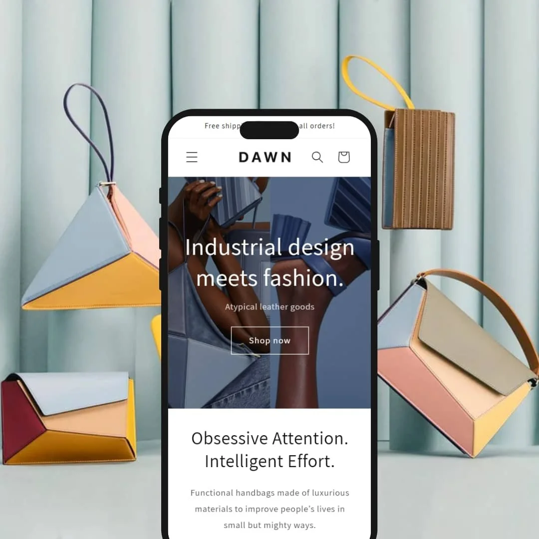
The Default preset stages Dawn as a pared-back fashion storefront centered on leather goods. The look is airy and image-first; copy is brief and purposeful so shoppers land quickly on products.
What works in this preset
The homepage opens with a full-bleed hero titled “Industrial design meets fashion” plus a direct call to “Shop now.” It sets a confident tone and funnels attention toward product pages without clutter. Below, a featured collection grid titled “Obsessive Attention. Intelligent Effort.” keeps cards spacious and readable, which helps merchandise feel premium rather than crowded.
A short “Back in stock!” section highlights two categories with simple, editorial imagery. It’s a quiet way to route returning customers to revived inventory while preserving the minimalist mood. The copy remains restrained and utilitarian so the photography leads.
Product pages continue the same restraint. The hierarchy reads cleanly on first pass; core info sits near the call-to-action, with deeper detail easy to discover. Value cues appear close to decision points, so shoppers understand shipping and exchange policies without hunting.
A gentle end-of-page recommendation area nudges exploration after an item has been considered. It fits the preset’s calm pacing and encourages another browse without feeling pushy.
Where it stumbles
The preset is extremely minimal, which some brands love but others find too austere. If you need heavier editorial modules or denser product storytelling on the homepage, you’ll do extra arrangement and section work to get there.
Navigation and merchandising are staged conservatively in the demo. Stores with deep catalogs will likely add more prominent structural cues and richer header composition before it feels “complete” for complex assortments.
Niche Suitability
-
Fashion and accessory brands that sell through photography first. The Default preset’s calm typography, ample spacing, and straightforward product emphasis let imagery carry the experience.
Not Ideal For
-
Spec-heavy or B2B catalogs that demand dense comparison details and many navigational signposts. Those stores will want a busier canvas and more up-front structure than this preset shows by default.
-
Fashion, jewelry, and lifestyle brands that sell through imagery, value speed, and prefer clean, low-maintenance design.
-
High-SKU or spec-heavy catalogs that need dense comparison UI and assertive navigation patterns from day one.
-
Low. Most stores can launch quickly using the drag-and-drop editor and built-in sections. More complex catalogs should budget time to enrich navigation and homepage composition.
Final Recommendation
★ 8.0/10
Rating
-
Clean product pages with visual color options, tidy detail groupings, inline add confirmations, and related products cover core needs. The demo’s restrained staging leaves advanced merchandising patterns to merchant setup, which caps the score.
7
-
Section-based layouts and clear settings make customization straightforward for non-developers. The minimal design reduces decision fatigue during setup and edits.
9
-
Touch-friendly visuals and simple hierarchy read cleanly on small screens. The very airy pacing can require extra scrolling before some details appear.
7
-
Lightweight structure and modest scripting contribute to ~35% faster load than Debut in Shopify’s guidance. Interactions remain snappy during product exploration.
9
-
Online Store 2.0 sections provide meaningful control over layout, color, and type. The minimalist baseline is intentional, yet some brands will want additional editorial flourish that takes extra art direction.
8
FAQ
〰️
FAQ 〰️
-
👑 Yes. The Default preset foregrounds photography and keeps copy unobtrusive—an effective mix for image-driven brands.
-
📱Yes. In testing, visual browsing and detail reveal behaved smoothly, and the layout remained readable on small screens.
-
🎨 Highly. With Online Store 2.0 sections you can add, remove, and rearrange blocks across templates, then adjust colors, typography, and spacing in theme settings without code.
-
⚡ Dawn is positioned as ~35% faster than Debut thanks to a lean structure. Interactions like opening details or adding to cart felt immediate in the demo.
-
👕 Yes. Color choices can be shown as visual swatches, while other options keep to clear, familiar controls. Selections carry cleanly into the add confirmation.
-
🔎 Standard Shopify SEO fields (titles, descriptions, image alt text) are readily editable. Dawn’s uncluttered markup and quick load help search visibility efforts.
-
💱 Yes. Dawn works with Shopify’s native Markets features for languages and currencies. Enable them in Shopify settings, then place the selectors using the theme’s customization options.
-
⚙️ Yes. App blocks can be inserted as sections, moved, or removed within the editor, so many integrations no longer require theme file edits.
-
🛒 Yes. You can preview the Default preset in Shopify’s theme library and customize it in an unpublished store before going live.
This review is based on hands-on testing of the publicly available “Default” preset demo of the Dawn Shopify theme as of October 22, 2025. Theme features, preset availability, and performance can change with subsequent updates from the theme developer.