
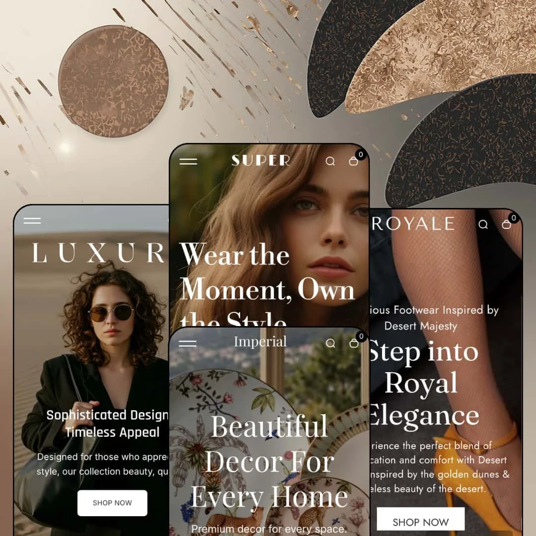
Most themes that put "luxury" in the pitch charge for it. Desert charges $100 and ships four presets, which puts it below Shopify's usual budget band while promising a section library that reads like a $300 theme's. Whether that promise holds depends on how much of the polish lives in the demos and how much is real capability, so I spent time across all four stores with that question in mind. Desert is built on Online Store 2.0: JSON templates, sections everywhere, and the familiar Dawn-derived price and facet strings under the hood.
A mega menu with real block variety
The Desert preset's Collections dropdown splits into four sub-columns, each listing a collection heading with five product links beneath it, while the Shop dropdown pairs link columns with three image promo tiles (Trending Dress, 50% Off on Shoes, Stylish Bag's). That's two menu architectures in one header. It matters because a merchant can route shoppers to a specific SKU from the nav without a click through a collection page. For multi-category apparel stores with 100 to 500 SKUs and cross-shop-heavy buyers, that depth turns the header into a merchandising surface.
Shop-the-look hotspots with a live side panel
The image-hotspot section pairs a lifestyle photo with a "Shopping Bag" panel that lists the tagged products alongside it. Luxury stages it as "Inspired by Luxury" with four bags; Royale stages it as "Get the Look" with three pairs of shoes. The section ships a separate mobile image slot, so the hotspot photo can be recropped for phones instead of squashed. Outfit-driven brands, whether footwear, apparel, or accessories, selling to impulse buyers who shop the whole look will get the most from it.
A purchase-decision strip on the product page
Under the Add to cart button, Desert stacks a returns link ("Hassle-free returns within 30 days"), an "Ask a Question" link, share icons, and then the accordion tabs, with a sticky add-to-cart bar that carries a thumbnail, price, both variant pickers, and quantity. Everything a hesitant buyer needs is within one scroll. That configuration suits considered-purchase categories, mid-market jewelry or leather goods in the $200 to $600 range with 50 to 200 SKUs, where a question link converts better than a chat widget.
Search that opens already populated
Dawn's predictive search opens as an empty input and waits. Desert's search overlay opens with a "What are you looking for..." prompt, a row of five popular-category chips, and a six-product "Popular product" grid, all visible before a single character is typed. The category chips are merchant-editable search queries, not tags. For stores with 200-plus SKUs and repeat buyers who search by name, that overlay shortens the path to a known product by one step.
The bundle section doesn't price the bundle
Desert's "Products to proceed & Save" section groups three products under a headline, a tab row (Winter, Summer, New Arrival), and a single ADD TO CART button showing the combined total. On the Desert preset that total is $2,440.00, which is exactly the three list prices added together. The "SAVE 50% OFF" badge above it is copy. It's not a discount. Merchants who want a real bundle price will need a Shopify discount or a bundle app doing the math behind the theme's button, and that's a gap for beauty or apparel brands running set-based promotions across 30 to 100 SKUs.
The toolkit pulls toward promotion, not restraint
Rotating announcement messages, marquee text strips in every footer, countdown sections, promo popups, product badges, and SALE stamps are all first-class citizens here. That's a fine kit for a mid-market brand. For luxury-tier jewelry, leather goods, or furniture selling considered purchases at $500 and above, the theme's defaults have to be actively turned off, and the demos show how fast a page reads as mass-market when they aren't. The restraint the vertical needs is on the merchant, not the theme.
Brand-content sections are hand-typed, not wired
The store cards, the events list, the counters, and the usage steps are all text fields filled by hand. The store section's "View map" button links to the contact page rather than an embedded map, and the events entries carry manually typed dates. A single-location DTC store won't care. A retailer with four physical stores and a monthly events calendar, or a hospitality-adjacent brand, will be maintaining that content by hand or replacing the sections with an app that reads from metaobjects.
What it takes to launch
Expect a two-to-three-day pass covering compare-at price cleanup across the catalog, market and currency re-staging, a product-tab copy sweep where template text has bled between verticals, replacement of third-party demo imagery, and a check over theme UI strings before launch.
-
What works in this preset
The homepage doesn't wait. Two full-bleed slides, then a seven-tile collection row where each tile carries a small caption label (WINTER, LEATHER, DRESS) above the collection name, which gives the row an editorial rhythm rather than the usual grid of identical cards. After that the page becomes a long promotional stack: a four-image overlay banner, four link-list columns with "SHOP NOW" buttons, image-with-text, a scrolling content banner, and two featured-product spotlights that pair a headline with a single product card.
Tabbed collections carry the middle of the page. A "Modern and Classic Pieces" section switches between CROP TOP, NEW ARRIVALS, and TRENDING without a page reload, and each tab has its own View All link, so one section can do the work of three carousels. The apparel product page uses a stacked four-image gallery with a "Low stock" indicator sitting under the title, a nice touch for drop-driven stores.
I noticed the footer earns its space here. It runs a newsletter block over an image, three link columns (Top Collections, Quick links, Presets), a full-width marquee strip, the logo, language and currency selectors, payment icons, and an "About description" text block at the bottom. That's a footer with real editorial capacity, not an afterthought.
Where it stumbles
The section stack is built for volume. This demo repeats the same nine products across at least six product sections, and the layout assumes a catalog deep enough to fill them. An apparel brand with a tight, curated range of 20 pieces will find itself either deleting half the homepage or accepting that the same shirt appears four times on a single scroll.
-
What works in this preset
Handbags get the treatment the theme name promises. The Luxury preset keeps a top bar with social icons, a phone number, and a single announcement line, then drops the main nav into an uppercase centered layout with the logo below it, a pattern that reads as fashion-house rather than marketplace. Dual logo files (black and white) are wired in so the header can switch on dark backgrounds.
There are sections here I didn't see stressed anywhere else. A numbered feature list (01 Masterpiece, 02 Timelessness, 03 Magnificence, 04 Grandeur) sits beside a tabbed image collage, and an "Elegant & Iconic" block stacks four hover-reveal panels, each with its own headline, body copy, and Shop now button. Below that, a three-card store section lists address, phone, and opening hours per location. It's the closest this preset comes to a brand-story page inside the homepage.
The product page pairs a Color axis with a Bag/Case material axis (Leather, Felt, Denim), so a merchant selling one silhouette in twelve combinations can see how the button-group variant picker holds up with two independent option sets. It holds up fine.
Where it stumbles
For a preset named Luxury, the merchandising leans hard on urgency. "Limited Stock, Act Fast" sits inside the mega menu, "Exclusive Deals for VIP Members" runs in the top bar, and SALE labels are stamped on all six collection cards of the product-page collection strip. A leather goods brand selling at $500 and above will want to strip most of that before launch, because the demo's staging pulls against the price point it's meant to serve.
-
What works in this preset
Footwear, and it shows in the product cards. Every card in the Royale grid carries two images, so the second view (typically the side or sole shot) surfaces on hover, and the collection filter drawer renders Color as a row of swatch chips rather than a text list, with a Size facet that runs from US 6 through EU 44-45. For a shoe store that's the right pair of defaults.
The Royale homepage is the leanest of the four. It skips the top contact bar entirely, keeps the nav to five flat links plus the preset switcher, and lets a two-slide hero with a small kicker line above each headline carry the brand. A ten-logo marquee strip and a before/after image slider break up the product sections, and the before/after asset ships with a separate mobile crop, which tells you the developer tested it on phones.
I sat up at the full product block embedded on the homepage. It's the complete product template (three-image gallery, Color and Size pickers, quantity, Add to cart, Ask About This Product link, and three accordion tabs including a Size & Fit Guide) rendered inline as a section, so a hero SKU can be bought without leaving the front page.
Where it stumbles
The demo positions itself as "Luxurious Footwear Inspired by Desert Majesty" and then stages a catalog that tops out at $67.54 with a single dropship brand in the Brand filter. Nothing wrong with mid-market footwear, but the preset's copy and its product staging are aimed at two different buyers, and a merchant will need to pick one before the hero and the grid agree with each other.
-
What works in this preset
Home decor is where this section library gets to stretch. Imperial opens with an eight-tile collection grid (Antique Collection, Dining Essentials, Flower Vases, Gifting Essentials, Home Lighting, Leather Essentials, Modern Furniture, Nature Luxe Decor), then moves into a three-column text feature block, a four-counter stats section, and an events list with session length and date per entry. Those are content-marketing sections, and they make Imperial the preset to look at if the store also needs to read as a brand site.
The product page adds a usage section I didn't find in the other three demos: "How to Use Vista Carafe" runs five headed steps (surface, blooms, layering, water use, seasons), each with a short paragraph, sitting between the gallery block and the trust badges. For furniture and decor merchants who sell styling advice alongside the object, that's a section worth having.
Imperial also stages a countdown section with four product tiles beneath it, a four-tile promo strip (vases, bowls, table accents, planters), and a six-item accordion-style list under "Wide range of home decor." I clicked through the whole scroll twice. It's long, but the variety of section types is real.
Where it stumbles
Imperial is the newest of the four and the one that reads least finished as a vertical. The product page's accordion tabs, trust badges, and returns link are the same components Luxury uses for handbags, and nothing on the template speaks to the questions a furniture buyer actually asks: dimensions, weight, materials in a table, delivery windows for large items. Merchants selling sofas and side tables will be writing that structure into free-text accordions themselves.
One section library, four believable verticals
Apparel, handbags, footwear, and home decor are staged from the same section stack, and each demo looks like it was designed for its category. The variety comes from imagery, type, and which sections get deployed, not from preset-exclusive features, which means a merchant who learns the editor on one preset can switch to another without relearning anything.
Brochure-site capability at a store price
Between the store cards, events list, counters, usage steps, blog layouts, and multi-column text features, Desert can carry a brand site that happens to sell. One Theme Store reviewer used it for a showroom website with no buying at all. At $100 that's an unusual amount of non-commerce range.
Small details that show phone testing
The before/after slider and the hotspot section both ship separate mobile image slots, and the mobile menu drawer carries the contact email and phone number that the desktop header hides. Those are decisions that only get made after someone looked at the theme on a phone.
The presets share one homepage recipe
Slideshow, collection list, featured products, tabbed collections, bundles, image tiles, blog, newsletter, in roughly that order, on all four demos. The visual differences are real; the sequence differences are not. A merchant hoping for four distinct information architectures will find one architecture with four wardrobes.
Long-scroll density is the default
Every demo homepage runs fifteen or more sections, and the section stack rewards adding rather than cutting. That's a load and attention cost the merchant inherits. The theme gives no structural nudge toward a shorter page, so editorial discipline has to come from outside it.
★ 7.0/10
Rating
-
Hotspots, bundles, tabbed collections, usage steps, store cards, and a full inline product section are all theme-native; the bundle section's lack of pricing math keeps it from a 9.
8
-
Sections are consistent across presets and the editor learning curve transfers, but many content sections are hand-filled text blocks that need ongoing upkeep.
7
-
Separate mobile image slots on key sections and a contact-carrying mobile drawer show real attention; the long section stacks make for a lot of thumb travel.
7
-
Homepages run heavy: fifteen-plus sections, repeated product carousels, and marquee strips that duplicate their own content ten times, with lazy-loading doing the rescue work.
6
-
Four distinct visual identities from one library prove the tokens are flexible; the shared homepage sequence shows where that flexibility stops.
7
Frequently Asked Questions
-
No. The three tabs (for example CROP TOP, NEW ARRIVALS, TRENDING on the Desert preset) swap product grids in place, and each tab keeps its own View All link to the underlying collection.
-
Yes. Royale stages the complete product template as a homepage section, including gallery, variant pickers, quantity, Add to cart, and accordion tabs, so a hero SKU can be purchased without visiting its product page.
-
Both axes render as button groups stacked vertically, with the selected value echoed in the label ("Color : Brown", "Bag/Case material : Leather"). The Luxury demo runs four colors by three materials for twelve combinations without the picker getting crowded.
-
There's a store-cards section with image, name, address, phone, and hours per location, staged with three stores on the Luxury preset. The map button is a plain link, so an actual map embed would come from a page or an app.
-
On Royale the filter drawer shows Availability, a Price range, Color as swatch chips, Size as checkboxes spanning US and EU sizing, and Brand, with an Apply filter button at the bottom and eight sort options above the grid.
-
Yes, as a section with a draggable divider between two images, staged on both the Royale homepage and the Desert product page, with a separate image slot for mobile.
This review is based on hands-on testing of the publicly available preset demos of the Desert Shopify theme as of September 11 2026. Theme features, preset availability, and performance can change with subsequent updates from the theme developer.