
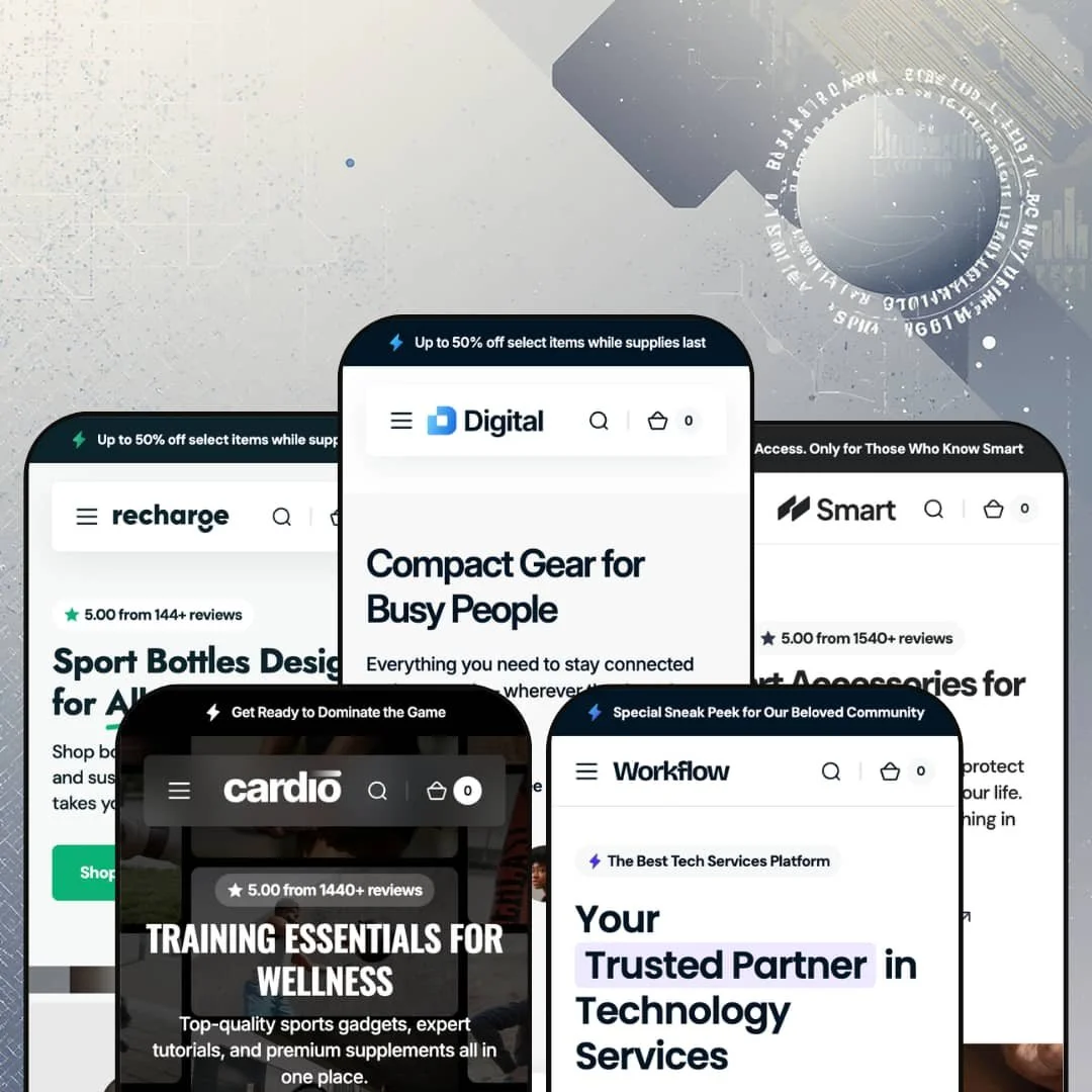
The most useful page in Digital's demo stores isn't the homepage; it's the menu. Every preset carries a "Features" dropdown that links out the entire toolkit as live pages, section by section and layout by layout, which turns the demos into their own documentation. Segment's $380 Online Store 2.0 theme ships five presets that stretch from electronics retail to a services site selling CRM guides. Whether one design system can credibly cover that much ground is the question worth answering before anyone spends premium money.
A section library that earns the 125+ claim
Twenty section types, each demoed live. Compare tables, pricing plans, hotspot markers, countdown timers, stat counters, case studies, and a before/after slider all ship as native theme sections, which moves whole categories of landing-page work into the editor instead of into custom builds. For electronics and gadget merchants with 50 to 300 SKUs selling considered purchases, that's the difference between assembling trust pages in an afternoon and commissioning them.
Eight ways to show one product
How many ways do you need to show one product? Digital's answer is eight. The demos stage simple, slideshow, bullet-slider, preview-slider, grid, and stacked galleries, plus swatch, pill, and dropdown variant pickers, with a separate digital-product configuration on top. A store whose catalog spans impulse-buy cables and considered-purchase projectors can match page architecture to price point instead of forcing both through one template.
Content publishing is a first-class system, not a blog tab
Seven blog layouts cover overlay, column, and full-width treatments with and without sidebars, and the case-study archive plus detail template extends that into proof-driven storytelling. The value compounds for stores that acquire through search and editorial rather than ads, because article presentation stops being the weak link. Single-brand stores running evergreen content programs, especially in tech and wellness niches, get the most from this.
Navigation doubles as a merchandising surface
The mega menu accepts promotional panels with imagery and CTA buttons alongside its link columns, and the demos stage two distinct column styles: straight product lists and collection tiles with description copy. In-menu promos mean the dropdown can push a launch before the customer reaches any page. Stores with 500+ SKUs and cross-shop-heavy buyers, where the menu is the real homepage, will feel this daily.
The theme's temperament is promotional, and it doesn't hide it
Every preset opens with an announcement bar and a first-order discount popup, then layers review counters, sale badges, and urgency staging through the page. Subtle, it is not. Luxury-tier brands selling considered purchases with editorial restraint will spend their customization time dialing the volume down, which means working against the theme's instincts rather than with them.
Pre-translated strings stop at five languages
Interface translations ship for English, French, Italian, German, and Spanish. That's it. A Dutch, Polish, or Swedish electronics retailer with a few hundred SKUs and a localized storefront takes on the full string-translation pass manually, and at this price point the gap between covered and uncovered European markets is a real operational line item.
The design assumes you have a content pipeline
Rotating headlines, logo walls, photo marquees, testimonial decks, stat counters, and case studies all want real material, and the demos look good precisely because every slot is fed with strong photography and specific numbers. I went looking for sections that would survive on thin content and found few. Single-founder stores with under 30 SKUs and no photography budget risk shipping pages that read half-finished.
What it takes to launch
Expect a multi-day pass covering homepage copy across long section stacks, mega menu re-staging for your own categories, full replacement of demo product data, and population of comparison, case-study, and testimonial content before launch.
-
What works in this preset
Browsing this demo feels like shopping a store that already knows its bestsellers. Six accessory categories carry the catalog: speakers, hubs and docks, power banks, projectors, chargers, and cables. I clicked through most of it, and the staging keeps a consistent retail rhythm where category banners hand off to product rows without dead space.
The before-and-after slider gets the smartest deployment in the family here. A "Before vs After One Hub" comparison shows a cluttered desk against a clean one, then routes straight to the charging hub that did it, so a section type usually reserved for beauty stores ends up selling cable management. That's a genuinely clever bit of staging.
Small conversion furniture is everywhere. An eight-chip feature grid translates specs into plain benefits like "Laptop-Friendly" and "Fast Data Transfer," a numbered coming-soon strip teases three products, and a partner logo wall pads out the trust story. None of it is loud individually, but together the page works like a salesperson who never stops talking.
Where it stumbles
For a preset pitched at electronics, the demo stages an accessories boutique rather than a spec-heavy catalog. The comparison layout lives on a Features subpage instead of inside the buying path, so merchants selling projectors, monitors, or anything bought on numbers will be re-staging that section into collection and product flows themselves.
-
What works in this preset
Smart is the quiet one in the family. The hero pairs a rotating headline, cycling through "Travel," "Work," and "Life," with a staggered image collage instead of a single banner, and the copy voice shifts to editorial lines like "The Wallet, Reimagined." It reads closer to a lifestyle brand than a gadget shop.
I noticed the merchandising restraint carries through the whole page. Collection tiles sit in an asymmetric banner grid, the bestseller row leans on warm product photography with hover swaps, and the trust line claims 1,540+ reviews without flashing badges at you, which is the most plausible-feeling staging of the five demos for a brand that sells on look and feel rather than urgency.
-
What works in this preset
A 25% sale badge on a $240 CRM guide is the first hint that Workflow isn't a normal storefront. The preset stages a tech-services company that happens to sell, with guides and video lectures as the only two collections. I sat up when I reached the product page: the guide is staged with accordion content blocks, a row of benefit chips, breadcrumb trail, and post-purchase sections covering performance stats and testimonials, so a PDF gets treated with the same merchandising seriousness as hardware.
The numbers do the persuading. Case-study cards pair stat headlines like 10,000+ clients served and 50% year-over-year growth with author quotes and photos, and a dedicated case-study archive plus detail template gives that content a permanent home. Service businesses rarely get this from a commerce theme.
The footer here is worth a look on its own. It runs a brand block with mission copy, two menu columns, a newsletter form, and a language toggle, all composed rather than dumped, which matters for a preset whose buyers will judge credibility from every corner of the page.
Where it stumbles
The demo commits to the services pitch so completely that the commerce surface stays thin. Two collections and a handful of guide products give merchants planning a wider digital catalog on this preset little staged reference for category depth, so that structure becomes their own build-out work.
-
What works in this preset
Can one catalog hold massage guns and PDF nutrition plans? Cardio's answer is yes, and the mix is the point. Physical trackers, blenders, and supplements sit alongside downloadable workout programs and a nutrition guide staged on the dedicated digital-product layout, which makes this the preset to study for anyone running a hybrid goods-plus-content business.
Energy is the design language here. A full-bleed photo marquee scrolls training imagery in three rows, the headline rotates through fitness keywords, and the newsletter field sits directly inside the hero rather than waiting at the footer, an aggressive placement that fits an audience built on programs and repeat engagement.
-
What works in this preset
Four collections, one product type. Recharge stages a water-bottle brand and proves the theme can scale down without looking empty, filling the page with a feature trio (insulated, leak-proof, eco-friendly materials), collection banners, and color-swap product cards instead of catalog sprawl.
The single-product focus changes what the sections do. The same components that sell variety elsewhere here sell depth, with each collection tile arguing a use case for what is essentially the same object, and that's a useful template for any one-hero-product brand deciding whether this theme would feel oversized for them. It doesn't.
The demos audit themselves
Across all five presets, the Features navigation exposes every section, product layout, blog treatment, and filter arrangement as a live page you can click before buying. That transparency is rare at any price and removes most of the guesswork that usually follows a premium theme purchase.
One license spans a storefront spectrum
Read the family end to end and a pattern emerges: pure retail in Digital, Smart, and Recharge, hybrid goods-plus-content in Cardio, and a near-SaaS services site in Workflow. A business that pivots from selling products to selling expertise, or adds digital goods to a physical line, stays inside the same theme.
Scheme-aware details run deep
The presets register paired light and dark logo assets and carry that two-scheme thinking through their staging, a small signal that the developer sweats rendering contexts most themes ignore. It's the kind of detail that shows up later as fewer edge-case fixes.
Five skins, one skeleton
Every homepage follows the same rhythm: announcement bar, discount popup, animated hero, image collage or marquee, banner grid, bestsellers, slideshow, testimonials. Preset choice changes the wardrobe, not the bone structure, so brands wanting a structurally different storytelling order will be rearranging, not selecting.
The vertical coverage clusters tightly
All five stagings orbit tech and active lifestyle. Apparel, beauty, food, furniture, and jewelry merchants get no staged starting point anywhere in the family, which means translating an unfamiliar aesthetic on top of normal setup work.
★ 8.2/10
Rating
-
Comparison tables, pricing plans, hotspot markers, countdowns, case studies, and a digital-product page configuration all live at the theme layer; very little is left to outside tooling.
9
-
The option count multiplies decisions per page, but the demo-as-documentation pattern means every choice can be previewed live before committing.
8
-
Image-heavy sections ship in scaled mobile renditions, and the slide-out cart drawer plus sticky buy bar keep purchase actions one tap away on long pages.
8
-
Product pages run lean, but the demo homepages stack a dozen-plus media sections including marquees and logo walls, and that weight is the default starting point.
7
-
Five vertical stagings, eight product-page configurations, seven blog layouts, and a heading animation and highlight system give unusual range within one purchase.
9
Frequently Asked Questions
-
Layout-wise, yes. A dedicated digital-product page configuration is staged in the Workflow and Cardio demos, with case-study and services page templates supporting the pitch; file delivery itself happens outside the theme.
-
Digital stages a six-category gadget shop with dense conversion furniture; Smart stages a leaner editorial boutique built on collage imagery. Pick by brand temperature, since the underlying toolkit is identical.
-
Yes. Compare is part of the section library and demoed on its own page in every preset, with attribute data populated by the merchant.
-
Three staged arrangements per preset: a traditional layout, horizontal filters above the grid, and a vertical sidebar. Each is linked live in the demo navigation.
-
Five pre-translated string sets (English, French, Italian, German, Spanish), plus right-to-left layout support.
-
Version 1.6.0 shipped May 28, 2026, on a theme first launched in February 2024, so the update cadence is active.
This review is based on hands-on testing of the publicly available preset demos of the Digital Shopify theme as of June 2026. Theme features, preset availability, and performance can change with subsequent updates from the theme developer.