
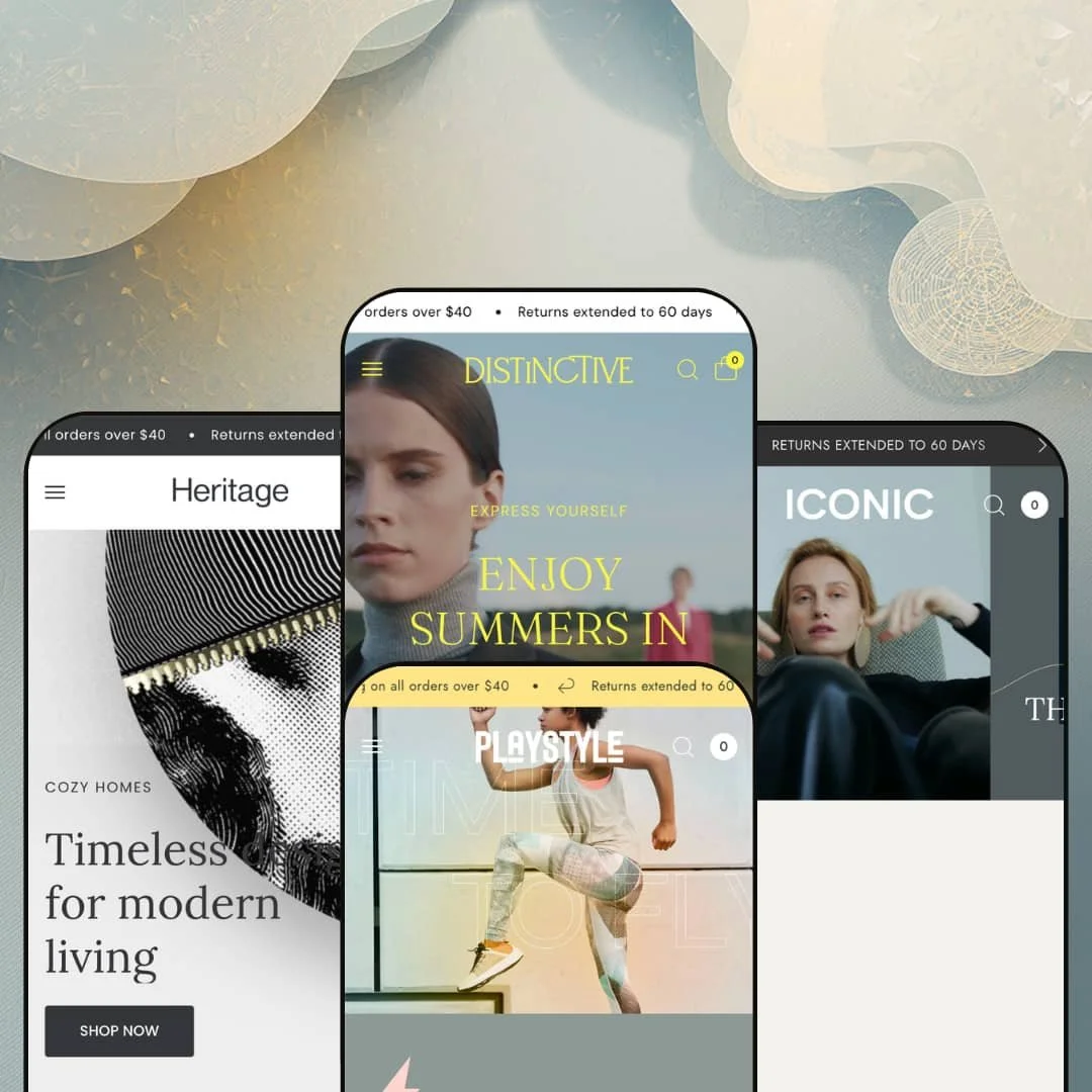
Most premium Shopify themes pick a vertical and commit. Distinctive, from Fuel Themes, ships four presets that read like four separate stores: a women's fashion label, a sneaker shop, a luxury bag house, and a furniture showroom. Underneath that range sits one Online Store 2.0 section library doing the heavy lifting, and the question worth asking is whether a single library can credibly carry verticals this far apart.
Colorway handling that bends to your catalog model
Distinctive ships two distinct ways to manage color. Variant Image Set groups a product's photos by color, so the gallery reorders the moment a shopper switches from navy to red. Sibling Products links separate product pages together as connected color options, for merchants who run each colorway as its own SKU with its own inventory and URL. For an apparel or footwear catalog with deep colorways and 50 to 200 SKUs, you can match the theme to how your inventory is already structured instead of rebuilding your catalog to fit one rigid model.
A section library built for brand storytelling
For a merchant who sells on brand and mood rather than price and specs, the editorial toolkit is the reason to look here. Across every preset the same library offers video heroes, shop-the-look hotspots, lookbooks, magazine-style blocks, marquees, and a press row, all native and all configurable. You're art-directing a storefront, not assembling a catalog. That fits fashion labels, luxury accessories, and design-led furniture brands where the photography is as much the product as the product itself.
A product page that merchandises, not just lists
The product page is the theme's named showpiece, and it backs the claim. It opens with an image-led gallery, then stacks a size-chart modal, collapsible metafield panels for shipping, materials, and guarantees, a sticky add-to-cart bar that follows you down the page, and a full run of editorial sections below. For a considered purchase like furniture or a higher-priced apparel piece, that depth lets the page sell rather than simply list, and it rewards merchants who arrive with real product content to fill it.
Four real verticals from one purchase
One license, four presets, four genuinely different storefronts. Distinctive stages apparel, footwear, luxury accessories, and furniture from the same section library, and none feels like a recolor of another. For a multi-brand operator or an agency building several client stores across different product types, that range is value you buy once and reuse rather than re-purchasing a theme per project. A single merchant still unsure of their direction gets four credible starting points instead of one.
Built for storytelling first, fast conversion second
This is an editorial theme wearing a commerce theme's features, and the priority order shows. The defaults favor mood, scroll, and brand moments, so a store optimized for speed to checkout, impulse buys, and high-velocity restocks will be trimming sections and fighting the theme's instinct to linger. If your buyer decides in ten seconds, the demo's long, lush homepages work against you. It's a positioning choice you should buy knowing which side it favors.
Online Store 2.0, not the newest architecture
At $360 in 2026, it's worth knowing which generation you're buying into. Distinctive is an Online Store 2.0 theme rather than one of the newer Theme Blocks builds, so block nesting is shallower and there's no AI-assisted block generation in the editor. For the average store this changes little: the library is already deep and the theme is actively maintained, with a 6.0 update shipped in May 2026. For an agency building heavily customized stores or a developer-led brand on a large catalog, the architecture generation is a fair thing to weigh against the premium price.
What it takes to launch
Every preset ships dense with demo content, so plan a multi-day pass before launch. Replace the placeholder taglines and section copy, swap in your own photography and video across the heroes and editorial blocks, populate the product-page metafield panels for shipping, materials, and guarantees, restage the mega-menu depth to your own catalog, and clear the demo's brand and product naming throughout the presets.
-
What works in this preset
The first slide loads and the header changes color with it. The hero pairs a slideshow with a color-adaptive header that swaps between light and dark logo treatments as the slides transition, so the navigation never fights the imagery sitting behind it. It's a small thing, done well.
New arrivals sit in a tabbed module that flips between Dresses, Tops, and Jumpsuits with no page reload, and the cards carry real merchandising weight. Each one stacks color swatches, size options, a vendor name, a sale price where it applies, and a short sustainability label such as Organic Cotton or Cleaner Chemistry. The cards do a lot. I clicked through several, and the colorway swatches behaved consistently as I moved between products.
Scroll on and the page keeps giving: a shop-the-look gallery with clickable hotspots, a magazine-style editorial block, a press row with quotes and logos, and a journal feed. This is the editorial heart of the theme, and the apparel preset leans into it hardest. A buyer browsing for inspiration is well served. The instinct here is clearly more, not less.
Where it stumbles
All that density has a cost. A shopper who arrived to buy one specific dress scrolls past a lot of editorial before reaching a focused path, which suits browse-led fashion better than a quick, intent-driven visit. The sections are reorderable, so it's a tuning question rather than a wall.
-
What works in this preset
Playstyle drops the slideshow and goes with one full-bleed hero, and the change of pace is immediate. Where the fashion preset whispers, this one is built for a sneaker drop, with a single strong image, a trending grid, and a limited-time promo band sitting right below it. It moves with urgency.
The standout is a featured-product block placed right on the homepage, with its own image set, a color swatch, a full run of sizes from 41 to 47, and an add-to-cart button. A visitor can put a shoe in the bag without ever opening the product page. It works. That's genuine conversion surface on a landing page, and it's wired cleanly.
Tap a point on the product shot and a callout appears: breathability, cushioning, upper materials, water resistance, arch support. The image hotspot turns one photo into an annotated spec sheet, which is a smart way to teach a footwear buyer what they're looking at before they commit. That's useful. It's the one preset where the editorial tooling serves utility over mood.
Where it stumbles
The trade-off is focus. The preset's center of gravity is hype and lifestyle, so a runner who shops by terrain or support meets mood-led staging before any spec-led browsing, even though the tooling to surface those specs is right there in the hotspot. Lean it toward filtering and the picture changes.
-
What works in this preset
Monark changes the lighting. The palette shifts to warm cream, the hero becomes a quiet video paired with an editorial tile grid, and the whole preset slows down to suit leather goods that run from a $123 wallet to an $1,820 bag without the layout straining. Restraint is the point.
The product cards here skip quick view and go straight to an add-to-cart control, a small staging choice that fits high-consideration luxury where a shopper wants the item in hand rather than a preview popup. Material and trust labels do quiet work alongside it: LWG Certified, Italian Leather, Fully Customizable. The cards feel considered.
Where it stumbles
Comparison isn't its strength. The preset leans to big editorial statements over dense comparison grids, so a buyer cross-shopping three bags scrolls between brand moments to weigh them rather than seeing them lined up side by side. For a curated capsule that suits the mood; for a deep catalog it asks more of the shopper.
-
What works in this preset
Lineage is the most recent of the four, and it shows. The preset dresses the same library for a furniture and home-decor catalog, with a slideshow of room sets, circular collection tiles, and product cards that price a vase at $96 and an armchair at $3,860 without the grid losing its footing. It feels current.
Its mega menu is the deepest in the family, running three full levels across Living Room, Bedroom, and Dining and Kitchen with a stack of sub-categories under each heading. I counted three levels before it bottomed out. It's also the only demo with the full country selector switched on, showing how the theme renders Shopify's market and locale controls in the header. Furniture catalogs tend to sprawl, and the deep menu earns its place here.
Where Lineage is strongest is the room set. Shop-the-look galleries place furniture inside fully styled interiors, so a shopper sees the sofa sitting in a real room rather than floating on a white background the way a generic grid would show it. Furniture sells in context. The theme's editorial DNA fits this vertical almost too naturally.
The range is real, and it holds
Read the four demos back to back and the surprise is how steady the quality stays. The theme moves from a women's fashion label to a furniture showroom without the design thinning out or the section library running short, which is rarer than a multi-preset count alone suggests. The breadth isn't cosmetic. It's a genuine reason a multi-brand seller or an undecided founder can treat one purchase as four.
Merchandising depth without an add-on pile
Tallied across the theme, the native merchandising surface is wide: variant imagery, sibling products, hotspots, lookbooks, pre-order, a stock counter, a sticky buy bar, a press row, and an FAQ section all ship in the box. A build that would otherwise lean on several paid add-ons can lean on fewer, and for a small team without a developer on call, that consolidation is worth real money over a year.
The editorial bar is a labor bill
The same art direction that makes the theme shine assumes you arrive with brand photography, video, and written editorial ready to go. A merchant with strong assets gets a storefront that looks expensive. A merchant without them inherits a beautiful skeleton that reads unfinished until the content lands. Budget for the photographer and the copy, not just the license.
Broad range, one underlying tempo
Beneath the vertical variety, every preset resolves to the same rhythm: a statement hero, a curated grid, a hotspot or lookbook, a marquee, and a journal. A brand whose identity wants a structurally different logic, something lean, utilitarian, or catalog-first, will feel the theme keep pulling back toward its editorial center no matter which preset it starts from. The presets change the clothing. They don't change the gait.
★ 8.0/10
Rating
-
The native merchandising surface is broad: variant imagery and sibling products, hotspots, lookbooks, pre-order, a stock counter, a sticky add-to-cart bar, size charts, a press row, and an FAQ section all ship without add-ons.
9
-
The section library is deep and consistent, but reaching the demo's polish means real content work, including populating the product-page metafield panels and restaging mega-menu depth to your catalog.
7
-
Presets carry mobile-specific hero art and a slide-out mobile menu, and the May 2026 update specifically reworked mobile-menu navigation.
8
-
Image-led by design, with lazy-loaded media and video heroes; the editorial density adds weight a lean catalog theme avoids, so the busier presets ask more of the connection.
7
-
One library credibly stages four verticals, with configurable mega-menu depth, multiple hero patterns, card CTA options, and a wide palette range available throughout.
9
Frequently Asked Questions
-
Largely, yes. The heroes, hotspots, and editorial blocks are built around large, high-quality imagery and video, and they look flat when filled with stock or low-resolution shots. Plan your asset production before you start building.
-
Playstyle is the most forgiving. Its single strong hero and tighter section run need less editorial content than the fashion or furniture presets, which lean on multiple galleries and magazine blocks. If your photo library is thin, start there.
-
A Shopify theme license is per store, so each live storefront needs its own purchase. The four presets are most useful to one merchant exploring directions, or to an agency reusing the theme across separate client builds, each licensed on its own.
-
Into collapsible metafield panels beneath the buy box. The demo fills them with long placeholder essays, so you'll swap in your own concise shipping, returns, materials, or care copy per product or through a shared metafield. Budget time for that content.
-
It can, but it isn't where the theme leans. The presets foreground curated editorial over dense, filter-heavy browsing, even though filtering and sorting are available throughout. A high-SKU store will spend more time tuning collection pages toward fast navigation.
-
Yes. The current version is 6.0.0 from May 2026, with recent work on mobile-menu navigation, the transparent header, and variant image matching. For a theme first released in late 2023, that's steady maintenance.
This review is based on hands-on testing of the publicly available preset demos of the Distinctive Shopify theme as of June 21 2026. Theme features, preset availability, and performance can change with subsequent updates from the theme developer.