
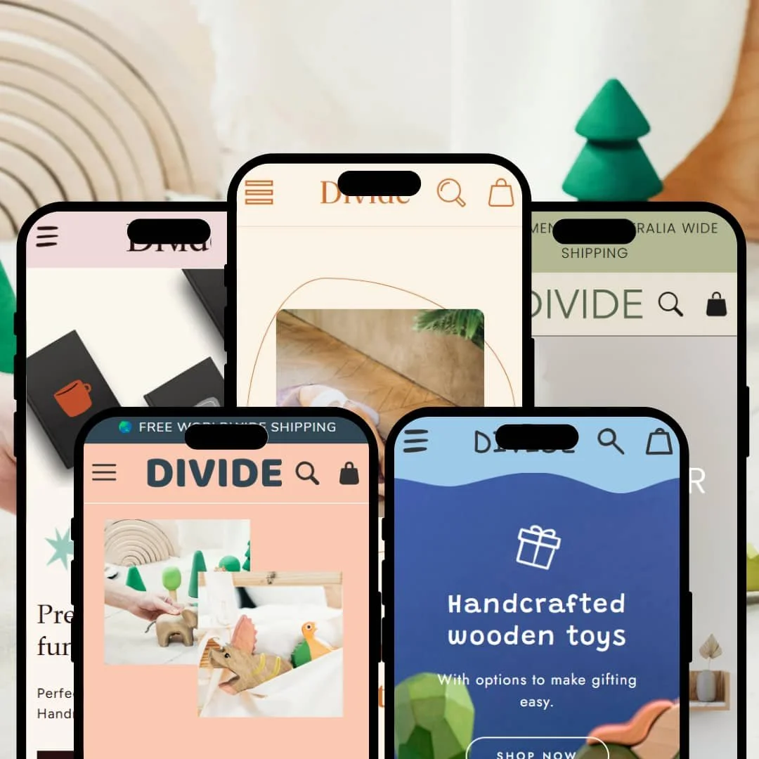
The Divide Shopify theme is a versatile, visually-driven theme designed for modern e-commerce brands. It packages five distinct presets—Divide, Explore, Leap, Move, and Treat—that cater to different niches, from physical products to high-ticket services. Our real-world testing cuts through the marketing fluff to reveal where Divide excels and where it falls short. The theme’s core design prioritizes large, immersive imagery and clean typography, immediately guiding visitors toward collection galleries and product pages with clear calls-to-action.
Pros.
〰️
Pros. 〰️
✚ True Business Model Flexibility: The inclusion of the Leap preset is a game-changer. It provides a unique, hard-coded architecture for service providers, making Divide one of the few themes that can capably serve both product and service businesses. This dramatically increases the theme's value and target audience.
✚ Rich Storytelling & Content Sections: The theme includes a robust suite of configurable content sections like accordions, testimonials, and detailed text-with-image blocks. This allows merchants to build rich, editorial-style pages that tell a compelling brand story, which can increase customer engagement and justify premium pricing.
✚ Built-in Conversion Tools: The theme provides global access to conversion-focused features that often require paid apps. These include a homepage countdown timer for urgency, quick-add functionality for a faster checkout, and scrolling text banners for promotions, which can directly improve the store's conversion rate.
✚ Cohesive and Polished Design Language: Across all presets, the theme maintains a high-end, premium feel. The typography, spacing, and smooth animations work together to create a professional user experience that enhances brand perception and supports a higher average order value (AOV).
Cons.
〰️
Cons. 〰️
− The Minimalist Trap: This is the theme's key strategic weakness. Its heavy reliance on clean layouts and large, professional imagery means merchants without high-quality visual assets and strong copywriting will struggle immensely. The theme provides an elegant frame but no art, posing a significant risk for design novices who may end up with a site that looks empty and unprofessional, potentially damaging customer trust.
− Inconsistent Feature Implementation: There's a noticeable gap in how core features are styled across presets. For example, some product pages use organized accordion tabs for details, while others use a simple list of links. This inconsistency creates a "hidden features" dilemma, forcing merchants to dig through settings to achieve parity and increasing the setup effort.
− Basic Collection Filtering: Across all product-focused presets, the demonstrated collection filtering is standard. The theme does not showcase an advanced filtering UI (like visual color swatches or price-range sliders) out of the box, which is a notable weakness for stores with large inventories where discoverability is key to driving sales.
-
The Divide preset (demo version named "Play") is an editorial-style storefront ideal for artisan creators and brands with a strong visual story. It uses a clean, grid-based layout that puts handcrafted products at the forefront.
⊕ Pros
✚ Strong Gifting Focus: The layout and content blocks are specifically geared towards gifting, with highlighted options for engraving and special packaging that directly appeal to gift-oriented shoppers.
✚ Curated Homepage Design: The demo effectively stages global features like the countdown timer and testimonial blocks to create a compelling narrative for launching a new product.
⊖ Cons
− Over-reliance on Professional Photos: The minimalist design requires high-quality, professional product photography to look premium; otherwise, the layout can appear plain and unengaging.
− Standard Grid Filtering: Collection page filtering is functional but relies on a basic sidebar. The demo does not showcase advanced visual options, which might slow down product discovery for large catalogs.
-
The Explore preset is engineered for a single-product store or a brand with one flagship offering. It functions as a long-form landing page to educate and convert customers on a single, focused item.
⊕ Pros
✚ Homepage Product Form: A unique structural feature allowing customers to select variants and add a product to the cart directly from the homepage, which can significantly reduce clicks to purchase.
✚ Direct-Response Layout: The entire preset is architected as a conversion-focused sales page, a fundamental design choice that sets it apart from a standard e-commerce layout.
⊖ Cons
− Limited Navigational Depth: The header and navigation are intentionally minimal. While effective for a single product, this structure scales poorly for stores with multiple collections.
− Intensive Content Requirement: The landing-page format is a core design choice that requires significant copywriting and visual content to be effective; it's not a plug-and-play solution.
-
The Leap preset is a standout, transforming the theme from a product-selling tool into a platform for service-based businesses. It abandons the traditional cart and product grid in favor of a layout designed to sell high-value services and consultations.
⊕ Pros
✚ Native Service-Based Architecture: This preset features a unique, hard-coded structure for selling services, with sections for strategy and deliverables that replace standard product details. This is its core, non-replicable strength.
✚ Service-Oriented CTAs: Instead of "Add to Cart," the preset uses "LET'S DO IT!" and "LET'S TALK" buttons. This fundamental change aligns the user journey with a consultation-based sales funnel.
⊖ Cons
− Excludes E-commerce Functionality: By design, this preset is unsuitable for selling any physical or digital products out-of-the-box, as it lacks a cart and standard product grid.
− Niche and Inflexible: While perfect for its intended purpose, its specialized design is a core structural choice that makes it inflexible for any other business model.
-
The Move preset (demo version named "Waves") offers a playful and modern design tailored for children's brands or stores with a fun, vibrant aesthetic. It balances large imagery with clear pathways to shop collections.
⊕ Pros
✚ Strong "Shop by Collection" Focus: The homepage architecture prioritizes large, clickable images to guide users to specific product collections, a design choice ideal for organizing products by theme or age group.
✚ Effective Merchandising Layout: The demo's layout skillfully showcases global theme features like sale badges and bundle sections, creating a strong visual hierarchy for promotions.
⊖ Cons
− Potential for Visual Clutter: The inherent design, which encourages multiple bright colors and varied layouts, could become visually overwhelming if not curated with a strong design eye.
− Generic Bestseller Grid: The "Our bestsellers" section uses a standard product grid that doesn't feel as curated or visually interesting as other parts of the homepage design.
-
The Treat preset is designed for wellness, food, and beverage brands. Its clean, airy design and focus on ingredients create a sense of health and quality.
⊕ Pros
✚ Excellent Storytelling Layout: The homepage is structured perfectly for brand storytelling, with beautifully integrated sections for brand history, ingredient sourcing, and customer testimonials that help build customer trust.
✚ Ingredient-Forward Design: The preset’s core layout is built to showcase product ingredients and health benefits, with an emphasis on clean typography and icons that enhances brand trust.
✚ Clear "How It Works" Stepper: A defining feature of the homepage is a simple "Step 1, 2, 3" visual guide that effectively explains how to use the product, a great design pattern for innovative items.
⊖ Cons
− Understated Social Proof: The testimonial section on the homepage is styled as simple quoted text, a design choice that gives it less visual impact compared to other presets.
− Subtle "Sold Out" Badge: The "SOLD OUT" tag on the homepage product grid is styled with low contrast, a design flaw that could be easily missed and lead to a poor user experience.
Niche Suitability
Not Ideal For
Final Recommendation
-
This theme is ideal for design-conscious entrepreneurs and brands that have strong visual assets. It's particularly well-suited for DTC brands with a focused product line, artisan creators who want to tell their story, and—uniquely—service providers looking for a professional, agency-style website within the Shopify ecosystem.
-
Large-catalog retailers may find the filtering capabilities too basic, which could frustrate shoppers and lead to lower conversion rates. Likewise, merchants on a tight budget who cannot afford professional photography will likely fall into the "Minimalist Trap" and struggle to make this theme look like its polished demos.
-
Medium. While the theme offers a great foundation, achieving the high-end look of the demos requires significant effort in content creation, including professional photography and compelling copywriting. It's not a "plug-and-play" solution for a novice.
★ 8.6/10
Rating
-
The theme provides a solid set of universal features and uniquely supports a service-based model. It loses points for inconsistent product page implementations and basic filtering that may not serve large-inventory stores well.
8
-
For merchants with clear brand assets, the drag-and-drop sections are intuitive. The theme settings are well-organized, making it straightforward to build out pages that mirror the demo's structure.
9
-
The theme is fully responsive and provides a clean, fast mobile experience. Navigation is clear, and CTAs are prominent on smaller screens. No significant mobile-specific issues were found during testing.
9
-
Interactive elements like menus, accordions, and quick-add features felt snappy and responsive during hands-on testing. Page transitions were smooth, contributing to a fluid and professional user experience.
9
-
The theme offers five very distinct starting points, which is a major strength. However, the minimalist core design means it's less flexible for brands that require dense, information-heavy layouts or a less photo-dependent aesthetic.
8
FAQ
〰️
FAQ 〰️
-
👑 Yes, the high-quality image support and editorial layouts in presets like Divide and Move make it a great fit for fashion and apparel brands with strong lookbooks.
-
📱Yes, testing confirms the theme is fully responsive. The mobile experience is clean, with easy-to-tap menus and sticky headers that keep key navigation and cart access in view.
-
🎨 It's highly customizable through Shopify's theme editor. You can easily change colors, typography, and layouts, but its core minimalist and image-forward design philosophy remains.
-
⚡Performance during hands-on testing was excellent. Pages loaded quickly, and interactive JavaScript elements like menus and accordions were smooth and lag-free.
-
👕Yes, it supports variants. The Explore preset shows text-based variant selectors on the homepage. While visual color swatches weren't in the demos, this is a standard feature that can be configured.
-
🔎 The theme follows Shopify's standard SEO best practices for page titles, meta descriptions, and semantic HTML, providing a solid foundation for search engine optimization.
-
💱Yes, functional language and currency selectors were present in the live demos, indicating full support for Shopify Markets.
-
⚙️ Yes, as a modern Shopify theme, it is built to be compatible with the vast majority of apps on the Shopify App Store for extending functionality.
-
🛒 Yes, you can add the theme to your store and test it with your own products for free. You only pay if you decide to publish it as your live theme.
Disclaimer: This review is based on hands-on testing of the publicly available "Divide," "Explore," "Leap," "Move," and "Treat" preset demos of the Divide Shopify theme as of June 26, 2025. Theme features, preset availability, and performance can change with subsequent updates from the theme developer.