
Drop is a conversion-focused Shopify theme developed by We Are Underground LLC, priced at $180 USD with a 94% satisfaction rating from merchants. Built for stores that emphasize product launches, flash sales, and time-sensitive promotions, the theme supplies a toolkit for creating urgency and driving purchase decisions. Across three presets, it showed strong capability in deep navigation, a slide-out cart experience, and timer-based selling.
The theme ships with three presets—Default (marketed as “Reveal”), Unveil, and Flash—each highlighting different merchandising approaches while sharing the same core feature set. All three can be configured with mega menus that reach a third tier and include product previews, a cart drawer that supports cross-sell placements, and flexible countdown sections that can be applied to products, collections, or site-wide promotions.
Drop’s edge is its focus on temporal selling. Built-in configurations allow launch dates and sale end times to drive “coming soon” states with countdowns or to trigger flash-sale messaging across key pages. In testing, these mechanics worked reliably once configured, removing the need for extra apps for most use cases.
Pros.
〰️
Pros. 〰️
✚ Flexible presets, consistent core
Flexible preset options that maintain core functionality while offering distinct aesthetic approaches. Each starting point can be re-skinned without giving up navigation depth, cart behavior, or urgency tooling. That lets teams switch tones as seasons and assortments change while keeping shopper muscle memory intact.
✚ Countdown timer flexibility across contexts
Drop supports countdowns at product, collection, and site-wide levels through simple configuration. Stores can run a launch timer while a separate sale timer ticks elsewhere, which keeps urgency specific to the context. Shoppers understand what ends when, and why they should act now.
✚ Mega menu with three-level depth and product previews
Navigation expands cleanly to tertiary categories and can surface items with images and prices inside the menu. Paired with breadcrumb trails, this reduces pogo-sticking and clarifies “where am I?” for large catalogs. Wayfinding stays fast even as the assortment grows.
✚ Slide-out cart drawer with integrated cross-selling
The cart opens as a drawer that confirms variants, shows subtotals, and keeps recommendations in view. Upsells feel like helpful suggestions rather than detours. The result is more items considered without breaking the shopping flow.
✚ Quick-add variants from product cards (when configured)
Variant swatches or size buttons can live directly on cards, allowing one-tap adds from spotlights or grids. For simple items, this trims steps between interest and commitment. It’s a small interaction that adds up across sessions.
Cons.
〰️
Cons. 〰️
− Preset-dependent quick-add visibility
Whether size or color buttons show on cards depends on section and preset configuration. That inconsistency can surprise merchants who expect the same behavior everywhere. A quick audit of chosen sections is needed to ensure parity across pages.
− Countdowns require manual metafield setup
The signature drop mechanics do not appear by magic. You must create and populate the right metafields and set dates intentionally. It’s straightforward once learned, yet it is setup work that some teams will need to plan for.
− Product information tucked into accordions
Details like materials, care, or size guidance commonly sit behind collapsible blocks. Pages stay tidy, but information takes an extra click. Detail-oriented shoppers may prefer more of that content surfaced by default.
-
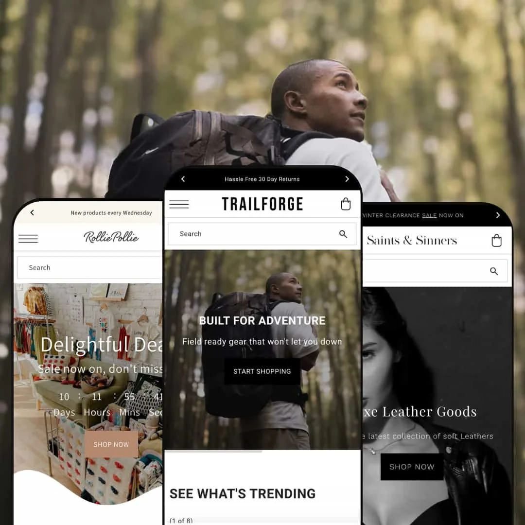
A rugged, outdoors-leaning presentation frames the Default preset. Imagery favors adventure gear and travel-ready accessories, and the layout mixes broad hero visuals with product storytelling.
What works in this preset
The homepage sequencing puts a full-width hero up front with restrained copy and a single call-to-action. This lets the photography do the heavy lifting and makes the entry path clear. A secondary hero returns later on, reinforcing the narrative without clutter.
Editorial blocks land in a practical mid-page rhythm. A “See What’s Trending” grid anchors scannable shopping while surrounding content—like a brand logo strip and a short testimonial callout—adds trust and social proof. The mix reads like a magazine spread rather than a catalog dump.
Category and story modules avoid visual noise. Spacing stays generous, headlines stay compact, and the eye moves naturally from hero to grid to supporting content. The layout feels balanced even as the page grows longer.
Where it stumbles
This preset leans into narrative pacing. If your merchandising style depends on urgency elements leading the page instantly, the Reveal composition makes you scroll first. It is a tasteful choice, yet brands that want an always-on “promo-first” feel may prefer a different starting point.
-
Unveil pivots to premium fashion. Think leather, seasonal capsules, and a cleaner, boutique sensibility with centered branding and confident typography.
What works in this preset
The hero pairs a crisp headline with a decisive primary button over lifestyle photography. Negative space gives the layout air, so products and copy read as intentional, not crowded. It feels modern without tipping into minimalism for its own sake.
Seasonal storytelling is baked into the pacing. Headline-plus-subhead sections introduce promotions cleanly, and product spotlights slip in without breaking flow. The overall effect is editorial, not ad-hoc.
Micro-signals like “New” badges and considered type scales help shoppers grasp freshness and hierarchy at a glance. It’s a small thing with outsized impact for browsing comfort.
Where it stumbles
The high-contrast palette and strong headline treatments can feel assertive. Brands chasing a softer, friendlier vibe may find the look a bit severe unless they dial back type weight and color accents.
-
Flash moves into kids, gifts, and boutique territory. It reads friendly and upbeat, with bright accents and approachable typography that keeps things light.
What works in this preset
Above the fold, a big, celebratory hero invites action quickly. Copy stays simple and welcoming, so the promotion is obvious without feeling pushy. It’s a mood setter that matches playful catalogs.
A tile-driven category mosaic breaks the page into bite-size choices. Labels are clear, image crops are generous, and counts or “new” cues nudge exploration. Browsing becomes playful rather than purely utilitarian.
Spotlight sections for single products give room to breathe. They work as “editor’s picks” and help small stores steer attention to new or margin-positive items without building complex landing pages.
Where it stumbles
Navigation spotlights can feel one-note if you showcase only a single brand in a dropdown preview. It’s a staging choice, yet rotating the spotlight or widening its scope will keep the header feeling fresh.
Niche Suitability
Not Ideal For
-
Brands that run seasonal drops, limited editions, or flash sales, and want timers, deep menus, and a smooth cart drawer to support those moments. Fashion labels, outdoor outfitters, and cheerful boutique stores all have a preset that fits their tone while keeping the same selling engine underneath.
-
If your brand avoids urgency framing and wants long, fully expanded product pages with exhaustive specs by default, a theme that prioritizes always-visible details over compact accordions will feel more aligned.
-
Medium — The presets work immediately, yet unlocking the hallmark countdowns and ensuring consistent card behaviors requires deliberate configuration. Teams comfortable with Shopify’s editor and metafields will move fastest.
Final Recommendation
★ 7.6/10
Rating
-
Strong cart drawer, deep navigation with previews, and flexible countdowns once configured. Quick-add on cards is available but section-dependent, so merchants must enable it where it matters.
8
-
Presets install cleanly. Countdown and drop mechanics need metafield work, and card-level add behavior should be verified per section. Layout adjustments follow Shopify 2.0 patterns, which lowers the learning curve.
7
-
On phones, the cart drawer feels smooth, timers remain legible, and tap targets for variant buttons are comfortable. Multi-level navigation stays reachable without feeling cramped.
8
-
Interactions felt snappy in testing. Menus open quickly, drawers animate without jitter, and timers update without layout shifts. Leaning on native theme features helps keep perceived speed high.
8
-
Three distinct presets cover outdoorsy, luxe, and playful aesthetics. Sections let you reorder, toggle timers, and place cross-sells without code. Accordion-first PDPs and section-dependent quick-add introduce some structural constraints.
7
FAQ
〰️
FAQ 〰️
-
👑 Yes. The Unveil preset in particular presents a boutique look with editorial pacing and product spotlights that suit apparel and accessories.
-
📱Yes. In testing, grids, menus, timers, and the cart drawer behaved smoothly on phones, and variant taps felt comfortable.
-
🎨 Drop follows Shopify 2.0. You can rearrange sections, adjust typography and color, and stage promos without code. The countdown system still needs proper metafields to drive dates.
-
⚡ Perceived performance was strong: menus opened quickly, timers updated smoothly, and the cart drawer felt responsive.
-
👕 Product pages handle variants as expected, and card-level variant adds are available when the chosen section exposes swatches or size buttons.
-
🔎 You get clean structures, editable titles and descriptions, and breadcrumb trails that aid both users and search engines. For advanced schema, many merchants pair the theme with a specialized app.
-
💱 Yes. Drop is compatible with Shopify’s native translations and Shopify Markets for multi-currency, which you can enable in your store settings.
-
⚙️ Yes. The theme supports app blocks, so common tools like reviews, email capture, recommendations, and analytics can slot into sections.
-
🛒 Yes. You can install and customize the theme in an unlimited trial on your store before purchasing, and explore live demos of each preset.
This review is based on hands-on testing of the publicly available “Default (Reveal)”, “Unveil”, and “Flash” preset demos of the Drop Shopify theme as of October 21, 2025. Theme features, preset availability, and performance can change with subsequent updates from the theme developer.