
Dwell is a lifestyle-oriented Shopify theme built around calm spacing, soft typography, and layouts that let product photography carry the storefront. In the demo experience, the mood is serene and premium, with merchandising elements that feel intentional rather than crowded. The shopper journey is geared toward keeping discovery and purchase steps simple, with interactions that stay visually consistent from page to page
Pros.
〰️
Pros. 〰️
✚ Full-screen search that supports faster discovery
Dwell’s header search opens into a full-screen overlay, creating a focused discovery moment rather than a small dropdown competing with page content. In the demo, the search experience includes predictive results and a recently viewed area, which helps shoppers re-enter browsing quickly. It also reduces dead ends, since the search layer provides a clear next step even when shoppers are still deciding what they want.
✚ Multi-level navigation built for browsing by category
In mobile testing, the navigation is organized into a drawer-style menu that supports top-level categories with nested subcategories. This approach keeps the header visually tidy on smaller screens while still accommodating deeper catalog structure. For shoppers, it makes category exploration feel consistent across templates instead of shifting navigation patterns from page to page.
✚ Quick add and quick view that adapt to product complexity
In desktop testing, Dwell supports a faster add flow from listings that changes based on whether a product requires selections. In the demo, quick view is triggered from a hover-revealed plus icon for products with options, while simpler single-SKU items can be added more directly. This balances speed with accuracy, reducing wrong-variant mistakes without forcing every shopper through the same slower workflow.
✚ Cart drawer that keeps the shopper on the page
Adding an item triggers a right-side cart drawer instead of redirecting the shopper away from their current context. The drawer lists items with quantity controls and remove actions, shows an estimated total, and provides a clear checkout entry point. This keeps basket edits lightweight, which helps shoppers continue browsing without losing momentum.
Product pages that balance imagery with tidy information
Product pages lean on a multi-image gallery so the visual story stays front and center. In the demo, longer product details such as materials, care, and shipping are kept organized through accordion-style sections, which helps the page feel readable without hiding information behind excessive scrolling. The overall template supports a premium tone, especially for categories where texture and photography drive purchase confidence.
Light merchandising and email capture without disrupting the layout
The demo includes a persistent announcement bar that can carry a promotional message without taking over the page. Newsletter sign-up blocks also appear in the flow, giving shoppers a secondary conversion option if they are not ready to buy immediately. These elements support ongoing merchandising and retention while still fitting the theme’s minimal tone.
Cons.
〰️
Cons. 〰️
🚫 Subtle UI can hide speed features
The theme prioritizes clean surfaces, and in the demo this can make speed features easy to miss. In smartphone testing, quick view was not visible, and the listing-level quick add behavior was only verified on desktop. On desktop, quick view relies on a hover-revealed trigger, so the fastest path depends on pointer-based interaction rather than a tap-first pattern.
🚫 Carousel-forward staging can slow scan-heavy shopping
The demo leans heavily on horizontal sliders for collections and recommendations, reinforcing the editorial vibe but making fast comparison harder. Shoppers who want breadth quickly may need more swiping and clicking to cover the same ground. If your merchandising strategy depends on rapid scanning, you may need to rebalance the layout away from carousel-forward modules.
🚫 The calm aesthetic depends on strong content direction
A restrained palette and consistent spacing are part of Dwell’s identity, but sections can blend together if imagery and copy do not provide enough contrast. The demo works best when merchants create clear visual punctuation through photography and module sequencing. Without that, the storefront can feel polished yet slightly repetitive over longer scrolls.
-
The Default preset is staged for home and lifestyle catalogs, using an airy homepage and a neutral visual language to create a relaxed, upscale feel. It favors curated entry points and gentle cross-sells over high-density merchandising, which keeps the storefront feeling composed even with modest content.
What works in this preset
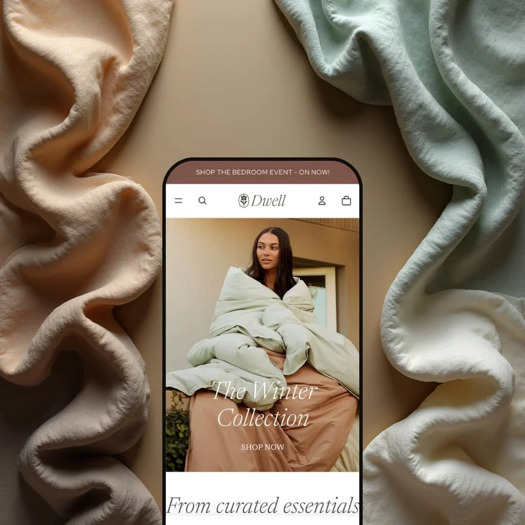
The homepage leads with a large hero banner that sets the tone immediately, pairing a headline with a direct call to action. In this demo staging, the hero reads like an editorial cover rather than a promotional billboard, which supports a more premium first impression. The generous whitespace makes the opening section feel calm and deliberate, and it leaves room for photography to do the heavy lifting.
The preset also leans early on curated category entry points through a “shop by collection” style carousel. This is a natural fit for home goods shopping, where many visitors start with a room, a category, or a mood rather than a specific product name. The staging stays visual and lightweight, so shoppers can choose a direction quickly without needing dense copy or overly busy navigation cues.
Further down the page, bestselling call-outs and recommendation-style modules keep the shopper moving through the assortment in guided steps. The demo’s rhythm is consistent: establish a theme, surface a handful of products, then invite deeper exploration. This works well for coordinated categories, where a shopper might begin with a duvet or towels and then build a basket through adjacent items.
Visually, the Default preset commits to restraint. Serif-forward headings, a muted palette, and wide spacing create a unified mood across sections, helping the storefront feel like one designed environment instead of a stack of disconnected modules. Because the styling is intentionally quiet, strong imagery and clear product naming have an outsized impact on how “complete” the store feels.
Where it stumbles
In this demo staging, product listings are kept extremely clean, which can make faster purchase shortcuts easy to miss at first glance. Shoppers who expect always-visible purchase prompts may need an extra moment to discover the quicker path from a listing. The result is elegant, but sometimes a little understated about what’s possible on desktop without opening a full product page.
Several key discovery areas on the homepage are presented as horizontal carousels. This supports the curated, magazine-like feel, but it also asks the shopper to swipe or click through panels to see breadth. For scan-heavy browsing, that format can feel slower over longer sessions.
The calm aesthetic can also reduce visual separation between sections. When typography, spacing, and background treatment remain consistent throughout a long scroll, the page can read as one continuous flow rather than distinct chapters. To avoid a “blended together” effect, merchants may need to rely on deliberate contrast through imagery, copy, or section sequencing.
Niche Suitability
-
Home goods, bedding, decor, and lifestyle brands that want a tranquil, upscale storefront. The Default preset’s editorial pacing and curated modules suit catalogs where shoppers buy into a mood and build coordinated baskets over time.
Not Ideal For
-
Fast-fashion or tech catalogs that depend on bold color, aggressive promotional density, or a highly kinetic storefront feel. If your strategy relies on shoppers scanning a lot of products quickly, the Default preset’s calmer pacing and carousel-forward staging may feel less aligned.
-
Dwell is best for lifestyle merchants who want a serene, premium presentation where imagery leads and the browsing journey feels curated. It aligns naturally with bedding, bath, decor, and similar categories where shoppers build coordinated baskets rather than making purely spec-driven purchases.
-
Brands that need a loud, high-energy storefront or depend on dense scan-and-compare browsing may find Dwell’s understated UI and editorial pacing less aligned with their goals. If your merchandising requires constant high-contrast promotions and rapid grid-style scanning, a more utilitarian, high-density theme may be a better fit.
-
Medium — The core shopping interactions are already in place, but the Default preset’s calm presentation depends on strong imagery and thoughtful section pacing to avoid a repetitive scroll. Most of the work is merchandising and art direction rather than structural layout changes.
Final Recommendation
★ 7.0/10
Rating
-
Strong in-context shopping tools, including a full-screen search experience, category navigation built for depth, quick add behavior, and a cart drawer.
6
-
The demo’s browsing and purchase flow feel straightforward, with clean layouts that avoid overwhelming shoppers and keep common actions easy to reach.
8
-
Navigation and cart drawers translate cleanly to small screens, but quick view was not visible in smartphone testing and listing-level quick add was only verified on desktop.
8
-
The demo pages loaded smoothly and interactive elements such as overlays and drawers responded quickly during hands-on use.
8
-
The styling delivers a consistent calm identity, but brands seeking a louder look will need stronger art direction to create contrast and section separation.
5
FAQ
〰️
FAQ 〰️
-
👑 Yes. The Default demo is staged around bedding, bath, and decor-style shopping, and the overall look is designed to feel serene and premium. If your products benefit from large imagery and coordinated sets, the theme’s editorial pacing is a natural fit.
-
📱Navigation and cart interactions translate cleanly to small screens through drawer-style UI. In smartphone testing, quick view was not visible, and the collection-card quick add behavior was only verified on desktop. If quick view on phones is a requirement for your store, this is the key behavior to validate in your own preview before committing.
-
🎨 The Default preset shows a restrained palette, serif-forward typography, and generous spacing, and those choices strongly shape the storefront feel. The fastest path to a distinct brand look is usually photography, section sequencing, and copy tone, since those are what the calm layout highlights most. If you need bolder contrast between modules, plan on bringing that through content direction so the page doesn’t read as one continuous stream.
-
⚡ In hands-on use, the demo loaded smoothly and the main interactive components responded quickly, including the search layer and the cart drawer. The experience felt responsive enough that interactions did not become the bottleneck in browsing.
-
👕 In desktop testing, products with selectable options route shoppers into a quick selection step before adding, while simpler items can be added more directly. This keeps momentum for straightforward products while protecting against wrong-variant adds.
-
🔎 The demo’s pages present content with a clean structure and an organized hierarchy, which is the part of SEO the theme most directly influences. The theme reads as design-and-commerce first, emphasizing clarity and tidy presentation rather than positioning itself as a specialized SEO toolkit. If SEO is a top priority, the practical lever here is how you stage copy, headings, and on-page context within the theme’s calm layout.
-
💱 Yes. Multi-language and multi-currency behavior is determined by your Shopify configuration, and Dwell is designed to work within that setup rather than replacing it with a separate system.
-
⚙️ As an Online Store 2.0 theme, Dwell supports adding app blocks and sections. Integrating reviews widgets or advanced filtering apps should be straightforward.
-
🛒 Shopify allows merchants to preview free themes like Dwell and premium themes in their store before publishing. The public demo provides a sample of how the theme behaves with sample content.
This review is based on hands-on testing of the publicly available preset demos of the Dwell Shopify theme as of December 27, 2025. Theme features, preset availability, and performance can change with updates from the theme developer.