
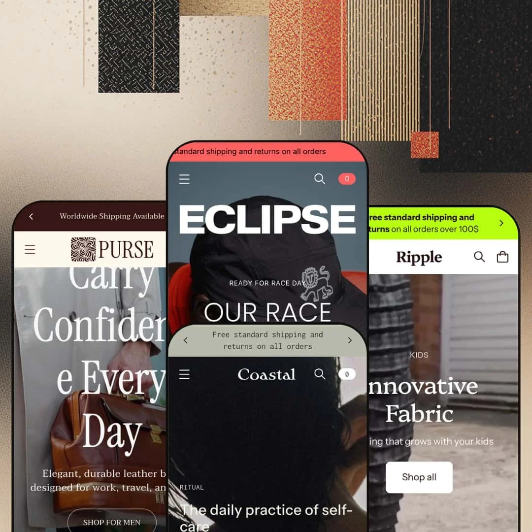
The Theme Store listing calls Eclipse a theme for sports brands. Then its own demos hand you luxury leather goods, a children's clothing label, and a coastal self-care studio, none of which involve a finish line. That gap between how Eclipse markets itself and what it actually does is the most useful thing to grasp before buying, because this is an Online Store 2.0 theme whose real selling point is range, not a single vertical. At $280 from Fluorescent Design Inc., the question isn't whether Eclipse can dress one kind of store; it's whether its one section library can carry four.
Shop-the-look and shoppable feed working as one tool
Every preset ships the same pairing: a scroll-based "shop the look" gallery and a shoppable feed that sets live product tiles inside editorial imagery, so inspiration and purchase live in the same scroll rather than two separate pages. The Eclipse demo runs five styled looks; Coastal and Ripple reuse the exact mechanism for self-care and kidswear. The motion is identical, the products are not. For visual-led apparel and accessories brands whose customers buy by outfit or by set rather than one impulse item at a time, this is the feature that earns its place first.
A mega menu that scales with the catalog
The header is genuinely theme-layer work, not a default. Across the demos the mega menu runs up to three levels deep and mixes link columns with promotional content: the Eclipse menu folds in two image promo tiles, Coastal carries an image card plus a sustainability text promo, and Ripple adds a whole age-based navigation column. That lets a store organize by more than one logic at once, by activity and by color, or by age and by product type. For mid-sized catalogs in the 50-to-150-SKU range where shoppers cross-shop between categories, the navigation holds up where a flat menu would strain.
A product page that rewards real product data
The depth is real here. On the Classic Sports Bra I counted a button-style size selector with per-variant sold-out states, a size-guide modal, fit and materials accordions, an in-store pickup notice, a "pairs well with" cross-sell row, and metafield-fed extras like a model-height note. All of it is theme-layer, wired to Shopify metafields rather than an app. For apparel, footwear, and leather-goods sellers with structured product data and considered, fit-sensitive purchases, the template gives shoppers most of what they need to decide before they reach the cart.
Four genuinely different verticals from one license
If you are an agency or a multi-brand operator weighing one theme license against several, this is the pitch. Eclipse ships four presets, Eclipse, Coastal, Ripple, and Purse, that target sports, self-care, kidswear, and leather goods, and they don't read as the same store wearing four hats. The section library is shared; the resulting identities are not. For a studio launching client stores across categories, or a single operator who may pivot verticals later, four polished starting points under one $280 license is real flexibility rather than a number on a spec sheet.
The best of the product page is gated behind data work
That product-page depth comes with a condition. The model notes, the feature icons, and the fit data are all metafield-driven, so a store has to define and populate those fields before the template resembles the demo. Out of the box, before that work, the page is ordinary. For early-stage merchants under roughly 30 SKUs, or small teams with nobody to own product-data modeling, a real share of what makes Eclipse worth its price sits behind setup that many won't finish in the first week.
Built for DTC storytelling, not wholesale or B2B
Eclipse is a direct-to-consumer theme through and through. There is no surfacing for wholesale price lists, quantity-break tables, or account-tier pricing in any of the four demos, and the whole design assumes one shopper buying a few items for themselves. A brand running a wholesale-enabled side, or selling to buyers who order in bulk and expect tiered pricing, will be adding apps or custom work to cover ground the theme doesn't attempt. That is a positioning decision, and a defensible one, but it closes a door.
The editorial instinct works against lean, high-SKU catalogs
Every preset wants content. Long homepages, brand-story blocks, guides, and journals are the theme's default rhythm, and they shine for a brand with a story and the assets to tell it. A high-SKU commodity seller, picture hundreds of near-identical units competing mostly on price, gets little from the editorial sections and spends setup time stripping them out to reach a faster, flatter catalog. The theme can be trimmed to suit that, but it means paying for a content-led design and then switching most of it off.
What it takes to launch
Plan a multi-day pass across hero copy, the editorial modules (guides, journals, philosophy blocks), and per-vertical mega-menu re-staging, plus metafield definition and population to light up the product-page features, and a localization sweep if you use the bundled EU languages. Replacing demo imagery and video with your own assets is the larger lift sitting on top of that.
-
What works in this preset
Race day is the whole pitch here. The homepage opens with paired, video-style heroes for race sets and sports bras, then a "shop by color" block routes shoppers into color-filtered collections that show live product counts, so a 40-plus-SKU catalog feels browsable rather than bottomless. The colors do the sorting. I clicked into Grenadine and landed on a clean single-shade edit, which is a smart first move for a brand whose customers think in palettes.
Past the products, the preset turns into a running magazine. A six-city guide grid (Belfast, Zurich, Toronto and more) and a community-stories blog give it the feel of a brand with a club behind it, and the navigation reserves a whole "Community" column for race clubs, expert Q&As, and guides. This is the most lifestyle-led of the four homepages.
Where it stumbles
It is also the least portable of the four. The Eclipse preset is so tuned to an endurance-sport story, races, clubs, training plans, that adapting it to a different kind of athletic brand, say a strength or combat-sports label, means rewriting not just the copy but the entire content premise the layout is built around.
-
What works in this preset
Slow is the point in Coastal. The palette goes soft and sandy, an animated marquee drifts phrases like "beauty in ritual" past the hero, and the brand-philosophy blocks read more like a magazine spread than a storefront, which suits a self-care label that sells a mood alongside a candle. A welcome popup offers 10% for an email. It is the most restrained of the four demos, and the restraint is plainly deliberate.
Underneath the calm, the catalog is genuinely mixed: a hemp apparel line, knitwear, and a skincare range under one roof. Two businesses, one storefront. What ties it to the real world is the omnichannel wiring, since product pages carry Shopify's in-store pickup notice and the homepage closes on a "Visit us in person" section for the brand's Tofino shop, so the build assumes a street presence as well as a screen.
Where it stumbles
Coastal puts its brand-story sections at the top of the page, so the skincare range, the part of the catalog with the most repeat-purchase potential, sits well down the scroll before a shopper reaches anything they can add to a cart. The ordering serves the mood. It works against the part of the business most likely to bring customers back.
-
What works in this preset
What does Eclipse look like with a real catalog behind it? Ripple is the answer. This is the densest demo of the set, built around a nine-tile collection grid, an "our values" icon row, and a collection list that shows live counts like Kidswear 71 and Toys 15, so a parent sees the depth at a glance.
The merchandising leans harder than the other presets. A multi-message announcement bar rotates free shipping against a SPRINGNOW code, product cards stack color swatches with an overflow count when a style runs many colorways, and a "buy the set" feeding bundle pushes complementary mealtime items together to lift basket size.
Editorial still has a seat. Company, technology, and guide columns plus a blog keep the storytelling, but here it shares the page with heavy product rows instead of leading them, which is the clearest evidence that the same section library bends from a quiet boutique into a working catalog.
-
What works in this preset
Purse trades motion for weight. The hero runs as a quiet slideshow over full-grain leather, trust-badge rows (30-day returns, flexible payments, 24/7 support) bracket the page top and bottom, and when I opened a best-seller it surfaced in a quick-view overlay instead of adding straight to cart, a staging choice that suits considered, higher-ticket buys where a shopper wants detail before committing.
The architecture is collection-led, not feed-led. An "Explore our classic collections" list breaks the range into named lines with counts (Emma 4, Walden 6, Clarissa 5), and the men's and women's menu columns sort by bag type rather than by season, which is how a leather house wants to be read. It is the most catalog-classical of the four.
Where it stumbles
Purse is the most product-forward preset and the lightest on narrative. That is a staging choice, not a missing feature. The editorial sections live in the same shared library every preset draws on, and Purse's demo simply deploys fewer of them, leaning on trust badges and a deep best-sellers grid instead. A heritage label selling $560 briefcases on craft and provenance will likely want to pull more of that storytelling back in.
Editorial and commerce are native to the same architecture
The thing the four demos prove together is that storytelling isn't bolted on. Guides, journals, philosophy blocks, and values rows are first-class sections that sit beside product rows in every preset, so a content-commerce blend is the theme's resting state rather than a customization you have to engineer. Brands that sell a worldview as much as a product are working with the grain instead of against it.
One motion language across four identities
Across wildly different palettes, the animation and transition behavior stays consistent: the same scroll reveals, the same hover rollovers, the same slideshow timing carry from leather goods to kidswear. That coherence is why the presets read as four designs from one confident hand instead of four unrelated templates, and it is the clearest sign the build underneath is disciplined.
The result is only as good as your photography
Every preset is built around big, confident imagery and video, and that is also the catch: the layouts assume art direction at the level of the demos. Feed them ordinary product shots and the generous image sections that look editorial in the demo start to look bare. The theme sets a high visual ceiling and then makes you reach it on your own.
Marketed as one thing, capable of another
Eclipse sells itself as a sports-brand theme, yet its most convincing demos are a leather house and a self-care studio. The mismatch is harmless once you understand it, but it means the listing undersells the theme's actual range, and a buyer shopping strictly by vertical could scroll right past the one theme that would have fit them best.
★ 8.2/10
Rating
-
Deep across cart (notes, in-store pickup, sticky cart), merchandising (lookbooks, shoppable feed, swatches), and a metafield-rich product page; little a DTC store would miss.
9
-
Looks complete on install, but the standout product-page and editorial features expect metafield setup and per-vertical curation before they match the demos.
7
-
Mobile-specific settings, a stacking back-button mobile menu, and an app-like quick-shopping flow on product cards.
8
-
Lean homepage habits, image lazy-loading, and restrained scripts, though the heavy imagery and animation each preset leans on will reward disciplined asset sizing.
8
-
Four convincingly different identities from one shared section library is the strongest evidence of range.
9
Frequently Asked Questions
-
Yes, and arguably more so. The demos cover leather goods, kidswear, and self-care convincingly, and the section library doesn't favor athletics; the "sports brand" label reflects one demo, not a limit.
-
Four: Eclipse, Coastal, Ripple, and Purse. They draw on one shared section library, so the look of any preset can be rebuilt in another. The presets are starting points, not locked templates.
-
Both. The Ripple demo runs a dense, count-labeled catalog with filtering, infinite scroll, and a deep mega menu, while Coastal shows the same library in a sparse, boutique mode.
-
Yes. Product pages display a Shopify in-store pickup notice, and the Coastal preset includes a store-location section, which is why Fluorescent positions the theme for shops that also sell in person.
-
Both, depending on how a card is staged. The leather-goods preset opens products in a quick-view overlay, while the sports and self-care presets use a one-tap add. Both are theme settings you control per card.
-
Yes. Animation is a theme setting, on by default and reducible or removable section by section, which matters for very large or text-heavy catalogs where the movement can get in the way.
This review is based on hands-on testing of the publicly available preset demos of the Eclipse Shopify theme as of May 2026. Theme features, preset availability, and performance can change with subsequent updates from the theme developer.