
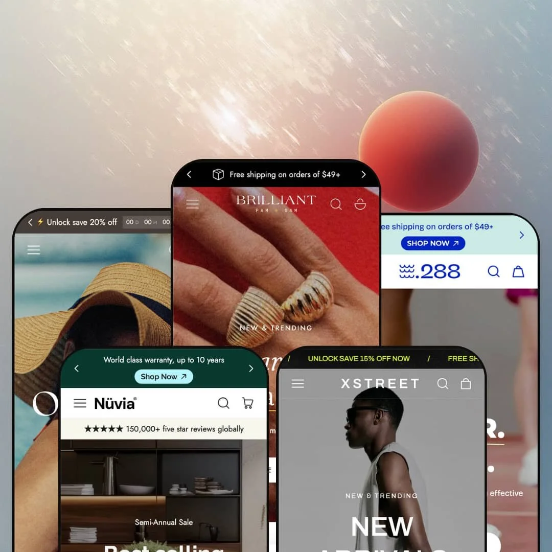
The Edge Shopify theme caters to merchants seeking highly visual storefronts with built-in merchandising tools. Across its five presets (Default, Layer, Sundown, Step, and Linea), it leans on oversized heroes, product-forward landing pages, and editorial storytelling sections that frame products with more brand context than a basic grid-first layout. During testing, the main shopping journey stayed consistent across presets, while each demo staging clearly pushed a distinct mood and merchandising rhythm.
Pros.
〰️
Pros. 〰️
✚ Flexible presets with distinct moods
Edge’s demos show five presets that vary widely in aesthetic, from luxury jewellery styling to neon streetwear, coastal pastels, performance footwear storytelling, and mid-century furniture calm. That range lets a merchant choose a starting point that already matches brand tone, rather than forcing a single visual identity. Even with the mood shifts, the shopping flow stays coherent as you move from hero to product discovery.
✚ Merchandising that keeps shoppers in the buying flow
Across the demos, Edge emphasizes quick-shop interactions and a cart drawer experience designed to keep shoppers on the page. The cart drawer presentation includes practical add-ons and progress cues such as free-shipping messaging, gift-wrap toggles, and cross-sell suggestions. The net effect is a storefront that encourages basket-building without forcing shoppers to repeatedly leave the product discovery context.
✚ Search and navigation built for browsing, not just finding
Edge pairs multi-tier navigation with a search overlay approach that surfaces trending prompts and live results as shoppers type. The mega menu presentation supports category exploration with multiple columns and promotional imagery in the navigation area itself. Together, these tools are geared toward discovery-heavy shopping where customers do not arrive with a single exact item in mind.
✚ Product pages that support both decisions and storytelling
The theme’s product page structure supports rich merchandising content, including variant selection, detailed information sections presented as accordions, and a sticky add-to-cart pattern that stays present during long reads. Several demos also stage deeper storytelling and comparison-style blocks, like editorial sections, specification tables, and interactive content. This makes Edge well suited to products where shoppers want context, reassurance, and reasons to believe before purchasing.
✚ Built-in promotion staging when you need urgency
Edge’s demos include multiple ways to stage promotions, from banners and ribbons to countdown-style urgency. Used selectively, these elements help spotlight sales and offers without requiring extra apps. The key is restraint, because heavy promo repetition can reduce impact.
Cons.
〰️
Cons. 〰️
🚫 Content-heavy staging can overwhelm and slow the journey
Several presets lean on long pages packed with media, promotional blocks, and editorial sections. That richness can be persuasive, but it also risks diluting focus and making navigation feel slower for shoppers who want a quick path to product selection. On older devices, the combination of videos, animations, and long scrolls can feel demanding.
🚫 Readability and tap precision need attention in dense layouts
In testing, minor legibility issues showed up when light text sat over high-contrast imagery, particularly as screens got smaller. The Layer demo also used very small search and menu icons on mobile, which can make precise tapping harder. These are fixable issues, but they require careful contrast choices and usability checks during setup.
🚫 URL complexity can create avoidable friction
Some product URLs in the demos included lengthy descriptors, and mistyping them led to 404 errors. While most shoppers will not manually type product slugs, the behavior is still worth noting for merchant QA and internal workflows. Clean, consistent URL structures help reduce edge-case confusion.
-
The Default preset embodies a jewellery boutique aesthetic, leaning on light backgrounds, elegant serif fonts, and generous white space to foreground fine-detail imagery. It feels intentionally quiet, with an editorial tone that prioritizes product photography and careful pacing over high-energy promotions. That makes it an easy fit for luxury accessories or refined fashion brands that want the storefront to feel curated rather than crowded.
What works in this preset
The strongest impression here is restraint. Light backgrounds and ample spacing keep the page from feeling salesy, even when the layout includes multiple content blocks. That breathing room makes the design feel premium, and it encourages shoppers to slow down and look closely.
Typography does a lot of the mood-setting. The elegant serif styling reads like a boutique lookbook, which pairs naturally with product imagery that relies on texture, shine, and small details. If your brand leans on craftsmanship cues, this staging supports that without needing loud visual effects.
The Default demo also leans into editorial storytelling as a companion to merchandising. Instead of presenting product blocks as purely transactional, the layout makes room for narrative sections that support brand positioning. This helps luxury-oriented stores reinforce value through context, not just price.
Where it stumbles
In this preset demo, the sticky add-to-cart bar occasionally obscures content on long product pages. It can sit over bottom-of-page information until it’s manually dismissed, which may interrupt shoppers right when they are trying to finish reading details. The issue is minor, but it is noticeable enough that merchants should sanity-check spacing and overlap on long templates.
-
Layer targets streetwear and lifestyle brands, and it leans hard into bold typography, neon accents, and overlapping panels. The overall staging feels dynamic and youth-oriented, with playful illustration and motion cues that make the storefront read more like a campaign page than a traditional catalog. It is deliberately busy, which can be a feature when your brand thrives on energy and visual attitude.
What works in this preset
Layer’s strongest quality is its sense of motion and editorial punch. Overlapping panels and bold type create a layered rhythm that keeps the eye moving, which suits drops, capsules, and trend-driven collections. The page feels designed to be scanned quickly, with visual “hits” that keep browsing lively.
In this preset demo, urgency is staged prominently through countdown banners and diagonal ribbons. Sale messaging is not subtle here, and the design makes promotional moments feel like part of the brand voice rather than an add-on. If your merchandising relies on timing or limited runs, this presentation supports that feeling.
The demo also uses layered editorial sections to keep shoppers engaged between product-focused moments. Vertical text lists and overlapping imagery add a magazine-like cadence, and the playful 3D animation staging (including a dog chasing sneakers) adds personality. It is a deliberate choice that signals “street” and “play” more than “minimal” or “luxury.”
Where it stumbles
The same density that makes Layer exciting can also overwhelm. With numerous animations, promo callouts, and overlapping panels, shoppers looking for straightforward browsing may feel like they have to work harder to find the “next simple step.” This is less about any single element and more about cumulative visual load.
Text legibility also dips in a few places in this demo staging. Light text placed over high-contrast imagery can be hard to read, and that problem is amplified when screens get smaller. If you adopt this preset’s approach, you will want to be disciplined about contrast and background complexity.
In this demo, the search and menu icons are also quite small, particularly on mobile. That can create tap precision issues for some shoppers, especially when they are moving quickly through a busy page. It is a small usability friction that stands out more because the rest of the layout is already visually intense.
-
Sundown exudes a coastal vibe with pastel colours, serif headers, and soft curves that immediately signal a summer mood. The staging feels warm and aspirational, designed to guide shoppers through category exploration while maintaining a relaxed, lifestyle-forward tone. It suits swimwear, resort wear, and beauty-adjacent brands that want the storefront to function like a seasonal lookbook.
What works in this preset
In this preset demo, category discovery is staged front and centre through oversized tiles that include product counts. Instead of making shoppers guess how deep each category is, the staging sets expectations immediately. That can make browsing feel lighter because shoppers can choose a path with more confidence.
The overall design language supports “soft” merchandising. Pastel palettes, curved shapes, and serif headers make the storefront feel gentle rather than urgent, even when promotions are present. For brands selling mood and lifestyle alongside products, this is the kind of presentation that can reinforce the emotional pitch.
Sundown also leans into editorial storytelling in its long-form product page staging. After the core product details, the demo uses additional content blocks such as Sand to Sunset, along with supporting sections like hero imagery, mission-oriented statements, and frequently asked questions presented in an accordion format. The result is a product page that feels more like a brand narrative, not just a specification sheet.
Where it stumbles
The demo’s promotional messaging can feel repetitive. Multiple “Sale up to 40% off” banners appear on the home page, and that repetition risks diluting urgency by making the message feel constant rather than time-sensitive. It can also pull attention away from the actual product story the preset is otherwise trying to build.
This preset’s pages can also run long because the staging layers editorial blocks and promotional moments in addition to product content. That depth can be engaging, but it also means more scrolling before shoppers reach later-page elements. For some audiences, the presentation may feel like it asks for more patience than a faster, more compact product page.
-
Step is crafted for footwear and athleisure brands, pairing minimalist monochrome backgrounds with bold headline typography and oversized product imagery. Ambient video clips and motion cues create a high-energy feel, while sale and category blocks focus attention on footwear segmentation. It is a demo that reads like a performance brand landing page, designed to feel active even when the layout is clean.
What works in this preset
The opening hero in this demo is driven by a muted video backdrop with calls to action layered on top. It immediately communicates motion and momentum, which is a natural fit for athletic and footwear brands. Subtle animations continue throughout, keeping the presentation lively without turning the entire page into a loud visual collage.
A distinctive staging choice here is the multi-category sale block. The central sale banner divides the screen into women’s, men’s, and kids’ segments, which helps shoppers self-select quickly. For stores with clear audience splits, this is the kind of structure that can reduce wandering and speed up category entry.
In this Step demo staging, product storytelling is also supported by interactive comparison framing. A comparison table contrasts the featured shoe with competitors across criteria like outdoor use, barefoot feel, and water resistance, giving shoppers a structured way to interpret claims. That kind of presentation is especially valuable for performance-oriented products where shoppers want proof points, not just lifestyle photography.
The demo continues that “proof plus story” cadence with a before/after slider and surrounding editorial blocks. Mid-page storytelling sections cover mission cues, testimonials, and video-backed lifestyle imagery, which keeps the product narrative moving. It is a deliberate blend of functional comparison and brand storytelling that matches footwear marketing well.
Where it stumbles
This demo can feel heavy because it stacks multiple media-rich elements on one page. Between animations, editorial blocks, comparison content, and videos, the experience is engaging but potentially demanding on older devices. The staging is ambitious, and it works best when merchants are willing to curate and trim rather than default to “everything everywhere.”
The home page also concentrates attention on sale banners and primary collections, which can hide secondary navigation depth. In this staging, categories like accessories or care products are present but less visible at a glance. If your catalog relies on secondary product lines, you may need to rethink the front-page emphasis to avoid burying them.
-
Linea channels a modern, mid-century furniture boutique, and the Nuvia demo uses muted greens, earthy tones, and generous white space to showcase sofas, chairs, lighting, and decor. The staging is calm and gallery-like, with large category cards and soft animations that make browsing feel slower and more deliberate. It is a preset that tries to turn furniture shopping into an editorial experience rather than a purely utilitarian search for items.
What works in this preset
The most defining element of this demo is its extensive home page variety. The layout layers many sections, moving from category structures into testimonials, inspirational lifestyle imagery, curated room prompts like Get Inspired, and From the Journal blog articles. That breadth keeps customers engaged while repeatedly reframing products in different contexts.
In this preset demo staging, merchandising is paired with “service reassurance” cues. Service icon rows and concierge-style messaging are woven into the page flow, reinforcing the idea that furniture buying comes with delivery, support, and guidance. For higher-consideration categories, that kind of staging can reduce hesitation by making the store feel more like a boutique than a warehouse.
The demo also makes room for inspiration-driven shopping. Shop-the-look hotspots and curated room inspiration sections encourage shoppers to imagine complete spaces rather than isolated purchases. When staged well, those moments can raise average order size simply by showing how items belong together.
Where it stumbles
The sheer number of sections can be overwhelming. With dozens of blocks stacked into the landing flow, the demo demands significant scrolling, and some shoppers may struggle to locate specific information quickly. It is an impressive showcase, but it benefits most when a merchant curates and removes what does not serve a clear purpose.
In this demo, visual density also shows up inside certain sliders. Product names and badges sometimes overlap in sections like New Signatures and Designs on Sale, which slightly reduces clarity during browsing. This is the kind of detail that is easy to overlook during setup, but it matters in a category where shoppers compare multiple items quickly.
There is also a demo content mismatch to be aware of. Some specification and FAQ text appears unrelated to furniture products, including references that fit other categories better. It reads like placeholder demo copy, and it should be updated immediately to avoid confusing shoppers.
Niche Suitability
Not Ideal For
Final Recommendation
-
Edge is a strong match for merchants who want a polished, highly visual storefront with built-in merchandising tools and editorial storytelling. Brands that benefit from mood-setting design and richer product context, including fashion, lifestyle, and home decor, will likely find the preset variety especially useful.
-
Merchants seeking a minimal, ultra-fast theme or a very compact landing page may find Edge’s default staging too content-heavy. If your storefront strategy depends on short pages and low editorial density, you may prefer a simpler foundation.
-
Medium — Most core merchandising patterns work out of the box, but the demos show how quickly pages can become dense when every section is enabled. Expect to spend time curating sections, tightening copy, and tuning typography and colour choices to keep the storefront coherent.
★ 7.2/10
Rating
-
Edge delivers comprehensive merchandising tools including quick-view modals, mega menus, cart drawer upsells, comparison tables, and a robust search overlay.
7
-
Core interactions are intuitive, yet the abundance of sections and media can make pages feel heavy. Long scrolling and repeated promotions may overwhelm some shoppers.
7
-
Overall mobile usability held up well in testing, but some text-on-image sections lose readability on smaller screens. Tap precision can also suffer where icons are staged small.
8
-
Videos and animations usually load smoothly, but the most media-rich demos can tax slower devices. On older hardware, the amount of content may lead to noticeable slowdowns.
7
-
Five distinct presets provide varied aesthetics, and the theme editor supports meaningful layout, colour, and typography changes. The same core foundation can be pushed into very different brand directions.
7
FAQ
〰️
FAQ 〰️
-
👑 Edge proved versatile across jewellery (Default), streetwear (Layer), swimwear (Sundown), footwear (Step), and modern furniture (Linea). The variety of preset moods and merchandising approaches makes it adaptable to many fashion, lifestyle, and home decor niches.
-
📱Yes, overall. In testing, the main shopping flow remained usable, though some sections that place light text over imagery lost readability on smaller screens. Tap targets can also feel tight when icons are staged small in denser layouts.
-
🎨 Very. Merchants can adjust colours, fonts, section order, and imagery to reshape each preset’s mood. Layer’s neon, illustration-forward staging and Linea’s earthy, mid-century calm show how far the same theme foundation can be pushed.
-
⚡ Overall performance was solid in hands-on testing, especially for core shopping interactions. The most content-heavy demos, particularly those with long pages and multiple videos or animations, can be more demanding on older devices.
-
👕 Yes. Product pages and quick-view modals present variant selection clearly, including options like colour swatches, size or width selectors, fit-style controls, and quantity adjustments. In the Step demo staging, a comparison table is also used to help shoppers interpret product differences.
-
🔎 Beyond Shopify’s built-in SEO settings, Edge emphasizes structured layouts with clear hierarchy. Merchants who need advanced SEO workflows will still look to apps, but the theme’s section organization supports clean, readable pages.
-
💱 Yes. Languages and currencies are handled through Shopify’s localization features, and the demos show selectors placed in the header or footer so shoppers can switch locales. Setup and availability depend on your Shopify settings, not on the preset demo staging.
-
⚙️ Edge follows Shopify’s standards, so common apps for reviews, subscriptions, or page-building typically integrate smoothly. Its built-in merchandising sections can also reduce reliance on some third-party add-on tools.
-
🛒 Yes. Shopify’s theme store allows merchants to preview themes in their own store before purchase, and Edge also provides live demos for each preset. This review was based on those public demos and the behaviors they surfaced.
This review is based on hands-on testing of the publicly available preset demos of the Edge Shopify theme as of 4 January 2026. Theme features, preset availability, and performance can change with subsequent updates from the theme developer.